

Basic organization chart editable powerpoint templates




Try Before you Buy Download Free Sample Product
 Impress Your
 Audience
 100%
100% Editable
 Save Hours
 of Time


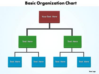
Business Organization Chart Editable PowerPoint, displays the company’s structure in a perfect sequence. Since an organization has a vast number of employees, working in different positions and the relative ranks, an Organogram slide template is an effective way to represent that relationship. Keeping its importance in mind for any group of industries, the professionals have designed this organizational chart template for you. And, because we know every association has different data to set in the directorial icons, we offer to download the Organogram slides, which allow editing. So, no more need to think over preparing the layouts or work on organizational charts to showcase the structure. This presentation is enough to explain hierarchical, matrix or flat structure with icons. Hence, have an access to this PowerPoint slide template, outline your company’s internal structure and depict a clear organizational chart template in front of your audience. Even the best ideas need to be presented well to succeed. Choose from thousands of basic organization chart editable powerpoint templates to put yours in the best possible light.
People who downloaded this PowerPoint presentation also viewed the following :
Basic organization chart editable powerpoint templates with all 4 slides:
Our basic organization chart editable powerpoint templates are known for their usability factor. They have created optimum experiences for many.
FAQs for Basic organization chart
Definitely need names, titles, and those connecting lines showing who reports to who. Photos make such a huge difference too - I always think it'll look fine without them but then you add headshots and it's like night and day. Group people by department so it makes sense. Oh, and don't cram everything together - white space is your friend, especially if you're gonna project it. Build it in sections so when Sarah inevitably gets promoted next month, you can just drag and drop instead of rebuilding the whole thing from scratch.
Oh totally, color schemes are game-changers for org charts! Dark colors for executives, lighter ones for junior staff - super intuitive. Or just color-code by department so everyone knows who's where. Honestly though, I've seen some that look like a kindergarten art project gone wrong lol. Stick to maybe 3-4 colors that actually work together. Make sure your text doesn't disappear into the background either. Pro tip: start with your company's brand colors - looks way more polished that way.
So there's basically three types you'll run into. Traditional hierarchical ones are your standard corporate ladder thing - super clear who reports to who. Matrix charts show when people have multiple bosses, which honestly gets confusing to look at but makes sense for project teams. Then flat structures are more like startup vibes where everyone's kind of on the same level. I'd go hierarchical if you want something simple and clean. Matrix if your org is actually that complicated (and it probably is). Flat works when you're trying to show collaboration over who's in charge. Does that help?
Keep each box super minimal - just job titles and names. Don't try cramming your entire company onto one slide because honestly, it always ends up looking like a hot mess. Split big departments across multiple slides instead. Make sure your hierarchy is crystal clear with good spacing so people can instantly see who reports to whom. Stick with the same colors and fonts throughout (sounds boring but it actually helps). Here's what really works though - show it to someone who doesn't know your org structure. If they're squinting and confused, you've got more simplifying to do. The whole thing should make sense within like 3 seconds of looking at it.
Flexibility is huge - you'll be switching people around way more than you think. Find something that won't completely fall apart when you add or remove boxes. The design should handle however many levels your company has, plus leave room for names, titles, maybe headshots if you're into that. Clean beats fancy every time - nobody wants to squint at some overly designed mess during a meeting. Make sure it matches your brand colors and actually looks decent when printed (because someone will definitely print it). Oh, and test how it looks on different screen sizes. Your future self will appreciate picking something simple that just works.
Put your CEO at the top, then branch down with solid lines for direct reports. Keep spacing consistent between levels - looks way cleaner. Use dotted lines for those annoying matrix relationships (seriously, who invented those?). Same box sizes within each level, and color-code departments so it's not just a sea of beige rectangles. The whole thing should make sense in like 3 seconds. If someone has to trace lines with their finger to figure out the chain of command, you've overcomplicated it. Short version: top to bottom flow, clear lines, consistent formatting.
Look, nobody wants to stare at a bunch of boring text boxes - that's just death by PowerPoint. Try adding role-specific icons instead, like gears for ops people or lightbulbs for your creative types. Photos make it feel way more personal too. Colors work great for showing different departments or levels. I'd probably go overboard with the icons if I'm being honest, but the trick is staying consistent so people actually focus on who reports to whom. Short version: anything that breaks up those identical rectangles will make your chart way more readable.
Start with a basic template that matches your company size, then just swap out the job titles and tweak the hierarchy. Colors matter more than you'd think - healthcare companies usually go with clean blues while creative agencies can get away with bolder brand colors. Tech startups might use flat structures with trendy titles like "Growth Hacker," but law firms stick to traditional partner/associate levels. Most templates let you add or remove boxes pretty easily. Honestly, the hardest part is just picking a starting point that's close to what you need, then editing from there.
Dude, interactive org charts are so much better than those boring static ones. Add clickable links to people's profiles and hover effects for contact info - your presentations will actually be engaging for once. People can explore at their own pace instead of you droning through every single employee (honestly such a relief). New hires love being able to click around and figure out the company structure themselves during onboarding. Start simple with hyperlinks to LinkedIn profiles or your internal directory. Oh, and no more squinting at tiny text boxes during meetings - that alone makes it worth doing.
Dude, definitely get your team to look at it first. They'll catch stuff you totally missed - like when roles that work together daily aren't even connected on the chart. I've watched people completely redo their org charts after getting feedback because what looked good on paper made zero sense in real life. Your coworkers will tell you straight up if the hierarchy is confusing or if you're missing key relationships. Honestly? The reporting lines on paper rarely match how things actually function. Send it around early and ask "Does this show how we really work?" Trust me, you'll avoid so many headaches later.
Pick one format for labels - either just job titles or names with titles - and stick with it. Same font size for people at the same level too. I've seen way too many org charts where the CEO gets this massive bold font while everyone else is squished into tiny text. Looks terrible honestly. Make titles short but clear enough that outsiders can figure out what people actually do. Oh, and definitely show it to someone outside your team first - they'll catch confusing stuff you missed since you're too close to it.
Just show the top 2-3 levels and bunch everything else into departments instead of mapping out every single person. Trust me, execs don't want to see your entire company directory - they want the big picture structure. Keep it clean with lots of white space because messy charts are the worst. Names, titles, maybe some key responsibilities if there's room. That's it. Oh and definitely have a detailed backup version ready though. Someone always wants to dive deeper during questions, and you'll look super prepared when you can pull that out.
Oh god, the tiny text thing drives me crazy! Nobody can read that stuff from the back of the room. Also don't cram like 50 people onto one slide - it's just visual chaos. Inconsistent formatting looks amateur too, like when someone randomly switches fonts halfway through. Wrong reporting lines are super awkward (been there). Short version: clean fonts, consistent colors, break big teams across multiple slides. Your audience will actually thank you instead of pretending they can see what you're showing them.
Ok so basically animated transitions help people actually pay attention to your org chart instead of getting lost in all the boxes. Start with subtle stuff - gentle fades work way better than anything bouncy or distracting. You can reveal hierarchy levels one at a time, or smoothly switch between different departments. Honestly it's pretty satisfying to watch compared to boring static charts (maybe that's just me though). Build it top-down or by department so you're controlling where people look. Just don't go overboard with the effects.
Honestly, I'd just hit up Microsoft's template gallery first - they've got some decent free ones built into PowerPoint. If those look too basic, SlideModel and SlideTeam have way more polished stuff but you'll pay for it. Canva's surprisingly good for org charts too, even though everyone thinks it's just for Instagram posts. For totally free options, Template.net works, or just search Pinterest for "organization chart PowerPoint" - there's actually tons of good downloadable templates there. Start with the Microsoft freebies though, then see if you need something fancier.
-
Awesome presentation, really professional and easy to edit.
-
Unique research projects to present in meeting.