


Business operations dashboard production ppt pictures clipart images




Try Before you Buy Download Free Sample Product
 Impress Your
 Audience
 100%
100% Editable
 Save Hours
 of Time


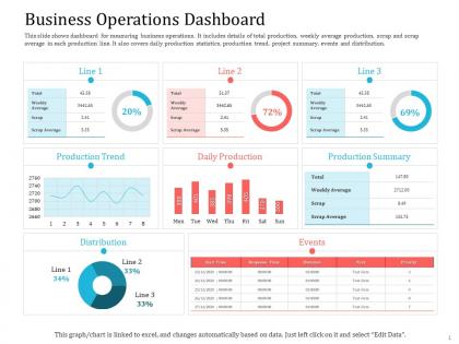
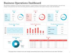
This slide shows dashboard for measuring business operations. It includes details of total production weekly average production scrap and scrap average in each production line. It also covers daily production statistics production trend project summary events and distribution.
People who downloaded this PowerPoint presentation also viewed the following :
Business operations dashboard production ppt pictures clipart images with all 2 slides:
Use our Business Operations Dashboard Production Ppt Pictures Clipart Images to effectively help you save your valuable time. They are readymade to fit into any presentation structure.
FAQs for Business operations dashboard production ppt
Look, start with the basics - revenue growth month to month, your profit margins, and cash flow. Those are non-negotiable. Then add operational stuff like how long your processes take and productivity rates. Customer satisfaction scores matter too, obviously. Don't forget about tracking your team's performance and any weird industry-specific things for your business. Honestly, I see too many people go overboard with dashboards that nobody actually uses. Pick maybe 6-8 metrics your team will actually check every day. You can always add more later when you figure out what's missing.
Dude, real-time data integration is what separates useful dashboards from fancy wallpaper. Your sales, inventory, customer stuff - it all updates automatically so you're not waiting around for some report that's already outdated. Honestly changed everything for me once I set it up properly. You'll spot inventory issues before they become real problems, or catch those random demand spikes you can actually do something about. Just make sure the integration doesn't crap out on you (learned that the hard way). Nothing's worse than thinking your data's fresh when it's actually from Tuesday.
Honestly, the worst part is gonna be your data living in like 5 different places that hate each other. Super fun to sort out. Plus getting people to actually use the thing instead of their beloved Excel sheets - good luck with that one. Oh, and you'll probably obsess over tracking everything when half those metrics don't even matter. My take? Pick one team to start with, fix the data mess first (seriously, do this), and let people help design it. When they feel like it's partly theirs, they're way more likely to use it.
Bar charts work great for comparing stuff, line graphs for tracking trends over time. Honestly, I'd put your most important metrics right up top where people can't miss them. Heatmaps are clutch for pattern spotting too. Don't go overboard with colors though - some dashboards look like a unicorn exploded. Think about what decisions your users actually make every day, then build around that. You want them catching problems or opportunities immediately instead of scrolling through endless data tables. Clean layouts win every time.
Oh man, data accuracy is everything with dashboards. Bad data will totally screw you over - it's like driving with a busted speedometer thinking you're doing 30 when you're actually flying at 60mph. I've seen people make awful decisions because their data was garbage or way outdated. You really can't trust anything you're looking at unless the underlying info is solid. Set up some validation checks to catch errors early, and honestly? Audit your data sources more often than you think you need to. Real-time, clean data makes all the difference when you're trying to act fast.
Honestly, you gotta customize by department because everyone cares about completely different stuff. Sales wants pipeline numbers and conversion rates. HR's obsessing over turnover and hiring metrics. Operations? They live and breathe efficiency data and supply chain bottlenecks. Here's what worked for me - interview each department head first. Figure out what decisions they're making daily and what's driving them crazy. Then build dashboards that actually show what they need to take action on. Start with one team, get their dashboard perfect, then roll it out to others. Way less overwhelming that way.
So for business dashboards, Tableau and Power BI are the big names - crazy flexible but they'll hit your wallet hard if you scale. Google Data Studio's free and honestly pretty decent, just has some quirks. Here's the thing though - I've watched so many teams obsess over finding the "perfect" tool instead of just getting started. Quick wins? Airtable or even Notion work fine for basic stuff. My buddy's startup used Notion dashboards for like 6 months before upgrading. Look at your data sources first, then grab whatever connects easiest. Don't overthink it.
Honestly, the historical data section is where the magic happens. Pull up your last two years of reports and just dig in - you'll spot patterns you never noticed before. Seasonal stuff jumps out immediately, plus you can see how customer behavior shifted over time. I always compare year-over-year performance first, then drill down into quarters. The trend features are pretty solid for connecting dots between metrics that seemed random day-to-day. It's basically your data telling you a story about what actually worked. Sometimes the biggest surprises are hiding in plain sight.
Dude, having a good ops dashboard completely changes how you make decisions. Instead of flying blind until your monthly reports come in, you'll actually see what's happening in real time. Spotting problems early becomes so much easier. I honestly don't know how I managed before having all that data right there. You can catch trends before they bite you and make way better choices faster. The trick is focusing on metrics that actually move the needle for your business - not just pretty numbers that make you feel good but don't really matter.
Honestly, being able to handle stuff from your phone is pretty clutch. When you're stuck in traffic or grabbing coffee, you can still approve urgent requests and catch problems before they blow up. I used to stress about being away from my desk - like what if something breaks while I'm out? Now alerts hit my phone immediately instead of sitting there for hours. Your team doesn't have to wait around either, which they definitely appreciate. Those small issues that would normally turn into disasters by the time you get back? They just don't anymore.
Think of user roles like handing out different sets of keys - some people get access to everything, others just see the basics. Map out your user types first (this step saves you so much headache later). Design the most locked-down view initially, then add features as permissions increase. Read-only folks might only see summary charts, while power users can dig into all the financial details. The annoying part? Making sure your interface doesn't look totally broken when buttons randomly appear or vanish depending on who's signed in. But honestly, it's worth getting this foundation right from the start.
Ok so for supply chain stuff, I'd focus on order fulfillment time first - basically how fast you're shipping things out. Inventory turnover and supplier lead times are clutch too. On-time delivery percentage is probably the most important though, customers get really annoyed with late orders. Oh and track cost per shipment plus warehouse utilization so you can catch problems early. Stock-out frequency matters since you can't sell what you don't have. That's like six solid metrics that won't overwhelm you with data.
Honestly? Treat it like a living thing that needs attention. Do quarterly check-ins to see what metrics actually matter vs. what's just noise now. Your users will tell you straight up what's broken or missing - just ask them! I swear, dashboards turn into these cluttered messes if you don't stay on top of them. Mix in new data sources as they pop up, but don't go overboard. The whole point is building those feedback loops so it doesn't become another "set it and forget it" situation. Start by asking your team what bugs them about the current setup. They probably have opinions.
Skip the generic tutorials - they're useless honestly. Walk your team through actual scenarios they deal with every day. Show them the buttons, sure, but explain why those specific metrics matter for what they do. Role-playing different situations works way better than boring slide decks. Set up "champions" in each department who can help when people get stuck. Oh, and definitely make quick reference guides they can actually use. The real trick? Don't dump everything on them at once. Give them time to practice, then circle back in a few weeks to see what's still confusing them.
Honestly, just ask your users what they actually need - surveys, those little feedback widgets, whatever works. Track which features they're completely ignoring (there's always at least one). See what data they keep asking for and where they're getting stuck. I've seen so many dashboards built around what devs think is cool rather than what users actually use day-to-day. Maybe they need better mobile support or clearer charts. Test changes with a few people first before pushing updates to everyone. That feedback loop will save you from building stuff nobody wants.
-
Awesome use of colors and designs in product templates.
-
Awesome use of colors and designs in product templates.
-
Very unique, user-friendly presentation interface.
-
Understandable and informative presentation.