


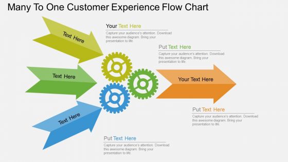
cf Diagrama de flujo de la experiencia del cliente de muchos a uno Diseño de PowerPoint plano




Try Before you Buy Download Free Sample Product
 Impress Your
 Audience
 100%
100% Editable
 Save Hours
 of Time


Su industria comercial puede tener una gran cantidad de clientes y clientes, pero siempre es necesario administrarlos a todos. cf Diagrama de flujo de la experiencia del cliente de muchos a uno El diseño plano de PowerPoint es un icono de PPT innovador que le ayuda a agrupar a sus clientes en uno y obtener beneficios comerciales con una gestión adecuada. Se trata de diagramas de flechas, todos enfocados para moverse en una dirección. Además, una estructura tipo diagrama de flujo que conduce a un solo destino aclara el motivo de una presentación comercial sin hacer muchos esfuerzos. Un usuario puede crearlo de manera innovadora mientras hace uso de la organización creativa de flechas. Puede ayudar a los presentadores de negocios a administrar la relación con los consumidores y apuntar a una política de muchos clientes para un crecimiento futuro instantáneo. Por supuesto, su cliente es el rey de su negocio y cuando eso se administra con la experiencia del cliente, toda la tarea de administrar los asuntos comerciales se vuelve más fácil. Por lo tanto, este ícono de diapositiva PPT de experiencia de cliente de muchos a uno puede presentarse de manera innovadora entre los profesionales de negocios o también puede ser una bendición para los individuos de marketing. Resuelva las diferencias con nuestro Diagrama de flujo de la experiencia del cliente Muchos a uno, Diseño de PowerPoint plano. Consígalos todos en la misma página.
People who downloaded this PowerPoint presentation also viewed the following :
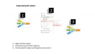
cf Diagrama de flujo de la experiencia del cliente de muchos a uno Diseño plano de PowerPoint con las 4 diapositivas:
Se inteligente. Cree la presentación perfecta con nuestro versátil diagrama de flujo de la experiencia del cliente de muchos a uno, diseño de PowerPoint plano. Contamos con un equipo de profesionales dedicados que eligen estilos únicos y dinámicos para hacer que su contenido parezca visualmente impactante e impresionante.
FAQs for Cf many to one customer experience flow chart
Most companies break it down into awareness, consideration, purchase, onboarding, and retention/advocacy. Start by figuring out how people discover you, then follow them through comparing options, buying, getting set up, and hopefully sticking around. Your industry totally changes this though - like B2B sales cycles are way different than e-commerce. I'd honestly just map out the big stages first instead of getting crazy detailed right away. You can always drill down once you've got the main touchpoints and problem areas figured out. Way easier than trying to perfect everything from the start.
So basically you map out every step customers take and then you can actually see where they're hitting walls. Like, maybe everyone's bailing at checkout or constantly calling support after one specific thing. The visual part is key - way easier than staring at endless spreadsheet rows (ugh). I'd start by sketching your current process first. Then throw real user data on top of it. You'll probably be surprised where people actually struggle versus where you think they do. It's honestly like getting inside their heads without the mind-reading part.
Honestly, just stick with the basics everyone already knows - rectangles for processes, diamonds for decisions, circles for start/end. People get those instantly. I'd throw in some color coding too, like green for the good stuff and red for where things go wrong. Make your arrows thick enough that people don't need reading glasses to follow them! Simple icons work best - shopping carts, phones, whatever makes sense. The real test? Show it to someone fresh and see if they can follow it without you explaining anything. If they're confused, you probably made it too complicated.
Honestly, just build those feedback loops right into your flow chart wherever customers naturally hit you up - after buying stuff, support calls, onboarding, whatever. We totally screwed this up once and missed super obvious issues! Create different branches based on what people tell you. Happy customers? Show them upsells. Pissed off ones? Route them straight to your retention team. The trick is making feedback feel normal, not like some annoying survey popup. Use satisfaction scores or sentiment to automatically trigger different paths. Trust me, when you make it feel natural, you'll get way better responses that actually fix things.
Honestly, start by mapping your customer journey first - then pick 2-3 metrics that actually matter for each stage. Awareness stuff like reach and impressions. Engagement rates for consideration. Conversion rates when they're ready to buy. I learned this the hard way, but don't track everything or you'll go insane with all the data. Focus on your biggest drop-off points instead. That's where granular tracking pays off. Post-purchase is tricky though - satisfaction scores and repeat purchases tell you if people actually stick around. Match the metric to what's happening at that exact moment in their journey.
Honestly, flow charts are clutch for breaking down those stupid departmental walls. Map out the whole customer journey - from when marketing first touches someone to sales handoffs to support calls. Everyone gets the same visual, so no more "not my job" nonsense. Each team can actually see how their work connects to everyone else's. Super simple to start: grab one person from each customer team and map just one journey together. You'll catch gaps nobody noticed before (and probably argue less about whose fault things are).
Dude, you absolutely need tech for this stuff. Analytics platforms show you real customer journeys instead of what you're guessing happens. Heatmaps reveal where people bail on your site - super eye-opening honestly. Your CRM probably has tons of useful timeline data already sitting there. Survey tools grab feedback at different points too. I mean, you could try mapping without any tools but that's like... why make it harder? Oh and don't overthink it - just start with whatever analytics you've got running and add more later.
Honestly, you've got to check on this stuff regularly - like every quarter minimum. Set up alerts so your analytics tools ping you when numbers get weird. Your customer service people are gold mines here since they hear all the complaints first, so actually chat with them. The flow chart isn't some sacred document you create once and never touch again. Someone needs to own keeping it updated or it'll just collect digital dust. I treat each review like I'm detective work - actively hunting for spots where the chart says one thing but customers are doing something totally different.
Don't map what you *think* happens - figure out what actually goes down with your customers first. I've seen people create these insane 47-step flowcharts that make zero sense. Start simple, then add layers later. Get real data or just ask your customers directly. Focus on your main customer path and test it with actual users before going crazy with the whole system. Oh, and here's something everyone forgets - plan for when stuff breaks. People always design the perfect happy scenario but ignore all the ways things can completely fall apart. Include those failure points and how customers recover from them.
Honestly, storytelling completely changes how people connect with your flow chart. Create a persona first - like "Sarah's order is missing and she's pissed off" instead of boring "Step 1: Contact Support." When you frame it as an actual person's journey, suddenly everyone on your team gets it. The emotional stuff becomes obvious. I've watched meetings where people were half-asleep suddenly get super invested because they're following a real story, not just boxes and arrows. It's kinda wild how much difference it makes. Plus you'll spot gaps in your process way faster when you're thinking about what Sarah would actually do next.
You want people to actually look at your flowchart, right? Size and color are your best friends here. Make the big decisions pop with bold colors, then use muted stuff for the boring details. White space helps too - don't cram everything together like you're saving paper. Here's the thing though: I've watched people destroy perfectly good charts by going font-crazy. Two weights, maybe three max. When you squint at it, the important bits should still jump out at you. If they don't, you've got some tweaking to do.
Think of personas as giving you the "why" behind each step. Map out what different user types are thinking and trying to do at every point. Your busy exec needs shortcuts and fewer clicks, but first-timers? They want way more hand-holding and those little "you're doing great!" moments. It's honestly like having their voice in your head while designing - sounds weird but it works. You'll spot pain points for each group and can build different paths that actually match how they behave. Just overlay your top 2-3 personas on your current flow and watch the gaps jump out at you.
Figma's honestly your best bet - you can make them look super clean and people can comment directly on stuff. Miro works great too, especially for collaboration. I know it sounds weird, but I've actually seen some decent flows made in Canva recently? Though that's more for basic ones. Lucidchart is the boring but reliable option if you want something straightforward. Just grab Figma's free version and mess around with their templates first. You'll probably have something workable in 20 minutes. The commenting feature alone makes it worth it when you're dealing with stakeholders who love to give feedback.
So basically, industry standards are like your cheat sheet for what customers actually expect at every step. You've got ISO standards, WCAG accessibility stuff, plus whatever regulations hit your specific sector - they're all setting the bar for minimum experience requirements. I'll be honest, it feels super limiting when you first start looking at them. But here's the thing - they actually help you catch blind spots you'd totally miss otherwise. Your flow chart needs to cover the basics like data privacy, response times, accessible pathways. Just figure out which standards apply to you first, then use those as your checkpoints while you're designing each part of the journey.
Honestly, lead with the customer's actual experience - make people *feel* that journey before you get into all the technical stuff. Don't overcomplicate it on round one or everyone just zones out. Throw in real quotes and data to make each step feel concrete instead of theoretical. The big friction points need visual callouts so they actually pop. Oh, and this is crucial - you've gotta tie it back to revenue impact at the end. That's literally the only thing that gets budgets approved. I've seen too many beautiful customer journeys that go nowhere because they forgot the business case part.
-
I discovered this website through a google search, the services matched my needs perfectly and the pricing was very reasonable. I was thrilled with the product and the customer service. I will definitely use their slides again for my presentations and recommend them to other colleagues.
-
Wonderful templates design to use in business meetings.