


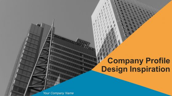
Company Profile Design Inspiration Powerpoint Presentation Slides


Try Before you Buy Download Free Sample Product
 Impress Your
 Audience
Editable
of Time


If you have never made a PowerPoint presentation on company profile before, it can be a little intimidating and time consuming. This is the reason our expert designs have built 59 slides ready-made Company Profile Design Inspiration Powerpoint Presentation Slides. These visually impactful PPT templates will aid in making a very professional company introduction PowerPoint presentation. There are various slides like about us, founders of the company, company overview, departments and teams, vision and mission, goals, objectives, core values, org chart, member profile, business services, company work flow, future projects, our profit, company performance are included in this complete PPT sample. This company intro PPT file will be helpful for anybody who is trying to present the company’s overall statistics. The best part is this that our company profile ppt template slides are fully editable and are best suited on both normal and wide screen format. Not only this there are various other slides like case study, our clients, customer testimonials, global presence, key financials, dashboards, matrix, silhouettes etc. So, do not think and just download our Company Profile Design Inspiration Powerpoint Presentation Slides and showcase your PPT presentation to desired audience. This PowerPoint presentation example will definitely impact onlookers in a positive manner. Enlist the help of your colleagues with our Company Profile Design Inspiration Powerpoint Presentation Slides. Be assured of their backing till the end.
People who downloaded this PowerPoint presentation also viewed the following :
Content of this Powerpoint Presentation
Slide 1: This slide presents Company Profile Design Inspiration. State your company name and begin.
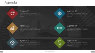
Slide 2: This slide showcases AGENDA. You can state your company agenda and use it accordingly.
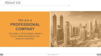
Slide 3: This is an About Us slide. Provide a brief introduction about company/ team here.
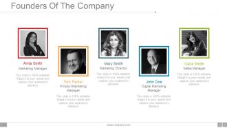
Slide 4: This is a slide for showing Founders Of The Company. Illustrate them beautifully with the help of this slide.
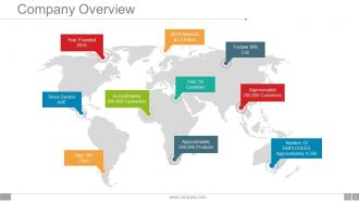
Slide 5: This slide presents the entire Company Overview. You can state your Founding Year, Number of Employees, Revenue etc. here.
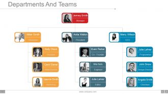
Slide 6: This slide showcases the hierarchy of Departments And Teams. State them here.
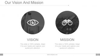
Slide 7: This is Our Vision And Mission slide to state.
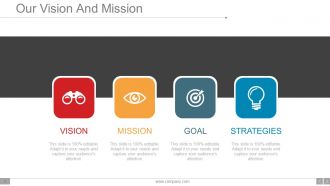
Slide 8: This is another slide to state Our Vision And Mission with text boxes.
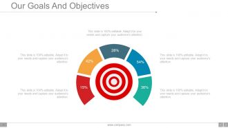
Slide 9: This is Our Goals And Objectives with target imagery. State your goals, objectives etc. here.
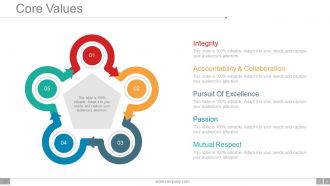
Slide 10: This slide showcases Core Values such as- Integrity, Accountability & Collaboration, Pursuit Of Excellence, Passion, Mutual Respect.
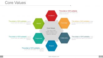
Slide 11: This is another slide showing company Core Values. You can state it as- Integrity, Collaborative, Excellence, Respect, Passionate, Progressive.
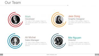
Slide 12: This is Our Team slide. State your team members with their respective designations, names etc. here.
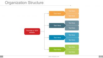
Slide 13: This slide shows Organization Structure. Present company, team structure etc. with the help of this slide.
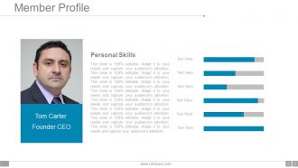
Slide 14: This slide showcases Member Profile with personal skills and designation to be indicated.
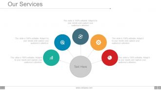
Slide 15: This is Our Services slide. State your company services here.
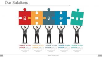
Slide 16: This slide showcases Our Solutions with creative imagery. State the customer solutions the company/organization provides.
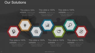
Slide 17: This is slide shows another variation of Our Solutions. State your business/ customer solutions here.
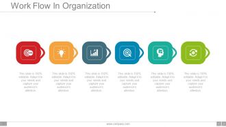
Slide 18: This slide showcases Work Flow In Organization with icon imagery and text boxes.
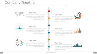
Slide 19: This slide shows Company Timeline in a creative format to illustrate company growth, highlights over the years.
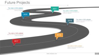
Slide 20: This slide states company Future Projects in a roadmap image form.
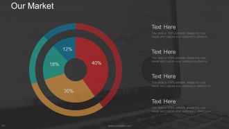
Slide 21: This is Our Market slide presented in a pie chart form.
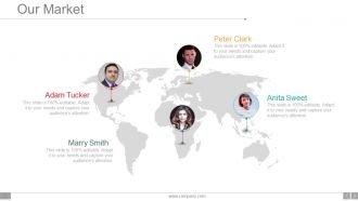
Slide 22: This slide also showcases Our Market on a world map image.
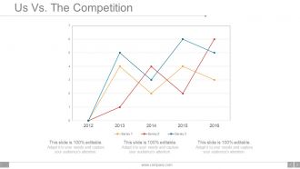
Slide 23: This is Us Vs. The Competition slide presented in a graphical form.
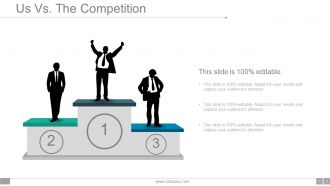
Slide 24: This slide shows another variation of Us Vs The Competition in people silhouettes.
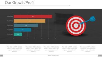
Slide 25: This slide shows Our Growth/ Profit in a graphical form.
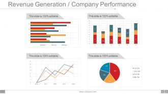
Slide 26: This slide showcases Revenue Generation / Company Performance in charts and graphs.
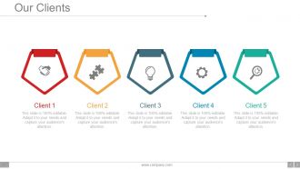
Slide 27: This is Our Clients slide with their respective icon imagery. State your company important clients here.
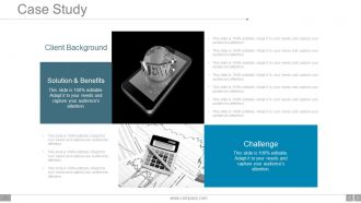
Slide 28: This is a Case study slide showing- Solution & Benefits, Client Background, Challenge.
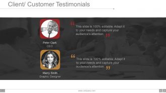
Slide 29: This slide presents Client/ Customer Testimonials with name, designation etc.
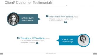
Slide 30: This is another slide to present your Client/ Customer Testimonials
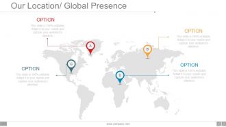
Slide 31: This slide showcases Our Location/ Global Presence on a world map image.
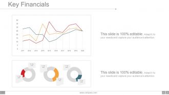
Slide 32: This slide showcases Key Financials in charts and graphs. Use it to show company financial stats, aspects etc.
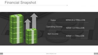
Slide 33: This slide presents Financial Snapshot showing- Sales, Operating Income, Net Income.
Slide 34: This is Find us on Social Media slide with creative imagery. State your social media handles with icon imagery here.
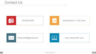
Slide 35: This is Contact Us slide with Email address, Address and Contact Number.
Slide 36: This slide is titled Additional Slides to move forward. You can alter/ change content as per your requirement.
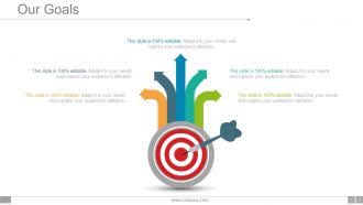
Slide 37: This is Our Goals slide with target imagery. State your goals, aspirations etc. here.
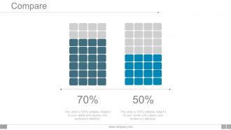
Slide 38: This is Compare slide to compare two products/ entities etc.
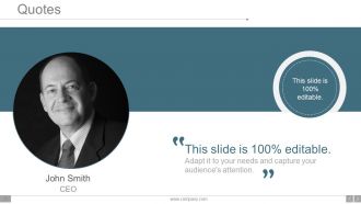
Slide 39: This is a Quotes slide to convey message, beliefs etc.
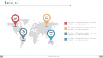
Slide 40: This slide showcases Location/ Global Presence on a world map image.
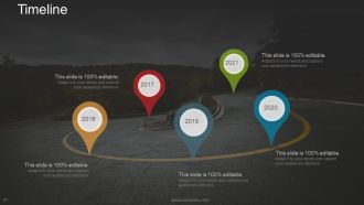
Slide 41: This slide presents a Timeline to show growth, milestones etc.
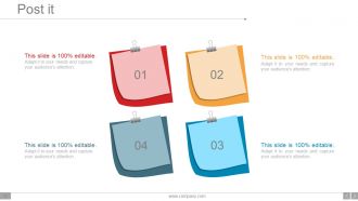
Slide 42: This is a Post it slide to mark reminders, events etc.
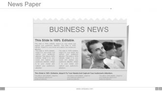
Slide 43: This is a News Paper slide to flash company event, news or anything to highlight.
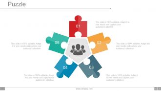
Slide 44: This is a Puzzle image slide to show information, specification etc.
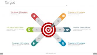
Slide 45: This is a creative Target slide. State your targets here.
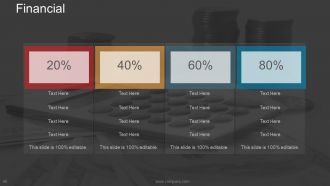
Slide 46: This is a Financial Score slide to show financial aspects here.
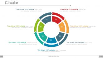
Slide 47: This is a Circular image slide to show information, specifications etc.
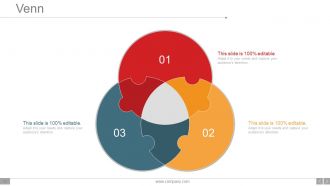
Slide 48: This is a Venn diagram image slide to show information, specifications etc.
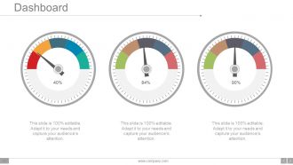
Slide 49: This is a Dashboard slide with respective imagery and text boxes.
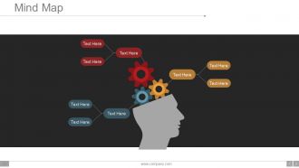
Slide 50: This slide shows a Mind map for representing entities.
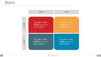
Slide 51: This slide presents a Low High Matrix to state information, specifications etc.
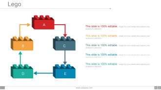
Slide 52: This is a Lego box image slide to state information, specifications etc.
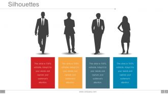
Slide 53: This is a Silhouettes slide to show people related information, specifications etc.
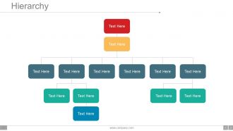
Slide 54: This is a Hierarchy chart slide to showcase team information, specifications etc.
Slide 55: This is a Magnifying glass image slide to show information, specifications etc.
Slide 56: This is a Bar Graph image slide to show product comparison, growth etc.
Slide 57: This is a creative Bulb Or Idea image slide to show information, innovative aspects etc.
Slide 58: This is a Funnel image slide to show information, funneling aspects, specifications etc.
Slide 59: This is a Thank You image slide with Address, Email and Contact number.
Company Profile Design Inspiration Powerpoint Presentation Slides with all 59 slides:
Give expression to your dream with our Company Profile Design Inspiration Powerpoint Presentation Slides. You will definitely create believers.
-
Company Profile Design Inspiration Powerpoint Presentation Slides
-
Company Profile Design Inspiration Powerpoint Presentation Slides
-
Company Profile Design Inspiration Powerpoint Presentation Slides
-
Company Profile Design Inspiration Powerpoint Presentation Slides
-
Company Profile Design Inspiration Powerpoint Presentation Slides
-
Company Profile Design Inspiration Powerpoint Presentation Slides
-
Company Profile Design Inspiration Powerpoint Presentation Slides
-
Company Profile Design Inspiration Powerpoint Presentation Slides
-
Company Profile Design Inspiration Powerpoint Presentation Slides
-
Company Profile Design Inspiration Powerpoint Presentation Slides
-
Company Profile Design Inspiration Powerpoint Presentation Slides
-
Company Profile Design Inspiration Powerpoint Presentation Slides
-
Company Profile Design Inspiration Powerpoint Presentation Slides
-
Company Profile Design Inspiration Powerpoint Presentation Slides
-
Company Profile Design Inspiration Powerpoint Presentation Slides
-
Company Profile Design Inspiration Powerpoint Presentation Slides
-
Company Profile Design Inspiration Powerpoint Presentation Slides
-
Company Profile Design Inspiration Powerpoint Presentation Slides
-
Company Profile Design Inspiration Powerpoint Presentation Slides
-
Company Profile Design Inspiration Powerpoint Presentation Slides
-
Company Profile Design Inspiration Powerpoint Presentation Slides
-
Company Profile Design Inspiration Powerpoint Presentation Slides
-
Company Profile Design Inspiration Powerpoint Presentation Slides
-
Company Profile Design Inspiration Powerpoint Presentation Slides
-
Company Profile Design Inspiration Powerpoint Presentation Slides
-
Company Profile Design Inspiration Powerpoint Presentation Slides
-
Company Profile Design Inspiration Powerpoint Presentation Slides
-
Company Profile Design Inspiration Powerpoint Presentation Slides
-
Company Profile Design Inspiration Powerpoint Presentation Slides
-
Company Profile Design Inspiration Powerpoint Presentation Slides
-
Company Profile Design Inspiration Powerpoint Presentation Slides
-
Company Profile Design Inspiration Powerpoint Presentation Slides
-
Company Profile Design Inspiration Powerpoint Presentation Slides
-
Company Profile Design Inspiration Powerpoint Presentation Slides
-
Company Profile Design Inspiration Powerpoint Presentation Slides
-
Company Profile Design Inspiration Powerpoint Presentation Slides
-
Company Profile Design Inspiration Powerpoint Presentation Slides
-
Company Profile Design Inspiration Powerpoint Presentation Slides
-
Company Profile Design Inspiration Powerpoint Presentation Slides
-
Company Profile Design Inspiration Powerpoint Presentation Slides
-
Company Profile Design Inspiration Powerpoint Presentation Slides
-
Company Profile Design Inspiration Powerpoint Presentation Slides
-
Company Profile Design Inspiration Powerpoint Presentation Slides
-
Company Profile Design Inspiration Powerpoint Presentation Slides
-
Company Profile Design Inspiration Powerpoint Presentation Slides
-
Company Profile Design Inspiration Powerpoint Presentation Slides
-
Company Profile Design Inspiration Powerpoint Presentation Slides
-
Company Profile Design Inspiration Powerpoint Presentation Slides
-
Company Profile Design Inspiration Powerpoint Presentation Slides
-
Company Profile Design Inspiration Powerpoint Presentation Slides
-
Company Profile Design Inspiration Powerpoint Presentation Slides
-
Company Profile Design Inspiration Powerpoint Presentation Slides
-
Company Profile Design Inspiration Powerpoint Presentation Slides
-
Company Profile Design Inspiration Powerpoint Presentation Slides
-
Company Profile Design Inspiration Powerpoint Presentation Slides
-
Company Profile Design Inspiration Powerpoint Presentation Slides
-

Company Profile Design Inspiration Powerpoint Presentation Slides
-
Company Profile Design Inspiration Powerpoint Presentation Slides
-

Company Profile Design Inspiration Powerpoint Presentation Slides
FAQs for Company Profile Design Inspiration
Definitely start with your mission statement and main services - that's the foundation. Include leadership bios and some solid client testimonials too. People absolutely love a good origin story, so don't skip that part! Throw in some real photos of your team (not those awkward stock photos everyone uses). Awards and achievements should go somewhere prominent. Oh, and sprinkle calls-to-action throughout - you want people to actually do something after reading it. Keep the design clean but let your personality show through. Honestly, just focus on getting all the content mapped out first. You can make it pretty later.
Dude, colors totally mess with people's heads before they even know what you do. Banks all use blue because it screams "trust me with your money." Red gets people hyped and creates urgency. Green feels natural and growing, orange is super friendly. Purple's fancy but can be weird - like, mystical vibes? Pick colors that match the feeling you want. Tech startup? Go with trustworthy blue over intense red. Stick to 2-3 colors tops and actually test them on real people to see how they react to your brand.
Keep it simple - just 2-3 fonts tops. Pick one for headers (this can have personality), another for body text that's actually readable like Arial or Helvetica. Maybe throw in an accent font if you want to get fancy. Honestly, I've watched so many people mess this up with those cursive script fonts that look pretty but nobody can read on their phone. Your fonts should complement each other without fighting for attention. Oh, and test everything on different screen sizes since people view profiles everywhere - phones, laptops, even printed stuff sometimes. Save yourself a headache and make a little font guide for later.
Look, nobody reads walls of text anymore - they just scroll past. Visuals actually get people to stop and pay attention. Try infographics for your growth story, real team photos (not stock images, those are the worst), and charts showing your wins. Each visual should push your story forward, not just take up space. Most people are skimmers anyway, so let the images do the work. Think about it like building a visual story where every piece backs up what you're saying about your culture or what you're good at. Just make sure they actually fit your message instead of being random filler.
Whitespace is honestly a game changer for company profiles. Most people cram everything together and wonder why nobody reads past the first paragraph. Give your content room to breathe - double the spacing around headers and your main selling points. I learned this the hard way after designing profiles that looked like textbook pages. Short paragraphs work better than long ones. Use spacing around images too since it helps guide people through your content naturally. Too little makes it feel cramped, but don't go overboard or you'll look unprofessional.
Don't just slap your values in some random text block - weave them into your whole design. Pick fonts that actually match your vibe (bold for tech startups, clean for healthcare, whatever). Colors matter too. I like telling people to imagine their brand walking into a party - what energy do they give off? Show your values through real examples instead of listing them out. Employee stories work great, or case studies that prove you're not just talking. Make it visual storytelling rather than some boring corporate speech nobody's gonna read anyway.
Digital profiles are way more interactive - you can add clickable links, videos, animations, all that stuff that actually engages people. Print just sits there, obviously. Plus digital updates instantly without reprinting costs, which is honestly a huge money saver. You can even do live social feeds or real-time data updates. Print's totally different though - you're stuck with fixed dimensions so high-res images and readable fonts become super important since people can't zoom. I'd say figure out how you're planning to distribute first, then pick your format. Makes the whole decision way easier.
Dude, infographics are seriously perfect for company profiles. They make all your boring data actually look interesting - growth numbers, team breakdowns, client wins, whatever. People will actually stop and look instead of skipping past another wall of text. Charts and icons just hit different, you know? Perfect for social media too since everyone's attention span is like 3 seconds now. I'd start with your best company stats and make those visual first. Honestly way more effective than I expected when I first tried it. You'll probably be surprised how much more engagement you get.
Okay so the worst thing you can do is cram way too much text everywhere - it looks messy and nobody reads it anyway. Also don't make everything about how amazing YOU are instead of what you'll actually do for clients. Those cheesy stock photos? Skip them entirely, they make you look fake. I learned that one the hard way lol. Use bigger fonts so people can actually read your stuff. Cut the business jargon nobody understands. Oh and put your contact info somewhere obvious - you'd be surprised how many people hide it. White space is your friend, and definitely proofread everything twice.
Your company profile has to actually sound like YOU, not some generic business template. Don't write like a law firm if your brand is super casual and friendly - keep that same energy from your other marketing stuff. Real stories work way better than boring corporate speak. Like, tell people why you even started this thing or talk about problems you've actually solved. I swear, half the profiles I see sound completely robotic. Oh, and match your colors and fonts too - the whole thing should feel connected. Basically, don't make it seem like two different companies wrote your profile versus everything else.
Honestly? InDesign's your best bet if you want something that looks really professional - especially for print. But Canva's stepped up their game big time lately, and their templates actually look legit now. Figma's free and web-based which is nice, though I always forget it's not just for UI stuff. PowerPoint sounds weird but I've genuinely seen some clean company profiles made in it. Your photos and brand stuff matter way more than the tool anyway. Oh, and don't overthink the template - just pick one that feels right and go from there.
Don't dump all your testimonials in one boring section - scatter them around your whole profile instead. Quote boxes with actual photos and company logos make everything way more credible (and less wall-of-text-y). For case studies, turn them into mini stories with before/after shots or cool metrics. Here's the thing though - resist using every compliment you've ever gotten! Pick ones that actually speak to what your target clients worry about most. Oh, and definitely get permission for names and photos. Makes such a huge difference over those generic "anonymous client" quotes that nobody really trusts.
Start with keeping your language super simple and clear - non-native speakers will thank you, plus it just reads better anyway. Skip region-specific stuff like idioms or references that won't make sense elsewhere. Your visuals should show diversity, and watch out for colors that might be offensive in certain cultures (red's tricky in some places). Don't mention specific business hours without noting time zones - that's awkward. International date formats are safer than the US version. Oh, and give people multiple ways to contact you since everyone has different preferences. Test it with actual people from those regions first though!
Honestly, track the stuff that actually matters for your business goals. Website traffic from the profile, leads it generates, how many convert - that's what counts. Social engagement and brand mentions are good indicators too. Don't get caught up in vanity metrics though, views mean nothing if people aren't buying. Set your baseline before you launch anything new, then watch what happens over like 3-6 months. Ask new clients what made them choose you - I've found that's way more telling than any analytics dashboard. Oh, and track inquiries that reference specific profile details.
Honestly, everyone's ditching those boring static PDFs for interactive stuff now - like mini-websites with clickable elements and hover effects. Video's basically mandatory at this point, which is kinda annoying but whatever. People want real employee stories instead of that fake corporate fluff. Oh, and definitely design mobile-first since that's where everyone's looking anyway. Sustainability storytelling is huge too. Data viz is getting way more creative than those basic pie charts we used to see everywhere. Start small though - even just embedding a video or adding simple animations will boost engagement like crazy. Worth experimenting with on your next update.
-
Excellent
-
Out of the box and creative design.
-
Easily Editable.