


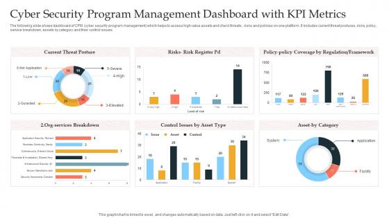
Cyber Security Program Management Dashboard With KPI Metrics




Try Before you Buy Download Free Sample Product
 Impress Your
 Audience
 100%
100% Editable
 Save Hours
 of Time


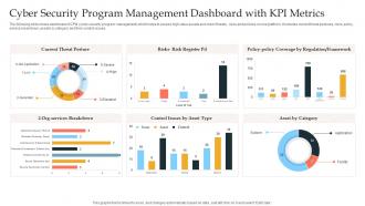
The following slide shows dashboard of CPM cyber security program management which helps to access high value assets and check threats , risks and policies on one platform. It includes current threat postures, risks, policy, service breakdown, assets by category and their control issues.
People who downloaded this PowerPoint presentation also viewed the following :
Cyber Security Program Management Dashboard With KPI Metrics with all 7 slides:
Use our Cyber Security Program Management Dashboard With KPI Metrics to effectively help you save your valuable time. They are readymade to fit into any presentation structure.





FAQs for Cyber Security Program Management Dashboard
Focus on the metrics that actually matter - threat detection rates, how fast you respond to incidents, and vulnerability counts sorted by severity. Patch management status is huge too. Honestly, don't sleep on user training completion rates because people mess up more than you'd think. Real-time threat feeds help catch the weird stuff early. Network traffic anomalies are clutch. Compliance status matters if you're in a regulated industry. The trick is finding that sweet spot where you've got enough data to catch problems but not so much that everything becomes white noise.
Color-coded threat maps are your best bet - red for critical stuff, yellow for medium, green for low priority. That way you can see what's actually urgent at a glance. Heat maps showing geographic attack patterns are super helpful too (though I'll admit, they're weirdly addictive to watch). Set up alerts based on how critical your assets are and threat impact scores. Your nastiest threats should automatically float to the top with real-time notifications. Oh, and throw in some trend lines - they're great for catching patterns before they become real problems. Dynamic charts that auto-update are clutch for staying current.
So user behavior analytics basically makes your security dashboard way smarter - it learns what's actually normal in your setup versus what's sketchy. Like if someone's suddenly logging in from halfway across the world at 2am, it flags that. Or when Bob from accounting is downloading terabytes of data for no reason. The cool part is it cuts through all the noise and false alarms by understanding context around how people actually work. You won't be chasing phantom threats anymore, just the stuff that's genuinely weird. Makes your life so much easier, honestly.
Honestly, visual indicators work great for this stuff - like red/yellow/green lights for each regulation. Heat maps are clutch too, they instantly show you where things are messy. Percentage bars help track progress on specific controls. Also throw in audit readiness scores and countdown timers for deadlines (certifications, remediation tasks, whatever). Oh and definitely highlight any failed compliance checks. The whole point is making it scannable so your leadership doesn't have to wade through endless spreadsheets to figure out if you're screwed or not.
For cybersecurity stuff, line charts and heat maps are your best bet. Line charts show attack volumes and threat patterns over time - makes it really easy to catch spikes. Heat maps work great for geographic attack data or network vulnerabilities (executives eat this up honestly). Bar charts are solid for comparing different threat types month to month. Oh, and skip pie charts completely - they suck for security data since you need to track changes over time, not just static breakdowns. Time-series visualization is where it's at for this kind of work.
Look, whatever your SLA targets are - that's what should be front and center on your dashboard. Got a 15-minute detection goal? Don't bury that metric on some random page where nobody'll see it. Containment and resolution times need to pop out immediately. I can't tell you how many gorgeous dashboards I've seen that are totally useless because they don't match how teams actually work. The most urgent stuff has to jump out first - arrange everything so your time-sensitive alerts are obvious. Also make sure your escalation triggers actually line up with real SLA deadlines, not some theoretical ones.
So SIEM platforms are your best bet here - Splunk, QRadar, Elastic Security. They're literally designed to pull data from everywhere: firewalls, endpoint detection, network monitoring, threat feeds, whatever you've got. Splunk's honestly amazing but super expensive unless you're a big company. Microsoft Sentinel works great if you're already using Azure stuff. Otherwise check out Grafana with security plugins - way more affordable. Oh, and make sure whatever you pick has solid API support and connectors for your current tools. That'll save you tons of headache later.
So basically, you wanna give each group what they actually need. Executives just want the big picture stuff - risk levels, compliance status, business impact. They don't care about individual firewall alerts, trust me. Your IT folks need the nitty-gritty though: threat feeds, incident queues, system health data they can dig into. Most platforms let you set up different role-based views or totally separate dashboards. Think of it like... curating different feeds for different people, I guess? Just ask each group what decisions they're trying to make with the data, then build around that. Way more effective than cramming everything into one view.
Honestly, the two big traps are cramming too much info on one screen and getting obsessed with metrics that look cool but don't actually help. Your team will just ignore a cluttered dashboard. Pick alerts and trends that matter for YOUR specific setup. Also - and this might sound weird - go easy on the red colors. Everything in cybersecurity already feels like the world's ending! Save red for actual emergencies so they pop. Your dashboard should scream "here's what needs fixing NOW" instead of just showing fancy charts. Test it with real users first though, trust me on that one.
So basically, cybersecurity dashboards let you see what's happening on your network right now - outdated software, weird traffic, failed logins, all that stuff. Think of it like having a security guard who actually pays attention (unlike Bob from my old office). The real trick is setting up alerts for when things go sideways, otherwise you're just looking at charts for no reason. I'd say pick your top 5 biggest risks first and get alerts on those. You'll catch problems before they turn into full disasters.
Watch out for weird network traffic spikes and tons of failed login attempts - that's usually the first sign. Unfamiliar IP addresses trying to get in are a dead giveaway too. Large file transfers happening at like 3am? Super sketchy. Your system should catch privilege escalation attempts and flag repeated security alerts from the same devices. Oh, and database queries that don't make sense are huge red flags - hackers love to poke around before they actually do damage. Honestly, most dashboards can spot this stuff automatically if you set the thresholds right. Just don't be lazy about checking alerts regularly.
Look at your old security logs and you'll start seeing patterns everywhere. Track attack frequency, vulnerability types, seasonal spikes - that stuff. ML algorithms can churn through years of data way faster than you could manually. Honestly, the patterns are kind of addictive once you get into it. Which attack vectors are growing? When do you get hammered the most? I'd set up automated alerts for when historical trends suggest something's about to spike. The seasonal thing is wild - like how phishing always jumps around holidays when people aren't paying attention. Start there and build out your dashboard.
Track completion rates and quiz scores obviously, but the behavioral stuff matters way more. Check if people actually report phishing emails after training - that's where you see real impact. Password compliance rates are huge too. Time-to-completion tells you if someone's just clicking through (nobody learns anything in 5 minutes, come on). I always look at security incidents before vs after training to see if it's actually working. Course feedback helps since miserable employees zone out completely. Honestly, quarterly dashboards make it easy to spot whether you're wasting money or not.
Look, when everything hits the fan, you'll want that dashboard ready to go. Everyone sees the same data instead of getting three different stories from three different people. Live metrics right there, affected systems clearly marked, response tracking - all visible at once. Honestly saved my butt so many times when the C-suite starts panicking and wants updates every ten seconds. Just screen-share and boom, they can see exactly where things stand. Oh, and definitely set up your views beforehand because nobody has time for that during an actual incident.
So for cybersecurity dashboards that don't suck - you want customizable widgets first. That way you can actually see what matters for your job instead of generic nonsense. Real-time alerts are crucial, but make sure they filter smart or you'll get buried. Dark mode is honestly a lifesaver when you're troubleshooting at weird hours. Role-based access keeps things organized. Mobile support saves you when stuff breaks at 2 AM (and it always does). Color-coded threat levels help you spot problems fast. One-click drill-downs are super helpful too - nobody has time to click through ten screens during an incident.
-
One word for SlideTeam–Versatile!
-
The quality of PowerPoint templates I found here is unique and unbeatable. Keep up the good work and continue providing us with the best slides!