


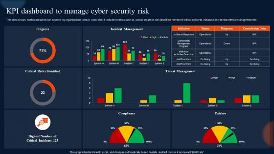
Kpi Dashboard To Manage Cyber Security Risk




Try Before you Buy Download Free Sample Product
 Impress Your
 Audience
 100%
100% Editable
 Save Hours
 of Time


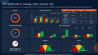
This slide shows dashboard which can be used by organizations to track cyber risk. It includes metrics such as overall progress, risk identified, number of critical incidents, initiatives, incident and threat management etc.
People who downloaded this PowerPoint presentation also viewed the following :
Kpi Dashboard To Manage Cyber Security Risk with all 7 slides:
Use our Kpi Dashboard To Manage Cyber Security Risk to effectively help you save your valuable time. They are readymade to fit into any presentation structure.
-
Kpi Dashboard To Manage Cyber Security Risk
-
Kpi Dashboard To Manage Cyber Security Risk
-

Kpi Dashboard To Manage Cyber Security Risk
-

Kpi Dashboard To Manage Cyber Security Risk
-

Kpi Dashboard To Manage Cyber Security Risk
-

Kpi Dashboard To Manage Cyber Security Risk
-

Kpi Dashboard To Manage Cyber Security Risk
FAQs for Kpi Dashboard To Manage
Focus on metrics that actually move the needle for your goals - don't get caught up tracking vanity numbers. Make it visually clean with charts and colors that aren't confusing. Real-time data is clutch, but honestly? Near real-time works fine too. You'll want context like targets or last year's numbers so people can tell if they're winning or losing. Here's the thing though - resist the urge to cram every possible metric on there. Stick to maybe 5-7 key ones max, otherwise it just becomes overwhelming noise. And make sure people can actually access it when they need to make decisions!
Okay so here's what I'd do - connect your KPIs straight to what you're actually trying to achieve. Revenue growth? Track conversion rates and average order value, not random stuff like page views. Honestly, most companies go overboard and track like 20 different things which just becomes overwhelming. Pick maybe 5-7 metrics that you'll actually use to make decisions. Simple test: if this number went up or down tomorrow, would you change something? No? Then drop it. Run with your chosen metrics for a month, see what's actually useful, then adjust from there.
Dude, just focus on your most important stuff up front - gauges and trend lines work great. I swear, some dashboards look like someone threw up a box of crayons on them. Max out at like 5-7 metrics per screen and use that green/yellow/red thing everyone gets. Your time periods need to match across everything or people get confused. Oh, and group similar stuff together! Always throw in some targets so folks know if they're crushing it or need to panic. Definitely test with real users first - they'll spot the weird stuff you totally missed.
Daily updates work best for most stuff honestly. Website traffic, sales numbers - that kind of thing benefits from daily refreshes without being annoying. Weekly's fine for slower metrics like customer satisfaction (nobody expects that to swing wildly overnight anyway). Real-time sounds cool but creates way too much noise unless you're watching something critical like servers going down. My take? Start daily and see how often your team actually checks the dashboard. If they're obsessing over it multiple times a day, then maybe bump up the frequency.
Honestly, dashboards work because nobody can hide from the numbers anymore. When performance is right there for everyone to see, people just start caring more about their results. You'll catch underperformers early instead of waiting for those awkward team meetings where everyone's like "so... how are things going?" The visual aspect is huge - wins get celebrated and weak spots become obvious. Teams basically start managing themselves once they can see their data in real time. I'd set yours to auto-update and do weekly team reviews. That's where the magic happens behaviorally speaking.
Tableau and Power BI are the big names but they'll cost you. Google Data Studio is free if you're already using Google stuff. Excel actually works better than people think for this - just doesn't look as slick. Klipfolio and Geckoboard are easier to use if you want something more straightforward. Here's what I'd do though - figure out where your KPI data is stored first. Pick whatever tool connects to that easily, then make it look pretty later. I've seen too many people fall in love with a dashboard tool only to realize it doesn't play nice with their data sources.
Dude, focus on what your actual users need, not what looks cool. Most important metrics need to be super obvious - like 3-second glance obvious. I can't tell you how many dashboards I've seen that are just... chaos. Rainbow charts everywhere. Consistent colors are your friend, and ditch anything that doesn't actually help. Your filters should make sense to normal humans. Oh, and definitely test it with real people first - you'll be shocked what confuses them. At the end of the day, a dashboard that people actually open every morning beats a pretty one gathering digital dust.
Look, real-time data is what makes KPI dashboards actually worth checking instead of becoming digital dust collectors. You can spot issues as they're happening rather than weeks later when damage is already done. Like if your conversion rate tanks 30% - wouldn't you rather know immediately? Not everything needs constant updates though (honestly that gets annoying fast). Critical stuff should refresh hourly at minimum. Figure out which metrics need instant attention when they shift. Oh and monthly reviews are still useful but they shouldn't be your first warning system.
Honestly, just think about what each person actually needs to see every day. Sales wants pipeline stuff and conversion rates. Marketing will bug you for every attribution metric under the sun - they're obsessed with that data. Executives? Keep it high-level with revenue trends and strategic numbers. Operations cares about efficiency and whether processes are running smooth. Ask people what decisions they're making regularly, then only show metrics that help with those choices. I'd start with maybe 3-5 key things per role and build from there. Way easier than dumping everything on everyone's screen.
Don't cram everything onto one screen - I learned this the hard way when our team spent weeks building what looked like mission control for NASA. People get overwhelmed and just stop using it. Vanity metrics are another trap. Sure, total page views sound impressive, but do they actually help you make decisions? Focus on 5-7 actionable KPIs tied to real goals. Skip the flashy animations - they're distracting anyway. Test with actual users first. You'll be surprised how differently they navigate compared to what you expect.
APIs and data connectors make integrating KPI dashboards with your existing BI tools pretty straightforward these days. Tableau, Power BI, Looker - they all play nice together now. Way better than the nightmare it was like 5 years ago, honestly. Start by mapping your current data flow first though. Figure out which metrics you actually want centralized vs what should just stay put. Don't create duplicate workflows just because you can - that's where things get messy fast. Pick integration points that genuinely add value instead of more headaches.
Honestly, KPI dashboards are game-changers for decision making. Instead of going off hunches or stale reports, you get real-time data right at your fingertips. Spotting trends becomes way easier, and you can catch problems before they blow up. Everyone sees the same numbers too, which stops those annoying debates about who's right. Fair warning though – they're weirdly addictive once you start using them daily. You'll be checking metrics constantly (my boss does this religiously). My advice? Pick 3-5 KPIs that actually move the needle for your goals and start there.
Honestly, KPI dashboards are game-changers for planning stuff. You get real-time data on how you're actually doing vs your goals - no more guessing or relying on last month's numbers. Trends become obvious. You'll see what's bombing and what's crushing it, then adjust fast. Think of it as your business health tracker that doesn't sugarcoat anything. Revenue, customer happiness, whatever matters most - it's all right there. Oh, and don't go crazy at first. Pick like 5-7 metrics that really matter and build from there. Way less overwhelming.
Target's retail dashboards are actually pretty solid - they track conversion rates, average order value, and inventory turnover to optimize store performance. Healthcare orgs focus on patient satisfaction, readmission rates, and bed occupancy. Manufacturing? They're all about OEE (overall equipment effectiveness), defect rates, production throughput. SaaS companies literally live or die by their MRR, churn rate, and customer acquisition cost dashboards. Financial services monitor loan approval rates and customer lifetime value. Here's the thing though - pick maybe 5-7 KPIs max that actually matter to your business goals. Don't just throw everything on one screen because you can.
Honestly, just check if people are actually logging in and using the thing. Usage stats don't lie. Then see if your KPIs are trending up - that's the whole point, right? I'd also survey users every few months about whether it's helping them make faster decisions. The real winner though? Walk into any meeting and listen for whether teams are citing dashboard data when they talk. If nobody's referencing it, you've got a fancy paperweight. Start simple - maybe just do monthly check-ins to see how data-driven your decisions are becoming.
-
The designs are super attractive. Me and my team love using SlideTeam’s presentations.
-
Innovative and creative templates with high-quality designs. Helped me with my presentation as the slides were easy to edit.