

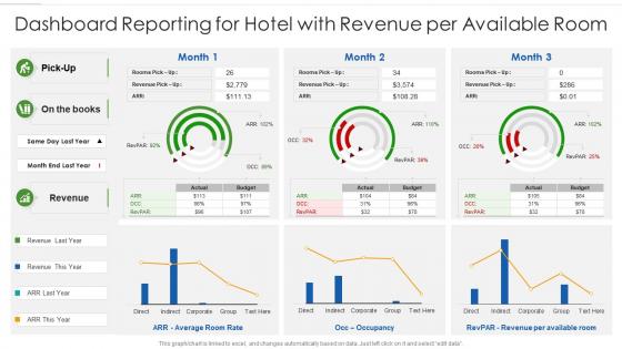
Dashboard reporting for hotel with revenue per available room




Try Before you Buy Download Free Sample Product
 Impress Your
 Audience
 100%
100% Editable
 Save Hours
 of Time


Our Dashboard Reporting For Hotel With Revenue Per Available Room are topically designed to provide an attractive backdrop to any subject. Use them to look like a presentation pro.
People who downloaded this PowerPoint presentation also viewed the following :
Dashboard reporting for hotel with revenue per available room with all 7 slides:
Use our Dashboard Reporting For Hotel With Revenue Per Available Room to effectively help you save your valuable time. They are readymade to fit into any presentation structure.





FAQs for Dashboard reporting for hotel with revenue
Honestly, less is more with dashboards - just show the stuff people actually need to decide things. Don't try cramming everything in there like I always used to do. Put your most important charts at the top left since that's where people look first. White space isn't wasted space, trust me on this one. Simple charts beat fancy ones every time because nobody wants to decode some wild visualization when they're in a hurry. Oh, and definitely test it with real users first - what makes perfect sense to you will probably confuse the hell out of them.
Honestly, data viz is a game changer. Your brain just processes visuals way faster than endless spreadsheet rows. Bar charts and heat maps instantly show you what's working and what's tanking - no more squinting at numbers trying to spot patterns. It's kinda like the difference between reading sheet music vs actually hearing a song, you know? Visual stuff helps you catch problems early and ask smarter questions. I'd start simple with basic charts. You'll be shocked how quickly trends pop out at you once everything's visual.
Start with the money stuff - current sales vs your targets, what's in the pipeline, conversion rates at each stage. Win/loss ratios matter too. Average deal size and how long sales cycles are taking will show you trends before they bite you. Activity metrics like calls and demos are fine, but only if they actually connect to revenue. I swear, half the dashboards I see are just filled with stuff that looks impressive but doesn't help anyone make real decisions. Keep it simple at first - you can always add more once you figure out what your team actually pays attention to.
Honestly, just figure out what each person actually needs to see first. Your executives? They want the big picture stuff - KPIs and trends. But your ops managers are looking at daily metrics they can actually do something about. Sales teams obsess over pipeline data while finance lives in budget comparisons. Totally different worlds. Set up role-based views so people only see what matters to them - nobody wants to dig through irrelevant data. I'd start by literally asking each team what decisions they're making every day, then build around that. Way easier than guessing what they want.
Honestly, interactivity makes or breaks a good dashboard. Users want to actually explore the data - filtering dates, drilling into metrics, hovering for more details. It's like having a real conversation with your numbers instead of just staring at some lifeless chart. Don't go overboard though (I've seen dashboards with like 20 different buttons and it's chaos). Give people control over what they see, but keep it focused. Start with maybe 2-3 interactive features that match what your users actually care about. Way more effective than trying to do everything at once.
So you'll want to hook up streaming connections - APIs, webhooks, or something like Kafka to pull data straight into your dashboard. Most BI tools (Tableau, Power BI, Grafana) already have connectors for this, which honestly saves you a ton of headache vs building it yourself. Configure your data sources to push updates automatically instead of waiting for those scheduled refreshes. Oh, and don't forget about caching or you'll totally overwhelm your system with constant queries. Start by figuring out what actually needs real-time updates - some stuff can just refresh hourly and be fine.
Honestly, the biggest mistake is cramming way too much stuff on one screen - it just becomes visual chaos. Don't fall for vanity metrics that look cool but tell you nothing useful. I see people using terrible chart types all the time (seriously, stop putting time data in pie charts). Focus on maybe 3-5 metrics that your team actually cares about. Without context like benchmarks or timeframes, your numbers are basically meaningless. Oh, and always ask yourself "so what?" before adding anything. Your audience needs to make decisions, not admire your data visualization skills.
Think of your dashboard like telling a story to someone who walked in halfway through a movie. Start with the big picture, then walk them through "here's what happened," "why you should care," and "what's coming next." Drop in some annotations to call out the interesting stuff - raw numbers alone are pretty boring. Each section should build on the last one, kinda like chapters. When there's a weird spike or trend, give people context so they're not scratching their heads. I always structure mine around one main question or problem. Makes the whole thing way more focused.
Honestly, I'd go with Tableau or Power BI - they're popular for a reason. Tableau's got insane visualization options, and Power BI works great if you're already using Microsoft stuff. Google Data Studio is free and pretty decent too, though it gets annoying when you want to do anything fancy. Oh, and I learned this the hard way - figure out what data you're working with first. Then think about who's actually gonna use this thing. Some people just want simple charts, others want to drill down into everything. Pick whatever makes connecting your data sources less of a headache.
Focus on single-column layouts that stack everything vertically - way easier to scroll through. Make your buttons bigger since fingers aren't precise like mouse clicks. Honestly, mobile users have zero patience for cluttered dashboards, so pick your top 3-5 metrics and that's it. Bump up font sizes because squinting sucks. High contrast colors are your friend here. Don't just resize your browser to test this stuff - actually grab a phone and see how it feels. Side-by-side charts look terrible on small screens anyway. Start simple and you can always add more later if needed.
Honestly, start with data validation right at the source - catch those inconsistencies before they mess up your dashboard. Document where everything comes from too, because trust me, executives will ask the weirdest questions about your numbers. Set up alerts for when data loads fail and get regular refresh schedules going. Your stakeholders are actually your best friends here - they'll spot weird trends way faster than any automated check. Monthly reviews help make sure your dashboard logic hasn't gone completely off the rails from what's actually happening in the business.
Honestly, just track if people actually use the thing. Check who's logging in and what reports they're clicking on most. If your stakeholders stop bugging you with random data requests, that's usually a good sign the dashboard is doing its job. The real win? Faster decisions and better outcomes. I'd set up basic view tracking - nothing fancy - and do monthly user feedback sessions. Oh, and don't overthink it at first. Sometimes the most obvious metrics tell you everything you need to know about whether it's working.
So basically, operational dashboards are for daily stuff - tracking sales, website hits, system alerts that your team needs to jump on right away. Strategic ones? Those are the executive-level monthly/quarterly trend reports showing progress on big goals. It's like your speedometer vs your yearly budget planning (if that makes sense). Honestly though, everyone tries cramming both into one dashboard and it becomes a total disaster. Pick what you actually need first, then build around that. You'll save yourself so much headache.
Honestly, just watch people use your dashboards - that's where you'll learn the most. Surveys and interviews are good too, but nothing beats seeing someone struggle with your layout in real time. Ask what they're actually trying to do and where things get confusing. Pattern-wise, look for the same complaints popping up - cluttered screens, missing data, workflows that make zero sense. Fix the stuff that bugs the most users first. My advice? Start tiny. Like, one or two small changes, test those out, then move on. Don't go redesigning everything at once - that's just asking for trouble.
So a few big things are happening right now. AI-powered insights are getting really good - your dashboards will literally suggest what to check next and catch weird patterns before you do. Conversational analytics is pretty cool too, where you just ask questions in normal English instead of hunting through menus. Everyone's obsessed with mobile-first design now since we're all glued to our phones anyway. Oh, and embedded analytics are blowing up - basically putting dashboards right inside the tools you already use. Honestly though? Just pick whichever one would fix your biggest headache first.
-
Helpful product design for delivering presentation.
-
Very unique, user-friendly presentation interface.