


Dashboard to measure performance of automation implementation ppt backgrounds




Try Before you Buy Download Free Sample Product
 Impress Your
 Audience
 100%
100% Editable
 Save Hours
 of Time


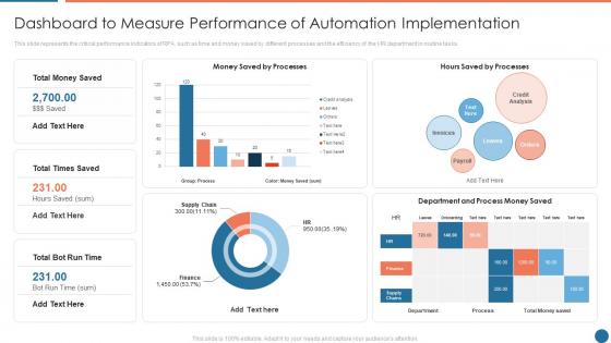
This slide represents the critical performance indicators of RPA, such as time and money saved by different processes and the efficiency of the HR department in routine tasks.
People who downloaded this PowerPoint presentation also viewed the following :
Dashboard to measure performance of automation implementation ppt backgrounds with all 7 slides:
Use our Dashboard To Measure Performance Of Automation Implementation Ppt Backgrounds to effectively help you save your valuable time. They are readymade to fit into any presentation structure.






FAQs for Dashboard to measure performance of automation
Pick the stuff that actually matters to your bottom line - revenue, how much you're spending to get customers, conversion rates. Don't go crazy with metrics though. I learned this the hard way when I had like 15 different charts and couldn't make sense of any of it. Stick to maybe 5-7 max that'll actually help you make decisions. Mix it up with some forward-looking stuff (pipeline health) and backward-looking numbers (monthly revenue). Oh, and only track things you can actually do something about - otherwise you're just making pretty charts that sit there.
Honestly, good visuals are what make the difference between a dashboard people actually check vs. one that gets ignored. Nobody wants to stare at spreadsheet rows when they could see a clean line chart instead. You'll spot trends and weird outliers so much faster with the right charts. Line graphs work great for tracking stuff over time, gauges are perfect for single metrics, heat maps help when you're comparing different categories. I'd start with your top 3-5 most important metrics and just play around with different chart types until something feels right. Trust me, executives eat this visual stuff up - makes everything look way more professional too.
So for dashboards, I'd probably start with Google Data Studio since it's free and does way more than you'd expect. Tableau and Power BI are amazing but honestly might be too much unless you're doing something really complex. Power BI's great if you're already using Microsoft stuff - plays nice with Excel and all that. I mean, you could even just use Excel itself, though it gets pretty messy once you have more data. Oh, and my old manager swore by some random tool called Grafana but that might be overkill. Just figure out what numbers you actually care about first, then don't overthink the tool choice.
Dude, real-time data is a game changer for dashboards. Your team will actually trust the numbers instead of playing that annoying guessing game about whether stuff is current. Fresh data means you can catch problems early and spot trends right as they're happening. Plus people won't avoid using it - which honestly happens way too often with crappy dashboards that show old info. You can make quick decisions without second-guessing everything. Just make sure your setup can handle constant updates without making the whole thing run like molasses.
Honestly, UX makes or breaks performance dashboards. Can't tell you how many I've seen that look impressive but are total garbage because nobody can actually use them. Figure out what each user role actually needs first - don't just dump everything on there. Put the critical KPIs front and center where people will see them right away. Clean visuals are everything. If users can't quickly understand the data and take action, you've basically made an expensive screensaver. Best approach? Shadow some users first to see how they really work, then design around that. Way better than guessing what they want.
Dashboards are honestly game-changers for seeing what's actually working vs what you *think* is working. I used to make way too many gut decisions before we got ours dialed in properly. Now you can catch trends early and pivot before small issues turn into disasters. The trick is focusing on metrics that actually matter to your business goals - not just stuff that looks impressive. Maybe 3-5 key ones max? I'd rather track fewer things well than have a cluttered mess. Oh and make sure they connect to real strategy, not vanity numbers that just stroke your ego.
Don't cram everything onto one screen - learned that the hard way lol. Pick like 5-7 metrics that actually matter for your goals. Skip the vanity stuff that looks cool but won't help you decide anything. Here's the thing: most people forget to define what success looks like before they even start building. Bad move. Make sure your data updates often enough to be useful, and definitely test it with real users first. Oh, and always start with "what decision am I trying to make here?" Works way better than just throwing charts together.
So it really depends on what industry you're in, right? Retail folks obsess over conversion rates and inventory turnover - makes sense. Healthcare is totally different though - they're tracking patient outcomes and readmission rates because of all the compliance stuff. Manufacturing companies focus on equipment efficiency and defect rates, which honestly seems way more straightforward to me. Financial services need real-time risk monitoring built in. The trick is figuring out what actually moves the needle for your specific business. Don't just grab some generic template - it won't match what you really need to watch.
Your team's gonna be pulling up those dashboards on their phones constantly - trust me on this one. During client meetings, commuting, whenever they need quick answers. If your design sucks on mobile, you'll get tiny charts nobody can read and text that's basically useless. People will just give up and stop checking the data altogether, which defeats the whole point. Make sure it actually works on different screen sizes. Oh, and put your most important metrics front and center for smaller screens - don't bury the good stuff.
I'd say weekly is your sweet spot - daily if you've got crazy fast metrics like sales numbers. Really depends on how often your data actually changes and when your team checks it. No point updating hourly if everyone only looks once a week, you know? Most people I know do weekly updates because it keeps things fresh without driving you nuts with constant maintenance. Daily works too for high-traffic stuff. Just pick whatever and stick with it - nothing kills a dashboard faster than letting it go stale. Set a calendar reminder or you'll totally forget.
So operational dashboards are all about right now - daily metrics, real-time stuff that needs your attention ASAP. Strategic ones? Totally different vibe. They're more big picture, like quarterly trends and long-term goals your executives actually care about. I honestly mixed these up for way too long lol. Use operational when you're putting out fires and need quick decisions. Strategic is better for planning months ahead and seeing if you're actually hitting those bigger company targets. Much easier once you think of it as "today vs. the future."
User feedback is everything! It shows you the difference between what your dashboard displays and what people actually need for decisions. Different roles care about totally different metrics, and you'll find out where your UI is confusing or what's completely missing. I've watched teams build gorgeous charts that literally no one touched because they answered the wrong questions. Monthly check-ins with key users help you spot usability problems and prioritize what to fix next. The goal isn't making something that looks cool—it's building something people will actually use to take action.
Honestly, just pick the stuff that actually moves the needle - revenue growth, profit margins, customer acquisition costs, that kind of thing. Executives get bored fast if you dump operational details on them (save those for your own team). Mix it up with some forward-looking metrics like pipeline health alongside the backward-looking ones. I'd cap it at maybe 5-7 metrics tops. Any more and you'll lose them before they finish their coffee. Each one needs clear targets and gets updated often enough to matter. The whole point is driving real decisions, not just pretty charts.
Start with clean data and automate your validation rules - catch the garbage before it hits your dashboard. Skip manual uploads whenever you can and connect straight to source systems. Because honestly, Karen from accounting will 100% forget to update that Excel file at some point. Set up regular quality checks and make sure someone actually owns the data accuracy piece. Alerts for weird spikes help too. Way easier to build validation upfront than chase down bad numbers later when your boss is asking questions.
Honestly, skip the boring feature demos - they don't help anyone. Get your team actually using the dashboard with real scenarios they'll hit every day. Role-play stuff like catching performance drops or spotting trends. I'd focus on the metrics each person actually needs first, then build from there. Quick reference guides are clutch too. After they've been using it for a few weeks, circle back to see what's confusing them. You'll be surprised how much they figure out on their own once they start clicking around.
-
Informative design.
-
Design layout is very impressive.