


Education Dashboard With Application Acceptance KPI




Try Before you Buy Download Free Sample Product
 Impress Your
 Audience
 100%
100% Editable
 Save Hours
 of Time


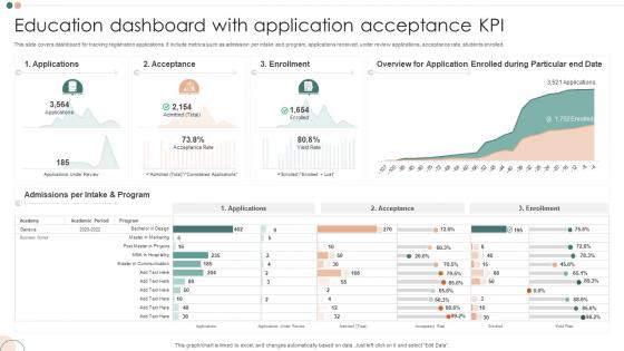
This slide covers dashboard for tracking registration applications. It include metrics such as admission per intake and program, applications received, under review applications, acceptance rate, students enrolled.
People who downloaded this PowerPoint presentation also viewed the following :
Education Dashboard With Application Acceptance KPI with all 7 slides:
Use our Education Dashboard With Application Acceptance KPI to effectively help you save your valuable time. They are readymade to fit into any presentation structure.
-
Education Dashboard With Application Acceptance KPI
-

Education Dashboard With Application Acceptance KPI
-

Education Dashboard With Application Acceptance KPI
-

Education Dashboard With Application Acceptance KPI
-

Education Dashboard With Application Acceptance KPI
-

Education Dashboard With Application Acceptance KPI
-

Education Dashboard With Application Acceptance KPI
FAQs for Education Dashboard With
Focus on the stuff that actually matters - attendance, how many kids finish assignments, grade trends, and test scores by subject. Participation rates are huge too, plus time spent on learning platforms. Those give you heads up before grades tank. Oh, and don't sleep on behavioral data like disciplinary stuff or who's using support services. Honestly, balancing academic performance with what's driving it underneath is where the magic happens. Start with these basics, then you can always add more specific metrics based on what your teachers actually need to make decisions.
Dude, visualizing your data is a total game changer. Heat maps show you instantly which kids are struggling - way better than scrolling through endless spreadsheets. Trend lines track progress over time, and color-coded charts let you compare different subjects or groups. It's honestly like the difference between reading a recipe vs watching someone actually cook. Way clearer! Just pick the right chart for what you're trying to show. I always start by figuring out what story I want to tell first, then find visuals that make those patterns pop. Makes everything so much easier to spot.
Honestly, I'd go with Tableau or Power BI if you need serious analytics power. Google Data Studio is solid too and it's free, which is nice. My team's been using Plotly Dash lately since we're all Python people - it's actually really good once you get the hang of it. For basic real-time stuff, Grafana does the job. Really though, it comes down to what data you're working with and how technical your team is. Tableau's drag-and-drop thing is pretty intuitive. Power BI plays well with Microsoft everything, obviously. I'd honestly just grab free trials of like 2-3 options and build the same basic dashboard in each. You'll know pretty quick which one feels right.
Set up alerts in your dashboard for the obvious stuff - declining grades, missed assignments, attendance drops, engagement scores tanking. Once a student hits multiple red flags, the system flags them automatically. Way better than just winging it, you know? I actually love this part - you can spot downward trends before kids completely disappear. Track patterns over time too. Set your own thresholds based on what actually matters for your students. Then create those intervention workflows so you're reaching out fast when alerts pop up. Takes all the guesswork out of it.
Honestly, real-time data is a total game-changer for education dashboards. You can catch struggling students right when they're having trouble with an assignment, not three weeks later when the damage is done. During live sessions, you'll see engagement drop and actually do something about it in the moment. Monthly reports are basically useless at this point - who has time for that? The whole point is making those quick adjustments that actually help kids succeed. Oh, and figure out what needs updating hourly vs daily first. That'll save you from drowning in unnecessary data feeds.
So basically these education dashboards put all the student info in one spot where everyone can see what's happening. Parents get instant updates on grades, attendance, missing assignments - no more waiting around for conferences or trying to track down teachers. Teachers can message parents directly through the system, and kids can actually see how they're doing (which honestly sometimes motivates them more than nagging). The transparency is pretty amazing. But here's the thing - it only works if people actually use it regularly. Otherwise you're back to the same old communication mess. I'd definitely set up those automatic notifications to keep everyone engaged.
Start with clean visuals and easy navigation - teachers need to spot student progress fast without drowning in data. Color code everything consistently, keep charts simple, group stuff by subject or timeline. I swear, half the dashboards I've used are total disasters trying to show everything at once. Put your most important metrics up top, then let people dig deeper if they want details. Oh, and definitely add filters so they can focus on one kid or specific dates. Test it with real teachers first though - they'll catch things you'd never think of!
Start with role-based access - only give people permissions they actually need. Encrypt everything, both stored data and when it's moving around. Your dashboard provider better be FERPA compliant too. Regular audits are a must (seriously, schools always skip this and kick themselves later). Try to anonymize data for broader reports when you can. It's honestly all about finding that sweet spot between getting useful insights and protecting student privacy. Oh, and check your current access permissions first - you might be surprised what you find in those audit logs.
Honestly, these dashboards are game-changers - they show you what's actually happening vs what you think is happening with your students. I was shocked at how wrong some of my assumptions were when we started tracking data. You'll spot knowledge gaps way faster and see which concepts trip kids up most. Mid-semester adjustments become possible instead of waiting for those end-of-term evaluations (which, let's be real, often come too late anyway). My advice? Start small with maybe 2-3 learning outcomes you really care about, then build from there. The real-time feedback is addictive once you get used to it.
Honestly, start by asking your users what they actually look at daily - saves you tons of guesswork. Teachers want gradebook stuff and assignment tracking. Admins need the big picture metrics like enrollment and school-wide performance. Students just want their own grades and deadlines (obviously not everyone else's business!). Set up role-based permissions so people only see what's relevant. Mix visual charts for your visual learners with data tables for the detail people. Oh, and throw in some quick summary cards too. The modular widget approach works really well - you can rearrange things based on what each group uses most.
So for K-12, attendance tracking and parent communication are your bread and butter - those helicopter parents need constant updates, trust me. Grade progression stuff too since compliance is non-negotiable. Higher ed's totally different though. Focus on retention analytics, course completion rates, financial aid tracking. Students there just want to graduate without going broke or flunking out. The behavioral tracking in K-12 gets pretty intense sometimes. College students? They want self-service tools and academic planning features instead. First figure out who's actually using this thing - administrators or the students themselves? That'll shape everything else.
Dude, these education dashboards are game-changers - they dump all your school's important data into one spot so you're not flying blind anymore. Student grades, who's skipping class, budget stuff, all that. What I love is catching issues before they blow up. Like if 3rd grade reading scores tank or Mrs. Johnson's class is struggling (probably needs help but won't ask). Real-time data beats waiting months for reports. Oh, and start with whatever's driving you crazy first - then find dashboard metrics that actually fix those headaches. Way better than the old guessing game we used to play.
Ugh, the worst thing you can do is throw every single metric onto one screen. Talk about information overload! Also make sure your data isn't ancient or confusing without explanation. Here's what I learned the hard way - actually talk to the teachers first before you build anything. Can't tell you how many fancy dashboards I've seen that just sit there collecting digital dust because nobody asked what people actually needed. Pick maybe 4 key things that help with real daily decisions. You can always add more later once people start using it.
Honestly, I'd start with those little rating widgets right in the dashboard - catch people when they're actually using it. Send surveys to your active users too, but don't overdo it. User interviews are gold, especially with teachers who live in the thing daily. Here's what I've learned though - sometimes your analytics tell you way more than any survey will. Like, if everyone's dropping off at the same spot, that's your answer right there. Oh, and those in-app feedback buttons? Super clutch for catching real-time frustrations. Just don't make it feel like more work for them. Pick one method first, see what actually gets responses.
Training is everything here - seriously, you can't just drop a fancy dashboard on teachers and expect magic. Most educators need help reading the data visualizations and figuring out which numbers actually matter for their kids. I've watched districts waste money on dashboards that collect dust because nobody knows how to use them properly. Your best bet? Find the tech-savvy teachers first and let them train everyone else. Cover both the technical stuff and how to actually apply it in class. Without proper onboarding, you're just giving people an expensive paperweight that'll frustrate them.
-
I discovered some really original and instructive business slides here. I found that they suited me well.
-
Nothing beats the well-formatted and professionally designed templates offered. Kudos to SlideTeam for their amazing collection of PPT slides.