


Education Dashboard With Enrollment And Retention KPI





Try Before you Buy Download Free Sample Product
 Impress Your
 Audience
 100%
100% Editable
 Save Hours
 of Time


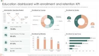
This slide displays student enrollment and attendance KPI tracking dashboard. It also include metrics such as student attendance percentage, course completion rate, freshman retention, teacher-to-student ratio, enrollment by gender, ethnicity, courses, age group, etc.
People who downloaded this PowerPoint presentation also viewed the following :
Education Dashboard With Enrollment And Retention KPI with all 7 slides:
Use our Education Dashboard With Enrollment And Retention KPI to effectively help you save your valuable time. They are readymade to fit into any presentation structure.





FAQs for Education Dashboard With Enrollment
Honestly, start by figuring out what your teachers actually do every day - then build around that instead of throwing in random features. You'll want clean visuals and real-time tracking, obviously. But the navigation has to be dead simple because nobody wants to hunt around for basic stuff like grades. Mobile-friendly is huge since everyone checks everything on their phone now. Set up automated alerts for struggling kids, make reports easy to generate, and let different user types customize their view. Oh, and keep the most important data right upfront - teachers don't have patience for buried info.
Dude, spreadsheets full of grades are the worst to look at. But throw that data into some charts? Total game changer. You can spot which kids are bombing multiple classes instantly with color-coded heat maps, or catch attendance patterns with basic line graphs. Way better than staring at endless rows of numbers for hours. Those interactive dashboards are pretty sweet too - click around from your whole class down to individual students. I'd say start simple with bar charts and trend lines for whatever matters most. The patterns just jump out at you.
Think of real-time data as your teaching GPS - shows you exactly where kids are struggling *right now*. No more waiting weeks for test results! You'll spot engagement drops and comprehension gaps as they're happening through your dashboard. Honestly, this beats the old "wing it and hope" approach we used to rely on. Mid-lesson pivots become possible when you see patterns emerging. Check your dashboard daily (I know, another thing to do) but even tiny data points reveal what's actually clicking with students. Game-changer for sure.
Three big things to tackle: encryption, access controls, and FERPA stuff. Your data needs to be encrypted when it's moving around AND when it's just sitting there. Set up role-based permissions - teachers see their kids, admins see their scope, etc. The permission settings can get ridiculously detailed but that's honestly perfect for keeping things locked down. Double-check your vendor is FERPA compliant too. I'd start by figuring out exactly what student data you're collecting first, then build your security around that. Way easier than doing it backwards.
Track login frequency, time on modules, and forum participation for engagement stuff. Progress-wise, focus on completion rates, test scores, and how they're moving through learning paths. Honestly, the best part is combining these - you'll spot kids who are super active but still bombing certain topics. Most platforms can ping you when someone's engagement tanks, which is pretty helpful. Oh, and don't go crazy with metrics at first. Pick like 3-4 main ones until your team figures out what the data actually means, then add more later.
Honestly, start by figuring out what each group's teachers actually check every day - that's your foundation. For ELL students, I'd spotlight language proficiency stuff and vocab growth. Kids with IEPs? Focus on accommodation tracking and goal progress (this is a lifesaver during IEP meetings, trust me). Advanced learners need different widgets showing enrichment work and higher-level skills. Use those filtering options to hide irrelevant clutter - nobody wants to scroll through data that doesn't apply to them. Oh, and don't overthink it at first. Build basic versions, then tweak based on feedback.
Honestly, skip the boring PowerPoint and just let people mess around with the actual dashboard - they'll learn way faster that way. Focus on the stuff they'll actually use every day instead of overwhelming them with every random feature. Make some quick reference sheets they can keep at their desk (trust me, they'll need them). Pick a few tech-savvy people in each department to be your go-to troubleshooters. Oh, and definitely do a follow-up session in a couple weeks because half of them will forget everything otherwise. People retain so much more when they can actually click through it themselves.
So basically, pick one metric from your dashboard that bugs you - like low engagement or whatever. Watch it for patterns, then tweak something small in your curriculum. I usually get weirdly obsessed with checking the results after a few weeks lol. If the numbers improve, cool - do more of that. If not, try something else. The whole thing becomes this cycle: spot trend → make change → check if it worked → repeat. Don't overthink it though. Start simple with just tracking one thing you actually care about, then build up from there once you've got the hang of it.
So basically you'll want to watch for the usual red flags - grades dropping, kids skipping class, missing assignments piling up. The dashboard flags anyone who misses like 3+ classes in a week or their GPA tanks. Honestly, seeing it all laid out visually hits different than just hearing about it. You can spot patterns too, like which subjects trip kids up most. I'd set up alerts for whatever matters at your school so you're not constantly checking but still catch problems early. Way better than waiting until report cards come out, you know?
You need to connect with whatever systems schools are already using - PowerSchool, Infinite Campus, those big student info platforms. SSO is a must because teachers hate managing tons of passwords (and honestly who can blame them?). Google Classroom, Canvas, gradebooks, attendance stuff - all that needs to sync up. The trick is letting data flow without making schools toss their current setup. I'd start by asking each school what three systems they literally cannot function without. That becomes your roadmap right there. Don't try to reinvent everything at once.
Points and badges work really well - kids love seeing those progress bars fill up as they move through stuff. Leaderboards are solid too, just don't make struggling kids feel worse about themselves. Daily login streaks keep them coming back, and unlocking achievements for specific skills hits different than regular grades. Honestly, the arbitrary point systems get old fast though. Make sure whatever rewards you pick actually connect to what they're trying to learn. Oh, and visual stuff matters way more than you'd think - those little dopamine hits from seeing progress really do work.
Mobile accessibility is absolutely crucial for education dashboards. Students and teachers are constantly on their phones, so if your dashboard doesn't work well on mobile, people just won't use it. I've seen this happen so many times - great desktop interface, terrible mobile experience, and engagement tanks. The mobile version can't just be a shrunken desktop version either. It needs to actually function properly on smaller screens. Test everything on phones and tablets before launching. People expect to check grades and assignments on the go now, and honestly? A bad mobile experience will turn users off faster than almost anything else.
Honestly, parents just want to see what's actually happening with their kid's schoolwork. Give them a dashboard that shows grades, attendance, missing assignments - all the important stuff in one place. Charts work way better than those confusing report cards, trust me. Add messaging so they can bug teachers directly (kidding, but not really). Automatic alerts for late work are clutch. Oh, and throw in some tips for helping with homework at home. The whole thing needs to be dead simple though - if my mom can't figure it out in 30 seconds, it's too complicated.
Honestly, just focus on the big three: completion rates, assessment scores, and time-to-competency. Those will actually tell you if your program works. Also track engagement stuff like login frequency - I mean, if people aren't even showing up, you're screwed regardless of everything else. Post-program outcomes matter too: job placements, skill application, whatever success means for your situation. Skip the vanity metrics that look pretty but don't mean anything. Keep your dashboard simple - maybe 5-7 key things that connect to your actual goals. Make sure you can dig deeper when numbers look weird.
Put your most critical stuff at the top - student performance and attendance that you check daily. Group similar data together and make urgent items pop with bigger fonts or bold colors. I used to jam everything on one screen too and wow, what a disaster that was! Stick to 5-7 key points max, then create separate views for the detailed stuff. Less important info goes behind tabs or secondary screens. Oh, and organize by how often you actually use it - daily checks up top, weekly stuff in the middle, monthly reports at the bottom. Works way better than random placement.
-
Crisp and neat slides. Makes it fun and easier to curate presentations.
-
The information is visually stunning and easy to understand, making it perfect for any business person. So I would highly recommend you purchase this PPT design now!