


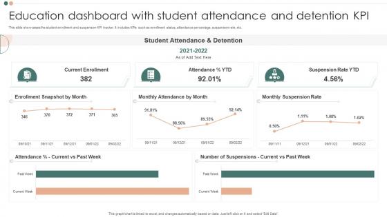
Education Dashboard With Student Attendance And Detention KPI




Try Before you Buy Download Free Sample Product
 Impress Your
 Audience
 100%
100% Editable
 Save Hours
 of Time


This slide showcases the student enrollment and suspension KPI tracker. It includes KPIs such as enrollment status, attendance percentage, suspension rate, etc.
People who downloaded this PowerPoint presentation also viewed the following :
Education Dashboard With Student Attendance And Detention KPI with all 7 slides:
Use our Education Dashboard With Student Attendance And Detention KPI to effectively help you save your valuable time. They are readymade to fit into any presentation structure.





FAQs for Education Dashboard With Student Attendance
Look at attendance first - that's your biggest red flag. Assignment completion rates tell you a ton too. Grade trends over time are obvious but super useful. Don't sleep on the behavioral stuff though, like tardiness patterns or how much time kids actually spend on learning platforms. Participation rates during class discussions? Gold mine. I'd also track if any intervention programs you're running actually work (spoiler: half of them don't). Test scores matter but they're kinda late-stage indicators. You want the early warning signs so you can jump in before a kid completely tanks.
Look, spreadsheets full of test scores are basically useless until you turn them into actual charts. Bar graphs show you which subjects kids bomb at. Line charts track trends over time. Heat maps? Perfect for spotting performance patterns across different groups. I swear, trying to read raw data is like... well, it's torture honestly. You'll catch at-risk students way earlier when you can actually see the patterns instead of staring at endless rows of numbers. Just figure out what story you're trying to tell first, then pick whatever visual makes it super obvious.
Dude, this stuff is actually pretty cool - you can catch problems right when they're happening instead of finding out weeks later. Like if kids are bombing today's math lesson, you'll know immediately and can switch things up. I check my dashboard every morning now (honestly became a bit of a habit). The live engagement numbers show me who's zoning out, plus I can spot weird attendance patterns that might mean something bigger's going on at home. Way better than waiting for those useless quarterly reports. Just make little adjustments based on what you're seeing and it really adds up over time.
So basically these dashboards show you exactly where kids are struggling across different subjects and grade levels. Like if math scores tank every March, boom - your fractions unit sucks and needs fixing. Way more useful than just guessing or waiting months for those standardized test results to come back. The visual stuff makes it super obvious which topics aren't clicking and what teaching approaches actually work. I'd start with whatever subject area looks the worst and then drill down into individual student data from there. Honestly beats flying blind and hoping for the best.
Keep it stupid simple - non-tech users panic when there's clutter everywhere. Clear labels, no jargon, break stuff into chunks with breathing room. Color-coding is your friend for quick glances. I swear, most dashboards look like NASA control rooms when teachers just want "are my kids struggling?" Put the big stuff up front. Hide nerdy features behind clicks. Always add tooltips explaining what the hell those numbers mean (trust me on this one). Test with real teachers constantly - they'll catch things you'd never think of.
Progress bars and point systems are game-changers for dashboards. Students love earning XP for modules and unlocking achievements - it's basically turning homework into a video game. Visual progress rings that fill up are super satisfying too. Leaderboards get students motivated, though honestly they can create some intense competition lol. Daily login streaks work well, plus those little level-up animations when they nail a concept. Just make sure the rewards actually connect to real learning, not random tasks. I'd start with maybe two features and see what your students actually use.
Honestly, start with mapping out your data flows first - like actually draw it out or you'll miss stuff. Three big things to nail: only grab data you truly need (I see people collecting everything "just in case" and it always bites them), set up proper role-based access so teachers can't peek at other classes, and be super clear about getting parent consent. Also throw in some anonymization for reporting. The consent part is honestly the trickiest since parents get weird about school data. But if you're transparent about what you're doing with it, most people are cool.
So basically, education dashboards let you see exactly where each kid is at - like Sarah's bombing fractions while Tom's already doing algebra. Pretty helpful, right? The visual stuff makes it dead obvious who needs help instead of you just winging it. You can set up different paths for different students and even spot kids who might tank before it happens. Oh, and you can push specific resources their way too. Honestly though, the whole thing only works if you actually *use* the data to change how you teach, not just make fancy graphs.
Honestly, these dashboards are game-changers because everyone sees the same info at once - grades, attendance, behavior stuff, whatever. Parents don't have to wait around for conferences anymore, they can just hop online whenever. Teachers can fire off quick updates too. Your kid gets to see everything which actually makes them more accountable (shocking, I know). You can set alerts for missing work or when grades tank, so you catch issues early. Only downside is everyone has to actually USE the thing consistently or you're back to the usual chaos of random emails and crumpled papers.
Honestly, **Tableau** and **Power BI** are probably your best bet if you don't mind the learning curve - they're pretty robust. **Google Data Studio** is free which is nice, but it can be kind of a pain sometimes. If you're already using Canvas or Brightspace, their built-in analytics (**Canvas Data** or **Brightspace Analytics**) might save you some headache. **Qlik Sense** is decent too. My advice? Figure out what data you actually need to pull first. That'll help you pick the right tool instead of just going with whatever looks shiniest.
So basically you can spot struggling kids before they actually bomb out by tracking their attendance, grades, how much they're logging in, stuff like that. The algorithms get scary good at predicting who's gonna have trouble - honestly kind of wild how accurate they are. Set up alerts when someone hits risk levels so teachers can jump in with extra help or tutoring. That's the whole point though, right? All this data means nothing if you're not actually doing something about it to get these students back on track.
Data integration is honestly a nightmare - your IT folks will be pulling their hair out trying to connect everything. Faculty resistance is the other big one, but I get it, teachers are already swamped. Start with a small pilot using your tech-friendly teachers first. You'll want solid data policies from day one, plus real training (not just a 30-minute overview, ugh). Quick wins are everything here. Once teachers see dashboards actually help them spot struggling kids or speed up grading, they'll come around. Focus on fixing actual problems instead of just pretty visualizations.
Honestly, dashboards are a lifesaver for remote learning. You get everything in one spot - engagement rates, who's turning stuff in, attendance, actual learning results. Way better than jumping between five different platforms trying to figure out what's happening (which was a nightmare). Spot problems fast too - like if math is tanking online or certain kids need more help. Oh, and don't try to track everything at once. Pick your top 3-4 metrics that actually matter and start there. You'll thank me later.
Definitely go with progress bars - they're super intuitive and students get that instant dopamine hit seeing the bar fill up. Color-coded badges work amazing too, maybe different shades for partial vs complete? I'm obsessed with how satisfying those little checkmarks feel when they stack up. Group similar objectives together so it doesn't look like chaos, and stick with the same icons throughout (nobody wants to play guessing games). Oh, and always show where they are now AND what they need for the next level - that forward momentum is key.
So it's all about matching the complexity to your audience. Parents and teachers need simple stuff - attendance, grades, basic behavior alerts they can act on right away. College dashboards? Way more complicated with retention data, predictive analytics, financial aid tracking - honestly gets pretty overwhelming sometimes. K-12 is more about "hey, intervene now" alerts while higher ed focuses on spotting long-term trends. I'd start by figuring out what decisions each group actually makes day-to-day, then design around those specific needs. Don't overthink it initially.
-
I never had to worry about creating a business presentation from scratch. SlideTeam offered me professional, ready-made, and editable presentations that would have taken ages to design.
-
SlideTeam is my one-stop solution for all the presentation needs. Their templates have beautiful designs that are worth every penny!