


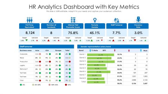
Hr analytics dashboard with key metrics





Try Before you Buy Download Free Sample Product
 Impress Your
 Audience
 100%
100% Editable
 Save Hours
 of Time


Our HR Analytics Dashboard With Key Metrics are topically designed to provide an attractive backdrop to any subject. Use them to look like a presentation pro.
People who downloaded this PowerPoint presentation also viewed the following :
Hr analytics dashboard with key metrics with all 2 slides:
Use our HR Analytics Dashboard With Key Metrics to effectively help you save your valuable time. They are readymade to fit into any presentation structure.
FAQs for Hr analytics dashboard
Focus on metrics that actually help you make decisions - employee turnover, time-to-hire, engagement scores, and absenteeism. Those are your bread and butter. Performance ratings and diversity numbers matter too, plus training completion rates. But honestly? Half the HR dashboards I've seen are just pretty charts that don't tell you squat. Each metric needs to connect to something you can actually do about it. Like if one department's turnover jumps, you know there's probably a manager problem or pay issue to dig into.
Honestly, HR dashboards are game-changers for catching problems early. Instead of waiting around for those yearly surveys (which are pretty much ancient history by the time you see results), you get real-time data on satisfaction scores, manager performance, turnover patterns - all that stuff. What's really helpful is setting up alerts when metrics suddenly tank. You'll spot which teams are struggling or see engagement dropping before people actually quit. I'd definitely start there and then dig into career progression rates to find your at-risk employees. Way better than playing catch-up after someone's already out the door.
Okay so basically, data visualization turns those endless HR spreadsheets into stuff you can actually understand at a glance. Why scroll through rows of numbers when you can see turnover patterns or diversity trends in a simple chart? Heat maps show you exactly which departments are bleeding people, and line graphs track engagement over time. Plus your boss will actually pay attention when you present with visuals instead of dumping raw data on them. Bar charts work great for comparing things, scatter plots show correlations - though honestly I still mix these up sometimes. The whole point is spotting problems fast so you can fix them.
So predictive analytics is like giving your HR team superpowers, honestly. You can actually see patterns in your data and predict who's about to quit or where you'll need to hire next. Way better than just looking at reports after everything already went wrong. The algorithms dig through all your historical stuff and basically tell you "hey, Sarah in accounting might bounce next month" or whatever. Then you can actually do something about it instead of panicking when people leave. I'd start with whatever's driving you crazy right now - like if turnover is killing you, focus there first. It's pretty game-changing once you get it rolling.
Start with data validation at the source - saves you so much headache later. Pull everything from your main HRIS instead of random spreadsheets (learned this when our turnover data was totally screwed for like 3 months). Define what terms actually mean for your company - "active employee" can be weirdly ambiguous. Set up alerts for weird outliers or missing stuff. Have someone check dashboard accuracy monthly because things drift. Oh, and document where your data comes from and how you're transforming it. You'll thank yourself when numbers look wonky and you need to figure out why.
So for HR dashboards, I'd probably go with Power BI first - way cheaper than Tableau and it plays nice with all the Microsoft stuff your company already uses anyway. Tableau's great too but pricier. There are HR-specific tools like Workday and BambooHR that have built-in analytics, which is nice if you don't want to build from scratch. Honestly, Google Data Studio works fine if you're just testing the waters. Power BI has this decent free version plus tons of HR templates you can mess around with. That's where I'd start - you can always upgrade later if you need more fancy features.
Honestly, HR dashboards are pretty clutch for seeing what's actually happening with your hiring. You can track stuff like how long it takes to fill roles, which job boards actually work (spoiler: some are total money pits), and spot patterns in who's quitting. The workforce planning side shows you skills gaps and headcount needs way ahead of time. Plus you'll see which recruiting channels bring quality hires vs just bodies. My advice? Don't go crazy trying to track everything at once. Pick your top 3-4 metrics that matter most and start there.
Ugh, data format mismatches are going to be your worst enemy - plus all the field names never match up between HRIS, payroll, and performance systems. Duplicate employee records will make you want to scream, honestly. Different security protocols for each system are annoying too. One thing that really trips people up is when systems update at totally different times - like one's hourly, another's daily. My advice? Map out your data sources first and figure out what fields you actually need. Then connect systems one by one instead of doing everything at once. Way less chaotic that way.
Honestly, the key is connecting your HR stuff to real business results in your dashboard. Measure what you're spending (training, recruiting costs) against actual improvements - like lower turnover or faster hiring. Short sentences work. The hard part is proving your initiatives actually caused the changes, not just happened at the same time. I'd track both leading indicators like engagement scores and lagging ones like retention rates. That way you get the full picture. Set up automated reports comparing before/after data for each thing you try. Then you'll actually know what's worth the money and what isn't.
Know your audience first - different people need different views, so build separate dashboards instead of one giant mess. Put your most important stuff at the top. Use charts that actually make sense (seriously, I've seen some that look like a unicorn threw up). Keep colors and fonts consistent. Add filters for departments and time periods - trust me on this one. Always include context like benchmarks or last year's numbers so people know if they're winning or losing. Oh, and test it with real users before you launch. Their feedback will save you from angry emails later when everyone's confused about how to use it.
Look, real-time tracking is a game changer because you catch problems while they're still small. Say your engineering team starts hemorrhaging people - you'd know right away instead of three months later when half the team's gone. Then you can actually do something about it, whether that's fixing whatever made them bail or pivoting your hiring approach. I've seen too many companies get blindsided by stuff they could've prevented. The trick is setting up smart alerts for your big metrics so you're not glued to dashboards all day. Way better than waiting around for those useless monthly reports that tell you what already happened.
Dude, seriously get your legal team involved before you do anything - GDPR fines are brutal and I've watched companies get absolutely wrecked over employee data stuff. Only grab the data you actually need for decisions, not just because it's sitting there looking interesting. Anonymize everything properly and make sure people are cool with being tracked first. Set up who can see what on those dashboards too. Oh and figure out how long you're keeping this stuff around. Privacy beats cool analytics every single time, trust me on this one.
Honestly, those HR dashboards are pretty eye-opening once you dig into them. They break down all your workforce data by demographics, departments, leadership levels - the whole thing. You'll start noticing patterns right away, like how certain groups might be missing from management roles or entire teams that have zero diversity. It's kind of wild how obvious the gaps become when you see it all laid out visually. Track your hiring and promotion rates by demographic too - that's where you'll actually see if your efforts are paying off. I'd start with pulling reports on job levels and departments first.
Look for patterns in who's leaving and when. Departments with high turnover? Usually means bad managers or crappy pay. If everyone bails within 6 months, your onboarding sucks. Seasonal spikes show when workload gets crazy - honestly, some companies just pile it on during busy periods. Geography matters too since location-specific problems pop up. Don't just look at one month's numbers though. Compare against industry averages and track trends over time. That's how you figure out which retention fixes will actually move the needle.
So you know how everyone hates those massive HR spreadsheets? Dashboards fix that by turning all your people data into actual visuals that make sense. Finance gets pumped about cost-per-hire breakdowns, ops teams can see headcount forecasts - way better than confusing numbers everywhere. The cool part is you'll answer questions like "what's up with engineering retention?" with real data instead of guessing. I'd start by figuring out what metrics each department actually cares about first. Then build separate dashboard views for them. Trust me, beats sending Excel files that nobody opens anyway.
-
Use of icon with content is very relateable, informative and appealing.
-
Easily Editable.
-
Informative presentations that are easily editable.
-
Great quality product.
-
Informative presentations that are easily editable.
-
Professional and unique presentations.
-
Thanks for all your great templates they have saved me lots of time and accelerate my presentations. Great product, keep them up!
-
Topic best represented with attractive design.