


Employee performance rating distribution bell curve




Try Before you Buy Download Free Sample Product
 Impress Your
 Audience
 100%
100% Editable
 Save Hours
 of Time


Our Employee Performance Rating Distribution Bell Curve are topically designed to provide an attractive backdrop to any subject. Use them to look like a presentation pro.
People who downloaded this PowerPoint presentation also viewed the following :
Content of this Powerpoint Presentation
Evaluating the performance of the employees to monitor their efficiency and identify areas of improvement is a common practice followed by many organizations. Later, this evaluation is significant to decision-making related to promotions, raises, and bonuses. Employee performance ratings also help identify the training and development needs to enhance the overall growth and productivity of an organization. Many surveys have shown that performance evaluation enhances productivity by 20%. Moreover, the results govern the feedback that will be then shared with the employees to know where they stand and improve their performance.
SlideTeam has developed a ready-to-use PPT Template to demonstrate your company's employee performance using the most effective, graphical method. You can rate the employee performance and accordingly categorize them into various groups based on their performance. Showcase the range of employee performances and take corrective steps in helping them improve.
Get this PPT Design to demonstrate the employee performance review evaluation form with ratings!!
Template 1: Employee Performance Rating Distribution Bell Curve
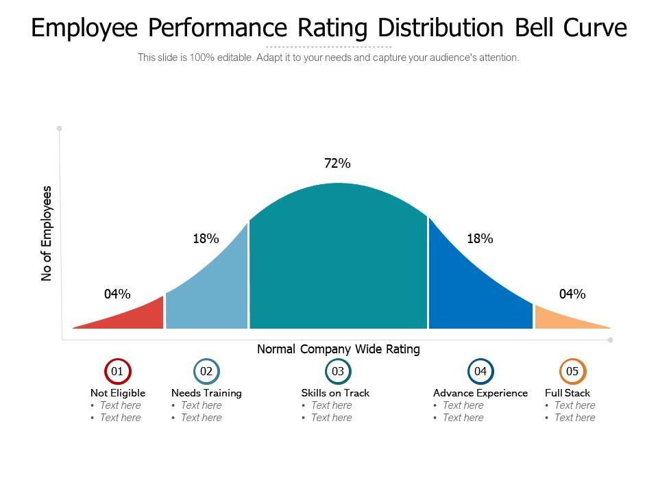
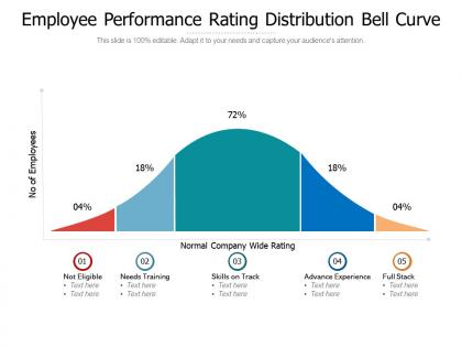
Represent the employee evaluation with the help of a graph that divides the employees into different categories according to their performance. This presentation template provides you the opportunity to put the employees in categories like not eligible, needs training, skills on track, advanced experience, and full stack. Use the bell curve which showcases a unique approach of demonstrating the results of your employees’ performance evaluation. Use color coding to identify the different ranges of performance categories spotted in this evaluation.
Unlock Your Team's Potential Through Performance Evaluations
Customizable templates will come in handy for an easy demonstration of the assessment of employees within your organization. Categorize them according to their individual performances. Give feedback to your team members to improve their productivity and motivate them to achieve more. This PPT Chart will also help you prepare relevant and effective training programs for them. Get this ready-to-use PPT Design to identify the mettle of your employees and prepare them for the competition ahead.
P.S. Explore our PPT Slide for Employee Performance Improvement Process Flowchart here to correctly identify areas of improvement and design training programs for them accordingly.
Employee performance rating distribution bell curve with all 2 slides:
Use our Employee Performance Rating Distribution Bell Curve to effectively help you save your valuable time. They are readymade to fit into any presentation structure.
FAQs for Employee performance rating
So basically it's this bell-shaped curve that's perfectly symmetrical around the middle. You've got the 68-95-99.7 rule - most of your data (68%) sits within one standard deviation, 95% within two, and 99.7% within three. Pretty neat how that works out. The curve never actually hits zero, just keeps getting closer and closer. Oh, and it's super handy because if your data follows this pattern, you can predict where most values will land. That's why you see it everywhere in stats - honestly makes life way easier for analysis stuff.
So the bell curve is basically how most stuff gets distributed naturally - like height, test scores, whatever. Most people cluster around the average, then it drops off toward the extremes. Pretty handy for predicting probabilities and figuring out patterns from your sample data. Honestly, half the statistical tests out there just assume your data follows this shape anyway. Quick tip: plot your data first to see if it looks bell-shaped. That'll tell you whether you can use normal distribution methods. Super basic but saves you headaches later.
Standardized tests are probably where you'll see bell curves the most - plus grade distributions and measuring how students perform overall. Most kids end up clustering around the middle, with way fewer at either extreme, so schools use this to figure out who needs extra help or should be in advanced classes. Honestly, lots of teachers grade this way naturally, though it can get pretty controversial. When you're looking at your classroom data or trying to make sense of district test results, it's super useful for spotting the outliers. Just don't force every single data set to fit perfectly - sometimes things aren't normally distributed and that's totally fine.
So basically the bell curve assumes most of your team performs at an average level, with fewer people being rockstars or total duds. You'd probably see like 20% high performers, 60% solid middle, 20% struggling. Companies use it for those forced ranking systems - though honestly that approach is kinda falling out of favor these days. Works better with bigger teams obviously. It helps you spot who deserves promotions or bonuses versus who needs extra coaching. Pretty straightforward way to organize performance reviews, just don't expect everyone to love being categorized like that.
So basically, that area under the curve shows you what chunk of your data sits in different spots. Like if you're looking at test scores, it tells you how many kids scored between certain numbers. The whole curve always adds up to 100% of your data - makes sense, right? When you measure the area between two points, you're figuring out the odds that some random person falls in that range. About 68% of everything clusters around the average (within one standard deviation, but whatever). Pretty handy for spotting weird outliers or guessing what'll happen next with your dataset.
Ugh, outliers are such a pain when you're working with bell curves! They basically drag the whole distribution in their direction, making it all lopsided. Like if you have some crazy high values, the right tail gets stretched out way longer than the left. The mean shifts toward wherever those weird data points are hanging out, which totally throws off your center. Plus your standard deviation gets bigger so the curve flattens out - I swear I spent like an hour yesterday trying to figure out why my data looked so wonky before realizing I had some outliers messing everything up. Always worth checking for them first!
Oh nice, that's actually the sweet spot! So basically when your mean, median, and mode all match up, your data has perfect symmetry - no weird skewing happening. You've got that textbook bell curve shape, which honestly makes everything so much easier for analysis. Any of those three measures will give you the real center of your data. Plus you can trust those standard deviation rules for predictions, and your statistical tests won't be as finicky. Pretty rare to see in real life though! Just double-check your data actually looks normal before assuming it.
Honestly, just throw your data into a histogram first - that's always my go-to. If it looks like that classic bell shape and everything's pretty symmetric around the middle, you're probably looking at normal distribution. Quick math check: roughly 68% of your values should sit within one standard deviation of the mean, and about 95% within two. Those numbers are basically the tell-tale signs. Oh, and if you want to get fancy about it, run a Shapiro-Wilk test or peek at your skewness values. But seriously, start with the visual - it'll save you time and give you that immediate "yep, that's normal" feeling.
So basically, standard deviation is like the volume knob for how spread out your data is. Bigger standard deviation = wider, flatter bell curve. Smaller one = tall and skinny. About 68% of your data sits within one standard deviation from the average, and 95% fits in two standard deviations. I always look at that number first when I'm checking out any bell curve - it tells you right away if your data's all bunched together or scattered everywhere. Makes way more sense once you see it that way, honestly.
So basically CLT means when you grab a bunch of sample means from any data - doesn't matter how weird it looks - those means will always form a bell curve. Wild, right? Try rolling dice repeatedly and averaging the results, or whatever random data you have lying around. Once you hit like 30+ samples, boom - there's your bell curve. Sample size of 30 is kind of the magic number everyone talks about. The curve gets tighter as you add more samples and centers right on your actual population mean. Honestly blew my mind in stats class.
Dude, bell curves are perfect for presentations! Most people instantly get them since we all survived school grading (ugh). They're awesome for showing where your data clusters and spotting the weird outliers. Performance reviews, test scores, quality stuff - anything where you want to show what's normal versus what's totally off the charts. You can even layer different time periods to show progress. Just make sure you label everything clearly - honestly, the outliers are usually where the juicy stories are hiding. Oh, and they're great for managing expectations too.
Oh man, the worst assumption people make is that everything's a bell curve - it's really not! Income data? Skewed as hell. Test scores? Same thing. Also, don't just toss outliers thinking they're mistakes. Sometimes those "weird" data points are telling you something important. Honestly, I see this all the time - people spot correlation in their nice normal-looking data and suddenly think they've found causation. Big mistake there. Just plot your stuff first before doing anything fancy. Sounds obvious but you'd be surprised how many skip this step and assume their data plays nice.
So basically the bell curve shows you where your "good" products sit versus the duds. Most parts land in that sweet center zone - like 68% within one standard deviation, 95% within two. Pretty cool how predictable it is, honestly. Your QC people can spot when things start drifting off-center or getting too spread out, which usually means your equipment's acting up. I'd set acceptance limits around 2-3 standard deviations. That way you catch issues before they become expensive headaches. Makes predicting defect rates way easier too.
So for normality testing, Shapiro-Wilk is your go-to if you've got under 5,000 data points - it's super sensitive to weird stuff. Larger datasets? Try Kolmogorov-Smirnov or Anderson-Darling instead. Honestly though, I always peek at a Q-Q plot or histogram first because sometimes it's painfully obvious your data's wonky without running any tests. Oh, and heads up - massive sample sizes will make these tests freak out over tiny deviations that don't actually matter. Visual check first, then back it up with whichever test fits your data size.
Bell curves are honestly really useful for market research - they show you how your customer data spreads out. Like, most of your customers cluster in the middle, but you'll also see the weird outliers on the edges. I plot survey responses, buying patterns, even demographics this way. Works great for satisfaction scores too. The shape tells you if your "average customer" idea is actually right or if you're missing something. Plus you can spot different segments pretty easily. Honestly didn't expect them to be this helpful when I first started using them, but now I throw everything onto a bell curve just to see what shakes out.
-
Great product with effective design. Helped a lot in our corporate presentations. Easy to edit and stunning visuals.
-
Easy to edit slides with easy to understand instructions.
-
Nice and innovative design.
-
Awesomely designed templates, Easy to understand.