


Employee Salary Review Dashboard With Non Salary Benefits




Try Before you Buy Download Free Sample Product
 Impress Your
 Audience
 100%
100% Editable
 Save Hours
 of Time


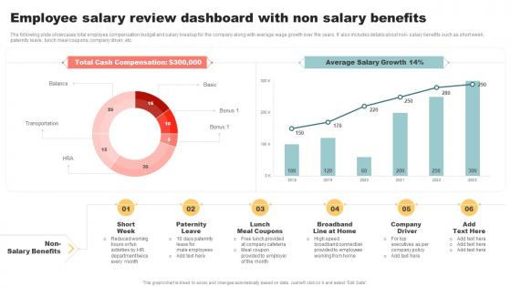
The following slide showcases total employee compensation budget and salary breakup for the company along with average wage growth over the years. It also includes details about non- salary benefits such as short week, paternity leave, lunch meal coupons, company driver, etc.
People who downloaded this PowerPoint presentation also viewed the following :
Employee Salary Review Dashboard With Non Salary Benefits with all 7 slides:
Use our Employee Salary Review Dashboard With Non Salary Benefits to effectively help you save your valuable time. They are readymade to fit into any presentation structure.





FAQs for Employee Salary Review Dashboard With
Start with pay equity stuff - salary ranges, gender gaps, where people fall in their bands. Merit increases and promotion rates matter too. Honestly, the demographic pay gap data can be pretty shocking when you first see it. Don't just look at base salary though - bonuses and equity change everything. Turnover by pay level is super telling about whether you're actually competitive. Oh, and benchmark against market rates or you're flying blind. You can always get fancier with the analysis later, but these basics will give you a solid picture of what's going on.
Build it with criteria everyone can actually understand and check themselves. Show salary ranges for each role, clear promotion paths, and the same performance metrics across the board. Honestly, the worst thing is when people have to guess why someone else makes more - total morale killer. Include demographic breakdowns so you can spot bias patterns that might fly under the radar. First step is auditing what you've got now for pay equity. Then the dashboard keeps you honest going forward. Oh, and don't forget regular updates or it'll become useless pretty quick.
Honestly, charts make comp data so much easier to digest than staring at endless spreadsheets. Heat maps will show you pay gaps across departments or demographics right away. Scatter plots are great for spotting those weird outliers - you know, the person making 30k more than everyone else at their level (how'd that happen?). Bar charts work well for basic department comparisons. You can track if your raises actually match market trends over time too. The visual stuff makes presenting to executives way less painful since they get it immediately. Start simple then add more layers as you go.
So benchmarking is basically your sanity check for pay decisions. You grab industry data to see if you're competitive or if you're bleeding talent because your offers suck. Think of it like GPS for salaries - otherwise you're just throwing darts blindfolded. Your dashboard needs to pull in external data with your internal stuff so you can quickly spot where you stand against similar companies. Honestly, I'd start small though. Pick 3-5 solid benchmark sources first, then work that data into your dashboard views. Way less overwhelming that way.
Yeah so basically you'd set up different filters for each department's stuff. Sales wants their commission numbers and quota tracking, HR needs salary ranges and equity info. Engineering? They're obsessed with stock options and bonus breakdowns - makes total sense honestly. Just create separate tabs or views that pull the right data for each team. Map out what each department's managers actually care about first though. Then configure those specific metrics and charts so they can find everything quickly. Way easier than making everyone dig through irrelevant data they don't need.
Honestly, filters are your best friend here - let people slice by department, role, experience, whatever. Interactive charts where you hover for details make a huge difference. I'd definitely add drill-down options so they can click into specific metrics. Comparison tools are solid too, helps employees see how they stack up against similar roles. Oh, and toggle switches for different time periods or pay components. The personalization stuff is where it gets interesting though - saved views, alerts when their data changes. That's what keeps people coming back. Just start with whatever features you're hearing about most.
Honestly, having real-time comp data is a game changer. Instead of waiting around for quarterly reports, you can catch problems early - like when certain roles get harder to fill because market rates jumped. I've seen too many companies miss pay equity issues until they're massive headaches. Set up alerts for when salaries drift 10%+ from benchmarks or turnover spikes in specific bands. Way better than scrambling after people already quit. Oh, and you can actually adjust budgets as things happen instead of being stuck with outdated numbers. It's pretty nice having all that info right there when you need it.
Data quality will absolutely wreck your day - HRIS formats salary info completely different from payroll systems. Bonuses across multiple platforms? Good luck with that mess. Privacy stuff gets weird fast since comp data is so sensitive. Plus your total comp calculations need to actually work, which sounds obvious but trust me. Real-time updates are basically impossible if systems don't sync properly (and they never do). Honestly, just start with basic salary data and build from there. Get that pipeline working first before you add all the complicated layers.
So predictive analytics can basically forecast salary trends and spot which employees might bail if you don't give them raises. Pretty neat, right? The algorithms crunch historical pay data and performance stuff to predict when roles will hit market ceiling too. Honestly saves you from playing the guessing game with comp planning. Plus you get heads up about pay equity issues before they blow up. I'd start with your most critical roles first - that's where you'll see the biggest wins. Oh, and it helps with budget planning for like the next few years which is clutch.
Start with GDPR and whatever state privacy laws you're dealing with - that stuff's non-negotiable. Set up role-based access so managers only see their own team's data, not the whole company's salary info. Trust me, cross-department salary drama is real and ugly. Equal pay compliance is huge too - you don't want your dashboard accidentally highlighting pay gaps that'll bite you later. Oh, and document everything with audit trails because compliance teams love their paper trails. Honestly though, the permissions setup is probably your biggest headache here.
Honestly, just build feedback into the dashboard itself - like a little widget where people can quickly tell you what sucks. User surveys and interviews are great, but watching the actual analytics tells a different story. People say they want one thing, then completely ignore those features once you build them. Track where users get stuck or keep asking for data they can't find easily. I'd focus on fixing the stuff that comes up most often and impacts their daily work. Oh, and make it ongoing rather than some big annual feedback project - that never works as well.
Yeah, I think it could really help with morale! People get way less frustrated when they can actually see the salary bands and understand how pay decisions work. No more weird guessing games about why someone makes more. It gives them a clear roadmap for getting promoted too, which honestly beats those vague "work harder and maybe you'll advance" conversations. The transparency makes people feel more valued - like you're not hiding anything from them. Just make sure you explain how to read the dashboard properly when you launch it, otherwise people might misinterpret stuff and create new drama.
So basically, your dashboard becomes this shared space where HR and management can actually talk the same language. No more digging through random spreadsheets during meetings - you just pull up real-time compensation data, benchmarks, budget stuff, whatever you need. Those salary conversations that used to take hours of prep? Way easier now. Management sees their big picture view while HR gets all the detailed backup for their recommendations. Oh, and definitely set up regular check-ins with your key people so everyone's on the same page about comp decisions. Trust me, it makes those awkward money talks so much smoother.
Honestly, go with Tableau or Power BI if you can swing the budget - they're what everyone uses for HR stuff and handle salary data really well. Excel works if you're strapped for cash, but trust me, it gets messy once you have multiple data sources. Google Data Studio is decent too and it's free, which is nice. The big thing is making sure whatever you pick connects to your HRIS and payroll automatically. I made the mistake once of updating everything manually each month and wanted to pull my hair out. Maybe start with this quarter's data as a test run?
So I'd track pay equity gaps and turnover rates by salary band first - those tell you everything. Time-to-fill positions is huge too. The benchmark comparison thing is honestly my favorite part because you can see exactly where your offers land against market rates. Pretty eye-opening stuff. Watch how employee satisfaction scores move when you adjust comp, and don't forget promotion rates - gotta make sure people can actually grow. Oh, and always connect it back to retention and performance metrics. That's where you'll see if your comp strategy is actually working or just burning budget.
-
Happy to found you SlideTeam. You guys are value for money. Amazing slides.
-
Wide collection of templates available. SlideTeam has made it easier to create presentations in just a few minutes.