


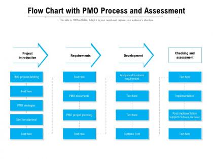
Flow chart with pmo process and assessment




Try Before you Buy Download Free Sample Product
 Impress Your
 Audience
 100%
100% Editable
 Save Hours
 of Time


Our Flow Chart With PMO Process And Assessment are topically designed to provide an attractive backdrop to any subject. Use them to look like a presentation pro.
People who downloaded this PowerPoint presentation also viewed the following :
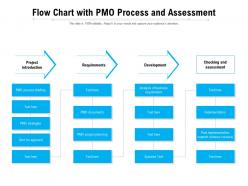
Flow chart with pmo process and assessment with all 2 slides:
Use our Flow Chart With PMO Process And Assessment to effectively help you save your valuable time. They are readymade to fit into any presentation structure.
FAQs for Flow chart with pmo
Okay so for your PMO flowchart, start with current state analysis and gap identification - that's your foundation. Then add stakeholder input collection and process maturity evaluation. Decision points are crucial for prioritizing immediate fixes vs long-term stuff. Honestly, most of these turn into nightmare diagrams nobody touches after week one. Keep it simple with clear swim lanes for roles. Don't forget feedback loops - you want this to be ongoing, not some one-time thing. Pro tip: map your existing processes first, then add assessment criteria on top. Way less overwhelming that way.
Honestly, flowcharts are a game changer for PMO stuff. You take those messy processes that nobody understands and turn them into simple visual steps. Way better than those boring procedure docs that sit in folders gathering digital dust. Anyone can look at a flowchart and instantly see what happens next, who does what, where decisions happen. It's like having a map instead of confusing written directions. Plus you'll actually spot problems - bottlenecks, duplicate work, missing steps - that you'd never catch in regular documentation. Start with whatever process confuses people most. Trust me, onboarding new people becomes so much smoother.
Focus on the stuff that actually matters - project success rates, budget variance, schedule adherence, and how well you're using resources. Stakeholder satisfaction scores too, plus whether your portfolio aligns with what the company actually wants to achieve. Honestly? I've watched way too many PMOs go crazy tracking every little thing when keeping it simple works better. Process adoption rates are good to measure, and time-to-value for new stuff. Start with maybe 5-7 metrics that tie directly to your org's goals. You can always add more once you've got solid baseline data to work from.
Look for spots where everything funnels into one decision point or approval - classic bottleneck territory. Those "pending review" boxes are dead giveaways too. Any loops that keep cycling back? Red flag. The really long, twisty paths from start to finish usually spell trouble (honestly, if your process looks like spaghetti, it probably is). Once you've got it mapped out visually, the problem areas jump out at you. Mark those chokepoints and go after the worst time-wasters first. Don't try to fix everything at once though - you'll just create new problems.
Honestly, stakeholder feedback is huge for this stuff. You need to hear from project managers, team leads, execs - basically anyone touching your processes daily. They'll tell you what's really broken versus what you think is working. And trust me, some feedback will sting a bit, but that's the good stuff you actually need! Ask specific questions about bottlenecks and pain points instead of generic "how's it going?" surveys. Don't just stick to one level either - get perspectives from top to bottom. Sometimes the people doing the actual work see problems leadership completely misses.
So flowcharts are actually pretty clutch for this - they show you how your PMO stuff connects to what the company's trying to do. Map out each step and you'll spot where things aren't really supporting the big picture. It's like getting that overhead view of everything, which honestly makes finding gaps way easier. The cool part is tracing a line from your boring daily tasks straight up to those strategic goals everyone talks about. Just start sketching your current processes, then mark which company objectives each step actually supports. Works better than you'd think.
Honestly, I'd start with Lucidchart or Visio for PMO flowcharts. Visio's the old reliable if your company already has it, but Lucidchart's web interface is so much cleaner to work with. Both handle complex processes really well. If budget's tight, Miro and Draw.io are decent free options - though I always forget Draw.io exists until someone mentions it. The collaboration features matter more than you'd think when multiple people need to edit. My advice? Just use whatever your team already has access to first. You can always switch later if it's not working out.
Honestly? Quarterly is probably your sweet spot, though I know some teams stretch it to every 6 months if their stuff's pretty stable. Things move so damn fast now - new projects pop up, people leave, priorities shift overnight. You get it. Whatever timeline you pick, just stick with it so you can actually see if you're getting better. Oh, and if you're in one of those crazy change periods or rolling out new tools, maybe do quick monthly check-ins instead. Pro tip: put those dates in your calendar RIGHT NOW or they'll never happen.
Don't try tackling everything at once - you'll just burn out and miss the actual problems. Go one process at a time instead. Talk to the people actually doing the work, not their bosses who have no clue what's really happening day-to-day. Here's the thing though - whatever's written in their process docs? Probably garbage compared to reality. I made that mistake before. Each company's weird in its own way, so don't assume it'll be like other places you've seen. Hit the critical stuff first, get real feedback from users, and write down issues as you spot them.
Honestly, flowcharts are a lifesaver for PMO teams. Everyone can actually see what's supposed to happen instead of guessing. No more "wait, whose job is this?" moments during handoffs. People pay way more attention to a visual map than some boring 10-page process doc - I mean, who has time for that? You'll spot problems like bottlenecks super fast when everything's mapped out. Redundant steps become obvious. I'd start with whatever process is driving everyone crazy right now. Once you get that first one done, you'll probably want to flowchart everything.
Honestly, the biggest win is getting everyone bought in from the start. People are way more likely to follow through on fixes when they helped spot the problems themselves - it's weird but true. You'll catch stuff you'd totally miss on your own too. Plus different people see different pain points, which is clutch. The whole thing builds trust and makes people feel heard, so when you actually roll out changes later it's not this huge uphill battle. Oh and pro tip - just get your key people together and ask what's driving them crazy about how things work now. Sometimes the obvious approach is the right one.
Honestly, you've gotta hit people from multiple angles with these things. Email them out, drop them in your shared workspace, bring them to meetings. I started doing quick walkthrough videos too - sounds extra but people actually watch them way more than you'd think. Keep your symbols simple and labels clear so the non-tech folks don't get lost. Set up some Q&A sessions afterward because someone's always gonna be confused about something. Different people learn differently, so the repetition across channels really helps. Oh, and definitely create one main spot where the latest versions live - otherwise you'll have people using old charts forever.
Honestly, the flowchart will show you bottlenecks right away - those are your biggest wins. Look for redundant steps you can cut and decision points that confuse everyone. Missing handoffs between teams mess things up too. You'll probably find approval loops that go nowhere or steps that don't actually help anything. People create weird workarounds when the official process sucks, so watch for those. I'd tackle whatever's killing your timelines first, then quality issues. Map out what you're actually doing now (not what you think you're doing), then get the team involved in designing something better.
Honestly, flowchart assessments are pretty solid for catching risks early. You'll spot bottlenecks right away when you map everything out visually. All those random delays that drive everyone crazy? They suddenly make perfect sense. Plus you can see where handoffs get weird between teams, which steps are most likely to break, and where important stuff might slip through the cracks. I've found the visual thing really helps when you're trying to explain risks to your team too - way better than some boring bullet-point list. Single points of failure become super obvious, and you'll catch those redundant approval loops that slow everything down.
Here's the deal - the more mature your PMO is, the cleaner your process assessment will look. Low maturity means you're gonna find a mess of ad-hoc stuff everywhere. Missing docs, inconsistent project execution, the whole nine yards. It's actually pretty shocking when you see it all laid out the first time. Mature PMOs? Way more standardized processes and solid governance. You'll spot measurable outcomes instead of chaos. Use whatever level you're at now as your starting point, then figure out which improvements will actually move the needle for your team.
-
Great product with effective design. Helped a lot in our corporate presentations. Easy to edit and stunning visuals.
-
Nice and innovative design.
-
Best way of representation of the topic.