


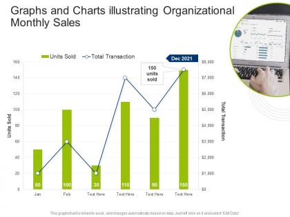
Graphs and charts illustrating organizational monthly sales




Try Before you Buy Download Free Sample Product
 Impress Your
 Audience
 100%
100% Editable
 Save Hours
 of Time


Our Graphs And Charts Illustrating Organizational Monthly Sales are topically designed to provide an attractive backdrop to any subject. Use them to look like a presentation pro.
People who downloaded this PowerPoint presentation also viewed the following :
Graphs and charts illustrating organizational monthly sales with all 2 slides:
Use our Graphs And Charts Illustrating Organizational Monthly Sales to effectively help you save your valuable time. They are readymade to fit into any presentation structure.
FAQs for Graphs and charts illustrating
Key components of effective sales visualization include interactive dashboards, real-time performance metrics, pipeline tracking, conversion rate analytics, and territory mapping. These elements streamline decision-making by providing clear visual insights into sales trends, customer behaviors, and revenue opportunities, with many organizations finding that comprehensive visualization ultimately enhances forecasting accuracy and accelerates deal closure rates.
Data storytelling enhances sales presentations by transforming complex metrics into compelling narratives, connecting emotional impact with factual evidence, and guiding prospects through logical decision-making journeys. Through strategic visualization and narrative structure, sales teams streamline complex information delivery, accelerate prospect understanding, and ultimately drive higher conversion rates, with many organizations finding that story-driven presentations increase engagement and close rates significantly.
Effective sales visualization includes bar charts for comparing performance across territories, line graphs for tracking trends over time, pie charts for market share breakdowns, funnel charts for pipeline analysis, and heat maps for geographic performance. These visualizations streamline data interpretation by highlighting top performers, identifying seasonal patterns, and revealing growth opportunities, ultimately enabling sales teams to make faster strategic decisions.
Sales visualization transforms decision-making by converting complex data into clear charts, graphs, and dashboards that reveal patterns, trends, and performance gaps instantly. Through interactive visual tools, sales managers can identify underperforming territories, forecast accurately, and allocate resources strategically, while teams gain real-time insights that accelerate responses to market opportunities and ultimately drive revenue growth.
Common sales visualization mistakes include cluttered dashboards, misleading scales, irrelevant metrics, poor color choices, and lack of context or benchmarks. These errors confuse decision-makers rather than clarify performance, with many sales teams finding that overly complex visualizations delay critical decisions, while simplified, focused charts enhance pipeline visibility, accelerate deal closure rates, and ultimately deliver clearer strategic insights.
Technology enhances sales visualization effectiveness by enabling real-time data integration, interactive dashboards, predictive analytics, and automated reporting capabilities. Through AI-powered platforms and cloud-based tools, sales teams can access dynamic visual insights, identify trends faster, and personalize presentations for different stakeholders, ultimately delivering more compelling pitches and data-driven decision making.
Audience analysis determines visual complexity, data depth, messaging focus, and presentation format to ensure maximum impact and comprehension for specific stakeholders. By understanding whether you're presenting to C-suite executives, sales teams, or technical buyers, organizations can tailor charts, metrics, and narratives accordingly, ultimately delivering more persuasive presentations and faster decision-making outcomes.
Sales visualization tools integrate into existing workflows through API connections with CRM systems, automated data syncing from sales databases, and dashboard embedding within current platforms like Salesforce or HubSpot. These integrations streamline reporting processes, eliminate manual data entry, and enhance team collaboration, with many sales organizations finding that seamless workflow integration ultimately delivers faster decision-making and improved sales performance.
Crucial sales visualization dashboard metrics include conversion rates, pipeline velocity, revenue forecasts, lead-to-close ratios, customer acquisition costs, average deal sizes, and sales cycle length. These metrics enable sales teams to identify bottlenecks, optimize performance strategies, and accelerate decision-making processes, with many organizations finding that comprehensive dashboards ultimately deliver improved forecast accuracy and enhanced competitive advantage.
Cultural differences significantly influence sales visual interpretation through varying color associations, reading patterns, symbolic meanings, and data presentation preferences. For instance, while red signifies prosperity in Chinese markets, it represents danger in Western contexts, and right-to-left reading cultures process charts differently, requiring strategic adaptation to ensure accurate communication and optimal customer engagement across global markets.
Best practices for presenting sales data to diverse audiences include tailoring complexity levels to stakeholder expertise, using interactive dashboards for real-time exploration, employing consistent visual hierarchies, and providing multiple format options like executive summaries and detailed reports. These approaches enhance understanding by enabling sales teams to showcase performance metrics clearly, while executives can quickly grasp strategic insights, ultimately delivering improved decision-making and stakeholder alignment.
Sales visualization enables trend identification through interactive dashboards, heat maps, pipeline analytics, and performance comparisons across territories, time periods, and product lines. These visual tools streamline pattern recognition by highlighting seasonal fluctuations, customer behavior shifts, and emerging market segments, with many sales organizations finding that visual data analysis accelerates opportunity discovery and enhances strategic decision-making capabilities.
Color choices in sales visualization significantly impact data comprehension, decision-making speed, and audience engagement by enhancing pattern recognition, highlighting key trends, and reducing cognitive load. Strategic color application enables sales teams to quickly identify top performers, spot revenue opportunities, and communicate insights more effectively to stakeholders, ultimately delivering faster analysis and more persuasive presentations that drive business results.
Sales visualizations for remote presentations can be tailored through larger fonts, simplified charts, interactive elements, screen-sharing optimization, and mobile-friendly formats. These adaptations enhance virtual engagement by ensuring clarity across different devices, enabling real-time collaboration through digital tools, and maintaining audience attention with dynamic visuals, ultimately delivering more effective remote sales outcomes and stronger client connections.
Interactivity enhances sales visualizations by enabling real-time data exploration, personalized filtering, and dynamic scenario modeling that engages prospects more effectively. Through interactive dashboards and clickable elements, sales teams can customize presentations to address specific client concerns, drill down into relevant metrics, and demonstrate immediate value propositions, ultimately delivering more persuasive and memorable sales experiences.
-
Innovative and attractive designs.
-
Topic best represented with attractive design.
-
The Designed Graphic are very professional and classic.
-
Easily Understandable slides.