


Impact and feasibility effort save matrix




Try Before you Buy Download Free Sample Product
 Impress Your
 Audience
 100%
100% Editable
 Save Hours
 of Time


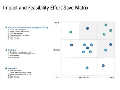
Select our Impact And Feasibility Effort Save Matrix PowerPoint Presentation Slide for your time management. Employ this PPT template as a decision-making tool for the operational and functional management in your organization. Determine the efficiency and effectiveness of a product or element using this PPT layout to assign your time and resources in the right direction. Take advantage of this PPT slide for providing an insight into the resource-leveling process and techniques. Accurately displayed horizontal and vertical axis plots impact and feasibility activities from high to low range in this PPT design. Elaborate on the key features like customer relationship management, brand management, marketing, innovation, and consumer insights by taking the aid of this PPT visual. Brainstorm, compute and generate a consolidated plan of action with the help of this PPT theme. Utilize this PPT graphic to highlight the project context and objectives in a clearly defined manner. Download this PowerPoint template and create a winning presentation.
People who downloaded this PowerPoint presentation also viewed the following :
Impact and feasibility effort save matrix with all 2 slides:
Give your audience a fulfilling experience. They will find our Impact And Feasibility Effort Save Matrix elevating.
FAQs for Impact and feasibility
So basically you plot tasks based on impact vs effort - makes it super easy to see what's actually worth doing. High impact, low effort stuff? That's your goldmine right there. I always go for those first since they're like free wins. Low impact but tons of work? Yeah, skip those unless you hate yourself lol. The whole thing just cuts through that overwhelming "where do I even start" feeling when you've got a million things on your plate. Honestly wish I'd learned about this years ago. Just grab your team and start plotting your ideas - you'll see patterns immediately.
So basically you plot tasks on a simple 2x2 grid - high/low impact vs high/low effort. Go for the high impact, low effort stuff first because those are easy wins. Then hit the big important projects when you've got time and energy. I mean, it sounds super basic but seeing everything laid out like that really helps when your team's arguing about priorities. Nobody can complain when they literally see why something should wait. Oh and don't waste time on low impact anything - learned that the hard way. Just throw your next sprint tasks on there and you'll instantly know what to tackle first.
Ok so basically you've got two axes to work with. Impact goes vertical - think revenue, user happiness, whatever actually moves the needle for you. Then effort goes horizontal covering time, complexity, team capacity, all that stuff. Plot your ideas honestly on there and boom, you can see which ones are worth doing first. Those high-impact, low-effort wins in the top left? Chef's kiss. Just don't be like me and underestimate how long things actually take - I swear every project somehow doubles in scope once you start digging in.
So the impact-effort thing is more about ROI - like, what gives you the biggest return for the work you put in? Eisenhower is just pure urgency vs importance. Honestly, I think Eisenhower feels more reactive? You're constantly putting out fires. Impact-effort makes you think strategically about where to spend your time and resources. I use Eisenhower for daily stuff when everything feels urgent. But for bigger projects or when you need to convince your boss why something should get priority, impact-effort wins every time. Way easier to justify spending money on high-impact, low-effort wins.
Honestly, the whole thing falls apart because impact and effort are so damn subjective. What you think is high-impact might look trivial to your PM or designer. Teams waste forever arguing about where stuff goes on the grid instead of just deciding. Also, everyone's way too optimistic about how long things take - tale as old as time. The matrix becomes this rigid bible when really priorities shift based on random external stuff it can't account for. Use it to start conversations, sure, but don't let people debate placement for hours. That defeats the whole point.
Yeah totally! I've been using the impact-effort matrix for ages and it's honestly a game changer. Basically you plot tasks by how much they'll actually matter vs how hard they are to do. The stuff that's high impact but low effort? That's your goldmine - tackle those first. Low impact tasks either get pushed way down or just ditched completely. I started with weekly planning but now I use it for bigger life stuff too. Sometimes I get a little obsessed with categorizing everything lol. Just try mapping your current to-do list and see what pops into that sweet spot of easy wins.
Honestly, I just ask myself "what's the worst that happens if we skip this?" Rate everything 1-5 or high/medium/low - whatever works. Look at revenue impact, customer stuff, how it fits your bigger goals. Some tasks hit right away, others pay off later. Also think about how many people get affected by it. Those weighted scoring things are fine if you're into that, but honestly? Half the time I just talk it through with the team and trust our gut. Works pretty well tbh. Just don't change your criteria halfway through or you'll mess everything up.
Honestly, I'd check that matrix every 2-4 weeks or whenever something major shifts in your project. Stuff changes so fast - what looked super important last month could be completely pointless now. Been there, done that lol. New feedback or budget cuts can flip everything upside down. Quick 15-minute review before tackling your next batch of tasks is clutch too. Just throw a recurring reminder on your calendar. Trust me, it beats spending days working on the wrong things because you didn't update your priorities.
Honestly, color coding is a game changer for impact-effort matrices. Green for quick wins, red for total money pits - people get it instantly. I like sizing the bubbles based on how many resources you'll need too. Way better than staring at boring text. Make your quadrant labels super clear and position everything consistently so stakeholders can figure out where stuff falls without squinting at it. Throw in some icons or quick descriptions to keep things scannable during those endless meetings. The goal? Anyone should walk in and understand your priorities in like 30 seconds flat.
Honestly, the biggest mistake is being wishy-washy with your scoring. People hate picking extremes so everything ends up mushed in the middle, which defeats the whole point. Define what "high impact" actually means for your situation first - don't just wing it. Do your homework before plotting stuff too. I've seen so many teams just throw ideas up there based on pure guesswork. At least sanity-check with a few people who know what they're talking about. And here's the thing - don't get precious about perfect placement. It's supposed to help you make quick calls, not be some masterpiece. Rough estimates work fine to start.
Before anyone puts stuff on the matrix, make everyone say WHY they think something goes where. Define what "high effort" and "high impact" actually mean first - I've watched teams argue for hours because nobody agreed on the basics. Get someone to facilitate who'll push for details when people disagree. Still can't agree? Try averaging positions or dot voting. The whole thing only works if people explain their reasoning. Otherwise you're just moving sticky notes around based on gut feelings, which honestly isn't super helpful.
Honestly, those matrices can totally screw you over when your estimates are garbage. You'll mark something "low effort" then realize it needs approval from like five different teams - whoops, now it's a nightmare. Dependencies are where these things fall apart. Plus "impact" means completely different things to different people, which gets messy fast. Sometimes you've got regulatory deadlines breathing down your neck, so that medium-impact project suddenly can't wait. I still think they're useful though - just don't treat them like gospel. More like a conversation starter for your team.
Honestly, going digital with your impact-effort matrix is a game changer. Tools like Miro or Figma let everyone jump in simultaneously - no more waiting for Karen to email back her edits. Your team can drag stuff around when priorities inevitably shift, and you'll actually see what people are thinking in real time. The linking feature is clutch too. You can connect project docs directly and add comments without drowning in meeting follow-ups. I always color-code mine by team or deadline because I'm weirdly visual like that. Just grab a simple template and try moving your next matrix online.
You absolutely need other people's input on these matrices. Engineering thinks something's high-impact? Sales might call it useless. What seems easy to you could be hell for another team. I learned this the hard way - built one completely solo and it was garbage. Get stakeholders to help rate stuff or at least run your scores by them first. They'll spot things you totally missed and save you from that cringe moment when your boss questions why you prioritized something they think is worthless. Honestly, just grab 30 minutes with key people before you finalize anything.
So here's what I do - before each sprint, I plot our user stories on the impact-effort matrix. High impact, low effort stuff? Those are your no-brainers for the sprint. Works amazing for ending those endless "what next?" arguments we always have. Medium impact, low effort tasks make perfect backlog fillers when you need something quick. For the high impact, high effort features, you'll want to break those down first - they're usually too chunky anyway. Honestly, just throw the matrix up on screen during planning. Your team will actually debate with real data instead of everyone just going with their gut. Makes such a difference.
No Reviews