


Impact effort matrix tool with arrows and icons




Try Before you Buy Download Free Sample Product
 Impress Your
 Audience
 100%
100% Editable
 Save Hours
 of Time


Our Impact Effort Matrix Tool With Arrows And Icons are explicit and effective. They combine clarity and concise expression.
People who downloaded this PowerPoint presentation also viewed the following :
Impact effort matrix tool with arrows and icons with all 2 slides:
Give your audience a fulfilling experience. They will find our Impact Effort Matrix Tool With Arrows And Icons elevating.
FAQs for Impact effort matrix tool with
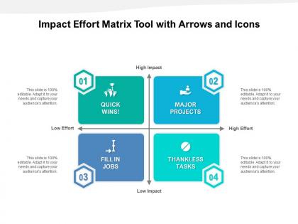
So basically the Impact Effort Matrix stops you from wasting time on stuff that seems important but actually just eats up all your resources. You map out your projects by how much impact they'll have vs how much work they need - makes it way easier to see what to prioritize. Honestly, there's something really satisfying about getting it all laid out visually! It forces your team to actually talk about trade-offs instead of just saying "everything's important." Focus on those high-impact, low-effort wins first - they're like finding money in your couch cushions. Just start by listing what you're working on and rate each thing 1-5 for both impact and effort.
So basically you plot everything on a simple grid - impact vs effort. High impact, low effort stuff? Do that immediately. High impact but tons of work needs careful planning. Low impact, easy tasks are fine for downtime (though honestly, I sometimes skip these too). And low impact + high effort? Hard pass unless you're really bored. What's cool is everyone can see the logic behind your choices. No more arguing about priorities when it's right there visually. Your team gets why you're tackling X before Y, and it cuts down on those "why aren't we doing this instead" conversations.
Oh totally, it's a game-changer for agile teams. During sprint planning, just throw your user stories into those four quadrants - high/low impact vs high/low effort. We always do the whiteboard thing with sticky notes (weirdly addictive moving them around). Quick wins go straight into your next sprint while the high-effort, low-impact stuff gets buried in the backlog where it belongs. The tricky part? You'll need to redo this constantly since agile priorities change like every week. Actually works great in retros too - helps you figure out if what you shipped was actually worth the effort.
So for impact, think revenue potential, user count, and whether it actually moves the needle on your company's big goals. Cost/risk reduction matters too. Development time and technical complexity drive the effort side - plus any dependencies that'll slow you down. Honestly, I always add a gut check because spreadsheets lie sometimes. The trick is staying consistent with your scoring so you're not comparing random stuff. Start with simple 1-5 scales for each thing. You can get fancy later once everyone's used to it, but keep it basic at first or people get overwhelmed.
Just make a simple 2x2 grid - Impact on the Y-axis, Effort on X. Honestly, PowerPoint works fine for this stuff. Drop your projects as dots or sticky notes in each quadrant. The magic happens in that top-left corner (high impact, low effort) - those are your quick wins that'll get everyone nodding. Color-code the dots by priority or whatever makes sense. Don't go crazy cramming everything in there. People should glance at it and immediately know which projects to tackle first. I've seen way too many of these that are just... overwhelming.
Don't rush through the scoring - that's where most teams mess up. You'll get random ratings all over the place if people haven't agreed on what "high impact" actually means first. And honestly? Once you're done, don't get too hung up on whether something belongs in medium vs high effort. Those lines are pretty blurry anyway. I've watched teams waste 20 minutes debating tiny movements when they could've been making real decisions. The whole point is having those trade-off conversations with your team. Use it to talk through priorities, but don't let it become some sacred document that controls everything you do.
So basically you plot projects on a grid - impact vs effort required. Quick wins are high impact but low effort, so tackle those first obviously. The high impact, high effort stuff? Worth investing in if you've got the resources. Everything else with low impact should probably just get cut, honestly. I've found it's super helpful for actually saying no to pointless busywork that feels productive but doesn't really accomplish anything. Try it next planning meeting - you'll be surprised how clear it makes things when you see everything mapped out like that.
Miro and Figma are solid for real-time collaboration - your whole team can jump in and move stuff around. Google Sheets works too if you want something dead simple. ProductPlan's pretty nice for the drag-and-drop thing, plus it connects to other project tools. Honestly though? Pick whatever your team won't abandon after a week. I've seen so many fancy setups that just collect digital dust. Start with what you've already got access to first.
The Impact Effort Matrix works because everyone gets to argue about priorities using the same visual framework. People start debating why something belongs in "high impact, low effort" instead of having those endless abstract conversations about what matters most. Stakeholders actually buy into decisions since they helped build the thing rather than just getting told what to do. Makes resource talks way more concrete too. I'd definitely run a live session where people move sticky notes around on the wall - sounds cheesy but they'll leave feeling heard and actually aligned. Way better than death by PowerPoint, honestly.
So basically, Eisenhower Matrix is all about urgency vs importance - perfect for daily stuff and figuring out what fires to put out first. Impact Effort Matrix? That's more strategic. It weighs project value against how much work you'll actually need to put in. Honestly, I use Eisenhower for my everyday to-do chaos, but Impact Effort is clutch when you're deciding which big initiatives are worth your team's time over months. Like, do we tackle the website redesign or the new feature rollout first? Different tools for different headaches, you know? One's tactical, the other's more big-picture planning.
Product teams love these matrices since they're drowning in feature requests constantly. Works well for marketing campaigns and IT stuff too - basically anything where you're comparing potential results to the work involved. I've seen it used everywhere, even in hospitals which was kinda surprising. Just make sure you can actually estimate both sides beforehand. Plot your current backlog first. You'll probably spot some easy wins you missed and realize which projects are total resource drains. Those low-impact, high-effort ones? Yeah, those can wait.
Update it every 2-4 weeks, honestly. Things change fast - your "easy wins" might suddenly need way more resources, or something you thought was impossible becomes totally doable. I learned this the hard way by clinging to an outdated matrix for months (oops). Market shifts happen, stakeholders change their minds, budgets get slashed. Sprint reviews work great for this, or just set a monthly reminder. That random idea sitting in your "someday" pile? Could be next week's top priority. Don't get precious about moving stuff around - it's supposed to be flexible.
Dude, you definitely need your whole team for this - doing it alone is basically pointless. Different people spot different things when rating impact and effort, so you get way better data. Plus people actually follow through on stuff they helped decide on, weird how that works. Short sentences work. The group discussion usually uncovers dependencies or easy wins that you'd totally miss otherwise. I'd run it like a workshop where everyone can argue about where things should go until you all agree. Gets messy but worth it.
So basically, grab an Impact Effort Matrix and plot your risks by damage potential vs how tough they'd be to fix. Those high-impact, low-effort ones? Hit those first - they're your quick wins. Honestly, half the time it's stuff everyone already knows needs fixing but just... doesn't. The high-impact, high-effort risks need way more planning and resources, obviously. But seriously, start with the easy stuff. You'll drop your project's vulnerability pretty fast, and it feels good to actually cross things off the list for once.
Make your matrix tell a story - explain what "high impact" actually means for YOUR project, not some vague business jargon. Go through each section systematically. Honestly, people get most excited about those quick wins (high impact, low effort), so spend extra time there. Have real examples ready instead of just theoretical stuff. I'd probably throw in a small story or two if you can. Finish strong with 2-3 concrete next steps from your quick wins section. Stakeholders love leaving meetings with actual things they can picture happening next week.
No Reviews