


Incident Reporting Dashboard Snapshot Vulnerability Administration At Workplace




Try Before you Buy Download Free Sample Product
 Impress Your
 Audience
 100%
100% Editable
 Save Hours
 of Time


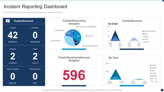
The firm will track the various incidents issues faced and resolved in the firm.
People who downloaded this PowerPoint presentation also viewed the following :
Incident Reporting Dashboard Snapshot Vulnerability Administration At Workplace with all 7 slides:
Use our Incident Reporting Dashboard Snapshot Vulnerability Administration At Workplace to effectively help you save your valuable time. They are readymade to fit into any presentation structure.





FAQs for Incident Reporting Dashboard Snapshot Vulnerability
Track your incident volume first - total counts and trends over time. Severity breakdown matters too (critical vs minor stuff). Response times are huge: detection speed, how long until resolution, escalation rates. Don't forget impact metrics like affected users and downtime costs. Honestly, repeat incidents will make you want to pull your hair out, so definitely monitor those. SLA compliance rates are pretty standard to include. Basic categorization by type helps too. Just don't go overboard with metrics - people's eyes glaze over when there's too much data. Start simple, then add more granular tracking once your team gets the hang of it.
Dude, real-time data integration is what separates useful dashboards from those fancy-looking reports that are basically useless by the time you look at them. Your incidents automatically flow in as they happen, so you can actually spot patterns and catch stuff before it gets really messy. Honestly, the difference in response times is crazy good. Set up automated feeds from your monitoring tools and whatever ticketing system you're using - saves you from constantly updating things manually. You'll notice trends way faster than if you were just looking at yesterday's numbers. Sometimes I wonder why more teams don't do this, but maybe they just haven't seen how much time it saves.
Start with visual hierarchy - clear status indicators and accessible color coding. Group related metrics so users can scan quickly. Put your most critical incidents at the top with super obvious severity levels. Honestly, I've seen way too many dashboards that look like someone just threw data everywhere! Make filtering and search functions prominent since people need to drill down fast during incidents. Oh, and definitely test it with actual users who'll be responding to incidents - they'll spot usability issues you'd never think of. Short sentences work. Longer ones with natural flow keep it readable.
So basically these dashboards just pull all your incident data and throw it into charts automatically - saves you from drowning in Excel hell. You can slice it by timeframe, severity, department, whatever. Super helpful for catching weird patterns like "why do we always crash on Fridays?" honestly probably because everyone's mentally checked out already. The visual stuff makes it way easier to show your boss that the new security training is actually working. Just set up some automated reports so you're not scrambling before every leadership meeting pulling the same numbers over and over.
Honestly, visualizations are game-changers for incident data. Raw spreadsheets just make everyone's eyes glaze over. Charts actually tell a story people can follow and act on. Heat maps are perfect for showing when things go sideways - way clearer than staring at timestamps all day. You've got to think about your audience though. Executives want the big picture stuff showing business impact. Technical folks need the nitty-gritty breakdowns. I always start by figuring out what decisions each group needs to make, then build visuals around that. Makes the whole process way more focused.
Look, these dashboards are literally a game-changer for compliance stuff. They auto-organize all your incident data exactly how regulators want it - no more digging through random spreadsheets when auditors show up (trust me, that's the worst). Everything gets timestamped and categorized for OSHA or whatever standards you need. Best part? You can spot trends that make you look super proactive to inspectors. I'd honestly set up automated reports ASAP so you're never scrambling. My old manager waited until the last minute once and... yeah, don't be that person. The audit trails alone are worth it.
Honestly, Grafana's your best bet here - it plays nice with pretty much everything and handles real-time feeds really well. Tableau and Power BI work too but they're more corporate-y. If you're doing IT stuff specifically, PagerDuty has dashboards built right in, which is convenient. Start by figuring out what metrics actually matter to whoever's gonna look at this thing. Then just connect it to your ticketing system and logs. I spent way too much time overthinking the tool choice on my last project when I should've just picked something and run with it. Prometheus pairs well with Grafana if you're already using it for monitoring.
Honestly, I'd start with a security audit of what you've got now - that'll show you the biggest holes to plug first. Role-based permissions are huge so only the right people see sensitive stuff. Encrypt everything (in transit and at rest, all that jazz). Compliance is a pain but necessary - GDPR, HIPAA, whatever applies to your field. Oh and audit trails! Super important for tracking who looked at what and when. I know it sounds like a lot of technical headache, but skipping this stuff will bite you later. The access controls alone will make a massive difference in your security posture.
So basically, ML algorithms are amazing at spotting patterns in your incident data that you'd totally miss doing it by hand. They'll crunch through historical trends, seasonal stuff, equipment failures - even outside factors - to predict where incidents might pop up next. The algorithms actually get better as they see more data, which is pretty neat. You can use those predictions to get ahead of problems - maybe schedule maintenance early or bump up safety protocols. Oh, and make sure you've got at least 6-12 months of clean data to feed them first, otherwise the results will be garbage.
Honestly? User adoption is gonna be your biggest nightmare. Staff hate reporting incidents - they think you're gonna blame them or it's just more busywork. Data quality sucks too because everyone describes the same thing totally differently, making analysis impossible. Integration with your current systems might be smooth or might make you want to scream, depends what you're working with. Oh, and you'll definitely underestimate training time. Start small with people who actually want to help and show some quick wins fast - builds momentum way better than forcing it on everyone.
So basically these dashboards show different people exactly what they need to know. Your executives see the big picture stuff - trends, risk patterns, strategic planning data. Middle managers can dig into departmental problems and figure out where to put resources. But honestly? Frontline supervisors get the most value - they see real-time alerts about safety issues they can actually fix right now. You'll want role-based access so people aren't getting buried in data that doesn't matter to them. Makes everyone way more effective when they're only seeing what's relevant to their job.
Honestly, start with real-time notifications and offline mode - those are non-negotiable. GPS tagging is clutch for location data, and voice-to-text saves so much time when you're rushing to file reports. Photo/video capture is obvious but worth mentioning. Push notifications actually get people's attention (unlike email, ugh). Your forms need to be customizable for different incident types, and everything should sync with desktop seamlessly. WiFi's always spotty when something goes wrong, so offline functionality isn't optional. I'd audit your current mobile setup first - see where users are bailing out of the process.
Feedback loops are seriously game-changing for incident dashboards. Users will tell you exactly what's broken or annoying - like when filters are impossible to find or pages take forever to load. I've watched dashboards go from completely ignored to actually useful just from fixing the stuff people complain about. Quick rating buttons work great, or just ask people directly what sucks about it. The workflow suggestions you get are usually things you'd never think of internally. Sometimes users hate features you thought were brilliant (happens more than you'd think). Set up regular feedback sessions to catch this stuff while it's still bothering them.
Skip the boring theory stuff and jump straight into hands-on practice. Have them work through actual scenarios they'll face - generic examples are pretty useless honestly. Make some quick cheat sheets they can grab when stuck, plus short videos for the basic tasks everyone does. Break it into small chunks that match what each person actually needs for their job. Oh, and pick a "dashboard person" in each team who can help when things go wrong. You'll probably want refresher training every few months since people forget the features they rarely use.
So basically you just tweak the data fields and workflows to fit whatever industry you're dealing with. Healthcare folks need patient safety stuff and HIPAA tracking - all that compliance headache material. Manufacturing is totally different though - they care about equipment breaking down and safety incidents that shut down production lines. Most platforms these days let you customize forms and set up automated routing without bugging IT (thank god). I'd start by figuring out what incidents actually matter for your specific field, then build everything around those key areas. The reporting templates are usually pretty flexible too.
-
Informative presentations that are easily editable.
-
It saves your time and decrease your efforts in half.