


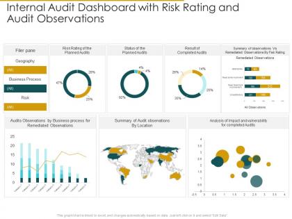
Internal audit dashboard with risk observations internal audit assess the effectiveness




Try Before you Buy Download Free Sample Product
 Impress Your
 Audience
 100%
100% Editable
 Save Hours
 of Time


Our Internal Audit Dashboard With Risk Observations Internal Audit Assess The Effectiveness are topically designed to provide an attractive backdrop to any subject. Use them to look like a presentation pro.
People who downloaded this PowerPoint presentation also viewed the following :
Internal audit dashboard with risk observations internal audit assess the effectiveness with all 2 slides:
Use our Internal Audit Dashboard With Risk Observations Internal Audit Assess The Effectiveness to effectively help you save your valuable time. They are readymade to fit into any presentation structure.
FAQs for Internal audit dashboard with risk observations internal audit
So for your audit dashboard, I'd start with completion rates - like how many audits you're finishing on time versus dragging past deadlines. Risk coverage is huge too - make sure you're actually hitting the scary stuff and not just easy wins. Quality metrics help, like satisfaction scores from stakeholders (though honestly, some people will never be happy). Oh and track repeat findings because that's embarrassing when the same issues keep surfacing. Resource stuff matters - are you burning through hours way faster than budgeted? Keep it visual with colors and charts so the executives don't have to think too hard. Start small with maybe 6-8 KPIs.
Honestly, charts and graphs are game-changers for audit dashboards. Instead of staring at endless spreadsheet rows, you'll spot trends and weird outliers right away. Heat maps are clutch for showing which departments have the most risk - way better than tables. Bar charts work great for comparisons. Line graphs show how things change over time. Those traffic light dashboard indicators are pretty useful too, though maybe a bit cheesy? But hey, they work. Don't overthink it at first - pick something simple and add more fancy stuff later once you get the hang of it.
Real-time data totally changes the game for audit dashboards. You'll catch issues as they're happening instead of weeks later when the damage is done. Critical risk areas absolutely need live updates - compliance violations, weird patterns, anything that screams "problem ahead." Though honestly, not everything has to be real-time (monthly stuff can wait). Your dashboard becomes something people actually trust when they know the info is current, not some dusty report from last month. I'd start with your riskiest processes first and build from there.
Honestly, these dashboards are a total game-changer for seeing what's actually happening with your risks in real time. No more digging through endless spreadsheets (thank god). You'll spot problems early, figure out where to focus your team's energy, and track how well fixes are working across departments. The best part? Everything's in one place instead of scattered everywhere. I'd start by asking your leadership what decisions they're making most often - then build around that. Way more useful than some generic template approach.
Put your biggest metrics right up top - completion rates, critical findings, overdue stuff. Users need to see that immediately. Group similar things together and stick with standard colors (red for oh-shit moments, yellow for watch-this). Don't cram everything together though - white space actually makes things readable. Your filters should be where people naturally look for them, not buried somewhere random. Honestly, just test it with real users first. They'll spot the annoying stuff you totally missed and save you from looking dumb later.
Get feedback constantly, not just when you're done. Start by talking to users about what they actually need - seriously, I've watched so many beautiful dashboards collect dust because nobody asked what people wanted to see. Mock up some wireframes first and let them react before you build anything real. Once it's working, keep checking in regularly. Maybe do quarterly reviews or something so the thing actually evolves with their changing priorities. The key is making sure it fits into their daily workflow, otherwise you'll end up with another fancy tool that sits unused.
Honestly? Data quality issues will be your biggest headache. Plus getting everyone on board is brutal - your audit team hates change, executives want to see immediate ROI, and your data sources are probably a disaster. Start with a small pilot dashboard, maybe 3-4 metrics that leadership actually cares about. Clean up your data first (I can't stress this enough), bring end users into the design early, and celebrate those quick wins. Oh, and get executive buy-in from the start. Without someone important backing you, it's like trying to push a boulder uphill.
So AI and ML basically take all the tedious report-building off your plate and catch weird patterns you'd totally miss. The system just pulls everything automatically now. Real-time alerts pop up when something's off, plus it actually predicts where problems might happen next - which honestly blew my mind the first time I saw it working. You can click around and explore issues way faster too, run different scenarios instantly. Oh, and definitely start with just one process first. Don't try to automate everything at once or you'll go crazy.
So benchmarking is basically your reality check - are you actually doing well or just telling yourself that? Compare your audit cycle times, resolution rates, coverage stats against industry peers and your own past performance. Honestly, most teams think they're crushing it until they see the real numbers. Track both external benchmarks and internal trends over time on your dashboard. Just don't get caught up in feel-good metrics that don't actually mean anything. Pick comparisons that'll push you to take action, not stroke your ego.
Dude, dashboards are a game changer for getting your audit stuff across to people. Visual data just hits different - executives can actually see what's going on without sifting through boring spreadsheets. You'll want to show the big stuff: risk levels, where you are in the process, what needs fixing. Honestly, most people's eyes glaze over with traditional reports anyway. The trick is figuring out what each group actually wants to know first. Like, your CEO cares about different things than department heads, you know? Keep it simple but make sure trends show up over time. Trust me, once stakeholders can digest your findings quickly, they'll actually act on them. Way better than those massive reports nobody reads.
Honestly, go with Power BI or Tableau if you want something that'll actually impress the higher-ups. Excel works okay for basic stuff, but trust me - it becomes a nightmare once you're juggling multiple audit cycles. I've seen people try to make it work and... yikes. If you need real-time monitoring, check out ACL Analytics or IDEA since they're made specifically for audit work. They play nice with most ERP systems too. My advice? Start with whatever your company already pays for, then push for better tools once you can show the dashboard actually saves time and catches issues.
Track who's actually using it first - login frequency, which reports get clicked, that stuff. But honestly, usage stats don't mean much if people aren't acting on what they see. The real question is whether audit findings get resolved faster now. Are management responses better quality? I've watched so many beautiful dashboards just sit there collecting digital dust because they looked great but didn't change anything. Short sentences mixed with longer ones work better for readability. What matters is if your dashboard actually improves how audits work, not just the pretty charts.
Compliance stuff is basically your foundation - you can't skip it. Regulatory deadlines, control testing, remediation tracking... all that has to be there because auditors will ask for it. Pretty boring but necessary. The good news? You can still make it useful by adding metrics that actually help people make decisions. I'd start with mapping out what regulations you need to cover first. Then build around those requirements with operational data that your stakeholders care about. It's way less flexible than other dashboards, but you're not completely stuck with just compliance boxes to check.
Honestly, monthly is ideal but quarterly works for most places. Just don't let it sit there for like 6 months because then nobody trusts the data anymore - learned that the hard way at my last job. High-risk stuff that changes fast? Definitely monthly. Strategic items can wait for quarterly updates though. The real trick is just being consistent about it. Set a calendar reminder and actually stick to it, otherwise your dashboard becomes totally useless. Really depends on how quickly your risks change and what your team expects from you.
Honestly, just think about what each person actually needs to do their job. Executives want the big picture stuff - risk trends, compliance status. They're not gonna dig into details anyway. Audit committee needs the nitty-gritty findings and how fixes are progressing. Department heads? Show them risks that actually affect their teams with stuff they can act on. IT wants all the technical vulnerabilities and system issues. Set up role-based access so people only see what matters to them. I'd start by literally asking each group what decisions they're trying to make, then work backwards from there. Saves everyone from drowning in irrelevant data.
-
Great designs, Easily Editable.
-
Nice and innovative design.
-
Professional and unique presentations.