


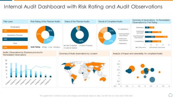
Internal audit dashboard overview of internal audit planning checklist


Try Before you Buy Download Free Sample Product
 Impress Your
 Audience
Editable
of Time


Our Internal Audit Dashboard Overview Of Internal Audit Planning Checklist are topically designed to provide an attractive backdrop to any subject. Use them to look like a presentation pro.
People who downloaded this PowerPoint presentation also viewed the following :
Internal audit dashboard overview of internal audit planning checklist with all 7 slides:
Use our Internal Audit Dashboard Overview Of Internal Audit Planning Checklist to effectively help you save your valuable time. They are readymade to fit into any presentation structure.


FAQs for Internal audit dashboard overview of internal
Focus on KPIs that show real impact - audit cycle time, percentage of high-risk findings, and how fast management actually closes your recommendations. Budget variance is clutch because executives eat that stuff up. Also track your audit coverage across business units and repeat findings (honestly, repeat findings are the best way to prove you're not just finding the same problems over and over). Real-time dashboard updates are ideal if you can swing it. Charts beat tables every time - nobody wants to stare at spreadsheets. Oh, and make sure it's visual enough that people will actually look at it during meetings.
Dude, visualizations are a game changer for audit dashboards. Instead of staring at endless spreadsheet rows (ugh), you'll spot trends and weird outliers instantly. Bar charts and heat maps make it super obvious which areas are sketchy versus doing fine. Plus your stakeholders will actually understand what you're showing them - half these people glaze over the second they see raw numbers. I'd start basic with trend lines for your main risk stuff. Honestly, anything beats scrolling through data hoping something jumps out at you.
Real-time data changes everything for audit dashboards. You'll catch problems as they happen instead of finding out weeks later through some dusty report. Anomalies, compliance gaps, control breakdowns - they all pop up immediately. Honestly, it's kind of addictive once you get used to it. Your team stops being the people who just document disasters and starts preventing them. Management actually gets current info for once, which makes their lives easier too. Oh, and definitely set up alerts for the critical stuff so you're not glued to your screen all day.
Honestly, I'd go with monthly updates for your internal audit dashboard. Quarterly can work too if that fits better with your cycle. Real-time data seems cool but audit stuff doesn't really change that fast anyway - you're not tracking stock prices here. Just pick whatever schedule you can actually maintain without stressing about it. Monthly gives you fresher info for board meetings and regulatory stuff. The main thing is staying consistent rather than being super ambitious and then falling behind later. You can always adjust if people start bugging you for updates more often.
Honestly, data integration is gonna be your biggest headache. All these different systems - audit tools, risk registers, random spreadsheets - they don't play nice together. Quality control becomes a mess fast. Figuring out which KPIs actually matter (versus ones that just look impressive) is tricky too. Plus you're stuck between making dashboards user-friendly but still comprehensive enough to be useful. Getting auditors on board can be like pulling teeth since they hate change. My take? Don't go crazy at first. Pick maybe 3-4 key metrics, get those rock solid, then build from there. Way less overwhelming that way.
Power BI and Tableau are your best bets - both handle audit data like champs. Excel works if you're just dipping your toes in, but you'll hit its limits pretty quick. Qlik Sense is decent too, especially for the drag-and-drop crowd. Now, if budget's not an issue, ACL Analytics and IDEA are built specifically for auditing (though they cost a fortune). Honestly? Just go with Power BI if you're already using Microsoft stuff. The integration alone will save you so many headaches down the road.
Look, an internal audit dashboard basically gives you a live view of what's going wrong (or could go wrong) in your company. No more crossing your fingers and hoping. You can track all your audit findings and see which risks are actually getting fixed vs. just sitting there. The cool part? It spots patterns you'd totally miss otherwise - like when three different departments keep screwing up the same process. I'd start by putting your worst 5 risk areas front and center on the main screen. That way you're not hunting through tons of data when something needs your attention ASAP.
For executives, go super clean and high-level. Traffic light indicators work great - red for high risk, green for done. Put your key metrics right at the top in cards they can scan fast. Interactive charts are clutch because they can hover for details without drowning in data. Progress bars show audit completion at a glance. Honestly, board meetings move so quick they need to get it in like 20 seconds max. Skip the endless tables - execs will just zone out. Stick to trend charts and major KPIs that tell the story of audit coverage and outstanding issues.
Honestly, dashboards are a total game-changer for audit stuff. You know how nobody reads those massive reports? Well, visual heat maps and trend charts actually get looked at. Management can scan risk levels in like 2 minutes instead of ignoring your 50-page document. I've seen teams track remediation progress way better this way - you can show real impact instead of just talking about it. The cool part is customizing views for different people. Board members get the high-level scary stuff, department heads see their operational details. Start with whatever metrics your leadership team obsesses over most.
Start with who you're talking to - execs want the big picture risks and trends, audit folks need all the nitty-gritty details. Management needs stuff they can actually do something about. Honestly, I've seen too many dashboards that look like someone threw up a box of crayons on them. Pick consistent colors and stick with them. Your most important info should be right there when they open it, not buried three scrolls down. Don't try to cram everything into one view - you'll just overwhelm people. Ask each group what decisions they're making first, then build what helps them decide.
So basically, create separate dashboard sections for all your compliance stuff - SOX, GDPR, whatever regulations hit your company. Set up alerts for filing deadlines and testing milestones. Color-coding is honestly a lifesaver for spotting problems fast. Pull data from the same systems your compliance team already uses so you're not dealing with conflicting numbers later. Track your control testing status, remediation work, and any violations in real time. Oh, and make sure it shows upcoming deadlines prominently - nothing worse than scrambling last minute because someone missed a date.
Start with your ERP and HR systems - those are goldmines. Financial data and compliance tools come next. Risk registers are where the real dirt lives, trust me on that one. IT security logs and vendor platforms matter too, but honestly? Don't try to connect everything at once or you'll go crazy. Pick maybe 3-4 sources that'll give you the biggest bang for your buck first. The magic happens when you can cross-reference operational stuff with financial patterns. Once those are running smooth, then add more data streams.
Honestly, dashboards are a game changer for this stuff. Instead of drowning in spreadsheets, you'll actually see patterns jump out at you - like weird expense spikes or departments going rogue on compliance. The visual setup does most of the work so you're not manually hunting through everything. Most have alert features too, which is clutch for catching things early. Oh, and definitely prioritize your biggest risk areas first when setting it up. Don't try to track everything at once or you'll just overwhelm yourself. Start with maybe 3-4 key things and build from there.
Focus on metrics that actually matter to your bosses first - audit completion rates, how fast findings get fixed, and satisfaction scores from the people you audit. Repeat findings are honestly my favorite to track because they show if anyone's actually listening to your recommendations or just ignoring them. Risk coverage percentage is solid too, plus how often you catch stuff before it blows up. Time from planning to final report and cost per finding round out the basics. Don't go crazy with like 15 metrics right away - pick 3-4 that'll make leadership pay attention, then build from there once you've got momentum.
Honestly, customization is a game-changer for audit dashboards. You can move widgets around and filter for what actually matters instead of scrolling through tons of useless stuff. Set up alerts for the critical issues you need to spot fast. Focus on your high-risk areas and those pesky recurring problems that keep popping up. Don't go crazy trying to customize everything though – I'd start with maybe 2-3 key views first. Trust me, you'll save so much time when you're scrambling to meet deadlines.
-
The content is very helpful from business point of view.
-
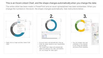
Easy to edit slides with easy to understand instructions.