


KPI Dashboard Highlighting Automation Results In Supply Chain Strengthening Process Improvement




Try Before you Buy Download Free Sample Product
 Impress Your
 Audience
 100%
100% Editable
 Save Hours
 of Time


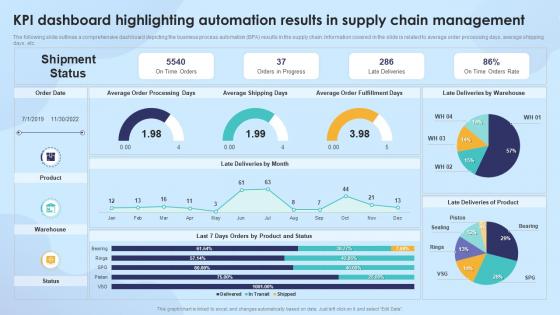
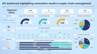
The following slide outlines a comprehensive dashboard depicting the business process automation BPA results in the supply chain. Information covered in the slide is related to average order processing days, average shipping days, etc.
People who downloaded this PowerPoint presentation also viewed the following :
KPI Dashboard Highlighting Automation Results In Supply Chain Strengthening Process Improvement with all 7 slides:
Use our KPI Dashboard Highlighting Automation Results In Supply Chain Strengthening Process Improvement to effectively help you save your valuable time. They are readymade to fit into any presentation structure.





FAQs for KPI Dashboard Highlighting Automation Results In Supply Chain
Here's what I've learned from building way too many dashboards: pick 5-7 metrics that actually matter to your goals. Don't cram everything in there - it's just overwhelming. Make sure the visuals are super clean so people can spot problems fast. Real-time data is nice, but honestly, hourly updates work fine for most stuff. The big test? Someone should look at it and know exactly what's wrong (or right) within 30 seconds. If they're squinting or asking "what does this mean," you've overcomplicated it. Keep it simple and actionable.
First thing - figure out what actually moves the needle for your business. Revenue? Customer happiness? Whatever it is, start there. Don't go crazy with metrics (I've seen dashboards that are basically unreadable). Stick to maybe 5-7 KPIs that actually connect to your big picture goals. Your CEO needs different info than your team leads, so think about who's looking at this stuff. Only track things that'll actually change how you make decisions - otherwise you're just collecting data for no reason. Keep it simple and make sure the numbers are fresh and reliable.
Gauge charts and progress bars are perfect for showing how you're hitting targets. Line charts work great for trends, obviously. Big bold numbers for your most important stuff - people love those. Bar charts handle comparisons really well across different categories or time periods. Sparklines are honestly amazing and nobody uses them enough - they're these tiny trend lines that don't take up much room but tell you everything. Heat maps are solid too if you've got performance data across multiple areas. Just pick whatever makes sense for how people actually look at data. Don't make them think too hard about what they're seeing.
Honestly? At least monthly, but it really depends on what you're tracking. Sales moving fast? Weekly makes way more sense. Long-term strategic stuff can probably wait until quarterly - though I've seen people forget about those completely lol. The worst thing is letting it sit there for months because then everyone stops trusting the numbers. Pick whatever matches how often you actually make decisions and stick with it. Consistency beats perfection here. Set a calendar reminder or you'll definitely forget (speaking from experience).
Honestly, if stakeholders don't buy into your dashboard, it'll just sit there unused. Talk to them first - figure out what numbers they actually care about and how they like seeing data. Some execs want high-level stuff, others need all the nitty-gritty details. Interview people early to understand their daily workflows and what's frustrating them. Then get them involved with mockups so they feel heard (plus you avoid building the wrong thing). I'd start by listing your user groups and setting up interviews ASAP. Oh, and don't make it too pretty at first - functionality beats aesthetics every time.
Three things will save you: source validation, regular audits, and clear ownership. Make sure you're pulling from reliable, single sources - duplicated data is a nightmare. Set up automated checks for anomalies before they hit your dashboard. Trust me, wrong sales numbers for a month taught me this lesson! Someone needs to own each KPI's pipeline, otherwise accountability goes out the window. I'd run monthly spot checks comparing dashboard vs source systems. Document any weird stuff you find so you can actually fix what's broken instead of just patching it.
Don't cram everything onto one screen - learned that the hard way! Focus on maybe 5-7 metrics that actually matter for decisions, not just vanity numbers that look cool. I've seen way too many dashboards that are basically rainbow vomit - pretty but totally unreadable. Clarity beats fancy design every time. Your data needs to update often enough to be useful, and definitely test with real users first. Oh, and label everything clearly so people know what they're looking at. For each metric, ask yourself "okay, so what do I do with this info?"
Honestly, the biggest win is that everyone's looking at the same numbers instead of arguing over who has the "right" data. No more outdated spreadsheets floating around! Teams can actually see how their stuff connects to the big picture, which is pretty cool when it clicks. You'll catch problems early and spot trends way faster than before. My old boss used to say it's like finally having a scoreboard that makes sense - cheesy but true. Just don't fall into the trap of tracking metrics that sound impressive but don't actually matter. Focus on what moves the needle.
Honestly, it comes down to your budget and how tech-savvy you are. Power BI and Tableau are great if you've got existing data systems - they handle complex stuff well and look professional. Google Data Studio's free and surprisingly solid for smaller datasets. I've actually seen people build pretty impressive dashboards with basic tools too, which always surprises me. Excel or Google Sheets work fine if you just need to track a few key metrics quickly. My advice? Start with whatever you already have access to first. See if it does what you need before dropping money on expensive software.
Look, figure out what metrics your audience actually uses to make decisions first. That's your starting point. Don't try to shove everything onto one screen - I've seen some truly horrific dashboards that way. Show the big KPIs right up front, then let people click through for details if they want more. Group similar stuff together and make the important bits stand out visually. Honestly, the goal is pretty simple: someone should get the main idea in about 10 seconds, but they can dig deeper if something looks off or interesting.
Yeah absolutely! You can set up different views for each department - it's honestly a game changer. Sales will want their conversion rates and pipeline stuff, HR cares about turnover and employee happiness metrics. Marketing's always obsessing over traffic numbers and lead generation (surprise surprise). Most tools let you control who sees what data through permissions. Then you can mess with layouts, chart types, colors - whatever works for each team. I'd start by just asking each department what 3-5 numbers they actually look at every day. Way easier than guessing what they need.
Look, start with the basics that actually matter for survival - MRR, customer acquisition cost, and lifetime value. Those three will tell you if you're building something sustainable. Burn rate and runway are obviously crucial too (nobody wants to run out of cash). I'd throw in active users and churn rate because knowing if people stick around is huge. Honestly, resist the urge to track everything under the sun. I've seen dashboards so cluttered they're basically useless. Pick maybe 6 metrics max and get really good at understanding those first. You can always add more weird vanity metrics later once you've nailed the fundamentals.
Dude, mobile accessibility is a game changer for dashboards. Your team can pull up metrics from anywhere instead of being stuck at their computers. I'm obsessed with checking our revenue numbers on my phone now - way more than I probably should be lol. Decision-making gets so much faster when people can review data during meetings or when they're out of office. One thing though - test it on actual phones first, not just your laptop browser made smaller. That's where most companies screw up. Make sure it loads fast and actually works on different devices before everyone starts using it.
Honestly, dashboards just make everything visible so people can't BS their way through meetings anymore. When your numbers are up there for everyone to see, you'll naturally own your stuff - nobody wants to be the only red metric on the board. Plus it cuts through all the "we're making progress" nonsense. Clear expectations, data-driven conversations instead of blame games. Problems get spotted faster too. My advice? Start small with maybe 3-4 metrics that actually move the needle. Don't go crazy with like 20 different charts - that's just overwhelming.
Honestly, just check if people actually use the damn thing. Track login frequency and time spent browsing around. But here's what really matters - are your teams saying "the data shows X" instead of "I think maybe Y"? Survey users about whether they're catching problems faster or spotting opportunities they'd have missed. Beautiful dashboards mean nothing if they collect digital dust after week one (seen it happen way too many times). Set up monthly check-ins to see if your KPIs are actually moving. That's the real test - whether performance conversations shift from gut feelings to hard numbers.
-
SlideTeam offers so many variations of designs and topics. It’s unbelievable! Easy to create such stunning presentations now.
-
Stunning collection! With a wide variety of options available, I was able to find a perfect slide for my presentation. Thank you, SlideTeam!