


Kpi Dashboard For Tracking Supply Chain Costs Industry Report For Food Manufacturing Sector




Try Before you Buy Download Free Sample Product
 Impress Your
 Audience
 100%
100% Editable
 Save Hours
 of Time


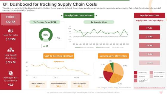
This slide represents the KPI Dashboard to track the Multiple Cost Associated with Supply Chain in Food Manufacturing Industry. It includes information regarding Cash to Cash Cycle in days, Carry Cost of Inventory along with details of Net Sales.
People who downloaded this PowerPoint presentation also viewed the following :
Kpi Dashboard For Tracking Supply Chain Costs Industry Report For Food Manufacturing Sector with all 7 slides:
Use our Kpi Dashboard For Tracking Supply Chain Costs Industry Report For Food Manufacturing Sector to effectively help you save your valuable time. They are readymade to fit into any presentation structure.





FAQs for Kpi Dashboard For Tracking Supply Chain Costs Industry Report For
Effective KPI dashboards include real-time data visualization, customizable metrics aligned with business objectives, trend analysis capabilities, drill-down functionality, and automated alerts for threshold breaches. These components streamline decision-making by delivering instant performance insights, enabling stakeholders to identify bottlenecks quickly, and ultimately enhancing operational efficiency across departments while maintaining strategic focus on organizational goals.
Organizations ensure KPI alignment with strategic goals by establishing clear objective hierarchies, conducting regular strategic reviews, and implementing cascading measurement frameworks that connect departmental metrics to overarching business outcomes. Through systematic goal-setting processes, companies can create accountability structures, track progress across multiple organizational levels, and adjust metrics based on evolving priorities, ultimately delivering enhanced strategic focus and measurable competitive advantage.
KPI dashboard best practices include using clear visual hierarchies, selecting appropriate chart types, maintaining consistent color schemes, implementing real-time data updates, and ensuring mobile responsiveness. These approaches streamline decision-making by reducing cognitive load, enhancing data comprehension, and enabling quick identification of trends, with many organizations finding that well-designed dashboards ultimately deliver faster response times and improved operational efficiency.
KPI dashboards should be updated based on data velocity and business needs, with real-time updates for operational metrics, daily refreshes for sales performance, weekly updates for project tracking, and monthly or quarterly reviews for strategic indicators. Financial services and retail organizations typically require more frequent updates than manufacturing, with many companies finding that automated refresh schedules enhance decision-making speed while reducing manual oversight.
**INPUT**: What tools and software are recommended for creating interactive KPI dashboards? **OUTPUT**: Recommended tools for interactive KPI dashboards include Tableau, Power BI, Qlik Sense, Google Data Studio, and Grafana, each offering distinct visualization capabilities and integration options. These platforms streamline data analysis by enabling real-time monitoring, customizable reporting, and seamless connectivity across systems, with many organizations finding that strategic dashboard implementation enhances decision-making speed and operational transparency. **Word count: 56 words**
Stakeholders can effectively interpret KPI dashboard data by focusing on trend patterns rather than isolated metrics, understanding contextual benchmarks, and identifying actionable correlations between different performance indicators. Regular training sessions and clear visualization standards help teams across departments, from sales to operations, quickly translate dashboard insights into strategic decisions, ultimately enabling faster response times and more informed resource allocation in competitive business environments.
Real-time data transforms KPI dashboards from static reports into dynamic decision-making tools by providing immediate visibility into performance metrics, enabling instant anomaly detection, and facilitating rapid response to changing business conditions. Through continuous data streaming, organizations across sectors like retail, manufacturing, and financial services can identify trends as they emerge, minimize response delays, and maintain competitive advantage in increasingly fast-paced markets.
KPIs can be categorized by business function (sales, marketing, operations), performance type (leading vs. lagging indicators), strategic levels (operational, tactical, strategic), and time horizons. This strategic categorization enhances dashboard clarity by enabling users to quickly locate relevant metrics, compare related performance indicators, and focus on specific business areas, ultimately streamlining decision-making processes across organizations.
Common KPI dashboard design mistakes include overcrowding with excessive metrics, using inappropriate visualizations, lacking clear data hierarchies, ignoring mobile responsiveness, and failing to align metrics with business objectives. These design flaws significantly reduce dashboard effectiveness by overwhelming users, obscuring critical insights, and hampering decision-making processes, with many organizations finding that simplified, purpose-driven dashboards ultimately deliver better strategic outcomes.
Organizations ensure user-friendly KPI dashboards through intuitive design, clear visualizations, customizable layouts, role-based access controls, and responsive interfaces that work across devices. These approaches streamline decision-making by reducing cognitive load, enabling quick data interpretation, and providing relevant metrics to each user, with many companies finding that well-designed dashboards significantly enhance operational efficiency and strategic alignment.
Sales performance KPI dashboards should include revenue growth, conversion rates, average deal size, sales cycle length, and lead-to-customer ratios. These metrics enable sales teams to identify bottlenecks, optimize pipeline management, and accelerate deal closure, with many organizations finding that tracking these comprehensive indicators ultimately delivers improved forecasting accuracy and enhanced competitive advantage.
A KPI dashboard drives accountability by providing real-time visibility into individual and team performance metrics, establishing clear ownership of outcomes, and creating transparency around progress toward goals. Through automated tracking and regular performance reviews, teams can identify gaps quickly, address issues proactively, and maintain focus on strategic objectives, ultimately fostering a culture of continuous improvement and measurable results.
KPI dashboard success depends on relevant metric selection, real-time data accuracy, intuitive visual design, stakeholder alignment, and actionable insights generation. These factors work together by ensuring decision-makers access timely information, understand performance trends quickly, and identify improvement opportunities, with many organizations finding that well-designed dashboards accelerate response times and enhance strategic outcomes.
Cultural differences significantly impact KPI dashboard design through varying data interpretation preferences, communication styles, hierarchy expectations, and decision-making processes across regions. Global organizations find that while Western cultures often prefer direct metrics and individual performance tracking, Asian markets may emphasize collective achievements and contextual storytelling, ultimately requiring localized dashboard approaches that respect cultural nuances while maintaining strategic alignment.
KPI dashboard customization techniques include role-based access controls, personalized widget arrangements, departmental data filtering, customizable visualization types, and adaptive permission settings. These approaches enable organizations to deliver targeted insights by restricting sensitive information, highlighting relevant metrics for each role, and streamlining decision-making processes, with many companies finding that tailored dashboards significantly enhance user engagement and operational efficiency.
-
Thanks for all your great templates they have saved me lots of time and accelerate my presentations. Great product, keep them up!
-
Great quality slides in rapid time.