


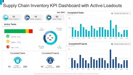
Supply chain inventory kpi dashboard with active loadouts




Try Before you Buy Download Free Sample Product
 Impress Your
 Audience
 100%
100% Editable
 Save Hours
 of Time


Our Supply Chain Inventory KPI Dashboard With Active Loadouts are topically designed to provide an attractive backdrop to any subject. Use them to look like a presentation pro.
People who downloaded this PowerPoint presentation also viewed the following :
Supply chain inventory kpi dashboard with active loadouts with all 2 slides:
Use our Supply Chain Inventory KPI Dashboard With Active Loadouts to effectively help you save your valuable time. They are readymade to fit into any presentation structure.
FAQs for Supply chain inventory kpi dashboard
Look, there's basically four buckets you need to cover. Operational stuff first - on-time delivery, order fill rates, inventory turnover. That shows if things are actually moving smoothly. Cost metrics matter too, like total logistics costs per shipment. Quality's huge - defect rates and supplier quality scores will save your butt later. Supplier performance is the last piece - lead times, reliability scores, all that. Honestly, I'd cap it at maybe 8-10 KPIs max because nobody wants to stare at a dashboard that looks like mission control. Keep it simple.
First thing - figure out what you actually care about, then pick metrics that match. Customer happiness? Track delivery times and order accuracy, not just costs. Honestly, there's no magic formula here since every business is different. Growing fast? Focus on supplier diversity and how much capacity you're using. Cutting costs? Watch inventory turnover and shipping expenses instead. I'd stick to maybe 5-7 KPIs max that actually move the needle on your goals. Oh, and don't forget to check if they're still useful every few months - priorities shift.
Dude, real-time data is a game changer for supply chain dashboards. You're not stuck looking at last week's numbers anymore - you can catch problems while they're actually happening. Delayed shipment? Inventory running low? You'll know right away instead of finding out when it's too late. Honestly, I learned this the hard way at my last job. Short sentences work better here. You can fix bottlenecks before they mess up customer orders, which saves you so much headache later. Trust me, get those real-time feeds set up because playing catch-up with old data just burns money.
Check your dashboard for the usual suspects - cycle times, inventory levels, throughput at each stage. Inventory piling up somewhere? That's probably your bottleneck right there. Lead times suddenly jumping? Same deal. Way easier than staring at endless spreadsheets (honestly hate doing that). Look at order fulfillment times, how your suppliers are performing, warehouse processing speeds. Set alerts so you get pinged when things go sideways - beats finding out about problems three days later when everything's already a mess downstream.
Stick with simple charts that executives can actually read fast. Line charts are your best friend for tracking stuff like delivery times over months. Gauges work perfectly when you're measuring against targets - fill rates, cost savings, whatever. Bar charts? Great for comparing suppliers or different regions side by side. Honestly, don't get tempted by those flashy visualizations that look impressive but make zero sense. I've seen too many presentations crash because someone thought a 3D pie chart was "innovative." Keep colors consistent and remember - if your boss can't understand it in 30 seconds during Monday's meeting, you've lost them.
Honestly, I'd start with just demand forecasting - don't try to do everything at once. Add those predictive models right into your existing dashboard so you're seeing current metrics alongside what's coming down the pipe. The really useful part is setting up alerts when things get sketchy, like when you're about to run out of inventory in 10 days. Historical data patterns help predict demand spikes and delivery delays pretty well. Once your team gets the hang of reading these forecasts (and actually trusts them), then you can layer on more predictive stuff. It's way less overwhelming that way.
Look, figure out what's actually breaking your business first. Inventory bleeding money? Track turnover rates, not some random vanity metric. Keep your dashboard to 5-7 KPIs max - I've seen too many people cram 15 things on there and nobody looks at it. Mix some predictive stuff (supplier lead times) with results-focused metrics (perfect order rate). Make sure your teams can actually do something about what you're measuring. Oh, and here's the real test - if seeing that number won't spark a conversation or change how someone works, just cut it. Seriously.
Honestly, resist the urge to cram every single metric onto one screen - it just overwhelms people. Focus on the KPIs that actually matter for decisions, not the ones that make executives feel important. Mix timeframes without labels and you'll confuse everyone (learned that one the hard way). Keep fonts readable and visuals clean. Nobody wants to squint at their dashboard. Your data needs to refresh often enough to be useful - otherwise you've got expensive wallpaper. Start with maybe 5-7 key metrics, then add more based on what users actually want.
Honestly, these dashboards are pretty clutch - you get real-time data instead of waiting around for those monthly reports that are already outdated. All your delivery times, inventory levels, supplier stuff actually lives in one place rather than scattered across random spreadsheets (which is such a pain). You can catch issues before they turn into disasters. Plus you're making decisions based on actual data instead of just winging it. The trick is starting small though. Pick like 5-7 metrics that hit your biggest headaches and build from there.
Honestly, Power BI is probably your best bet if you're already using Microsoft stuff - way easier to learn than the others. Tableau and Qlik Sense are solid too, but they can be overkill depending on your setup. Don't sleep on Excel though, it's still decent for basic dashboards. The cool thing about these tools is they'll automatically pull from your ERP and warehouse systems, so you won't be stuck doing manual updates all the time (thank god). My buddy swears by Tableau but I think it's unnecessarily complicated. Just grab some free trials and see what doesn't make you want to throw your laptop.
Yeah, your industry totally dictates what metrics actually matter. Pharma companies are obsessed with temperature tracking and expiration dates - makes sense since the FDA can basically end you. Manufacturing? They're all about OEE and defect rates. Retail lives or dies by inventory turnover and stockouts. Food companies watch cold chain stuff like crazy because one contamination issue and you're done. Honestly, most dashboards I see are just filled with vanity metrics that look impressive but don't actually help. You want the numbers that'll give you a heads up before things go sideways.
So for your supplier dashboard, definitely start with the basics - quality rates, on-time delivery, and lead times. Those three will tell you most of what you need to know. Cost variance matters too since nobody likes surprise price hikes. Oh, and response time is huge - trust me, you'll appreciate suppliers who actually pick up the phone when things go sideways. Maybe add communication scores if you're feeling ambitious. Honestly though? Don't go crazy with like 15 metrics right off the bat. Pick 4-5 tops and see how it goes.
Start with automated validation rules that catch bad data before it reaches your dashboards. Cross-check your numbers against source systems regularly - can't tell you how many times I've seen executives freak out over metrics that were just plain wrong. Assign someone to own each data point so there's accountability. Build audit trails so you can trace where calculations come from. Train your team to actually look at the numbers with a critical eye. Short version: garbage in, garbage out, and spot-checking saves everyone's sanity when something looks weird.
Honestly, user feedback is what makes or breaks your dashboard. Skip it and you'll build something gorgeous that sits there collecting digital dust. Your team knows which metrics actually drive their decisions and which charts make zero sense. Plus they're the ones who'll catch data problems you'd never notice from the tech side. Business priorities change constantly (learned this the hard way), so what mattered six months ago might be useless now. Don't just ask for input once and call it done. Monthly check-ins work great, or better yet - add feedback buttons right in the dashboard so people can complain immediately when something's off.
Look, these dashboards basically force everyone to look at the same numbers instead of having sales and procurement arguing over completely different data. Everyone sees the same inventory levels and delivery times in real time. When demand spikes, your procurement team can actually react before you're in crisis mode - which honestly saves so much stress. The key is getting departments to meet regularly and review the dashboard together. Otherwise people just ignore it. Short bursts work better than long meetings nobody wants to attend. It's amazing how many "urgent" issues disappear when everyone's working off identical information.
-
Innovative and Colorful designs.
-
Easily Understandable slides.
-
Awesomely designed templates, Easy to understand.
-
Presentation Design is very nice, good work with the content as well.
-
Out of the box and creative design.