

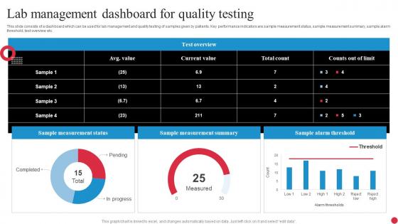
Lab Management Dashboard For Quality Testing




Try Before you Buy Download Free Sample Product
 Impress Your
 Audience
 100%
100% Editable
 Save Hours
 of Time


This slide consists of a dashboard which can be used for lab management and quality testing of samples given by patients. Key performance indicators are sample measurement status, sample measurement summary, sample alarm threshold, test overview etc.
People who downloaded this PowerPoint presentation also viewed the following :
Lab Management Dashboard For Quality Testing with all 7 slides:
Use our Lab Management Dashboard For Quality Testing to effectively help you save your valuable time. They are readymade to fit into any presentation structure.





FAQs for Lab Management Dashboard
Focus on the basics first - sample throughput, turnaround times, and how much your equipment's actually being used. Quality stuff matters too: error rates, how often you're retesting samples, calibration compliance. Staff productivity and inventory levels are solid for planning ahead. Honestly, inventory's such a headache unless you've got good automation. Cost per test and budget variance cover the financial side. Pick maybe 6-8 metrics max that actually help you make decisions - don't just throw everything on a dashboard. Start with whatever your boss keeps asking about, then add from there. Way easier than trying to track everything at once.
Think of it like having a mission control center for your lab. Instead of running around checking different systems, everything's right there - sample backlogs, which equipment is down, who's swamped with work. You can spot problems before they spiral out of control. Honestly, it's a game changer for figuring out where your bottlenecks actually are instead of just guessing. When something's moving slow, you'll know exactly why and can jump on it. Makes resource planning way less of a headache too.
Trend lines and heat maps are your best friends here - super easy to spot patterns and track stuff over time. Bar charts work well when you're comparing different labs. Gauges are actually pretty solid for real-time capacity or compliance rates (I know they seem cheesy but they work). Honestly, I used to go overboard with complicated visualizations but simple wins every time. People need to glance and get it instantly. Don't do pie charts with more than 3-4 slices - they turn into a mess. Start with your biggest KPIs first. Stick to consistent colors too - red for problems, green for good stuff. Pretty straightforward once you get the hang of it.
Dude, real-time data is a game changer because you catch stuff while you can still fix it. Equipment utilization tanks? You'll see it happening live instead of finding out next week when damage is done. Same with processing delays - your dashboard shows spikes immediately so you can shuffle resources or check what's broken. Honestly, those weekly reports are pretty useless when problems need fixing NOW. Set up alerts for your biggest pain points though, otherwise you're just staring at numbers all day. Way better than playing catch-up constantly.
So user access control is basically your security backbone - decides who sees what data and can do what actions. I'd map out everyone's actual job responsibilities first, then build permission levels around that. Lab techs should only access their experiments, while managers get the full operational view. Yeah, it's a total headache to set up initially but trust me, it's worth it. Without it you're looking at data breaches, people accidentally deleting stuff, or worse - someone messing with critical workflows they have no business touching. Role-based permissions are your friend here.
Dude, you'll love having a lab dashboard - it puts all your compliance stuff in one spot so you're not digging through random spreadsheets when auditors walk in. Track equipment calibrations, training certs, documentation deadlines, all that fun stuff. Way better than doing it manually, trust me. The alerts are clutch too - set them up before deadlines so your team doesn't scramble last minute for renewals and tests. Oh, and definitely get your main KPIs on the home screen first thing. Makes such a difference.
Dude, getting your lab instruments connected to a dashboard is honestly pretty sweet. You'll see everything happening in real-time - instrument status, sample throughput, the works. Catches problems before they blow up too. Less downtime, better resource planning, and your team won't waste time physically checking every piece of equipment. It's weirdly satisfying seeing all your data in one spot. Plus people can actually prioritize their work when they're not flying blind. I'd probably start with whatever instruments are most critical to your workflows first - don't try to do everything at once.
Honestly, a lab dashboard is a game changer for coordination. You'll see who's using what equipment and when stuff's free - no more awkward "are you done yet?" conversations by the centrifuge. Real-time updates help everyone plan sample handoffs better and share resources without stepping on toes. The trick is getting your team to actually log everything consistently (good luck with that). Once they do though, you can spot bottlenecks before they become disasters and help people out before they're drowning. Everything stays in one place so less gets missed or miscommunicated.
Honestly, the biggest pain is gonna be your team clinging to their precious Excel sheets - good luck prying those away! Data integration is always a nightmare too since nothing talks to each other properly. Your LIMS hates your inventory system, instruments speak different languages, the usual mess. Oh, and you'll waste time tracking fancy metrics that look cool but don't actually help anyone. My advice? Pick one workflow that's driving everyone crazy and fix that first. Once people see it actually works, they'll stop being so resistant to change.
So predictive analytics in your lab dashboard is pretty solid for forecasting equipment failures and sample processing times. Start with equipment monitoring first - seriously, there's nothing worse than your main analyzer crashing during a busy day (learned that one the hard way). The system looks at historical data to predict when machines need maintenance and estimate turnaround times for different tests. It'll even help you figure out staffing needs during crazy periods. Equipment monitoring gives you the best bang for your buck upfront, then you can expand from there.
Start with LIMS integration - that's your foundation for tracking samples and managing data. Instrument interfaces should be next so your analyzers dump data automatically instead of someone typing everything in manually. Honestly such a game changer for reducing mistakes. ERP integration handles your inventory and supply ordering. You'll need quality management software too, especially if you're dealing with regulatory stuff. Oh and calendar systems for scheduling equipment/staff. Really depends what kind of lab you're running though. But yeah, LIMS plus instrument connectivity first - biggest bang for your buck on workflow improvements.
Yeah, most dashboards are pretty flexible these days. You can drag and drop widgets around, set up custom alerts, filter by department - whatever works for your setup. Clinical labs usually care about turnaround times and sample tracking, but research labs? They're more focused on experiment progress and how they're burning through resources. Makes sense though, totally different worlds. You'll want role-based permissions too so your techs aren't seeing the same stuff as managers. Honestly, I'd just figure out what 5 things annoy you most every day and build around fixing those first.
Put your most important stuff right up front - equipment status, alerts, sample queues. That's what they need to see first. Group similar things together and stick with consistent colors (red for problems, green for good). Don't try to squeeze everything onto one screen though, that's always a mistake. Make navigation dead simple so techs aren't clicking around forever trying to find stuff. Oh, and definitely test it with real users - I can't tell you how many times something seemed obvious to me but was totally confusing to everyone else. They're usually juggling like three experiments at once, so keep it clean.
So basically, a dashboard shows you what's actually happening with your budget vs what you planned. Track your equipment usage rates first - those expensive machines just sitting there will make you cry. Monitor how fast you're burning through supplies on different projects too. The data reveals patterns, like seasonal spikes or equipment that's underperforming. When budget season hits, you'll have real numbers instead of wild guesses (huge win there). Honestly, start small - pick your three biggest money drains and focus on those. You can always expand from there.
Okay so the dashboard basics are super easy - logging in, filtering stuff, reading the main numbers. Takes like an hour max. But here's the thing - understanding what it all means for your actual job? That's where it gets interesting. Like connecting sample turnaround times to workflow issues, or figuring out which quality metrics actually matter. The real lightbulb moments don't happen right away though. Usually takes a few weeks of playing around with it before patterns start clicking. Skip the boring training sessions and just pair newbies with someone who knows their way around the dashboard. Way more effective, trust me.
-
Slideteam offers pocket-friendly products. As a college student this is a really necessary thing to look at while paying for something.
-
Amazing variety of PowerPoint slides. Really helpful in designing professional presentations.