


Lean Manufacturing Dashboard Executing Lean Production System To Enhance Process




Try Before you Buy Download Free Sample Product
 Impress Your
 Audience
 100%
100% Editable
 Save Hours
 of Time


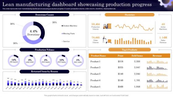
This slide represents lean manufacturing dashboard showcasing production progress. It covers production volume, order volume, downtime, returned item etc.
People who downloaded this PowerPoint presentation also viewed the following :
Lean Manufacturing Dashboard Executing Lean Production System To Enhance Process with all 7 slides:
Use our Lean Manufacturing Dashboard Executing Lean Production System To Enhance Process to effectively help you save your valuable time. They are readymade to fit into any presentation structure.





FAQs for Lean Manufacturing Dashboard Executing Lean Production System
Hey! So the big ones you'll want are OEE, cycle time, throughput, and defect rates. Most places throw in inventory levels and lead times too. Downtime tracking is huge - honestly everyone gets way too worked up about that one but it matters. First-pass yield is another good one. Depending on what you're making, maybe add 5S scores, customer satisfaction, cost per unit. Keep it visual with charts and colors so problems jump out at you. Oh and seriously - stick to like 5-7 metrics max or people won't even look at the thing.
Dude, these dashboards are actually pretty sweet for catching problems before they blow up. Instead of waiting weeks for reports, you'll see cycle times and defect rates updating live. Equipment goes down? You know immediately. The visual setup makes spotting trends way easier than staring at spreadsheets (which honestly nobody has time for anyway). Shop floor managers I know swear by them because you can make quick decisions based on actual data instead of just winging it. Pro tip though - start with maybe 3 or 4 key metrics. Don't go crazy tracking everything right away.
Dude, you absolutely need good visuals on your Lean dashboard. Color-coded stuff, charts, progress bars - anything that lets people see what's happening without squinting at boring spreadsheets. Short sentences work great. When someone walks by, they should instantly spot problems or wins. I honestly think too many dashboards try to be fancy when simple works better. Your team shouldn't need a PhD to figure out if things are going well or falling apart. Just make the important metrics jump out immediately so everyone stays on the same page about priorities.
Dude, real-time data is a game changer - you catch problems the second they pop up instead of discovering them way too late. It's like having a speedometer vs figuring out your speed after the trip's over, you know? Your dashboard becomes this live feed of what's actually happening right now. Bottlenecks, quality issues, equipment going down - you spot it all instantly. Honestly, I wish more companies would set up proper alerts for their key metrics. That way your team can jump on stuff immediately rather than waiting around for some weekly meeting where everything's already gone to hell.
Honestly, just stick to the stuff that actually matters - waste reduction, cycle times, OEE, defect rates. Make it super visual with charts and color coding so people can catch problems instantly. I swear, half the dashboards I've seen look like a spreadsheet exploded everywhere! Real-time data updates are clutch, and organize everything by production line so operators aren't hunting around for their numbers. The whole thing should make sense to someone in like 30 seconds max, even if they're just walking past.
So basically, these dashboards make waste super visible by showing your metrics in real-time. You'll spot the seven classic wastes - overproduction, waiting, excess inventory, defects, over-processing, unnecessary motion, and transportation delays. Bottlenecks become obvious when work piles up. Quality issues pop up as they happen. Machine downtime gets tracked too (which is honestly the worst). Cycle times show exactly where things slow down. I'd start with whatever's bugging you most - the dashboard will confirm those gut feelings you've had but couldn't really prove with data before.
Honestly, Lean dashboards are a game-changer for cross-functional teams. No more of those awkward meetings where everyone's staring at different spreadsheets going "huh?" Real-time data means operations can catch quality problems while engineering spots bottlenecks and finance tracks waste - all without playing telephone. The cool part is how it shows your team's work actually affects everyone else downstream. Breaks down those stupid departmental walls, you know? I'd start small though - maybe 3-4 metrics that actually matter to everyone. You can always add more weird metrics later once people stop panicking about change.
Power BI and Tableau are the big names everyone talks about. Excel still works great though - seriously, don't underestimate a solid Excel dashboard. Manufacturing places often use MES platforms like Wonderware or Ignition since they've got dashboards built right in. Your ERP system probably has reporting tools too if you're on SAP or something similar. Honestly? Just start with whatever software you already have access to. No point buying new licenses until you know what you actually need. Connect it to your current data sources and see what happens. You can always get fancier later once people see it's worth the investment.
Honestly, dashboards are game-changers for lean stuff. You get real-time data on bottlenecks and waste patterns instead of waiting weeks for reports. Super useful during kaizen events too. The visibility thing is huge - your whole team can see what's working and what isn't, so people actually contribute ideas. Plus you can track whether your improvements are making any difference (which, let's be real, sometimes they don't). I'd start with maybe 3-5 metrics that align with whatever you're trying to fix right now. Don't go crazy with too many at first.
Honestly? Daily updates are your minimum - hourly is way better if your system can handle it. Real-time data is what you're really shooting for since lean manufacturing is about catching problems fast. I've watched teams completely miss major bottlenecks because they were looking at day-old numbers, which is brutal when you're scrambling to meet deadlines. Don't go crazy with constant refreshes though - you'll just bog everything down. My advice is start daily, then ramp up the frequency once you figure out which metrics actually move the needle for your operation.
Ugh, data quality is gonna be your worst nightmare - stuff scattered everywhere, half of it's garbage. Getting your team on board? Good luck with that. Half will think you're trying to spy on them or something. Don't even get me started on picking the right metrics... you'll want to track everything but most of it's useless noise. Honestly though, just pick one small area to start with. Get a quick win so people can actually see why this matters, then build from there. Once they see results, they'll stop fighting you on it.
Honestly, user roles are everything when it comes to dashboards. Floor supervisors need machine status and quality alerts right up front - they're dealing with fires all day. Plant managers? They want those big picture KPIs, OEE trends, cost savings stuff. Executives mostly care about ROI metrics (and yes, they do love their pretty charts). You'll definitely want different permission levels so operators can't accidentally change target settings or whatever. I'd start by figuring out who checks what and how often, then either build separate views or just customize the widgets. Makes the whole thing way more useful.
Look at Toyota - they cut waste by 30% and slashed lead times in half with production dashboards. Ford did something similar and boosted equipment effectiveness 25%. Boeing? They reduced defects by 40% tracking assembly metrics. I know these numbers sound crazy high, but they're legit across different industries. The magic happens when operators get visual, real-time data they can actually act on immediately. Don't overthink it though - just pick your biggest bottleneck first and build around that specific mess.
Honestly, just pick the metrics that actually hurt when they're off in your industry. Automotive? Defect rates and cycle times are your life. Food production is all about batch consistency - nobody wants recalls. Healthcare manufacturing gets crazy with compliance stuff and sterility tracking. Most people screw this up by grabbing some generic template online. Don't do that. List your top 3 pain points first, then build your dashboard around those. Put the critical stuff front and center, add the supporting numbers after. I learned this the hard way when I spent weeks tracking useless vanity metrics that looked impressive but didn't move the needle.
Focus on real-time data visibility first - your team needs to see what's happening right now. Pick 3-5 metrics that actually matter: cycle time, defect rates, OEE, waste indicators. Design it so people don't have to squint at messy charts when they're troubleshooting. Honestly, half the dashboards I've seen are just digital eye candy that nobody uses. Make it accessible to everyone from floor ops to management. The whole point is triggering action, not impressing people with fancy visuals. Start small with your most critical KPIs and build from there.
-
I faced no difficulty while searching for the slide I wanted. Honestly, the website’s interface is easy to use and can be navigated easily!
-
Use of icon with content is very relateable, informative and appealing.