


Monthly sales growth and net profit margin dashboard




Try Before you Buy Download Free Sample Product
 Impress Your
 Audience
 100%
100% Editable
 Save Hours
 of Time


Avoid harrowing experiences with our Monthly Sales Growth And Net Profit Margin Dashboard. They help cater for any emergency.
People who downloaded this PowerPoint presentation also viewed the following :
Content of this Powerpoint Presentation
Description:
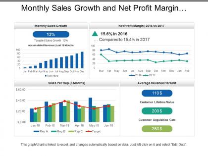
The image shows a PowerPoint slide titled "Monthly Sales Growth and Net Profit Margin," which is a comprehensive dashboard containing multiple graphs and key performance indicators (KPIs) related to sales and profitability.
The slide includes the following elements:
1. Monthly Sales Growth:
A bar graph showing sales growth for each month with a highlighted callout showing 13% growth, above the targeted 12%.
2. Net Profit Margin | 2016 vs 2017:
A line graph comparing monthly net profit margins between the two years, with a note that profit margin decreased slightly from 15.6% in 2016 to 15.4% in 2017.
3. Sales Per Rep (6 Months):
A bar and line graph tracking the sales performance of three representatives against a target over a six-month period.
4. Average Revenue Per Unit:
A callout showing $110, possibly representing the average revenue earned per unit sold.
5. Customer Lifetime Value:
Another callout with $200, which may indicate the total value a customer is expected to bring over their lifetime.
6. Customer Acquisition Cost:
The final callout showing $250, signifying the cost to acquire a new customer.
Below the graphs, a note states that the graph/chart is linked to Excel and advises how to edit the data.
Use Cases:
This type of slide can be used across various industries for performance review and strategic planning:
1. Retail:
Use: Analyzing sales trends and profitability.
Presenter: Sales Manager
Audience: Retail team, store managers
2. E-commerce:
Use: Monitoring online sales performance.
Presenter: E-commerce Analyst
Audience: Marketing team, executives
3. Automotive:
Use: Tracking dealership sales and profitability.
Presenter: Dealership Owner
Audience: Sales reps, finance team
4. Real Estate:
Use: Reviewing agent sales and company profitability.
Presenter: Real Estate Broker
Audience: Agents, investors
5. Pharmaceuticals:
Use: Evaluating drug sales and profit margins.
Presenter: Sales Director
Audience: Sales force, product managers
6. Technology:
Use: Assessing software or hardware sales success.
Presenter: CTO
Audience: Sales team, development team
7. Banking:
Use: Reviewing loan officer performance and bank profitability.
Presenter: Branch Manager
Audience: Loan officers, finance department
Monthly sales growth and net profit margin dashboard with all 6 slides:
Highlight crucial inputs with our Monthly Sales Growth And Net Profit Margin Dashboard. Increase awareness of important information.

FAQs for Monthly sales growth and net
Honestly, just track what actually makes you money first. Total sales, conversion rates, deal size - that's your bread and butter right there. Pipeline stuff matters too, like how fast deals move through and qualified leads coming in. Individual quota performance is huge because that's how you know who's struggling (and trust me, there's always someone who needs help). Activity metrics seem boring but calls and emails are solid predictors of what's coming. Just don't go overboard with tracking everything - I've seen teams drown in dashboards that don't tell them anything useful.
Dude, visualizations completely changed how I look at sales data. Instead of staring at endless spreadsheet rows (ugh), you'll spot trends instantly with charts and graphs. Heat maps show which regions are killing it, line charts reveal those seasonal patterns you'd miss otherwise. I actually look forward to our monthly reviews now - weird, right? Your brain just processes visual stuff way faster than numbers. Start simple with bar charts for comparisons, then get fancy with interactive filters. You can drill down into specific territories or time periods. Trust me, once you see your data this way, going back to raw numbers feels painful.
Honestly, real-time data is a game changer for sales tracking. You're not stuck waiting weeks for monthly reports to tell you what already happened. Spot problems right when they're happening - like if deals are moving slower or someone's having trouble with the new product (been there). Jump on issues immediately instead of finding out after your numbers already tanked. It's like having GPS instead of just looking backwards. Though you don't need everything in real-time - figure out what actually needs instant monitoring vs. what can wait till your weekly check-ins.
Dude, your sales dashboard is gonna show you so much cool stuff about customer behavior. You'll catch seasonal buying patterns and see which products are actually taking off. Plus you can track if people are shopping more often but spending less each time - or if certain groups are just disappearing on you. Geographic trends pop out too, along with which marketing channels bring in your best customers. I got way too into analyzing this stuff at my last job, honestly. Set up alerts for weird spikes or drops so you're not finding out about problems weeks later when it's too late to fix anything.
Honestly, customizing dashboards by team is a game changer. SDRs want to see lead flow and activity stuff, while account managers obsess over pipeline health and renewals. Makes sense, right? Instead of forcing everyone to stare at the same boring numbers, give each team their own view. When people can actually influence the metrics they're looking at, they'll check it way more often. I'd start simple - just ask each team what numbers they peek at first thing Monday. Those go right up top. It's like... why make your sales team dig through data that doesn't even apply to them?
Dude, CRM integration is a game changer - it turns your boring dashboard into an actual sales command center that updates in real time. No more manual data entry (thank god). You'll see your pipeline flow, track deals as they move, and it even scores leads automatically. The best part? You can spot exactly what activities actually make money and find where deals get stuck. I'd start with just your top 3 data points though, don't go crazy right away. Oh and you can click through from the big picture stuff straight into individual customer details, which is pretty neat.
Honestly, just track what actually affects your money coming in. Conversion rate and average deal size are huge - plus how long your sales cycle takes. If you're doing subscriptions, obviously MRR matters. I always tell people to watch lead-to-customer conversion too, especially when marketing budgets are tight (which, let's be real, they always are for small businesses). Don't get distracted by stuff like total leads if they're garbage quality. Pick maybe 5 KPIs tops and check them weekly. More than that? You'll just confuse yourself and lose sight of what's working.
Honestly, mobile access is a game-changer for sales dashboards. Your reps aren't sitting at desks all day - they're bouncing between meetings, traveling, living on their phones anyway. When they can quickly pull up their numbers or check pipeline status between calls, they actually stay on top of their goals. Real-time course correction happens naturally. Desktop-only dashboards? Those become the tools people forget to check until Friday afternoon when they're scrambling. Just make sure it loads fast and doesn't require tiny finger gymnastics to navigate, or you'll lose them.
Honestly, less is more here. Pick 5-7 metrics that actually matter for decisions - cramming everything in just creates chaos. Skip the vanity stuff too (like total calls made). Quality over quantity, right? Your reps need qualified leads, not impressive-looking numbers that don't help them close deals. Real-time data is huge - stale pipeline info is basically useless when they're planning their day. Oh, and definitely test this with actual sales people first. They'll catch weird usability stuff you'd never notice. Trust me on that one.
Hey! So for forecast viz, definitely do trend lines for the big picture view. Then show actual vs predicted side-by-side - people love that comparison. Color-code your scenarios too (best/realistic/worst case) because honestly, executives eat that stuff up. Don't forget confidence intervals so everyone knows how much to trust the numbers. I always include past forecast accuracy because it builds credibility. Make sure you can drill down from quarterly to monthly to weekly - stakeholders will want that flexibility. The whole point is showing both your trajectory AND how you got there, so they'll actually make decisions off it.
Honestly, daily updates are your sweet spot for sales dashboards. Real-time is even better if you can swing it. I've watched too many sales teams chase last week's numbers while actual opportunities slip away - it's painful to see. Quick decisions need fresh data, period. Though if your systems are acting up or data's a mess, every few hours still beats stale info. Just be consistent about timing so people aren't constantly wondering if the numbers are current. Set up auto-refresh if possible. Trust me, manually updating gets old fast.
Dashboards work great for this! Set up leaderboards with individual and team numbers - honestly, people eat that competitive stuff up. Make it visual with progress bars toward quotas. I'd show both results AND activities so your reps can actually see what moves the needle. Update it weekly (not daily, that gets annoying). Throw in some badges or mini-challenges if you want to get fancy. The trick is celebrating wins publicly when someone crushes it. But don't just shame your bottom performers - highlight improvement too. Oh, and definitely track behaviors, not just outcomes.
Honestly? Tableau, Power BI, or Looker are your best bets for sales dashboards - they make those slick visualizations that execs actually love. Google Data Studio's free and works pretty well if budget's tight. Already on Salesforce CRM? They've got decent built-in dashboard stuff. Excel works but it's kinda meh for anything fancy (though everyone knows how to use it, which helps). Oh, and definitely figure out what metrics you actually care about first - I've seen people get lost in feature overload. Pick whatever plays nice with your data sources and wallet.
Honestly, user feedback is like having a GPS for your dashboard - without it you're just guessing what people actually need. Your sales team complaining they can't find conversion rates fast enough? That's pure gold right there. Watch how people use it, send out quick surveys, see what gets completely ignored. I always tell people to set up some easy way for users to complain - sounds weird but those "this takes too many clicks" messages show you exactly what to fix next. The mobile requests are huge now too. Act on what you hear and your adoption will actually go up instead of everyone just ignoring those pretty charts.
Dude, dashboard design literally makes or breaks everything. People won't touch it if it looks like a hot mess - doesn't matter how good your data is. I've seen amazing analytics projects die because the interface was trash. Clean design with good visual flow? That's what gets people hooked. You want them excited to check it each morning, not dreading another confusing spreadsheet. Start simple though - just your key metrics first. Then add more based on what users actually want. Trust me, less is way more here.
No Reviews