

Parallel timeline design





Try Before you Buy Download Free Sample Product
 Impress Your
 Audience
 100%
100% Editable
 Save Hours
 of Time


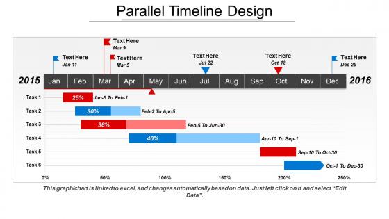
SlideTeam presents to you its Parallel Timeline Designs PPT. This PPT containing corresponding lines is a grant chart template whereby you can describe the annual development of a business project. The Parallel Linear Process can also be used to show and compare the working of a product or idea on a monthly basis. This kind of a tabular graph template can also be used to improve the work efficiency of the employees. This PPT slideshow is a set of five slides completely and fully prepared with the required graphical features. This kind of presentation can also be used to show the progress report of the company keeping in mind the set goals and objectives. This roadmap design contains a variety of graphical illustrations that will help you lead your company on the path of success. So download this PPT slideshow and make the best of it. Our Parallel Timeline Design will carry you a lot further ahead. They allow you to go that extra distance.
People who downloaded this PowerPoint presentation also viewed the following :
Parallel timeline design with all 5 slides:
Enlighten folks about current genres with our Parallel Timeline Design. Elaborate on contemporary arts.
FAQs for
Honestly, project sequencing is a game-changer for catching those sneaky dependencies between tasks. You'll allocate resources way better and spot bottlenecks before they wreck your timeline. Like when two critical tasks both need Sarah from design at the same time - nightmare scenario. Mapping everything out chronologically shows you exactly where things could blow up. Your stakeholders stay happy with realistic milestones to track. And when scope changes (spoiler: it always does), you can see how it'll mess with everything else. Start with listing tasks and their dependencies first - trust me on this one.
Here's the thing – chronology gives your audience a roadmap they can actually follow. People get cause-and-effect way better when events flow in time order, and honestly? Nobody wants to sit through a confusing mess of random info dumps. You can build suspense too by revealing things at the perfect moment. I always map out key events on a timeline first. Helps me catch story gaps and figure out the most compelling sequence. Short version: logical time order = engaged audience. Trust me on this one.
So there's a bunch of good options depending on what you're going for. TimelineJS is probably your best bet to start - it's free, web-based, and you can embed photos and videos which is pretty cool. If you've already got Lucidchart or Visio lying around, those give you way more design control. PowerPoint actually works fine for basic stuff too, weirdly enough. Sometimes simple is better, you know? For history projects specifically, Tiki-Toki and Preceden are solid choices. I'd honestly just mess around with TimelineJS first since it covers most bases without costing anything.
So it really depends on what field you're in. Historians are super picky about exact dates and how events connect to each other. Archaeologists? They're more about layering and what artifacts tell us. Geologists work with crazy long timescales - like millions of years, which honestly makes my brain hurt. They use radiometric dating and all that. Literary people look at when stuff was written and how time works in stories. Anthropologists study how different cultures think about time - some see it as circular instead of linear, which is pretty cool. Just figure out what chronological approach actually matters for your research.
Think of chronology as your GPS for history - without it, you're totally lost. Random historical events don't make sense until you see the order they happened in. Like, why did leaders make certain choices? You need the timeline to get it. Otherwise you're judging people from 1850 with 2024 brain, which is pretty unfair tbh. It's kinda like binge-watching a series but skipping around episodes randomly. Sure, you'll catch some plot points, but you'll miss why characters did what they did. Get your timeline down first, then analyze.
So chronology is like giving your audience a roadmap, you know? Start with the earliest stuff that matters and walk through how we got to where we are now. People get SO lost when you just dive into current problems without context - I've watched entire rooms of people zone out because they're missing the backstory. Short timeline = everyone stays with you. Makes the "why" crystal clear before you hit them with the "what." Oh, and throw a simple timeline slide near the beginning of your deck. Trust me on this one.
Honestly, the biggest thing is not rushing your research at the start. I've watched so many projects crash because people just grabbed dates from Wikipedia without checking the actual sources. Super frustrating to watch. Don't rely on secondary stuff when you can find the real documents - it's worth the extra digging. Also, you'll go crazy if you try including every tiny detail. Pick what actually moves your story forward. Oh, and if you're dealing with historical events or anything international, double-check time zones and calendar systems. That stuff gets messy fast. Build your framework first, then fill in details.
Our brains are wired for stories with a clear beginning, middle, and end - that's why chronological stuff works so well. People can actually follow what you're saying instead of getting lost. Works for pretty much anything too: case studies, project updates, explaining how you ended up in whatever mess you're presenting about. I swear, just starting with "here's how we got here" makes people sit up and pay attention. It's like giving them a roadmap so they know where you're headed. Way better than jumping around randomly and hoping they'll connect the dots themselves.
Dude, time order is everything in data viz. Your brain expects to see things happen in sequence - that's just how we're wired. Without chronology, you're basically staring at random puzzle pieces instead of the full picture. You'll miss seasonal patterns, growth spurts, or those weird dips that actually mean something important happened. Honestly, I've seen so many charts where people mess up the time intervals and it totally throws off the whole story. Keep your timeline consistent and label it clearly - don't skip months or use wonky spacing unless there's a really good reason.
Honestly, digital timeline tools are a game changer - they handle all the annoying layout stuff so you can just focus on your actual content. I'd start with Timeline JS since it's free and pretty solid. You just dump your dates and events into something like that or Tiki-Toki, and boom - clean, interactive timeline. No more wrestling with formatting in Word (ugh). The collaboration features are clutch too, especially if you're working with a team. Best part? You can shuffle things around or add new events without starting over. I probably should've discovered these tools way earlier than I did.
So here's the thing - when people are fighting, everyone remembers stuff differently. Like, wildly differently sometimes! Start by just walking through what actually happened, step by step. Sounds boring but it works. You'll cut through all the "but you said this" drama and suddenly patterns jump out - where things went sideways, what opportunities got missed. Once everyone agrees on the basic timeline, you've got solid ground to work from. Instead of pointing fingers, you're just solving problems. Trust me, try opening with "let's trace through what happened" next time things get messy.
Honestly, messing with chronology is such a cool way to hook your audience. You can drop hints out of order to build suspense, or let readers in on secrets the characters don't know yet. Makes those "aha!" moments hit harder when everything clicks together. It's kinda like giving someone puzzle pieces - super rewarding when it works. But yeah, you can definitely lose people if you go too crazy with it. I'd say make sure the emotional story still makes sense even when you're jumping around timeline-wise. Maybe try some simple flashbacks first? Don't go full Pulp Fiction on your first attempt lol.
Different cultures track time in totally different ways, so you can't just assume Western linear calendars work everywhere. Some societies use cycles instead of straight timelines. Others care more about seasons or religious events than exact dates - which honestly makes way more sense sometimes. Before analyzing any historical timeline, figure out what time-keeping system that culture actually used. Otherwise you'll completely misread when things happened. It's wild how much this stuff varies between societies, but understanding their framework first is crucial for getting the chronology right.
Honestly, there's so much you can do! Scrollytelling is super engaging - people scroll and watch events animate with data viz. Spiral timelines look amazing for cyclical stuff. The subway map thing is genius too, where different colored lines show parallel stories that cross at major moments. 3D gets really interesting... like peeling back layers of history. Oh, and I always tell people this - figure out your story first. The visual style should flow from what you're actually trying to say, you know? Don't just pick something because it looks cool.
So I'd start with stuff they actually know - like their birthdays, when they started kindergarten, family vacations. Makes way more sense than jumping straight into historical dates, you know? Once they get how their own life has an order, then you can branch out to bigger events. Picture sequencing games are honestly a lifesaver here. I love having kids make classroom timelines or play those "what happened first" games. Oh, and use words like "first" and "meanwhile" constantly - they'll pick up the language without realizing it. Having them timeline a recent field trip works really well too since it's fresh in their minds.
-
Awesomely designed templates, Easy to understand.
-
Great quality slides in rapid time.