

Sprint timeline show powerpoint slide designs


Try Before you Buy Download Free Sample Product
 Impress Your
 Audience
Editable
of Time


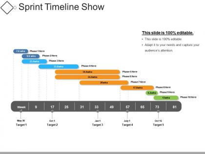
Forecast how a major release of your product or business is developed using this Sprint Timeline Show PowerPoint Slide Designs. It helps you track the progress from sprint to sprint, covering a specific period. Describe the journey your product undergoes using this sprint timeline PPT template. Derive the release plan from the sprint roadmap template. Meet your specific goals using an effective sprint planning template. Organize the smooth execution of your business. Give stakeholders a visual overview of future targets and releases through this sprint layout. Communicate your tasks effortlessly in the form of this graphical representation. Enhance your project management and product development skills with a high-quality content mentioned in this PPT template. Reduce the time of preparation for your impressive PowerPoint presentation. Choose this sprint project plan PPT template to make your presentation easy and comprehensive.
People who downloaded this PowerPoint presentation also viewed the following :
Sprint timeline show powerpoint slide designs with all 5 slides:
Escalate growth with our Sprint Timeline Show Powerpoint Slide Designs. Create grounds for faster development.
FAQs for Sprint timeline show
Put your sprint dates and duration right at the top - that's what everyone looks for first. Break down milestones chronologically with who owns what (seriously, accountability saves so much confusion later). Visual stuff like progress bars or timeline graphics help way more than walls of text. Colors for priority levels are clutch too. Make sure you call out any dependencies that could mess things up. Oh, and definitely include your sprint review date so people know when updates are coming. Keep the actual text pretty minimal - nobody wants to read a novel on a slide.
Oh man, color schemes are a game changer for sprint timelines! High contrast is key - dark text on light backgrounds usually works best. I'm obsessed with assigning one color per sprint phase or team member, makes tracking so much easier. Don't go crazy though, 3-4 colors tops or it'll look like a rainbow exploded. One bright accent color for deadlines is clutch - those critical dates need to jump out. Also maybe check colorblind accessibility with something like Stark? My teammate can't see red/green differences and we learned that the hard way.
Honestly, Gantt charts are a game-changer for sprint planning. You get this instant visual of what's happening when, plus you can spot those annoying dependencies that always trip teams up. Way better than staring at endless bullet points in meetings. Most people already know how to read them too, which saves you from explaining some complicated new system. I always color-code mine by team member - makes it super easy to scan. The best part? You'll catch delays early instead of scrambling at the end of your sprint. Stakeholders love them because they can see progress without diving into all the messy details.
So sprint timelines totally depend on your industry. Tech teams stick with those classic 2-week cycles - makes sense for coding. Marketing? They stretch it to 4-6 weeks since campaigns take forever to launch. Healthcare uses them for rolling out new systems, which honestly takes way longer than you'd think. Consulting firms map out client milestones, and even manufacturing does sprint-style schedules for production. The trick is matching your timeline to how fast your industry actually moves. Don't force a 2-week sprint if your stakeholders think in months, you know?
Honestly, less is more with these slides - stick to key dates and milestones since people can ask questions afterward anyway. I'd use simple icons like gears for development phases or checkmarks when testing's done. Color coding works great too, especially if different teams are handling various parts. Put your text above or below the timeline points instead of squeezing everything into those tiny boxes (learned this the hard way). White space actually makes it look cleaner. Oh, and definitely do the "back of the room" test - you'd be surprised how often text that looks fine on your laptop becomes totally unreadable on the projector.
Break down your sprint timeline with progressive reveals - way less overwhelming that way. Start with the basic framework, then animate each phase as you talk through it: planning, standups, dev work, retrospective. Fly In or Fade animations work well for this stuff. Just skip the bouncy ones - they look unprofessional honestly. Progress bars are solid too for showing work moving through the sprint. Time everything to match how you're speaking. Nothing's worse than slides that get ahead of what you're explaining. Oh, and those little checkmarks that appear when tasks complete? Your audience will love those.
Hey! So for remote sprint presentations, go super simple with your timelines. High contrast is your friend - think basic Gantt charts with chunky fonts that won't look like garbage on video calls. Honestly, dark backgrounds are clutch because nobody wants their retinas burned during another 2-hour meeting. Use bright colors for milestones and current progress stuff. Make your text huge - I'm talking "can you read this on your phone while squinting" huge. If it looks good there, you're golden. Skip anything fancy that'll just turn into pixelated mess when Bob inevitably has his camera quality set to potato mode.
Okay so basically you'll want two different versions. Stakeholders need the big picture stuff - major milestones, when things ship, how it affects the business. Your dev team though? They need all the nitty-gritty details like specific tasks, who's blocked on what, daily progress updates. Honestly, I've found it's way easier to just build the detailed team version first with all your sprint backlogs and story points, then create a stripped-down executive summary from that. Leadership doesn't care about technical dependencies - they just want to know what's getting delivered and when. Two timelines, same project, totally different audiences.
Honestly, font choice can totally make or break your sprint timelines. Stick with something clean like Arial or Calibri - I learned this the hard way after using some "stylish" font that nobody could read during a presentation. Pretty embarrassing. Sans-serif fonts are your friend because they're easy to scan quickly. Keep your sizes consistent and make sure there's good contrast with your background colors. Oh, and avoid anything too fancy or script-like. Your team will actually pay attention to the updates if they can read them without squinting. Simple beats creative here.
Dude, icons are a game changer for sprint timelines. They break up all that boring text and help people actually understand what's happening at each phase. I've been in way too many meetings with slides that are just walls of bullet points - ugh. Use sprint symbols, progress bars, calendar stuff, whatever works. Different colors for different workstreams is smart too. Just don't go crazy with it though. Pick maybe 2-3 icon styles and stick with them or it'll look messy. Oh and milestone graphics for big deliverables work great. Your slides will actually be scannable instead of death by PowerPoint.
Don't cram everything onto your timeline slides - you'll just make them impossible to read. Focus on the big milestones instead of every tiny task. I've seen way too many presentations where the font is microscopic and the layout is a total mess. Your colors should match throughout, obviously. Make sure things flow left to right in a way that actually makes sense. Honestly, people just need to see where you're at and what's coming up next. They don't care about every single story point - that stuff just bogs everyone down and defeats the whole point of having a clean timeline.
Just throw some visual arrows or circles on your slides that connect the retros back to planning - honestly it makes such a difference. Add little callout boxes for standups, reviews, all that stuff. What I always do is include a tiny "lessons learned" bit showing how last sprint's feedback actually changed things this time around. Makes stakeholders realize feedback isn't just some box you check at the end. Oh and definitely avoid making it look linear - sprints are messy and iterative, so your slides should show that too.
Honestly, just start with PowerPoint's SmartArt stuff - those timeline templates are actually pretty solid and way faster than building from scratch. You can also mess around with the drawing tools to make custom shapes if you need something specific. Sites like SlideModel have some decent free templates too (though the really good ones cost money, obviously). If you want something super polished, create it in Lucidchart first then paste it over - I've done that before and it looks way more professional. Main thing is don't go crazy with colors and effects. Sprint timelines should be clean and easy to read, not some rainbow explosion.
Start broad with high-level milestones and rough dates in your early sprints. Then get more specific as you go - add granular tasks, dependencies, actual vs planned progress. Honestly, my first sprint slides always look laughably vague when I look back! Mid-project you'll want to show completed work, current blockers, and realistic projections based on your team's real velocity. Don't fall into the wishful thinking trap though. Keep updating with actual data as things change. The whole point is making it reflect where you actually are, not where you hoped you'd be.
For sprint timelines, you'll mostly see Gantt charts, Kanban boards, and roadmap layouts everywhere. Kanban's probably your best bet to start with - super intuitive and everyone gets it right away. Gantt charts are solid when you've got overlapping tasks or dependencies to track. Roadmaps work well for exec presentations since they love those clean milestone views (though honestly, sometimes I think they just like pretty charts). These templates stick around because they actually match how agile teams work. Don't overthink it - pick something your team won't need training on.
-
Innovative and attractive designs.
-
Qualitative and comprehensive slides.