


Product roadmap powerpoint images


Try Before you Buy Download Free Sample Product
 Impress Your
 Audience
Editable
of Time


Enable farmers to improve their crop with our Product Roadmap Powerpoint Images. Advise them about irrigation.
People who downloaded this PowerPoint presentation also viewed the following :
Content of this Powerpoint Presentation
Description:
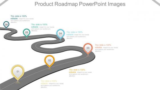
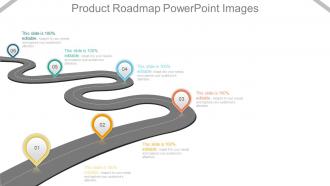
The image is a PowerPoint slide titled "Product Roadmap PowerPoint," which visually represents a product development timeline. The roadmap is depicted as a winding road with markers labeled from 01 to 06, indicating different stages or milestones in product development.
Use Cases:
This type of product roadmap is versatile and can be adapted for use across various industries to plan, communicate, and track a product's development over time:
1. Technology:
Use: Outlining the release of tech product updates
Presenter: Product Manager
Audience: Developers, stakeholders
2. Automotive:
Use: Showcasing the stages of a new vehicle model's development
Presenter: Chief Engineer
Audience: Executive board, design team
3. Pharmaceuticals:
Use: Tracking drug development and approval milestones
Presenter: R&D Project Lead
Audience: Research scientists, regulatory authorities
4. Consumer Electronics:
Use: Planning the launch sequence for a new gadget
Presenter: Marketing Director
Audience: Marketing team, retail partners
5. Software Development:
Use: Illustrating the phases of software feature rollouts
Presenter: Agile Coach
Audience: Development team, product owners
6. Construction:
Use: Detailing the timeline for a construction project
Presenter: Construction Manager
Audience: Investors, contractors
7. Education:
Use: Presenting the curriculum development process
Presenter: Curriculum Developer
Audience: Educators, administrative staff
Product roadmap powerpoint images with all 7 slides:
Create excellent citizens with our Product Roadmap Powerpoint Images. They help ensure good grooming.

FAQs for Product
Break it into quarters for your timeline, then map out key features with clear priorities. Color coding helps - I'm obsessed with making the "must-haves" pop vs the nice-to-haves. Add your target metrics too since everyone always asks why we're building something anyway. Honestly, the audience makes a huge difference in how detailed you get. Dependencies should be visible if they matter. Most critical thing? People need to scan it in 30 seconds max. Nobody's got time to study some overcomplicated chart, and I've learned that the hard way.
Honestly, the visual style can make or break your roadmap. Executives love timeline views - they want to see progress stretched across months. Swimlane diagrams work better when you need to show team ownership (who's doing what). For developers, Kanban boards are perfect for current sprint stuff. I've literally watched good roadmaps bomb because people couldn't figure out the format - it's kinda painful to see. Color coding helps too, especially for priorities or themes. Pick whatever makes your audience think "oh, got it" instead of staring blankly at your screen.
Look, Gantt charts are perfect for internal stuff - tracking dependencies, who's blocking who, all those nitty-gritty details your team needs. But honestly? They look crazy complicated to outsiders. Timeline graphics are way cleaner for presentations. Executives don't want to see a million connecting lines and task breakdowns - they just want the big milestones and phases. I learned this the hard way after confusing the hell out of some stakeholders once. Use Gantt charts with your team, timeline graphics when you're presenting up the chain.
Here's what I've learned the hard way - you can't make one roadmap that makes everyone happy. Engineers want all the technical dependencies and milestone details. Meanwhile, your executives just want themes and dates (honestly, sometimes I think they barely look at the dates). Sales gets super excited about anything customer-facing they can talk about. Marketing needs to see how everything lines up with their campaign schedules. I'd pick one main audience per visual instead of cramming everything together. Figure out what each team actually does with the roadmap info, then build something that makes sense to them.
Oh man, there's so many options for this! ProductPlan, Roadmunk, and Aha! are the big names - they're made just for roadmaps with timelines and easy sharing. But honestly? I've seen people make killer roadmaps in Airtable with their timeline view. Miro and Figma work great if you want more creative control. Even Google Sheets can look decent with some formatting tricks (though I probably wouldn't admit that in a meeting lol). Notion's another solid choice. I'd start with ProductPlan's free trial to figure out what you actually need, then decide if you want the fancy stuff or something simpler.
Dude, visuals totally change the game with roadmaps. Instead of everyone staring at boring spreadsheets (seriously, I've watched entire teams zone out), you're actually telling a story they can follow. Show the user journey, connect features to real outcomes - suddenly people understand why their work matters. I mean, there's nothing worse than a meeting where half the room looks confused, right? Try throwing in some simple icons or even rough sketches to illustrate customer pain points and how you're solving them. You'll notice the difference immediately - more questions, better engagement, everyone actually gets it.
Colors make or break how people read your roadmap - trust me on this. Use them to group related stuff or show what's urgent vs. nice-to-have. It's like color-coding your calendar (which I swear by). When someone can glance at it and instantly know priorities, you've basically nailed it. Don't go overboard though - stick to 4-5 colors tops or it looks like a kindergarten art project. Oh, and definitely test with colorblind folks first. Always add a legend too.
Build in review points and make your iteration cycles super visible on the roadmap. Color-code stuff that's actively getting user feedback. Teams get weirdly attached to original plans (been there!) so visual feedback indicators help keep everyone honest about pivoting when needed. Regular checkpoint milestones are clutch for reassessing priorities. Create swim lanes for different feedback sources - customer interviews, analytics, stakeholder input. That way you can actually see what's driving changes. Oh, and make sure whatever tool you're using lets you drag things around easily when feedback inevitably changes everything.
Dude, execs don't want to hear about your fancy API stuff - they care about revenue and customer numbers. Keep everything high-level and tie it back to business goals. Your timelines? Add some padding because something always goes sideways. Use bold colors for the important bits and practice your pitch beforehand. Oh, and definitely prep for when they inevitably ask "can we do this faster?" The whole thing should tell a story about why each decision matters. Simple visuals work best. They'll tune out if you get too deep in the weeds with features.
Honestly? Every 2-4 weeks is the sweet spot. I get it - constantly updating feels annoying, but your roadmap has to actually match reality instead of whatever pipe dream you had months ago. Big stuff like budget cuts or leadership doing a 180 should mean immediate updates though. Don't become that person spending half their day reformatting slides (been there). Just set a recurring reminder and actually follow it. Oh, and new customer feedback definitely counts as a reason to pivot things around.
Oh man, don't cram every tiny detail in there - you'll create this unreadable monster that nobody wants to look at. Also skip the vague nonsense like "improve user experience" because what does that even mean? Be specific about outcomes, not individual features. Keep timelines realistic and always mention they might shift (because they will). The worst thing? Forgetting to update it regularly. I've seen so many roadmaps showing stuff from months ago - instant credibility killer. Actually, focus on the big picture instead of getting lost in the weeds. Trust me, when priorities change you'll be glad you kept it flexible.
So basically you want to organize your roadmap around who's using what. Take your top 3 personas and create sections for each one - maybe use different colors or swim lanes. Then map your features to show which persona gets helped by what initiative and when. Group related stuff together so it makes sense. Honestly, I learned this the hard way after presenting a messy roadmap once. The whole point is stakeholders should glance at it and instantly see how you're prioritizing different user needs. It's kind of like sorting your to-do list by who's gonna be most annoyed if you don't deliver.
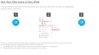
Icons are great for cutting down text-heavy descriptions - just don't go crazy with them. I'd stick to obvious ones like lightbulbs for innovation or gears for development phases. Flag icons work well for milestones too. The worst roadmaps I've seen look like ancient Egyptian walls because someone got icon-happy. Keep it consistent across all your roadmaps so people aren't constantly decoding new symbols. Color-coding related features helps a ton, and you can use different sizes to show priority levels. Start with maybe 5-7 core symbols, then expand slowly.
Your roadmap structure really depends on what methodology you're already using. If you're doing Agile, go with sprint-based or quarterly views - way easier to shift priorities around. Lean methodology? Focus on outcomes and customer value instead of just listing features. SAFe works for big organizations but honestly gets messy super quick. With Design Thinking, I'd map everything to user journeys. OKRs are great because they organize around objectives rather than random features. Don't overthink it though - just use whatever framework your team's comfortable with and build from there.
So with technical people, you can totally go nuts with the details - sprint timelines, API versions, all that messy stuff they actually care about. But executives? They just want the big picture: what's this gonna do for the business and when will customers notice. Engineers need to see *how* you're building everything. Leadership wants to know *why* it matters. I learned this the hard way after boring a room of VPs with dependency charts once - yikes. Technical folks can handle complex timelines with multiple tracks running. Keep business roadmaps dead simple though. Just clear milestones they can brag about. Really comes down to reading the room first.
-
Helpful product design for delivering presentation.
-
Much better than the original! Thanks for the quick turnaround.
-
ok
-
ok