


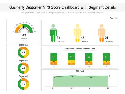
Quarterly customer nps score dashboard with segment details




Try Before you Buy Download Free Sample Product
 Impress Your
 Audience
 100%
100% Editable
 Save Hours
 of Time


Our Quarterly Customer NPS Score Dashboard With Segment Details are topically designed to provide an attractive backdrop to any subject. Use them to look like a presentation pro.
People who downloaded this PowerPoint presentation also viewed the following :
Quarterly customer nps score dashboard with segment details with all 2 slides:
Use our Quarterly Customer NPS Score Dashboard With Segment Details to effectively help you save your valuable time. They are readymade to fit into any presentation structure.
FAQs for Quarterly customer nps score dashboard
Put your main NPS score right at the top, then show how it's changed over time. That's basic stuff. Break it down by customer segments or products - honestly that's where you'll find the good stuff. Don't forget response volume and those written comments (seriously, people tell you way more in the feedback box than just clicking a number). Throw in your detractor vs promoter ratios too. Industry benchmarks are nice if you've got them. Keep the whole thing simple enough that your boss can scan it in 30 seconds and get the picture. You can always make it fancier later.
Dude, charts make NPS data so much easier to understand than spreadsheets. You can actually see patterns - like when scores dip or which customer groups are pissed off. Heat maps are great for spotting problem areas by department too. I remember drowning in those Excel reports until we got a proper dashboard set up. Game changer honestly. Now you can track if fixes are working with simple trend lines. Oh, and bar charts work well for comparing different product lines. Start basic with a timeline chart showing your scores over months - you'll immediately see what's happening.
Honestly, NPS alone won't tell you much. I'd add customer satisfaction scores and churn rates first - those are game changers. Revenue per customer is huge too since it shows actual business impact, not just feelings. Support ticket volume and how long it takes to fix issues matter way more than people think. Product usage data is solid if you can get it easily. The trick is matching what customers say to what they actually do. Start with maybe 2-3 of these that make sense for your business. You can always pile on more metrics later once you spot some trends.
Honestly? Monthly is probably your sweet spot, but weekly works great if you're getting decent response volumes. Daily feels way too aggressive unless something's on fire or you're in the middle of some big initiative. Here's the thing though - don't get caught up obsessing over tiny sample sizes. Set up some automated pulls so you're not constantly hitting refresh like it's social media. I'd start monthly just to see your patterns, then maybe bump it up once you get the hang of things. The rhythm matters more than being perfect about timing.
Honestly, segmentation is a total game-changer for NPS. You break down that one big number by customer type, region, product usage - whatever makes sense for your business. That's when you start seeing the real patterns. Like maybe your enterprise clients are thrilled but smaller customers hate you, or West Coast scores are tanking for some reason. Without it, you're just staring at an average that tells you basically nothing useful. Short sentences here work better than I thought they would. Point is, you need those breakdowns to figure out where to actually spend your time fixing things.
Look at your NPS scores across different timeframes - weekly, monthly, whatever makes sense for your business. The dashboard filters are clutch for breaking things down by customer type or product area. Don't just stare at the numbers though. Read through those comments and watch for patterns - same complaints popping up usually mean there's a real issue brewing. Honestly, most teams collect this stuff and then forget about it. Set up monthly reviews so you're actually doing something with the data instead of letting it pile up.
Make it clear and actionable, not just flashy numbers. Break down your NPS by customer segments, product lines, or time periods so people can actually figure out what's happening. Don't go overboard though - I've watched teams build these insanely complex dashboards that nobody touches. Show trends over time instead of just snapshots. Always add context about what you're doing with the feedback. Super helpful if you can click through from the main scores to actual customer comments when someone wants details. Pretty straightforward stuff really.
Look, NPS dashboards are actually pretty useful for figuring out what's broken. You'll see stuff like "our enterprise customers are happy but small businesses hate us" or "people love onboarding but our support team is killing our scores." Way better than just guessing, right? The trending data shows you which problems are getting worse over time. Honestly, I'd focus on the lowest scores where you have tons of customers - that's where fixing things will make the biggest difference. No point optimizing something only five people use when thousands are struggling elsewhere.
Tableau or Power BI are your best bet if you need heavy customization and analytics stuff. Both handle complex visualizations pretty well. Want something quicker? Looker Studio works, or just use dedicated survey platforms like Delighted - they've got NPS tracking built right in. Honestly, I've watched teams spend forever overcomplicating this when something simple would've worked fine. Just start with whatever dashboard your survey tool already has. You can always move to something beefier later if you need custom reports or deeper segmentation. Don't overthink it at first.
Dude, real-time NPS data is such a lifesaver. You're not looking at old customer feedback from weeks ago anymore - you actually see what's happening right now. When satisfaction scores suddenly tank after a product update, you'll know immediately instead of finding out in some monthly report. I swear it makes you way more proactive. Set up alerts for big score changes so you don't have to babysit the dashboard constantly. Just let it ping you when something's actually wrong and needs fixing.
Don't make NPS your only metric - honestly, that's where most people mess up. Small changes happen all the time, so freaking out over a 2-point dip is pointless. Look at trends instead of single snapshots. The comments are usually way more valuable than the actual score anyway. Comparing yourself to random industries? Pretty useless without context. Oh, and here's the thing - always figure out WHY your score changed before you go making big moves. I've seen teams completely pivot based on one weird month of data. Bad idea.
Mobile design for NPS dashboards is a game-changer, honestly. Your team can check customer scores anywhere instead of being tied to their desks. When there's an urgent issue, nobody wants to wait until they're back at the office to see what's happening. The cool thing is that designing for smaller screens actually makes you cut the fluff and focus on what matters most. Touch-friendly buttons help everyone navigate better too - not just mobile users. I've noticed it forces cleaner layouts overall. Real-time access to your data means faster responses to customer problems, which is huge.
Definitely add commenting so your team can discuss weird NPS drops right on the dashboard. Real-time notifications are huge when scores tank or you get important feedback. Oh, and set up role permissions - learned this the hard way when someone accidentally deleted our main filter lol. @mentions work great for flagging specific people about customer complaints. You'll need export options too for those endless meetings. Honestly? Start with comments and notifications first. Those two alone will save you so much back-and-forth email nonsense.
Honestly, the detractors are where the real gold is - they'll tell you exactly what's broken in your business. Your promoters show what's actually working, so lean into those wins for marketing. I'd segment the data by customer type or region to see patterns. Short bursts work better than long surveys, trust me on this one. Connect your NPS trends to actual numbers like retention or revenue - that's what makes it useful. Set up monthly check-ins to see if changes are moving the needle. The key is treating it like detective work rather than just collecting scores.
So the main difference is how you segment things. B2B needs breaking down by account size, industry, contract value - makes sense since losing one big enterprise client is way worse than some random consumer bouncing. B2C dashboards focus more on demographics and purchase patterns instead. Also, B2B feedback takes forever - enterprise people are slow to respond compared to regular consumers. Your B2B version should track account health trends and relationship manager performance, while B2C can be more real-time focused. Oh and figure out your key segments first, that'll make everything easier.
-
Appreciate the research and its presentable format.
-
Easily Understandable slides.
-
Excellent products for quick understanding.