

Rating scale communicating qualitative measuring financial survey




Try Before you Buy Download Free Sample Product
 Impress Your
 Audience
 100%
100% Editable
 Save Hours
 of Time


Our Rating Scale Communicating Qualitative Measuring Financial Survey are topically designed to provide an attractive backdrop to any subject. Use them to look like a presentation pro.
People who downloaded this PowerPoint presentation also viewed the following :
Rating scale communicating qualitative measuring financial survey with all 13 slides:
Use our Rating Scale Communicating Qualitative Measuring Financial Survey to effectively help you save your valuable time. They are readymade to fit into any presentation structure.
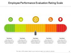
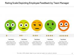
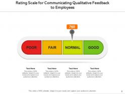
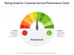
FAQs for Rating scale communicating qualitative
So you've got Likert scales - the whole "strongly agree to strongly disagree" thing. Then there's numeric scales like 1-10 ratings, which honestly are pretty straightforward. Frequency scales use never/sometimes/always type responses. Semantic differential scales compare opposites like happy vs. sad. Net Promoter Score is huge right now - just asks "would you recommend this" on a 0-10 scale. You can also do ranking scales where people order their preferences, or simple yes/no binary scales. The trick is picking what actually makes sense for what you're measuring and your audience.
So the scale you pick totally changes your results. With 5 points, people gravitate toward that middle option - but 6 points forces a lean since there's no neutral. I've watched entire meetings get derailed arguing about this stuff lol. Different scales mess with your response patterns and what statistical tests actually work. Plus whether you'll catch real differences between groups. Honestly? Just pick based on what decisions you're making with the data. Then don't second-guess yourself and switch halfway through.
Honestly, Likert scales are pretty brilliant for research. Instead of just getting yes/no answers, you capture how strongly people feel about stuff - there's a huge difference between "strongly agree" and "mildly agree," right? Most people are already familiar with the format, so they don't sit there confused. The data's way easier to analyze statistically compared to open-ended responses (those take forever to sort through). I always go with 5 or 7 points - gives enough options without making people's heads spin. Oh, and stick with odd numbers so there's a neutral middle choice.
So basically you give people pairs of opposite words like "good-bad" or "strong-weak" and they pick where they fall on a 1-7 scale. It's pretty clever because you can measure different feelings at once - like whether someone thinks something is positive AND how excited they are about it. People actually find them easy to fill out, which is nice. The tricky part is picking good word pairs that actually matter for whatever you're studying. I spent way too much time on that last time I used one, but it's worth getting right or you'll just get useless data.
VAS is perfect when regular scales feel too limiting. You know how sometimes you're not quite a 6 but definitely more than a 5? That's exactly when you want visual analog - it lets people mark that 5.7 spot. Really useful for pain studies or satisfaction surveys where those subtle differences actually matter. People can't just pick the middle option or round numbers either, which cuts down on lazy responses. The continuous data gives you better stats too. I'd go with VAS when you need precision over simplicity - clinical stuff especially. Though honestly, it's probably overkill for quick feedback forms.
So rating scales basically stop people from going off on random tangents when they answer your questions. You give them set options like "strongly agree" to "strongly disagree" - boom, everyone's on the same page. Just don't make your language all leading and weird. Space out your scale points evenly too. I personally think 5-point scales work better than 4-point ones since people can pick neutral if they really want to. Oh, and shuffle your questions around because people definitely get bored halfway through surveys. You should probably test it with like 10 people first before sending it out to everyone.
Honestly, stick to 5-7 points max or people just freeze up. I'd use descriptive labels too - like "extremely helpful" beats plain numbers since everyone reads "3 out of 5" differently. Trust me on this one, our survey data was a mess until we figured that out! Balance is key with equal positive/negative options. You might want a neutral middle depending on what you're actually measuring. Oh, and definitely test it with a few people first - you'll catch weird wording issues. Main thing though? Match your scale to your goal. Are you checking satisfaction, recommendations, or what exactly?
Oh man, this is such a real problem! Asian respondents usually avoid extreme ratings and stick to the middle - meanwhile Americans will happily use the whole scale. It's wild how some cultures think giving top ratings seems braggy, even when they're actually super satisfied. Latin Americans generally rate more positively than Northern Europeans, who are just naturally more critical I guess. You can't treat all responses the same way. Either adjust your analysis or use different benchmarks for each culture, otherwise your data's gonna be completely off.
Here's the thing - longer scales give people way more room to show how they really feel. Like, 3 points? You're basically asking "good, bad, or meh" which is pretty limiting. Go with 7-10 points and people can actually express nuance. I've seen surveys with 20+ options though and that's just overkill - nobody wants to sit there analyzing the difference between a 12 and 13, you know? Start with 7 points. It hits that sweet spot where you get decent detail without making people's heads spin. Plus it's not as intimidating as those giant 10-point scales.
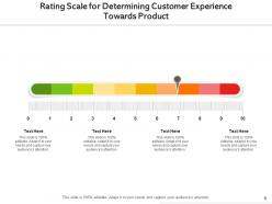
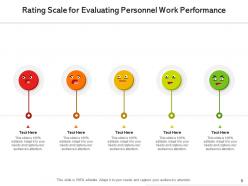
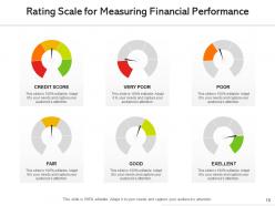
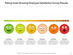
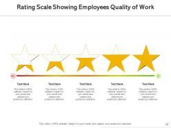
Build rating scales right into your slide templates so you're not recreating them every time. I usually go with 1-5 or 1-10 scales and keep the styling consistent - same fonts, colors, spacing. Stars and circles work great since everyone gets them instantly. Drop these near your key metrics or survey data where people need to quickly gauge performance. Oh, and definitely use color coding like red/yellow/green so the ratings jump out. Makes it way easier for your audience to spot what's important without digging through a bunch of numbers.
Honestly, it depends who you're asking. Descriptive scales like "poor to excellent" are way better for customers - they don't have to decode what a "6" means, you know? But if you're dealing with internal teams or need to crunch numbers across huge datasets, go numerical. Small sample size? Stick with descriptive categories so you're not averaging weird stuff. I personally hate when surveys make me guess whether my satisfaction is a 7 or 8 - like what's the difference really? Think about whether your people naturally think in numbers or words about whatever you're measuring. That'll tell you everything.
Honestly, the biggest thing is getting everyone on the same page about what each number actually means. Like, what's a "3" on your 5-point scale? Define that stuff clearly with real examples - I've watched entire studies get screwed because nobody agreed on the ratings. Practice sessions help too, though they're kinda boring. Try sticking with one scale if you can, makes life easier. If you're stuck with different ones, just convert everything later during analysis. Oh, and document your criteria! People forget how they were rating things after a few weeks. Regular team check-ins catch any weird drift before it becomes a problem.
Biggest mistake? Making it way too complicated. People need to get it fast. Don't do uneven gaps like "poor, okay, good, excellent, amazing" - that's just messy psychologically. Stick to 5-7 points max or you'll lose people. I swear, half the surveys I see go totally overboard trying to be super precise. Your labels should be clear and balanced. Test with a few friends first - they'll tell you if your "neutral" option actually feels neutral. Oh, and start simple. You can always tweak it later once you see how it works.
Honestly, charts make rating data so much easier to understand than just throwing numbers at people. Bar charts show you how responses are distributed across your scale points. For tracking changes over time? Line graphs are perfect. Heat maps are clutch for survey stuff - you can see problem areas immediately. I probably use those too much lol. Match your visual to whatever story you're telling. Skip the boring data tables next time and just show a simple bar chart instead. People actually pay attention when they can see patterns instead of drowning in spreadsheet hell.
Honestly, I'd just go with SurveyMonkey to start - their free version is pretty decent and walks you through the whole process. Qualtrics is solid too but might be overkill unless you're doing something complex. Google Forms is whatever, gets the job done but feels kind of clunky. Typeform's nice if you want something that doesn't look like it's from 2010. The main thing is picking a platform where you can easily test different approaches - like whether 5-point scales actually work better than 7-point for your people. Most of these have templates anyway so you won't be starting from scratch.
-
Wonderful templates design to use in business meetings.