


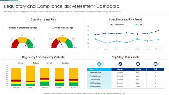
Regulatory And Compliance Risk Assessment Dashboard




Try Before you Buy Download Free Sample Product
 Impress Your
 Audience
 100%
100% Editable
 Save Hours
 of Time


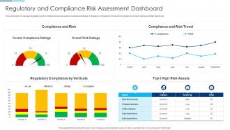
This slide aims to assess regulatory and compliance across various business verticals. It displays comparison of overall compliance and risk rating and their trends etc.
People who downloaded this PowerPoint presentation also viewed the following :
Regulatory And Compliance Risk Assessment Dashboard with all 7 slides:
Use our Regulatory And Compliance Risk Assessment Dashboard to effectively help you save your valuable time. They are readymade to fit into any presentation structure.





FAQs for Regulatory And Compliance
Look at compliance rate percentages first - that's your bread and butter. Days until your next audit deadline is crucial too, obviously. I'd throw in outstanding violations and risk scores broken down by department. Those heat map visuals are honestly game-changers for spotting problem areas fast. Training completion rates matter since auditors obsess over that stuff, plus policy acknowledgment status. The real trick is showing both where you stand now AND trends over time - catches issues before they blow up. Start with these basics, then layer on whatever your industry specifically cares about.
Start with automated feeds pulling from HR, finance, IT security - basically wherever your compliance headaches live. Real-time refreshes are key, not those annoying daily batch updates. Getting different systems to play nice together is honestly such a pain, but worth it once you can set alerts for when stuff goes sideways. Role-based access is pretty crucial so people only see what they need. I'd focus on your biggest 3-5 compliance risks first rather than trying to monitor everything at once. You'll catch policy violations, audit issues, and those regulatory deadlines that always seem to sneak up on everyone.
Dude, automation literally saves your sanity with compliance stuff. No more manually pulling data from like 5 different systems every week. It grabs everything in real-time and actually catches issues before they blow up on you. The alerts are clutch - they ping you when something's off instead of you discovering it during an audit (been there, not fun). Reports just generate themselves now. Start with whatever compliance task makes you want to cry - that's your first automation target. Honestly wish I'd done this years ago.
So basically, a compliance dashboard shows you all your regulatory stuff in real-time - way better than digging through random spreadsheets every time. You'll get alerts when things start going sideways, plus you can spot trends before they bite you. Honestly, it's like having early warning radar for compliance headaches. The best part? Everything's consolidated instead of scattered everywhere. Oh, and definitely customize those risk thresholds to match what your company can actually handle. Those trend reports are gold for figuring out where you'll need backup next quarter.
Put your scariest stuff right at the top - risk alerts, deadlines about to blow up, health scores. Color coding should be obvious (red = panic, green = chill, yellow = meh, needs attention). Group similar compliance stuff together so people aren't hunting around. You'll want simple navigation that lets users dive deeper without getting completely lost. Oh, and rainbow dashboards are the worst - nobody can focus on what actually matters. Test it with regular people, not just compliance nerds. They'll spot the confusing bits you totally missed.
Honestly, dashboards are a game-changer for this stuff. You get all your regulatory updates in one spot instead of manually hunting through different sites (which is honestly such a pain). Set up alerts for the regions that actually matter to your business - like your top 3-5 jurisdictions to start. It's basically a customized news feed but only for compliance changes that'll hit you. The cool part is it pulls from tons of sources and sorts everything by priority and deadlines. You can even catch when different regions have conflicting requirements before it becomes a headache later.
Hey! So for compliance stuff, bar charts and line graphs are your best bet - super easy for auditors to read trends and violation counts. Heat maps work great too, especially when you need to quickly spot which departments are screwing up. Honestly? Skip anything fancy or flashy. Regulators are basically allergic to creative visuals - they want boring and clear. Tables with some conditional formatting can handle your detailed breakdowns nicely. Oh, and always timestamp your data sources. Trust me on this one - you'll thank me later when audit time rolls around and everything's properly documented.
Honestly, compliance dashboards are pretty clutch for getting everyone on the same page. No more digging through email threads wondering where you stand on some random regulation. Different teams can see what matters to them - legal gets their view, ops gets theirs - but it's all the same data underneath. The automated alerts are where it gets really useful though. Set thresholds and the right people get pinged when something's off. I'd probably start with just one compliance area that's highly visible, prove it works, then roll it out wider. Way better than those painful meetings where everyone's working off different spreadsheets.
Honestly, I'd start with mapping out what compliance metrics you actually need first - that'll save you headaches later. Tableau and Power BI are solid choices if you want something reliable without too much hassle. Power BI's probably cheaper if you're already using Microsoft stuff. MetricStream and ServiceNow have decent built-in dashboards too, though they're more enterprise-y. If your compliance team knows their way around code, custom builds with D3.js or Python Dash give you way more control. Just make sure whatever you pick can handle your data sources and won't confuse the hell out of whoever's using it daily.
Honestly, the best way to tell if your dashboard is working is just watching how people actually use it. Are they logging in regularly? Catching problems faster than before? I'd also track whether you're seeing fewer violations month over month - that's the real proof it's doing its job. If your team is still maintaining their own spreadsheets behind the scenes, that's usually a dead giveaway something's not clicking. Check if audit prep takes less time now too. The whole point is making everyone's life easier, right? Set some baseline numbers today, then compare every few months to see if you're headed in the right direction.
Honestly, the worst thing you can do is cram everything onto one screen - nobody wants to deal with that mess. Skip the backward-looking stuff too. Compliance teams need metrics that actually help them catch problems before they blow up. I've watched people spend weeks making dashboards look Instagram-perfect while completely missing what compliance officers actually care about. Talk to the people using it daily first - they'll tell you which alerts matter and which ones are just annoying noise. Oh, and start small. Pick maybe 5 key things, see how it goes, then add more based on what they actually ask for.
Daily updates are your minimum - but honestly, real-time is way better if you can swing it. This stuff changes constantly and I've watched teams get totally screwed by using week-old data that missed something big. Financial reporting and safety metrics? Those need live feeds, no question. Set up automated pulls so you're not stuck manually refreshing everything like some kind of robot. Oh, and treat it like it's actually alive - build those refresh schedules right into what you do every day. Stale compliance data is basically useless data.
Your compliance teams are basically walking around with all the answers you need - you just have to ask them. They know which reports get exported constantly and what data is impossible to find fast enough. That's pure gold for prioritizing updates. Plus they'll spot weird usability stuff, like needing to filter three things simultaneously or wanting different alert formats. Honestly, they're stuck with your dashboard every single day, so who better to tell you what sucks? I'd just grab feedback through quick surveys or chat with them during regular meetings. Way easier than guessing what they actually want.
Look, bad data will kill your dashboard faster than anything else. Regulators spot wonky numbers immediately and then they don't trust anything you show them. One screwed up metric during an audit? Game over - suddenly your whole compliance program looks sketchy. You've gotta build in solid validation processes and check accuracy regularly. Also track where your data comes from so you can trace problems back to the source. I'd start by looking at your current data feeds and figuring out where things usually go wrong. Trust me, it's worth the upfront work.
Honestly, a compliance dashboard is pretty clutch for training stuff. Track who's done their required modules and spot where departments are falling behind. Set up alerts so nobody misses certification deadlines - trust me, that'll save you headaches later. You can see exactly where people struggle most with compliance topics, then tweak your training to hit those weak spots. It gives you this overview of everything at once instead of juggling spreadsheets. Oh, and definitely figure out which metrics actually matter for your goals first. Don't get caught up tracking random stuff that won't help.
-
“Thanks to SlideTeam. Now I can make smart presentations in a fraction of time without any hassle.”
-
Impressive templates. Designing a presentation is fun now!