

Resource utilization report powerpoint images




Try Before you Buy Download Free Sample Product
 Impress Your
 Audience
 100%
100% Editable
 Save Hours
 of Time


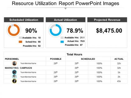
Depending on the nature of products and services, every organization has its own set of resources which get consumed over a period of time and hence need to be properly managed to ensure that there is no bottleneck in the smooth functioning of the organization. For this purpose, the organizations need to maintain and present resource utilization report PowerPoint images to the employees of the company. This detailed report on resource utilization PPT model depicts the scheduled utilization, actual utilization, projected revenue and other minute details related to it. Since this is a predesigned PowerPoint template, it will save a lot of your time and effort which otherwise would have spent in designing the PPT from scratch. The resource management PowerPoint template is of use in almost all organizations irrespective of the nature of its work. Experience exponential growth with our Resource Utilization Report Powerpoint Images. They have a block buster effect.
People who downloaded this PowerPoint presentation also viewed the following :
Resource utilization report powerpoint images with all 5 slides:
Our Resource Utilization Report Powerpoint Images pay heed to your desires. They are geared to fulfill them all.

FAQs for Resource utilization
So you'll need current resource allocation - basically who's doing what. Utilization percentages are key, plus that capacity vs demand breakdown. Timeline impacts too. Honestly, charts are everything here because spreadsheets just kill people's attention spans. Don't forget bottlenecks and underused resources, then forecast next quarter's needs. Oh, and split billable vs non-billable hours if that matters for your company. The whole point is making it super scannable. Leadership needs to spot problems and reallocation opportunities fast - they're not gonna dig deep into details.
Track employee hours vs capacity, budget vs allocated spend, and equipment usage rates by department. Time tracking software + project management tools + financial reports will give you what you need. Honestly the setup is annoying at first but totally worth it. Start with one department as a pilot - trust me, you don't want to deal with company-wide issues right off the bat. Create standardized reporting periods so you can actually compare departments fairly. The whole thing's way less painful once you get the rhythm down.
Start with utilization rates - that's your bread and butter showing actual hours worked versus what's available. Cost per resource hour matters too, plus breaking down billable vs non-billable time. Project completion rates within budget are huge. Revenue per employee is honestly way more telling than most people think. Don't sleep on idle time percentages either. Skills gap analysis helps you see if the right people are doing the right work - sometimes that's half the problem right there. Focus on utilization and cost metrics first though. Those two will show you immediately where things are going sideways.
Honestly, resource utilization can make or break your whole project. Push people too hard and they'll burn out - quality goes to shit and deadlines get missed. But if you're not using your team enough, you're just throwing money away while everything crawls along. Your team gets restless too, which nobody wants. I'd aim for about 75-85% utilization. Gives you wiggle room when stuff inevitably goes sideways, but keeps things moving. Check in weekly so you can catch issues before they explode. Trust me on this one.
Honestly? Start with whatever project management tool you're already using - most have decent reporting built in. If that's not cutting it, Microsoft Project and Smartsheet are solid for tracking who's swamped vs. who has bandwidth. Toggl Track is my go-to for time tracking stuff. Excel works too if you're feeling scrappy about it. Power BI or Tableau can make your data look pretty impressive if you need fancy dashboards for the higher-ups. Don't overthink it though - sometimes the simplest solution ends up being the one that actually gets used.
Honestly, most dashboards just sit there looking pretty while nobody uses them. You want metrics that actually make people DO something. Figure out your biggest bottlenecks first - maybe it's the dev team drowning in work or marketing burning through budget crazy fast. Set up alerts so you know RIGHT when utilization spikes, not weeks later when you're screwed. Oh and trends matter way more than those static snapshot reports everyone loves. If your report doesn't make someone go "oh shit, we need to move people around" then you're tracking the wrong stuff.
Ugh, the data mess is going to drive you crazy. Your info will be spread everywhere - timesheets, project tools, HR systems, whatever else your company uses. People are terrible at logging hours accurately, and don't even get me started on different teams tracking stuff their own way. Real-time data? More like real-time headache because everything's already old news by the time you see it. Honestly, just pick one main system and force everyone to use it consistently. Otherwise you'll spend forever trying to make sense of garbage data from like six different places.
Honestly, heat maps are a game changer for showing capacity across teams. Raw numbers make people's eyes glaze over instantly. But throw those same stats into a colorful chart? Suddenly everyone's asking smart questions. Timeline charts work great for project overlaps, and real-time dashboards keep stakeholders actually engaged. I'd start simple - maybe just a basic capacity chart this week. Bar charts are perfect for comparing utilization rates between teams. Pie charts break down allocation by department pretty nicely too. You'll probably see way more engagement in your next review meeting. Way better than boring spreadsheets anyway.
Monthly works best for most places, but weekly might make sense if you're constantly juggling priorities. Daily? Total waste of time unless you're putting out fires 24/7. I'd say start with monthly - gives you enough data to actually see patterns without getting lost in the weeds. Fast-moving teams sometimes need that weekly pulse though. The real trick is just being consistent with whatever you pick. Oh, and don't overthink it - you can always change the frequency later if monthly feels too slow or weekly feels like overkill.
Your team knows where the real problems are - they see the bottlenecks and stupid delays that reports miss completely. Those utilization numbers only show you what's happening, but talking to people tells you why it's happening. Quick pulse surveys work great, maybe monthly? People also hate being treated like spreadsheet data (who doesn't, right?). When you actually ask for their input, they'll be way more on board with changes. The feedback is honestly what makes the difference between fixing surface issues and actually solving the root problems that slow everyone down.
Honestly, these reports are game-changers for figuring out where your team's actually spending time vs where they should be. You'll spot the obvious stuff - like departments that are slammed while others are twiddling their thumbs. Makes hiring decisions way easier when you're working with real data instead of just guessing. I'd start with your biggest gaps first since those are probably costing you the most money. Oh, and you'll catch those weird inefficiencies early before they blow up your budget. Way better than flying blind on resource planning.
Don't just stare at utilization numbers without context - that's the biggest mistake. Like, 95% CPU might look scary but could be totally normal during your peak hours. Averages are sneaky too. Your server shows 50% average but might be maxing out for hours straight. I learned this the hard way honestly. Check your time ranges and compare against what's actually normal for YOUR system, not some random thresholds you found online. Set alerts based on your real usage patterns instead.
Honestly, benchmarking is like getting a wake-up call about whether you're actually being efficient or just fooling yourself. Compare your stuff to industry standards and you'll probably find some uncomfortable truths - maybe you're overstaffed or your competitors figured out how to do the same job with way fewer people. I've seen companies realize they were burning through budget like crazy compared to everyone else. The best part? You can actually back up your resource requests with real data instead of just going with your gut. Oh, and don't go overboard - just pick 2-3 solid metrics to start.
Honestly, those reports are perfect for figuring out where you're bleeding resources. Look for stuff like servers running constantly when nobody's using them, or departments stockpiling way too much inventory. I've seen offices with entire floors sitting empty while paying full utilities - it's wild. Track your numbers over a few months and you'll start seeing patterns. When you pitch sustainability projects to the bosses, having actual data makes it way easier to get budget approval. My advice? Pick your biggest 3 problem areas first and focus there.
Don't just dump spreadsheets on people - nobody wants to decipher rows of data. Charts showing trends work way better, especially with that green/yellow/red color coding thing. I made this mistake once and watched everyone's eyes glaze over completely. Break it down by teams so it actually matters to whoever's listening. The key part though? Come with solutions, not just problems. Like if utilization sucks, suggest training or moving people around. Otherwise you're just the bearer of bad news with no plan.
-
Easily Editable.
-
Very unique and reliable designs.