


Return On Investment Powerpoint Presentation Slides





Try Before you Buy Download Free Sample Product
 Impress Your
 Audience
 100%
100% Editable
 Save Hours
 of Time


Explore our content ready topic-oriented Return On Investment PowerPoint Presentation Slides. The investment gains PowerPoint complete deck contains a set of ready to use slides such as financial and non-financial return analysis, ROI calculation, marketing return on Investment, ROI projection, etc. Demonstrate concepts of risk, sales, capital, return, finance, growth, progress, measure, investment, and success using this return on capital Presentation graphics. This content ready presentation is fully editable. Modify content as per your need. This is a powerful tool to attract the attention of your audience. Our professionally designed ROI presentation graphics speak visually. Furthermore, return on assets Presentation templates are intended to exhibit various subjects like return on equity, marketing plan, return on capital, return on marketing investment, the rate of profit, rate of return and many more. Keep in mind the purpose of your presentation and be prepared with the right content. Download capital investment analysis PowerPoint templates to measure business profitability.
People who downloaded this PowerPoint presentation also viewed the following :
Content of this Powerpoint Presentation
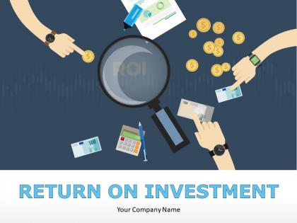
Slide 1: This is an introductory slide to Return On Investment with imagery.
Slide 2: This is an Agenda slide. Present it cohesively here.
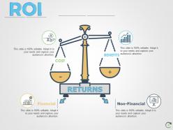
Slide 3: This is ROI slide showing COST, BENEFITS and RETURNS. It also shows two types of finances- Financial and Non-Financial.
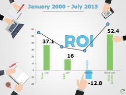
Slide 4: This slide presents a graphical image showing return on investment in terms of years.
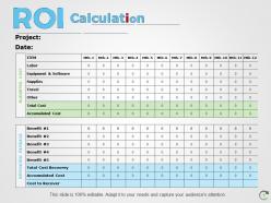
Slide 5: This slide shows ROI Calculation in a tabular form.
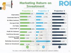
Slide 6: This slide shows the Marketing Return on Investment. Use it to showcase your projections etc.
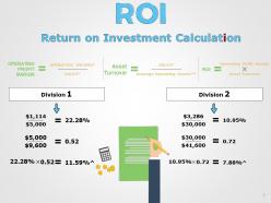
Slide 7: This slide also shows Return on Investment Calculation with two divisions and stated.
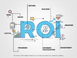
Slide 8: This slide shows ROI with INVESTMENT, SALES, RISK, INTEREST CALCULATION, CAPITAL, RETURN, MEASURE, SUCCESS, PROGRESS.
Slide 9: This slide is titled Additional Slides which are to be used if required. You can also alter the slide content as per your requirement.
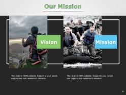
Slide 10: This slide represents Our Mission. State your mission and vision etc.
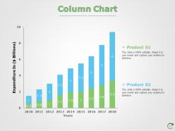
Slide 11: This slide presents a Column Chart for showcasing product/ company growth, comparison etc.
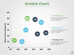
Slide 12: This slide presents a Bubble Chart for showcasing product/ company growth, comparison etc.
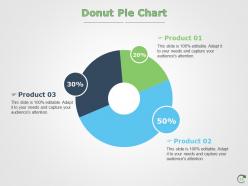
Slide 13: This is a Donut Pie Chart slide to present product/ entity comparison, specifications etc.
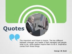
Slide 14: This is a Business Quotes slide to quote something you believe in.
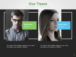
Slide 15: This slide helps depict Our Team with text boxes.
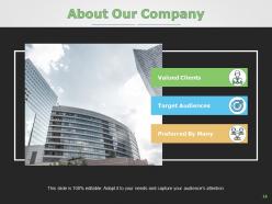
Slide 16: This slide showcases About Our Company with- Valued Clients, Preferred By Many, Target Audiences as examples to state about.
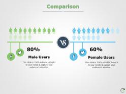
Slide 17: This is a Comparison slide to compare male users and female users.
Slide 18: This slide showcases Post It notes to be displayed. Show events, important piece of information, events etc. here.
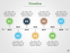
Slide 19: This slide covers the Timeline of various processes, you can use it as per your requirements.
Slide 20: This slide is a Venn diagram slide. Show information, specifications etc. here.
Slide 21: This is a Puzzle pieces image slide to show information, specifications etc.
Slide 22: This is a Thank You slide with Address, Email Address, and Contact Number.
Return On Investment Powerpoint Presentation Slides with all 22 slides:
Expand your journal with our Return On Investment Powerpoint Presentation Slides. Get good authors to contribute articles.



FAQs for Return On Investment
You'll want to nail down four main things: upfront costs, expected revenue/savings, timeline, and risks. Show the actual dollars - money going out vs coming back in. Clean math = better chance of approval. Don't oversell the timeline though, that always bites you later. Factor in ongoing maintenance costs too since those add up. Oh, and prepare both conservative and optimistic scenarios. Trust me, someone's gonna ask "what if" questions anyway, so beat them to it. Honestly, the pessimistic version sometimes sells better because it shows you've thought things through.
Good presentations definitely help with engagement, and that translates to better ROI. Your audience actually pays attention instead of scrolling their phones when slides are clean and visual. I mean, we've all sat through those brutal text-heavy presentations - nobody remembers anything from those. Engaged people ask better questions and take action. Cut your text in half (seriously, like 50%), throw in some relevant visuals, and structure it so there's a clear story. The difference is huge. Short sentences work. But don't make everything choppy - mix it up so it flows naturally.
Track your costs first - time spent making it, design stuff, distribution. Then figure out what revenue it actually brought in. Lead numbers, how many converted, sales values from those prospects. The annoying part? Attribution is messy since deals close way later. I'd set up UTM codes or just ask new leads where they heard about you during calls. Sometimes people forget though, which sucks. Once you've got those numbers, divide total revenue by costs and multiply by 100. That's your ROI percentage. Not rocket science but tracking everything consistently is honestly the hardest part.
Honestly, template choice matters way more than people think. A polished, clean design makes stakeholders trust your ROI data more. But go too flashy or messy? They'll get distracted from your actual findings. I've literally watched solid ROI work get shot down because it looked sloppy - such a waste! Pick something that fits your company's vibe. Good contrast and readable fonts are non-negotiable. Keep formatting consistent throughout. When your presentation looks professional, people take your recommendations seriously. It's weird how much visual stuff affects credibility, but it totally does.
Stories make presentations way more effective because people actually remember them. Like, your audience will totally forget slide 23 with all those bullet points, but they'll remember the story about that one customer who almost quit. Data's important obviously, but wrap it in a narrative and suddenly people care enough to act on it. Nobody's making big decisions just from staring at charts - they need that emotional hook. Pick one really good story that backs up whatever you're asking for and center everything around that. Trust me, it works so much better than drowning them in facts.
Track stuff like productivity, retention, and sales before training starts - that's your baseline. Check back in 6-12 months to see what changed. Quarterly reviews help too. The math is simple: (benefits minus costs) divided by costs times 100. Honestly, separating training impact from everything else happening is messy and you'll never get it perfect. But close enough works. Customer satisfaction scores are gold if you can get them. Oh, and promotion rates - people forget about those but they're telling. Start measuring before your next session or you're basically flying blind.
Ugh, the worst thing you can do is skip defining what you actually want to achieve. Sounds boring but trust me on this one. Generic content that tries to please everyone? It pleases no one. I've watched so many people cram everything into one deck - terrible idea. Your key points just get lost. Poor delivery prep kills me every time. Great slides mean nothing if you're reading off them like a robot. Oh, and not following up afterward? You're basically throwing away potential business. Pick 2-3 specific outcomes first, then build everything around those.
Good visuals actually boost your ROI because people stay tuned in longer. When audiences are engaged, they remember your main points and convert better. Honestly, I've watched terrible slide design torpedo perfectly good deals - it's painful! Clean layouts and consistent colors stop people from scrolling their phones during your pitch. Smart imagery helps too. The thing is, if your template looks professional, audiences ask smarter questions afterward. They're way more likely to take action. Every visual should earn its spot by keeping people focused. Don't let boring slides sabotage all your hard work on the content itself.
Figure out what actually matters to them first - money, cutting costs, making things run smoother, you know? Build everything around those problems and connect the dots to real business results. Honestly, most people mess this up by talking about cool features instead of what it'll do for the company's wallet. Get specific with your numbers too - "cut processing time 30% by Q2" hits way harder than some wishy-washy promise. Oh, and flip your approach: start with the financial win they'll see, then explain how you'll make it happen. Works every time.
Honestly, customizing your presentation templates is a total game-changer for ROI. Your audience connects way better when slides match their industry and pain points - I've watched this play out so many times. Generic decks just feel lazy and impersonal. People can tell you didn't put in the effort, you know? When you show you actually understand their world, they're more likely to take action. You'll close more deals and get way better feedback. Oh, and don't go crazy - just create like 3-4 audience-specific templates instead of using the same boring deck for everyone.
Start with whatever metric actually matters to your team - lead quality, audience retention, whatever. Google Analytics or Adobe Analytics will track your digital stuff like time spent and clicks. Compare that against your usual surveys and attendance numbers. HubSpot or Salesforce are solid for tracking leads and conversions from both formats. PowerBI honestly destroys Excel when you're trying to make clean comparison visuals (though I still use Excel for random stuff sometimes). Cost-wise, just throw your expenses in a basic spreadsheet - hosting fees vs printing and venue costs. Pick one thing first, don't try to measure everything at once.
Honestly, most people just ignore presentation feedback, but you shouldn't. Track what actually works - like did your demo get people more excited than those boring slides? After each pitch, dig deeper than the usual "nice presentation" comments. Ask what specific parts clicked with them. Look for patterns in what gets follow-up questions or moves deals forward. Maybe your pricing story needs work, or certain examples just don't land. Then - and this is crucial - actually change stuff based on what you learn. Test those tweaks in your next presentations and see if your close rates improve. It's basically building your own cheat sheet.
Look, your presentation can literally be the difference between just sharing info and actually making money. The trick? End with a crystal clear call to action that tells people exactly what to do next. I've watched so many good presentations just... fizzle out because they didn't give people a clear path forward. You want someone scheduling a demo? Say that. Need budget approval? Ask for it directly. Make it specific and time-sensitive - like "Let's get your demo scheduled this week" instead of some vague "reach out if interested." People need that push, honestly. Remove any friction and they'll act on it.
So here's the deal - when you're doing internal ROI stuff, you can get into the weedy details. Training costs, employee happiness metrics, all that jazz your team gets. But external presentations? Stick to numbers you can actually prove with receipts. I've watched so many pitches crash because someone tried to be fancy with projected savings that sounded made-up. Investors don't care about "morale improvements" - they want cash flow they can track. Keep it simple and conservative for outsiders. Your internal folks might buy the softer benefits, but external audiences need the hard financial wins only.
Honestly, visual analytics are a game changer for making sense of messy data. Your team won't waste hours buried in spreadsheets anymore—they'll actually spot trends and weird outliers right away. Charts and dashboards tell the story way better than endless number slides (we've all been tortured by those). Quick decisions happen when people can see what's going on. You'll catch opportunities faster and dodge those expensive "oops we waited too long" moments. ROI gets better because you're acting on real insights instead of just... drowning. Try turning three of your main metrics into simple visuals first—seriously, you'll notice the difference pretty much immediately.
No Reviews