


Sample value stream mapping template ppt infographics


Try Before you Buy Download Free Sample Product
 Impress Your
 Audience
Editable
of Time


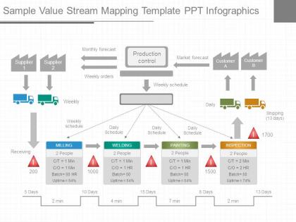
Make our sample value stream mapping presentation template be a part of your next presentation. Our designing team has created this wonderful presentation slide for you. The PPT template slide illustrates the flow of materials and information from supplier to customer. Value stream mapping is a lean manufacturing technique used to analyze, design, and manage the flow of materials and information required to bring a product to a customer. It helps identify waste and streamline the production process. The PPT Slide is a four stage process. The stages in this process are supplier, monthly forecast, weekly orders, production control, market forecast, customer, weekly schedule, weekly, daily, shipping, daily schedule, milling, welding, painting, inspection, receiving. Every organization plan short and long term organizational goals and then work towards it. So it is important to identify all possible opportunities for ensuring that the time taken to produce items and have them ready and transported out in as short a time as possible. So, use this slide and make awesome presentations. Cover for any delays with our Sample Value Stream Mapping Template Ppt Infographics. Generate action to counter it's effect.
People who downloaded this PowerPoint presentation also viewed the following :
Sample value stream mapping template ppt infographics with all 7 slides:
Our Sample Value Stream Mapping Template Ppt Infographics keep the sun shining brightly. They allow you to make hay all day.

FAQs for Sample value stream mapping
So VSM basically gives you this whole bird's eye view of your process from start to finish. You map out every single step - all the waiting, handoffs, bottlenecks, the works. Honestly, it's pretty eye-opening when you actually see it all laid out visually instead of just talking through problems in endless meetings (we've all been there). The visual part makes spotting inefficiencies way easier. Once you can see where work piles up or time gets completely wasted, you'll know exactly which improvements are actually worth your time. It helps you focus on what'll really impact cycle time and quality.
So basically, VSM makes you draw out literally every step in your process - and that's when you start seeing all the garbage. Bottlenecks jump out at you. Handoffs that make no sense become obvious. Inventory just sitting there doing nothing? Yeah, you'll spot that too. The whole visual thing is honestly brilliant because you're seeing the entire flow instead of getting stuck on individual pieces. I'd definitely start with mapping what you're doing now - don't try to fix anything yet. Once it's all laid out, the wasteful stuff practically screams at you. Then you can tackle the worst offenders first.
You'll mainly need rectangles for process steps, with data boxes below showing cycle times and inventory. Arrows show material flow, plus push/pull icons. Customer and supplier boxes go on the sides. Those triangle symbols are key - they represent inventory sitting between processes. Material flows horizontally, but information flow (dashed lines) usually goes up and down or diagonal. Oh, and saw-tooth lines for FIFO lanes, truck symbols for shipments. Honestly, I'd start simple with a current state map using just the basics. Timeline goes across the bottom, and don't forget kaizen bursts for marking improvement spots. You can always add more detailed symbols later once you get the hang of it.
You know what's crazy? VSM gets everyone staring at the same diagram instead of arguing about different versions of reality. Suddenly people aren't talking past each other anymore - they're pointing at actual boxes and arrows. The visual thing really works for getting tech people and business folks on the same page (which honestly feels like a miracle sometimes). When teams map stuff out together, they finally get why other departments do weird things or hit roadblocks. My advice? Next time you're in one of those painful cross-functional meetings, just grab a whiteboard and start sketching the process. Works way better than PowerPoint debates.
Yeah, totally works for service stuff! Instead of tracking physical products, you're mapping information flow. Pick one process that's driving everyone crazy and map it out first - like how customers move from initial contact to final delivery. Healthcare does this for patient flow, banks use it for loan approvals. I've seen call centers have huge success with it too. The trick is figuring out what actually adds value vs what's just bureaucratic nonsense from your customer's point of view. Look for handoffs between departments and where things get stuck. Software teams are probably the best at this honestly - they map features from idea all the way to release.
First thing - pick your product family and map out how things actually flow from order to delivery. Get out there and walk the floor! Seriously, conference room brainstorming is pretty useless here. Document every step with cycle times, wait times, all that inventory data. Create your future state by spotting waste and fixing the flow issues. The difference between where you are and where you want to be? That's your roadmap right there. Oh, and definitely loop in the floor workers - they see problems management totally misses.
Just follow the work around for a full cycle and document everything you see - and I mean everything, including the messy parts. Time each step. Note where stuff just sits waiting around. Map out all the handoffs and delays happening right now. Don't make it sound better than it is! Once you've got that brutal reality mapped out, then sketch your ideal future state - faster flow, less inventory collecting dust, smoother handoffs. Honestly, most people want to skip the current state part because it's tedious, but you can't fix what you haven't actually measured.
Customer feedback is everything in VSM - it shows you what actually creates value instead of what you assume does. Without it, you're basically guessing. I've watched teams obsess over internal metrics that customers don't give a damn about, which is painful to see. Their feedback helps you spot which activities truly matter versus pure waste. Plus it tells you where to focus your improvements first. The whole point is making customers happier, right? So collect their input throughout your mapping process, not just when you're done. Otherwise you might fix the wrong stuff entirely.
Dude, digital mapping tools will change your life - no more redrawing those sticky note maps every single time you tweak something. You can pull real data straight from your systems instead of standing there with a stopwatch like some kind of efficiency detective. IoT sensors catch stuff you'd totally miss otherwise. The coolest part? You can test changes digitally first before screwing anything up in real life. Oh, and your team can actually work on maps from home now, which is clutch. Start simple with basic mapping software - seriously saves so much time when you're iterating through versions.
Track cycle time first - that's how long each step actually takes. Lead time is different though, it includes all the waiting around between steps. You'll also want to measure first-pass yield for quality stuff, plus changeover times and how much inventory piles up at each stage. Oh and takt time is super important too, shows you the pace needed to hit customer demand. Value-added vs non-value-added ratios help too I guess. Map everything out with these numbers first, then you can spot where the real problems are hiding.
Honestly? Every 6-12 months works for most people. I used to stress about keeping mine updated constantly - total waste of time. Big process changes are what really matter though. New tech, workflow tweaks, that kind of stuff. Annual updates are fine if things stay pretty stable. Just don't be like my old manager who had maps from 2019 still hanging up last year lol. They're useless when they're that stale. Set a phone reminder or you'll totally forget. Oh, and if you notice reality doesn't match what's mapped anymore, that's your cue to refresh it.
Honestly, resistance to change is gonna be your biggest headache - nobody wants to admit their processes are a mess. Plus scope creep hits hard when teams try mapping everything instead of picking one area first. Getting real data is tricky too since people describe the "perfect" workflow, not the actual chaos happening daily. Oh, and data collection? Way more painful than you'd think, especially if things are already disorganized. My advice: start with just one value stream. Get the front-line workers on your side early - they're doing the real work anyway. Don't stress about perfection initially.
Yeah, totally! VSM plays really nice with both approaches. Start with mapping your current state - you'll spot waste and bottlenecks right away (that's your Lean side). Then Six Sigma's DMAIC process helps you actually fix the specific problems you found. The visual aspect makes everything obvious, honestly. When you're tracking cycle times and lead times on the map, you're already gathering all that data Six Sigma needs anyway. Design your future state using Lean principles, then use Six Sigma tools to bridge the gap. Works like a charm - I've seen teams get way better results this way than picking just one method.
So basically you draw out your whole process from start to finish - every step, handoff, all the waiting around. It's like finally seeing that mess you knew was happening behind the scenes! The timeline runs underneath so you can spot where stuff gets stuck or duplicated. Materials and info flow are both tracked. Honestly, it's pretty satisfying once you see it all laid out. Then you sketch your dream version and figure out what actually needs fixing to get there. Way better than guessing what's broken, you know?
Honestly, you've got a bunch of options here. Basic stuff like Visio or Lucidchart works fine when you're starting out - even PowerPoint if that's what you have. There's specialized VSM software too like eVSM or ValueStreamGuru that comes with all the symbols and does calculations for you, which is pretty handy. A lot of teams I've seen still use pen and paper first though. Gets everyone actually talking instead of staring at screens. You can always digitize it later for sharing and updates. My advice? Just use whatever your team already knows how to use, then maybe upgrade once you're doing this stuff regularly.
-
Use of icon with content is very relateable, informative and appealing.
-
Great designs, really helpful.