


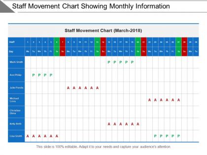
Staff movement chart showing monthly information




Try Before you Buy Download Free Sample Product
 Impress Your
 Audience
 100%
100% Editable
 Save Hours
 of Time


Carry out an exhaustive examination with our Staff Movement Chart Showing Monthly Information. Check out every detail that emerges.
People who downloaded this PowerPoint presentation also viewed the following :
Staff movement chart showing monthly information with all 5 slides:
Clearly bring out biased approaches with our Staff Movement Chart Showing Monthly Information. Be able to expose injustice.

FAQs for Staff movement chart
So basically it's like getting a map of how everyone moves around your company - who got promoted, transferred, quit, all that stuff. You'll start noticing weird trends, like why is marketing losing everyone? Pretty cool once you get into it, honestly kinda nerdy but whatever. The best part is catching problems early - like realizing you need to start training Sarah's replacement before she retires next year. Just track the basics for three months and you'll be shocked at what you missed before. Trust me on this one.
So I've been tracking staff movements for a while now, and honestly? The patterns you discover are wild. Look at the last 2-3 years of data first. You'll spot where people get bottlenecked in certain roles, which departments are bleeding talent, and what positions actually lead somewhere good. My favorite part is seeing how some random job becomes this unexpected stepping stone everyone uses. Makes workforce planning so much easier when you can actually predict what's coming next. Plus you'll probably find some trends that'll totally change how you think about hiring and developing people.
So basically you need employee names, current roles, and where they're moving to with dates. Reporting structure changes are key too. Salary adjustments if there are any. Honestly, the "reason for move" column saves you so many headaches later - trust me on that one. Department transfers, location stuff, who's covering their old job temporarily. Oh and make sure you get the right approvals lined up. I'd start super basic with just names and positions first. Then add the other stuff once you see what actually matters for your situation. Way easier than trying to build the perfect spreadsheet from day one.
So staff movement charts basically track who's leaving, getting promoted, or switching teams. Map these patterns out and boom - you'll spot talent gaps right away. Like when three senior backend engineers bail but nobody gets promoted up? That's a problem. Also watch for spots where people get stuck - usually means career paths suck there. Honestly, most companies ignore this stuff until it's too late. Check these quarterly though and you can actually fix gaps before they become total disasters. Way better than scrambling later.
Honestly, the biggest trap is overcomplicating everything - I've seen people create these insane spaghetti monsters that nobody can decode. Keep roles super clear and don't stuff too much into one chart. Timeline details matter, and your arrows should actually make logical sense. Also update the thing regularly because stale org charts are useless. Oh, and pick consistent formatting - randomly mixing fonts looks terrible. Start basic, show it to a couple people first, then fix whatever confuses them. Trust me on this one.
Honestly? Monthly updates work best if you've got a lot of turnover. Quarterly is fine for more stable places, but once people start noticing the chart's wrong, they'll just ignore it completely. Real-time updates are pretty sweet if you can swing it - some teams use shared docs that stay current automatically. New hires, departures, role switches... all that stuff needs to show up fairly quick or what's the point? I'd rather have a slightly messy chart that's accurate than a perfect one from three months ago. Just pick whatever timeline matches how crazy your org gets and actually stick to it.
Definitely use arrows with consistent colors - green for promotions, red for exits, blue for sideways moves. Make your timeline consistent too, like monthly or quarterly. Don't cram everything in there though! I swear some of these charts end up looking like a hot mess. Focus on the big moves instead of every tiny role shift. Your department labels need to be readable, and maybe try thicker lines for senior-level people? Oh, and test it out on someone else first - if they can't follow it quickly, you'll know it needs tweaking.
Oh, staff movement charts are gold for succession planning! They literally map out how people have moved around your company over time. You'll start seeing patterns - like certain roles that always lead to management, or departments where you keep hiring outsiders instead of promoting internally. Kind of shows you the career paths that already exist, you know? Plus you can spot your rising stars who've made smart moves and figure out where you're missing talent pipelines. Honestly, it's way better than guessing. Use that info to build development programs and show people realistic ways to move up.
Honestly, just get a cloud-based org chart tool to start - saves you so much headache. Most of these can pull employee data straight from HR systems automatically, which beats doing it by hand every time someone switches teams. The real game-changer though? Multiple people can edit the same chart without that awful "final_FINAL_v2" file situation we've all been there with. Some even connect to scheduling systems to show who's actually working vs who should be. Oh, and the fancy ones predict future staffing needs, but that's probably overkill for now. Start simple and add features as you go.
So basically it's your tracker for who's coming, going, or moving around at work. When people start, you'll see which teams are growing fast and need more training help. High turnover in one department? The chart spots those red flags real quick. Update it monthly - trust me, monthly is way better than trying to remember everything later. Share it with HR and department heads so nobody's caught off guard. Oh, and it covers your butt for compliance stuff too. Really helps with planning ahead since you can actually see the staffing patterns instead of just guessing.
Dude, these charts are lifesavers for tracking who moved where. No more awkward "um, who handles this now?" conversations when someone switches departments. Like if marketing person X jumps to sales, you'll actually know instead of sending emails into the void. Real-time updates are clutch though - otherwise you're stuck with some useless outdated document nobody looks at. Oh and make sure people can actually find the thing! I swear half the time these charts exist somewhere random that requires three logins to access.
So you'll want to track turnover by department first - that's your bread and butter. Time-to-fill positions matters too, along with internal promotion rates. Exit interview data is honestly where the real insights live though, way better than guessing why people bail. Track tenure data since it shows which teams are actually keeping people vs just churning through them. Oh and seasonal patterns - some departments just naturally have cyclical turnover so don't panic over normal fluctuations. Start with these basics for your dashboard. You can get fancy with more detailed metrics once you see what trends pop up.
Staff movement charts are gold for catching diversity problems in promotions and transfers. Map out the last 2-3 years and see if certain groups get stuck while others climb fast. Really shows if your hiring efforts actually matter or if there's some invisible ceiling happening. The visual aspect is clutch when you're trying to convince leadership something's wrong - way better than just throwing numbers at them. Look for departments where people seem trapped, or levels where advancement just... stops. Then you can build targeted programs around what you find.
Honestly, Visio's probably your best bet if your company already has it - that thing handles org charts like a dream. Lucidchart's my go-to though since it's web-based and doesn't make you want to throw your computer out the window. Templates actually work too, which is rare. BambooHR has built-in chart stuff if you're already using them for HR. PowerPoint works fine for basic charts, or even Google Drawings if you're feeling cheap. I'd just start with whatever you've got access to first. No point paying for fancy software if PowerPoint does what you need, you know?
Honestly, start with the basics - retention rates and how many people actually get promoted internally. Time-to-fill for positions matters too. Employee satisfaction surveys are clutch, but make them anonymous because nobody's gonna be real with HR otherwise. Watch if people are actually following your mapped pathways or just doing their own thing (which happens more than you'd think). The satisfaction scores around career development will tell you loads. Short version: track the data, but don't forget to update your chart when reality doesn't match your plan.
-
Awesomely designed templates, Easy to understand.
-
Great quality product.