


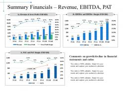
Summary financials revenue ebitda pat powerpoint slide download





Try Before you Buy Download Free Sample Product
 Impress Your
 Audience
 100%
100% Editable
 Save Hours
 of Time


Acquire distinction with our Summary Financials Revenue Ebitda Pat Powerpoint Slide Download. Earn the admiration of your colleagues.
People who downloaded this PowerPoint presentation also viewed the following :
Summary financials revenue ebitda pat powerpoint slide download with all 5 slides:
Encouragement flows with our Summary Financials Revenue Ebitda Pat Powerpoint Slide Download. Funds will arrive as you desire.

FAQs for Summary financials revenue ebitda pat
Start with your main financials - P&L, balance sheet, cash flow statement. Charts are your friend here because honestly, who wants to squint at rows of numbers? Grab your key metrics too: revenue growth, margins, burn rate if you're dealing with that. Put an exec summary up front with the big picture stuff. Variance analysis is clutch - show actual vs budget so people can see where you missed or crushed it. Oh, and definitely call out your assumptions and any red flags. One slide, one point. Trust me on this - people zone out fast when you cram too much onto one slide.
Dude, charts and graphs are a lifesaver because people's brains just eat up visuals way faster than boring spreadsheet rows. I swear, I've watched so many meetings where everyone zones out the second you throw numbers at them. Bar charts and line graphs? You'll catch trends and weird outliers right away that would take forever to find otherwise. Colors help too - red for bad stuff, green for wins, you know the drill. Oh and don't go crazy with like 10 charts at once. Start with one solid visual for each main point, then have your detailed numbers ready if someone asks.
Honestly, the worst thing you can do is throw percentages around without explaining what they actually mean. I've seen so many people mess this up! Also, don't pick weird timeframes just to make your data look better - everyone sees right through that. Math errors will kill your credibility instantly, so double-check everything. One-time events can totally skew your numbers too, so call those out. Executives want the big picture while analysts need the nitty-gritty details. Start with what story your data tells, then show the clean numbers to back it up.
Honestly, it totally depends on your industry. Banking and insurance companies have to include tons of regulatory stuff and risk metrics that retail businesses don't even think about. Manufacturing focuses on inventory costs, while service companies care more about revenue recognition. Tech companies are obsessed with subscription numbers and how much they spend getting new users - it's kinda wild how detailed they get. Healthcare and pharma need massive R&D sections because of compliance requirements. My advice? Pull up some 10-Ks from competitors in your space and see what they're actually reporting to investors.
Your data needs a story, otherwise people's eyes just glaze over. I mean, you can show all the charts you want, but if there's no clear thread explaining *why* revenue tanked in Q2 and what you're doing about it, nobody will get it. The narrative connects cause and effect - not just "here's what happened" but the actual reasoning behind it all. Start with context before hitting them with numbers. Oh, and always tie everything back to your bigger business story. Trust me, stakeholders need that "so what" moment or they'll completely miss your key points.
Charts and graphs are your best friend here - way easier to digest than endless spreadsheets. Lead with your main point right up front, then back it up with 2-3 solid data points. Honestly, I can't tell you how many reports I've seen that hide the important stuff until page two. Always spell out your assumptions for forecasts because surprises suck. Keep the language straightforward and focus on what this stuff actually means for decisions. Oh, and throw in a quick "so what" section at the end that connects everything to real next steps people can take.
PowerPoint or Google Slides are still your best bet - stakeholders just expect that format. Clean up your data in Excel first though, makes everything way smoother when you import charts. Tableau's pretty cool if you want interactive stuff, but honestly? Most people overcomplicate this. A solid PowerPoint usually does the trick. I got distracted by fancy dashboards once and spent way too long on something that could've been three slides. Start with what story you're trying to tell, then pick whatever tool actually makes sense.
So investors want the flashy stuff - growth numbers, ROI, what's coming next. They're all about returns, obviously. Board members need the full picture though. Show them how you're hitting goals, where things went sideways, operational details. My old CFO used to say "investors want the sizzle, board wants the steak" which honestly nails it. Charts and future projections work great for investors. Board reports should be thorough but not overwhelming - they've got other stuff to review too. Just think about what decisions each group needs to make with your info.
Focus on revenue, profit margins, and cash flow - that's where the real story lives. Throw in some ratios like debt-to-equity and current ratio because investors eat that stuff up. Revenue growth gets all the attention, but honestly? Profitability trends matter way more for long-term health. Year-over-year comparisons are crucial too since numbers without context are pretty useless. Oh, and stick to maybe 5-7 metrics tops. I've seen presentations with like 15 different charts and everyone just checks out mentally. Pick whatever actually backs up your main point.
Start with the big stuff - revenue, profit, any major surprises. Then explain what caused those numbers. It's like writing a news article where you don't bury the headline. I know it's tempting to include every single detail (guilty of this myself), but people tune out fast. Save all that granular data for your appendix. Your main slides should focus on trends and what you can actually do about them. Honestly, if your audience can't remember the three biggest takeaways about your financial performance, you've probably overcomplicated it. Less really is more here.
Honestly, design is everything when it comes to financial summaries. I've watched executives literally shove reports aside because they couldn't deal with cramped text and messy tables. Clean formatting is your friend here - plenty of white space, logical grouping, fonts that don't require a magnifying glass. The key numbers should pop out immediately. Keep your colors consistent but don't go nuts with rainbow charts (learned that one the hard way). When people can actually scan through your data without getting a headache, they'll engage with it instead of just pretending to pay attention.
Yeah, definitely include some past performance but don't make it the star of the show. I'd grab like 2-3 years of the big stuff - revenue growth, profit margins, major wins. Shows you're legit and helps explain trends. But honestly? People care way more about what's coming next than what already happened. Historical data works great for backing up your future projections though. Short sentences work. Or you can go longer when you're explaining why your assumptions actually make sense. Oh, and stick those old numbers in charts or appendices - keeps your main analysis clean and forward-focused.
Drop the fancy business speak and tell them a story with your numbers. Charts beat spreadsheets every time - nobody wants to stare at rows of data. Start with why they should care, not the numbers themselves. I bombed a presentation once by leading with metrics instead of meaning. Pick 3-4 key things max and compare them to last quarter or whatever benchmark makes sense. People need context, not just random figures. End with what you're actually gonna do about it. You're basically translating nerd speak into human language. Oh, and always have those next steps ready or they'll just sit there wondering "...okay, so now what?"
Honestly, try turning your financial summaries into actual stories. Start with where the company was before, walk through what happened (the messy stuff and the wins), then show where you landed. Our brains just eat that narrative structure up - can't resist it. Skip the boring number dump. Instead, create some drama around big decisions or market shifts that changed everything. Throw in phrases like "then this happened" or "here's the plot twist." I swear it works way better than those dry bullet-point presentations everyone hates sitting through.
Honestly, cash flow projections are everything - they'll show you what's actually sustainable vs what just looks good on paper. Look at revenue trends by segment so you can see where to invest more or what's slowly dying out. Margin analysis by product line matters too, obviously. I'd skip getting buried in every little expense though. Pick 3-4 metrics that actually connect to your big decisions and show those with solid year-over-year comparisons. Way more useful than drowning people in spreadsheet hell, trust me.
-
Out of the box and creative design.
-
Excellent template with unique design.