Summary Of Key Findings Powerpoint Presentation Slides

Rating:
96%
Summary Of Key Findings Powerpoint Presentation Slides
Slide 1 of 14
Favourites Favourites

Try Before you Buy Download Free Sample Product

Audience Impress Your
Audience
Editable 100%
Editable
Time Save Hours
of Time
The Biggest Sale is ending soon in
0
0
:
0
0
:
0
0
Rating:
96%
This complete presentation has a set of fourteen slides to show your mastery of the subject. Can be changed into various formats like PDF, JPG, and PNG. You can customize the colors, font, and text without any hassle to suit your business needs. This template is adaptable with Google Slides, which makes it easily accessible at once. It is easily available in both 4:3 and 16:9 aspect ratio.

Content of this Powerpoint Presentation


Slide 1: This slide introduces Summary of key Findings. State Your Company Name and begin.
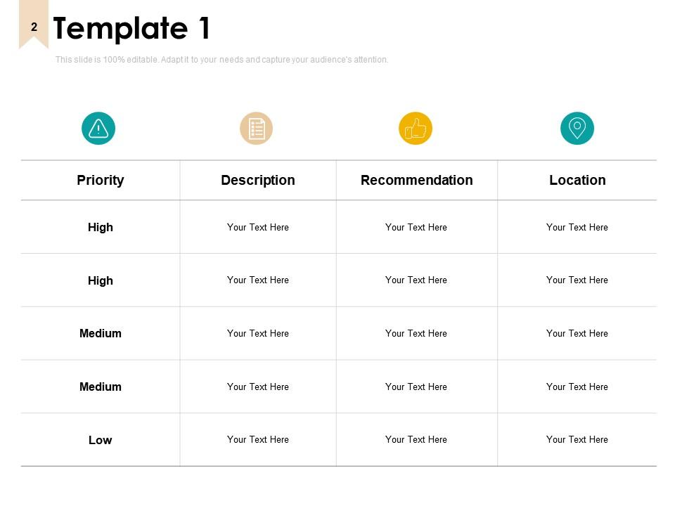
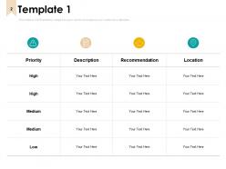
Slide 2: This slide shows Key Findings Template 1 in tabular form with categories as Priority, description, recommendation and location.
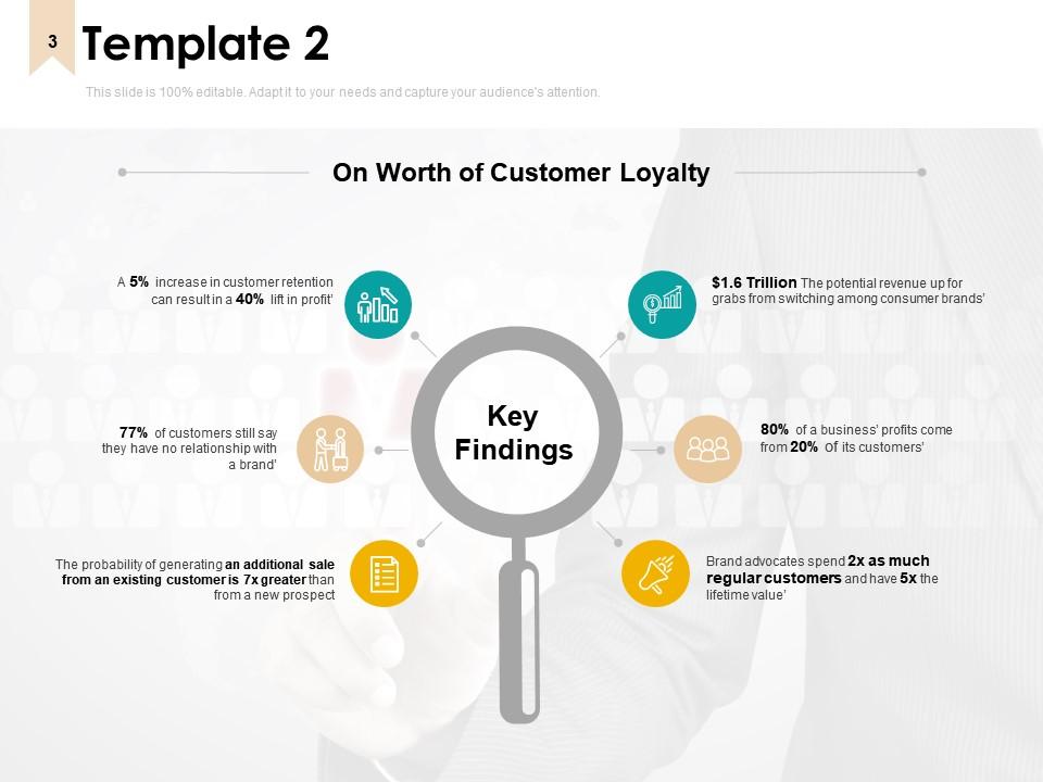
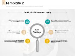
Slide 3: This slide presents Key Findings Template 2 with a related flow chart.
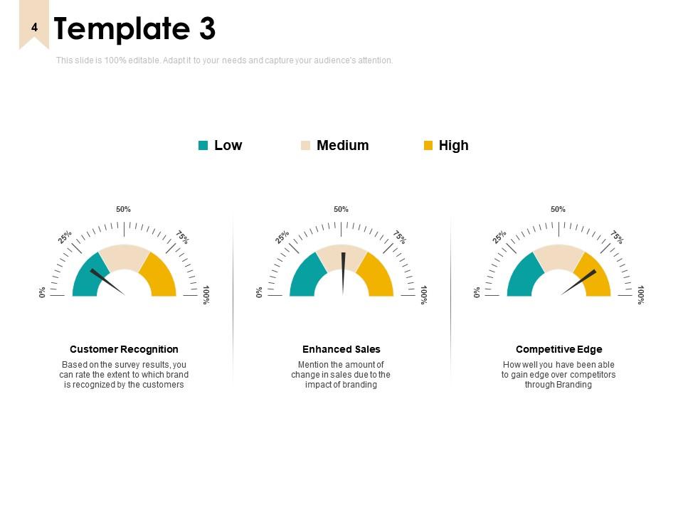
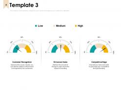
Slide 4: This slide displays Key Findings Template 3 to monitor the company performance on the basis of below mentioned parameters.
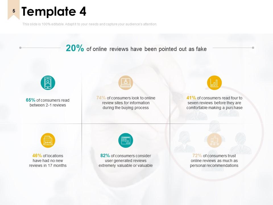
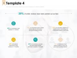
Slide 5: This slide represents Key Findings Template 4 for entering survey/ tracking results.
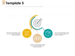
Slide 6: This slide showcases Key Findings Template 5 with related icons. Add text as per needs.
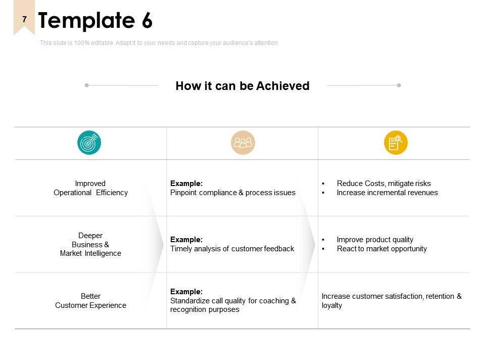
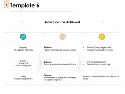
Slide 7: This slide shows Key Findings Template 6 in tabular form.
Slide 8: This slide displays Summary of Key Findings Icons.
Slide 9: This slide is titled as Additional Slides for moving forward.
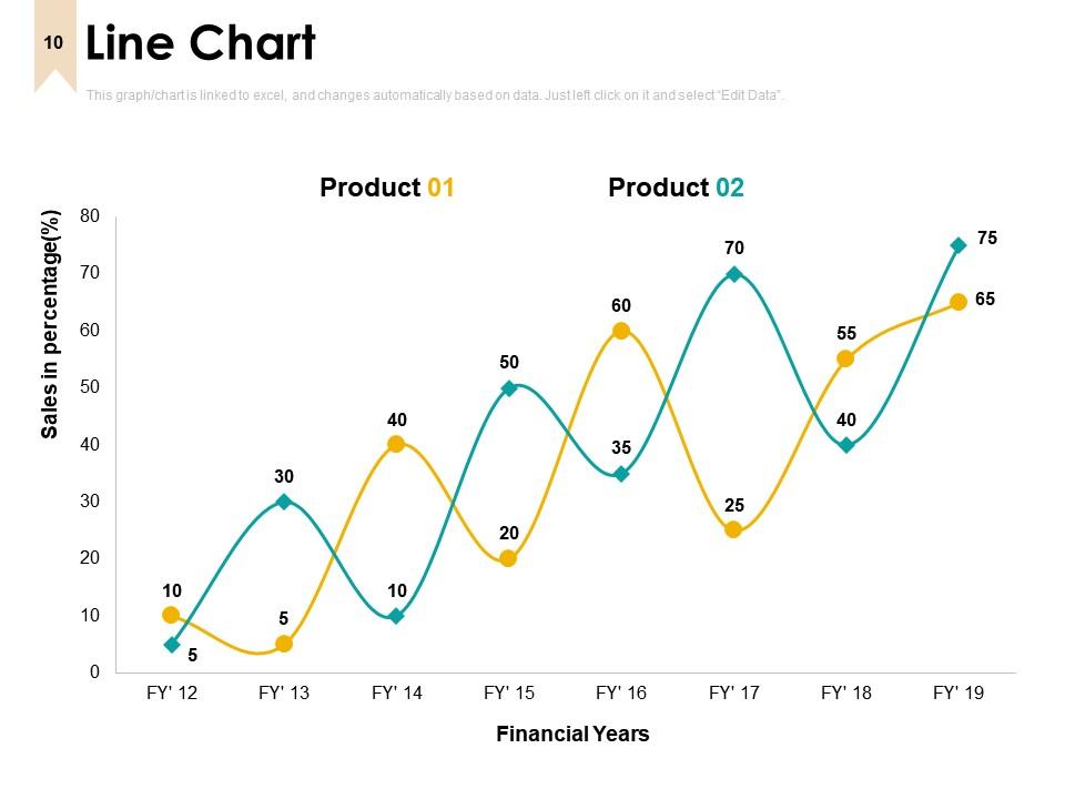
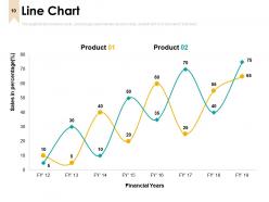
Slide 10: This slide shows Line Chart with two products comparison.
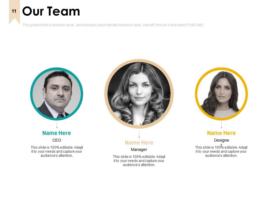
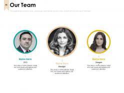
Slide 11: This is Our Team slide with names and designation.
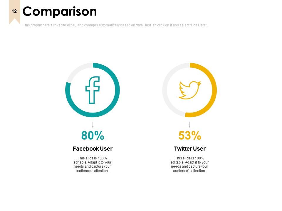
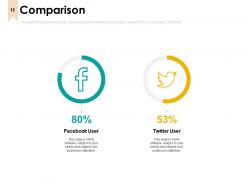
Slide 12: This is a Comparison slide to state comparison between commodities, entities etc.
Slide 13: This is a Quotes slide to convey message, beliefs etc.
Slide 14: This is a Thank You slide with address, contact numbers and email address.

FAQs for Summary Of Key Findings

Jump straight into your biggest 3 findings - attention spans are brutal these days. Bullet points are your friend here, nobody's reading paragraph novels. I do this thing where I ask "so what?" after every point. If I can't answer that in one quick sentence, it's getting axed. Always connect your findings back to whatever question you started with - sounds obvious but people forget this constantly. Then wrap up with actual next steps, not just random observations floating in space. Your audience needs to walk away knowing what the hell to do next, you know?

Honestly, visuals are a game-changer for getting your point across. People's eyes just glaze over when they see paragraphs full of numbers - mine definitely do. Bar charts work great for comparing stuff, line graphs show trends over time really well. Infographics are perfect when you need to walk someone through a process step by step. The trick is figuring out what visual actually fits your data. Like, don't just throw a pie chart at everything, you know? Find your biggest insight first, then think about what would make someone instantly go "ahh okay, that makes sense now!"

You've gotta think of data storytelling like being a tour guide instead of just throwing charts at people. Start with your biggest finding upfront. Then build around why anyone should care and what comes next. Honestly, most presentations are just number dumps that put everyone to sleep. Use visuals that actually make sense, show the human side behind your data, and walk them through problem to solution. It's way more effective than handing someone a spreadsheet and hoping they'll figure it out themselves.

Know your audience first - that's everything. Executives want the big picture stuff and business impact. Technical people? They care about your methodology and whether your data's actually solid. I've watched so many presentations crash because someone gave the exact same summary to completely different groups. For teams doing the actual work, hit them with what they can actually do next. Each group has different priorities, so figure out what decisions they're making with your info before you even start writing. Sounds obvious but people mess this up constantly.

Ugh, don't bury your main point! Lead with the biggest finding - I see people save the good stuff for last and it drives me nuts. Also, resist the urge to dump every data point in there. Three to five key takeaways, that's it. More than that and people's eyes glaze over. Oh, and ditch the research jargon - translate everything into normal business language your CEO would actually use. The whole thing should pass the elevator test. If you can't explain your summary in 30 seconds, you've made it way too complicated.

Structure totally makes or breaks how people remember your findings. Lead with your strongest point first - I can't tell you how many brilliant insights I've watched die because they got buried halfway through a presentation. Build your supporting evidence around that main finding. Group similar stuff together and use smooth transitions between sections. Your structure should basically grab people by the shoulders and point them exactly where to look. Oh, and always do an exec summary upfront plus clear next steps at the end. Trust me, it's night and day difference in how your audience responds.

Okay so first thing - only include charts that actually back up your main points. Ruthless editing here. Put them right after you mention the data, not shoved at the end where nobody looks. Your chart titles need to be super clear so people get it immediately. I always write a quick one-liner underneath explaining what they should notice - saves so much confusion later. Oh and stick to the same colors/formatting throughout, it looks way more professional. Trust me, I've sat through presentations where the visuals were all over the place and it's distracting as hell.

So I group my quant stuff by themes first, then drop in quotes and stories that explain what those numbers actually mean. Like "Finding 1: 73% said X happened, and here's how Sarah described it..." The qualitative bits make everything way more real - honestly, stats alone are pretty boring. Mix them together instead of just listing them separately. Show how the stories back up your data or sometimes contradict it (which is actually super interesting). The whole thing should flow like you're explaining why these numbers matter for actual people's lives.

Busy people love bullet points - they can scan and grab what they need without digging through walls of text. But narrative works better for complex stuff where you need to connect the dots between different findings. I've been doing this mix lately that's pretty solid: hit them with bullets first for the main points, then add some narrative after if there's context worth explaining. Though honestly, it depends on your crowd. Some executives I work with only read bullets, period. Try both and see what gets better engagement from your specific audience.

Dude, cultural context totally shifts how people read your findings. Like, data about individual success? Americans eat that up, but in collectivist cultures they're probably thinking "what about the team though?" Your charts and how you frame wins vs losses matter too - what looks positive to you might not land the same way elsewhere. Honestly, I learned this the hard way once presenting to a mixed group. Test your summaries with people from different backgrounds first. It'll save you from those awkward moments where half the room is nodding and the other half looks confused.

Honestly, just use PowerPoint or Google Slides - they're boring but they work and everyone gets them. If you want something prettier without learning design, Canva's templates are actually solid (I use them all the time now). Prezi does those fancy zooming presentations but it's kinda extra for basic summaries. Oh, and Miro's good if you need flowcharts or mind maps instead of regular slides. My take? Don't overthink it. Go with whatever your team's already comfortable with unless there's a real reason to shake things up.

Honestly, the whole "tell them three times" thing actually works. Hit your main points at the start, dive into the details, then wrap it up with those same key findings. I know it feels like you're beating a dead horse, but people zone out constantly - I do it too. Mix up your wording each time though. Like, use different examples or phrase things slightly differently so you're not just parroting yourself. End each big section by restating your main point before jumping to the next topic. Sounds basic, but your audience will remember way more of what you said.

Stick to 3-5 main points, takes about 2-3 minutes to get through. People's brains are already fried by the end of your presentation - honestly, I've seen so many audiences just check out if you drag it on. Skip the interesting-but-useless stuff. Zero in on findings that actually change what happens next. Oh, and definitely end with what people should do about it - otherwise they'll just sit there like "cool story, now what?" You'll lose them fast if you try cramming every detail in there.

Honestly, treat your summary like a rough draft and get people to tear it apart. I always think my first version is brilliant until someone points out I completely missed what they actually needed to know. Ask your stakeholders if the main points hit right - did you skip anything major? Does it even make sense to them? Then actually use their feedback to rewrite the thing. Sometimes you'll end up flipping the whole structure around, which is annoying but worth it. Circle back with the new version to make sure you didn't mess it up worse. The back-and-forth is tedious but it works.

Visual storytelling is taking over - everyone's dumping those boring text slides for infographics and interactive dashboards. Way more engaging, honestly. Real-time polling is everywhere too since people actually want to participate instead of just sitting there. The "bite-sized insights" thing is pretty smart though. Executives don't have time for long explanations, so breaking stuff down into quick chunks works. Also seeing tons of modular presentations where you can shuffle sections based on who you're presenting to. My advice? Start playing around with visual templates and interactive stuff for your next one. Makes a huge difference.

Ratings and Reviews

96% of 100
Review Form
Write a review
Most Relevant Reviews
  1. 100%

    by Courtney Griffin

    I discovered this website through a google search, the services matched my needs perfectly and the pricing was very reasonable. I was thrilled with the product and the customer service. I will definitely use their slides again for my presentations and recommend them to other colleagues.
  2. 100%

    by Dudley Delgado

    Out of the box and creative design.
  3. 100%

    by Smith Gomez

    Very well designed and informative templates.
  4. 100%

    by Clint Perry

    Great designs, really helpful.
  5. 80%

    by Dylan Richards

    Awesomely designed templates, Easy to understand.

5 Item(s)

per page: