


Supply chain cycle diagram powerpoint slide graphics




Try Before you Buy Download Free Sample Product
 Impress Your
 Audience
 100%
100% Editable
 Save Hours
 of Time


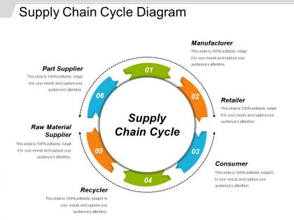
The Supply Chain Cycle Diagram PowerPoint Slide represents all activities that incorporate acquiring raw material as well as production through distribution to the end user. The supply chain management PowerPoint slide is crafted by professionals to display 6 elements of supply chain management. The readily available PPT slide is ideal for management professionals or teachers as they can make their viewers or students understand the concept of supply chain in the easiest and most effective way. Illustrate that supply chain management is the management of a business network as well as activities. It includes the procurement of raw or natural materials, production along with distribution management of finished goods. The editable PPT template represents different topics like management, logistics, analysis, distribution, planning, procurement etc. Get this professionally designed slide to display the logistic & supply chain management concepts.
People who downloaded this PowerPoint presentation also viewed the following :
Supply chain cycle diagram powerpoint slide graphics with all 5 slides:
Tickle them pink with our Supply Chain Cycle Diagram Powerpoint Slide Graphics. They will soon be laughing all the way to the bank.

FAQs for Supply chain cycle diagram
So there are five main stages in supply chains: planning, sourcing, manufacturing, delivery, and returns. Planning kicks things off with demand forecasting and figuring out what you need. Then sourcing handles procurement, manufacturing does the actual production, delivery gets stuff distributed, and returns deals with - well, returned products. It flows in order but it's really more of a cycle since each stage connects to the next one. Honestly, once you see it mapped out it makes total sense. For your diagram, I'd start with those five core stages as your foundation. Then just add your specific processes under each one and you'll have a solid setup to build from.
Think of it like a roadmap for your whole operation. Look for where stuff backs up - that's usually where your cycle times are longest or you've got tons of work piling up. Those spots are your bottlenecks. You can trace problems backward too, which is pretty handy when you're trying to figure out what went wrong. I always check the stages with the most inventory first - they're dead giveaways. It's basically like spotting traffic jams from above, except instead of cars it's your products getting stuck somewhere in the process.
Honestly, those diagrams are game-changers for seeing where stuff gets stuck in your supply chain. You can trace how one hiccup messes with everything downstream - learned that one during COVID mess. When you're trying to explain why costs went up to your boss, having a visual beats spreadsheets every time. Map out what you've got first, then play around with different scenarios before you commit to big changes. The vulnerability spots become super obvious once it's all laid out. My advice? Start simple and build from there - don't overcomplicate it right away.
So basically every industry tweaks the standard supply chain to match what they actually need. Food companies throw in cold storage and track expiration dates - makes sense. Tech manufacturers go crazy with quality testing and source components from like 10 different suppliers. Fashion is wild though, they're literally sprinting to beat trends with those seasonal drops. Healthcare has to deal with all the regulatory stuff and traceability headaches. Here's what I'd do: map out how you currently do things first, then see where the basic plan-source-make-deliver model doesn't match your reality. You'll probably find gaps.
Dude, you absolutely need tech for supply chain visualization these days. SAP and Tableau are solid choices for real-time dashboards that'll show you bottlenecks instantly. Machine learning can even predict problems before they screw everything up, which honestly blows my mind. IoT sensors are everywhere now - tracking warehouse temps, truck GPS, all feeding into your visual systems. I tried helping a buddy do this manually once and it was a nightmare. You'd be crazy to manage chains without these tools. Maybe start with one platform though, don't go overboard right away.
Cycle diagrams are perfect for this - they show how each part of your supply chain connects and flows into the next. Map out your main stages (sourcing, production, distribution) in a circle so people can see the continuous process. Trust me, regular flowcharts are boring and nobody pays attention. Color-code different functions and throw in some metrics at each stage. What's great is you'll spot bottlenecks right away that you'd totally miss in a text-heavy presentation. Start with Miro or Lucidchart to test it out with your team first - way easier than diving into something complex.
Honestly, just focus on the metrics that'll actually help you spot problems. Cycle time and inventory turnover are obvious ones. Order accuracy too - nothing worse than shipping the wrong stuff. Lead times will show you where things get stuck. If you're working with multiple suppliers, definitely track their performance scores. Fill rates and cost per unit are solid choices too. But here's the thing - don't go crazy with like 15 different metrics. Pick maybe 4 that match your biggest headaches right now. Build those right into each stage of your cycle diagram. You can always add more later once you've got the basics dialed in.
So basically, these diagrams let you see your whole process laid out - makes it super obvious where things could go wrong. You'll spot which suppliers are your biggest risk (like if one goes down, you're screwed) and where bottlenecks usually happen. Plus you can trace how one problem might mess up everything downstream. Honestly, they're great for those "what if this supplier disappears tomorrow" conversations with your team. Map out backup plans for each step while you're looking at it. Way easier than trying to figure it out when stuff actually hits the fan.
Honestly, the real-time thing is huge - you make a change and boom, everyone sees it instantly. No more chasing people down with updated printouts when a supplier switches or something shifts. The collaboration part is pretty sweet too since your whole team can jump in and edit stuff together. Paper diagrams are such a pain to keep current, and digital ones usually sync with whatever systems you're already using. So data updates automatically instead of you doing it by hand. Only downside is making sure everyone's cool with the tech, but most tools these days aren't too complicated. I'd just pick something simple and move your current stuff over.
Honestly, I'd say quarterly is a good starting point, but it really depends on your situation. Fast-moving industry or suppliers changing all the time? You'll probably need monthly updates. More stable operations can get away with twice a year. The real trick is watching for those trigger events - new suppliers, process changes, tech rollouts, or when everything goes sideways. Set up some calendar reminders (trust me, you'll forget otherwise) and make sure someone actually owns this task. Actually, why not take a look at yours right now? Does it still match what's actually happening?
Don't overcomplicate it from the start - that's the biggest trap people fall into. You'll waste tons of time mapping every tiny detail when you should focus on major flows first. Get your ops, procurement, and logistics folks involved because nobody knows the whole supply chain solo (learned that the hard way). Make sure you add feedback loops and delays since that's where everything usually breaks down. Keep it simple initially, then build from there. Oh, and treat it like a Google doc that gets updated constantly - supply chains shift way more than you'd think. It's basically a living document, not some perfect diagram you create once.
Think of it like giving everyone the same map instead of just telling them their one turn. Your suppliers and distributors can actually see how their part affects everything downstream - pretty eye-opening honestly. No more "why didn't anyone tell me this would impact delivery?" moments. The diagram helps spot bottlenecks way faster in meetings since everyone's looking at the same picture. Interactive versions work great too where people can flag issues right on it. Way better than those endless email chains trying to figure out where things went sideways. It's basically turning chaos into something you can actually manage.
Thick, obvious arrows work best since people gotta follow the path easily. I'd stick with consistent shapes for each stage and color-code by function - like blue for suppliers, green for distribution. Icons blow text blocks out of the water every time. White space is your friend here, cramped diagrams are the worst. Actually, keep your colors limited but meaningful - too many just confuses people. Less really is more with these things. Oh, and test it on someone who doesn't know your supply chain first. Trust me on that one.
Map out your whole supply chain from start to finish - you'll be shocked at what you find. Look for spots where things get stuck or where you're doing the same work twice. I swear it's like finally seeing the mess from above. Start with documenting what actually happens now (not what's supposed to happen). Then pick your worst three bottlenecks to fix first. You can probably consolidate some suppliers or cut out pointless handoffs between teams. Track how materials, info, and cash move through each step. Trust me, there's always redundant stuff hiding in there.
Honestly, sustainability isn't just some add-on anymore - it's baked into every part of supply chains now. Companies look at it when picking suppliers, reducing waste in manufacturing, optimizing shipping routes for carbon emissions. Even the end-of-life stuff matters now. Customers actually care about this stuff, and regulations are getting stricter too. The whole circular economy thing is pretty cool though - your waste becomes someone else's raw materials. My advice? Build those sustainability metrics into each step from day one. Way easier than trying to retrofit everything later (trust me on this one).
-
Appreciate the research and its presentable format.
-
Best way of representation of the topic.