


Team achievements powerpoint slide themes




Try Before you Buy Download Free Sample Product
 Impress Your
 Audience
 100%
100% Editable
 Save Hours
 of Time


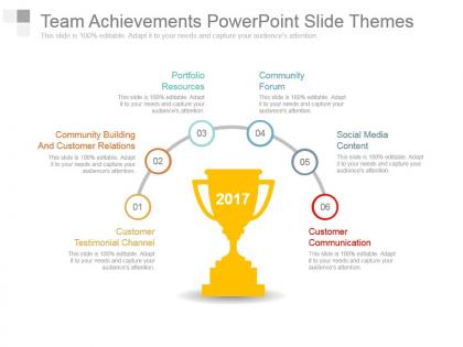
Are you in need of a pre-designed slide which can represent the achievements of your team in an eye pleasing manner? If yes, then download our impressive team achievements PowerPoint template and celebrate the success and hard work of our team. This team achievements PPT design has been created to keep an account of your team’s achievements and give credit to your team members and everyone else who contributed to your organizational success. With the help of our team achievements presentation visual, you can acknowledge your team members and discuss what all challenges they overcame while performing their business activities. You can add your business and team information in this team achievements presentation slide as it is completely modifiable. This slideshow can also be used to represent the importance of a strong team work which automatically leads to successful achievements and positive outcomes. Simply click on this remarkably designed team achievements PPT diagram right now. Gain that critical edge with our Team Achievements Powerpoint Slide Themes. Get ahead early in the game.
People who downloaded this PowerPoint presentation also viewed the following :
Team achievements powerpoint slide themes with all 7 slides:
Invent a fresh approach with our Team Achievements Powerpoint Slide Themes. Bring an end to jaded concepts.
FAQs for Team achievements
For your team achievements slide, start with a punchy headline about what you actually did. Then back it up with real numbers - metrics are everything here. Honestly, I'd skip the boring bullet points and go straight for charts or visuals instead. Way more engaging. Don't forget to mention the timeframe and which team members were involved. Oh, and definitely tie it back to bigger company goals somehow. I learned this the hard way - stick to 2-3 wins tops. Any more than that and people's eyes glaze over. You'll lose them completely.
Dude, stop with the boring bullet points! Your team wins deserve way better than "increased sales by 20%." Show the actual journey instead - timelines, before/after pics, whatever tells the story. Sure, charts are fine, but honestly? Sometimes just a photo of everyone celebrating hits harder than any fancy graph. You want people to *feel* the win, not just read about it. Structure it like a story too - here's what sucked, here's what we did, boom here's the victory. Trust me, people actually pay attention when you do this. Way more engaging than corporate speak nonsense.
Honestly, white space is your best friend here - it makes everything pop way more than cramming stuff together. Go with your usual brand colors but throw in one accent color for the big wins. And please make your text huge! Nothing's worse than people squinting from the back row. Skip the cheesy stock photos - real team pics are so much better. I'd put your biggest achievement first to hook everyone right away. Oh, and don't try to fit multiple wins on one slide. Trust me, less is more with this stuff. Your presentation will look way cleaner.
Honestly, visuals make such a huge difference when showing off your team's wins. Like, night and day difference. Instead of boring bullet points, good charts make people actually *see* how big your success was. Numbers suddenly feel real and impressive. But mess up the visualization? Even your biggest achievements look meh or confusing. People process visuals way faster than text anyway - I learned that the hard way in a presentation once. So make those graphs work for you, not against you. Start with whatever your biggest win was and build the most eye-catching chart around that first.
Honestly, blue and gold are your best bet here - they scream success without looking tacky. Green's solid too since it feels like growth and winning. Just stay away from red, it comes off way too aggressive even for good news. I'd go with dark backgrounds and bright accent text to make your numbers really pop. That's the whole point, right? Keep it to 2-3 colors max or your data gets messy to read. Oh, and definitely test it on an actual projector first - learned this the hard way when my colors looked completely washed out during the presentation.
Dude, infographics are perfect for this! Instead of drowning people in bullet points, show your wins visually. Progress bars work great for goals you've hit. Timeline graphics are solid for project milestones. Before/after comparison charts? *Chef's kiss* - those always land well. Don't sleep on icons either. Trophy symbols, growth arrows with percentages - way more engaging than text blocks. Oh, and here's something I learned the hard way: stick to one main achievement per graphic or it'll look like a hot mess. Keep your brand colors but make the design clean. People should focus on your accomplishments, not wonder what they're looking at.
Don't cram everything onto one slide - you'll just overwhelm people. Keep your font at 24pt minimum so people can actually read it. Those flashy animations? Skip them, they're just distracting. Make your biggest wins stand out instead of treating everything equally. I see this mistake all the time honestly. Use real screenshots or data instead of random stock photos that don't mean anything. Keep it simple. Your actual accomplishments should do the talking, not fancy graphics that add zero value.
Try "Fly In" or "Fade" effects to reveal each milestone one by one - builds nice anticipation. Smooth transitions like "Push" or "Morph" work well between project phases too. But honestly? Don't go overboard with the bouncy stuff, it's distracting. I'm partial to animating progress bars since they actually show growth visually. Oh, and definitely animate key dates or metrics to make them pop. Less is more though - one simple animation per milestone should do it. Start there and see how it feels!
Honestly, quarterly reports need boring but clean templates - corporate blues, lots of chart space, zero distractions. Project completions are the opposite though. Go bold! Celebratory colors, milestone highlights, team photos work great. I made this mistake once using some flashy template that totally buried my actual results. Sales presentations? Dynamic themes with progress bars are your friend. The whole thing comes down to vibe matching really - formal reports stay serious, team celebrations can get weird with it. Just pick something that makes your data shine instead of fighting with it for attention.
Here's what I'd do - connect every team win back to whatever your company obsesses over. Revenue, efficiency, you know the drill. Don't just say "we did this cool thing." Say "this boosted customer retention by X%" or whatever. Steal the exact wording from your strategic plan too, sounds corporate but it works. Use the same colors or icons throughout so it looks cohesive. Oh, and honestly? Executives love when you make their priorities look like your priorities. Makes the whole presentation feel less like "look what we did" and more like "look how we're crushing your goals."
Dude, visuals totally make or break achievement slides. Progress charts and team photos work great - anything that shows the actual work you did. Before/after comparisons are *chef's kiss* for showing real impact. Just don't go crazy with animations that pull focus from your wins. Oh, and stick to your brand colors so it doesn't look like a rainbow exploded. I always pick 2-3 strong images max that tie directly to the biggest accomplishments. The visuals should tell the story alongside your text, not fight against it. Trust me on this one.
Stop just throwing numbers at people - nobody cares about your 30% sales increase yet. Tell them the actual story first. What problem were you staring down? Maybe mention that random Tuesday when your team finally cracked the solution, or honestly, that moment you thought you'd completely failed. Raw struggle hits different than polished stats. Your slides should feel like chapters: "So here's the mess we walked into..." then show how you dug out. I swear, audiences lean in way more when they see the human side first. Save the victory numbers for the end.
Honestly, keep it super visual for mixed audiences - before/after shots work great, plus timeline slides showing progress. Bar charts and infographics are your friend here. Dense bullet points will kill you every time, people just zone out. I'm weirdly obsessed with "wins wall" layouts because they feel more celebratory than boring slides. Icons beat paragraphs any day for keeping people hooked, doesn't matter what department they're from. Oh, and definitely make like 2-3 versions first and test them with a few people to see what actually lands.
Get feedback before you even start designing - ask your team what wins they want showcased and how they like info presented. Share rough drafts during creation too. I've literally watched presentations bomb because someone's biggest achievement got overlooked since nobody bothered asking them! After presenting, find out what actually landed and what didn't. Here's what works: create a quick feedback form asking "What should we highlight more?" and "What format clicks for you?" Trust me, your slides will actually mean something to people instead of just being another deck nobody cares about.
Honestly, just shoot them a quick survey or ask around 24-48 hours later. Did it make sense? Were they actually engaged? Body language during the presentation tells you a lot too. The real test though? Whether people bring up your achievements in random meetings later - that's when you know it stuck. Also watch for follow-up questions afterward, that usually means they were paying attention. Oh and definitely do a team debrief while it's fresh in everyone's mind. Sometimes the stuff you think bombed actually landed well, so don't just go with your gut feeling.
-
Easily Understandable slides.
-
Best Representation of topics, really appreciable.