

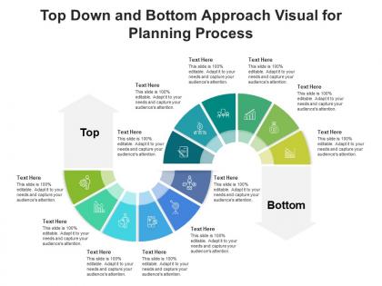
Top down and bottom approach visual for planning process infographic template




Try Before you Buy Download Free Sample Product
 Impress Your
 Audience
 100%
100% Editable
 Save Hours
 of Time


Our Top Down And Bottom Approach Visual For Planning Process Infographic Template are topically designed to provide an attractive backdrop to any subject. Use them to look like a presentation pro.
People who downloaded this PowerPoint presentation also viewed the following :
Top down and bottom approach visual for planning process infographic template with all 2 slides:
Use our Top Down And Bottom Approach Visual For Planning Process Infographic Template to effectively help you save your valuable time. They are readymade to fit into any presentation structure.
FAQs for Top down and bottom approach visual for planning
So there are basically five stages to planning. Start with analysis - figure out where you're at right now. Then set your goals, develop a strategy, plan the actual implementation, and finally monitor how it's going. The analysis part honestly can eat up way too much time if you let it, so don't get stuck there forever. Once you know your current situation, decide where you want to end up. Map out how to get there, create your action steps, then keep tabs on progress. Oh and definitely sketch this stuff out - makes way more sense visually than just thinking about it.
Dude, infographics are total game-changers for planning stuff. Your brain just processes visuals way better than boring text blocks. Color-coding and flowcharts show you exactly how everything connects - plus you'll spot problems before they blow up. I swear, half the project meetings I sit through could've been avoided with a good visual roadmap upfront. Makes dependencies crystal clear too. Next time you're kicking off something complex, sketch out an infographic first. Even a rough one works. Your team will actually *get* what you're trying to do instead of glazing over during your explanation.
Okay so first thing - ditch those cheesy lightbulb icons, they're everywhere and look terrible. You want clear visual hierarchy and consistent colors for each phase. Keep the flow simple, left to right works great. Don't write paragraphs - bullet points and short phrases only. Give everything room to breathe with white space, and honestly, if people have to squint at your font, you've already lost them. Make it scannable. Oh and definitely test it on someone who wasn't part of making it - they'll catch confusing parts you missed.
Stick with your brand colors or just pick 2-3 that work well together. More than that and it'll look like a mess - trust me, I've been there! For fonts, Arial or Helvetica work great for body text since they're super readable. Headers can be a bit more fun if you want. The contrast thing is huge though - make sure your text actually shows up against the background. Oh, and here's a weird trick: step back from your screen and squint. If you can still see the main points, you're good to go. Saved me so many times.
Ugh, the worst thing you can do is cram everything into one graphic - people just shut down when it's too busy. Make your steps super specific too, not some vague "optimize your workflow" nonsense that means nothing. Also fonts matter more than you'd think! Tiny text or weird colors will kill your whole thing. I learned this the hard way lol. Keep it flowing logically step by step. Consistent styling helps too. Honestly? Run it by someone who doesn't know your process first - if they're lost, you need to simplify more.
Think of visual hierarchy like a roadmap for your reader's eyes. Make your main steps bigger and bolder than the tiny details. Size, color, and positioning are your best friends here. I swear, nothing's worse than an infographic where everything screams for attention equally - total mess. Arrows and numbering work great for showing the flow from start to finish. Color coding helps too. Someone should glance at it and immediately get the sequence. Here's a weird trick: squint at your design. The important stuff should still stand out even when it's blurry.
Honestly, Canva's where I'd start - super easy to use and they have a million templates. Adobe Illustrator gives you way more control but it's kind of a pain to learn at first. Figma's cool if you're working with other people since it's all online. There's also Piktochart and Venngage which are made just for infographics, though I haven't used those as much personally. I'd probably mess around with Canva's free version first to see what you like, then maybe upgrade later if you need fancier stuff. Quick question though - what's the infographic for?
So first map out your actual process, then figure out what data points matter most. Break it into clear stages - discovery, analysis, strategy, implementation - with timeline milestones so everyone knows when stuff happens. Definitely show who's responsible for what at each step. Here's the thing though: checkpoints are where projects usually fall apart, so build those in. You'll need arrows or something to show how stages connect. Oh and don't forget the boring but necessary stuff - what tools you need, success metrics, deliverables for each phase. Honestly the visual flow matters more than people think.
Ok so basically treat it like you're telling a story instead of just boring bullet points. Start with the problem you guys were dealing with, then walk through how each step got you closer to fixing it. Think mini-movie plot but for planning - there's your team (the characters), whatever mess you're trying to solve (the drama), and boom, your solution at the end. Throw in some quick quotes from people involved to make it feel real. I'd sketch out the whole story arc first, honestly that part's kinda fun, then just match your planning steps to fit that flow. Way more engaging than the usual corporate nonsense.
Start with who you're talking to - beginners need different stuff than people who've been planning forever. Industries matter too; startups move fast while government moves... well, you know how that goes. How much time do they actually have? Nobody's reading a novel when they're stressed about deadlines. Figure out what's driving them crazy - missed deadlines, not enough resources, or getting everyone on board? That's what your infographic needs to fix. Oh, and use words they'd actually say at work, not planning jargon that sounds like it came from a textbook.
Break your planning process into clear stages with visual hierarchy guiding people through each step. Icons, arrows, and color coding work great for showing flow - honestly, good templates are lifesavers here and worth the investment. Keep text short but descriptive enough that someone could follow without asking questions. Group sub-steps under main phases using consistent formatting throughout. You want it scannable at a glance but still comprehensive. Test it with a coworker first - if they're confused without your walkthrough, you need to simplify. Short sentences mixed with longer explanations tend to work better than walls of text.
Dude, feedback is like your sanity check - you need to test that infographic with actual people before you finalize it. They'll spot confusing arrows or steps that made total sense in your head but are gibberish to everyone else. I swear, half the infographics I see look gorgeous but are completely useless because nobody asked real users "wait, does this actually work?" Get input early with a rough draft. Don't polish it first then ask for opinions - that's backwards. Oh, and actually use what people tell you instead of just nodding and ignoring it.
Dude, infographics are seriously clutch for planning stuff. Healthcare teams map out patient workflows with them. Construction uses them for project timelines - honestly makes so much sense when you think about it. Marketing goes crazy with campaign planning infographics, though they might overdo it sometimes. Manufacturing shows production schedules visually instead of boring spreadsheets. Even schools use them for tracking curriculum and student progress. You just gotta pick the right format for whatever you're planning. Start with your messiest process first - that's usually where you'll see the biggest difference.
For planning processes, I'd go with a timeline roadmap - shows phases flowing left to right nicely. Circular wheels work great if your planning repeats. Interactive flowcharts are super popular right now, people dig clicking through decisions. Sankey diagrams are my current favorite though, they show how stuff flows between stages really clearly. Oh, and step-ladder formats are solid too. Board game paths with milestone checkpoints can be fun if you're not too corporate. Really depends if your process is linear or has multiple routes. I always sketch out 2-3 options first to see what clicks.
Honestly, just pick one main point per section and stick with it. Bright colors and cool icons are great, but don't go overboard or they'll distract from what you're actually trying to say. People scan these things super fast, so keep your text short and sweet. I always do top-to-bottom flow—makes way more sense that way. Oh, and leave some breathing room! Cramming everything together looks messy as hell. Throw in real stats to back up your points, but break them into small pieces. Pro tip: show it to someone else first. If they don't get it in 30 seconds, you've got more work to do.
-
Great quality slides in rapid time.
-
Awesome use of colors and designs in product templates.
-
Visually stunning presentation, love the content.
-
Visually stunning presentation, love the content.
-
Innovative and Colorful designs.
-
Enough space for editing and adding your own content.
-
Editable templates with innovative design and color combination.