


Ampelbilder Stil 3 PowerPoint-Präsentationsfolien




Try Before you Buy Download Free Sample Product
 Impress Your
 Audience
 100%
100% Editable
 Save Hours
 of Time


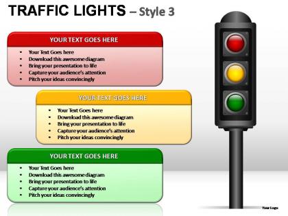
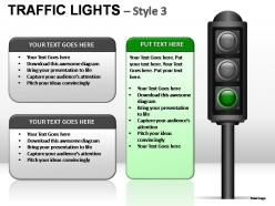
Hängen Sie Ihren Wagen an unsere Traffic Lights Style 3 Powerpoint Präsentationsfolien. Sie und Ihre Gedanken werden einen großartigen Tross bilden.
People who downloaded this PowerPoint presentation also viewed the following :
Ampelfarben Stil 3 PowerPoint-Präsentationsfolien mit allen 7 Folien
Präsentieren Sie Ihre Ideen mithilfe unserer Traffic Lights Style 3 Powerpoint-Präsentationsfolien. Sie werden deren Brillanz verstärken.

FAQs for Traffic lights style 3
Hey! So traffic light colors work because literally everyone gets them instantly. Red = stop/problems, yellow = caution/in progress, green = good to go. Stick to that throughout your whole deck. One thing though - yellow backgrounds are the worst for text readability, so watch out for that. Keep each slide focused on just one status with minimal text. People should grasp it in like 2 seconds without reading paragraphs. Oh and throw in some icons if you can! They help reinforce the message even when the colors are obvious.
Oh, the traffic light thing works so well! Red means stop/critical stuff, yellow is like "heads up, need to watch this," and green is all good. Everyone gets it immediately without you having to explain your weird color system. I use it all the time for project updates and risk stuff. Just stay consistent - don't randomly switch what colors mean halfway through (I've seen people do this, it's painful). Toss a little legend on your first slide and you're set.
Traffic lights are great for status updates and progress reports - stuff where you need that instant "good/caution/bad" vibe. Executives love them because they get the gist super quick. Perfect for dashboards and KPI meetings too. But honestly? People go overboard and slap them on everything, which just looks ridiculous. You need content that actually fits into three clear buckets. The biggest thing is making your green/yellow/red criteria crystal clear. Don't leave people wondering what the hell yellow even means in your context.
You should totally try animations for those traffic light slides! Have each color appear one at a time instead of showing all three upfront. Red fades in first, then yellow, then green as you talk through each stage. Your audience won't get distracted reading ahead to the end result. Honestly, it's like watching a real traffic light cycle which is oddly satisfying. People actually pay attention when there's that visual progression happening. Just keep the animations simple though - basic fade-ins or slides work great. Don't go crazy with spinning effects or whatever, that'll just be annoying.
Honestly, make those traffic light slides way more interactive! Get your audience guessing what color comes next before you reveal it. Quick polls work great for this - people vote on the status, then boom, big reveal. Way better than just clicking through boring updates, trust me. Each color should be like a natural pause point too, gives people time to actually process what they're seeing. Oh and definitely tell a story with how things progress from red to green (or whatever). Build some suspense around why certain things are stuck in red - makes people lean in instead of zoning out.
Honestly, those red-amber-green slides can totally backfire on you. Sure, most people get the traffic light thing, but not everyone sees red as "danger" - some cultures actually view it as lucky or prosperous, which is kinda the opposite of what you're going for. And don't forget about colorblind folks who won't even catch your color coding. I'd definitely add text labels or little icons next to the colors just to be safe. Maybe run it by a few different people first? You don't want your brilliant presentation falling flat because half the room interpreted your message backwards.
Traffic light slides are honestly perfect for executive dashboards. Big companies like Microsoft and Google use them all the time in quarterly reviews - executives can scan project status instantly without digging into details. McKinsey consultants are obsessed with this format too. Works great for project updates, budget reviews, risk assessments, basically anywhere you need quick visual cues. Put your most critical stuff at the top. Just make sure you're consistent with your red/yellow/green criteria, otherwise people get confused about what each color actually means.
So basically swap out the red/yellow/green for whatever makes sense in your field. Tech companies could do blue/orange/purple, or if you're doing rankings maybe gold/silver/bronze works better. The three-status thing is pretty universal - just change up the icons and labels. Healthcare? Throw in some hearts or medical crosses. Finance folks love their dollar signs and little chart symbols. Project management - checkmarks and warning triangles are your friend. Honestly, as long as people can instantly get that "good/okay/bad" vibe, you're golden. Pick stuff that doesn't make your audience squint and wonder what you mean.
Okay so typography matters way more than people think for traffic light slides. Bold, clean fonts work best - stick with sans-serif stuff like Arial. Nothing fancy that'll distract from your colors. Make the text big enough so people in the back can actually read it (I've sat through way too many presentations squinting at microscopic fonts, ugh). Different font weights help create hierarchy too. Short version: don't let your font choice fight against the color system you're using, and whatever you pick, use it consistently throughout the whole thing.
Oh definitely add text or icons next to those colors! Like 8% of guys are red-green colorblind - found this out when my boss had zero clue which dashboard items were actually good vs bad lol. Different shapes work too (circles, squares, whatever). You could also tweak the actual colors - darker red, way brighter green. Honestly, pattern fills are pretty solid for this stuff. Just don't make color the only way people can tell what's going on. My dashboard looked great until it... didn't.
Honestly just use PowerPoint's SmartArt - it's already there and works great. Canva has some nice templates too if you're feeling fancy, but don't overthink it. You can grab traffic light icons from Icons8 or even PowerPoint's icon library (Insert > Icons). For the colors, stick with the real ones: red
-
Awesome presentation, really professional and easy to edit.
-
Great product with highly impressive and engaging designs.