


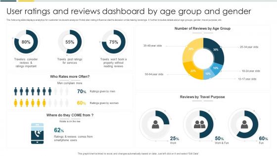
User Ratings And Reviews Dashboard By Age Group And Gender




Try Before you Buy Download Free Sample Product
 Impress Your
 Audience
 100%
100% Editable
 Save Hours
 of Time


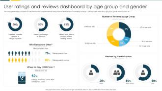
The following slide displays analytics for customer reviews to analyze if hotel star-rating influence clients decision while making bookings. It further includes details about age groups, gender, travel purpose, etc.
People who downloaded this PowerPoint presentation also viewed the following :
User Ratings And Reviews Dashboard By Age Group And Gender with all 7 slides:
Use our User Ratings And Reviews Dashboard By Age Group And Gender to effectively help you save your valuable time. They are readymade to fit into any presentation structure.





FAQs for User Ratings And Reviews Dashboard By Age
So the main stuff you wanna track: average rating, how ratings break down (like how many 1-stars vs 5-stars), total review count, and trends over time. Oh and response rates if you're actually replying to reviews - most people ignore that part but it matters. Honestly though? The trend data is where the gold is since you can see if things are getting better or worse. Also break it down by product or customer type so you can catch weird patterns. Sentiment analysis is nice too if you have time. Start there and you'll spot issues pretty quick.
Honestly, visual design can make or break your dashboard. Start with your most important metrics and build from there - don't try to cram everything in at once. Use contrasting colors for different rating levels, and make key stuff pop with bigger fonts or bold text. White space is clutch here (I see so many dashboards that look like someone threw data at a wall). Group related info together logically. Instead of just showing raw numbers, try star ratings or progress bars - way easier to scan quickly. Users should be able to glance at it and instantly get what's happening performance-wise.
Timing is everything - hit them right after they finish something or have a win. Simple 5-star systems work way better than complicated rating scales, trust me on this. Always add optional text feedback so you actually know why they picked that number. Here's the thing though - don't spam people with rating requests or they'll just tap whatever to make it disappear. Power users vs casual users will give you completely different feedback, so segment your data by user type. Otherwise you're just staring at meaningless averages that don't tell you much.
Honestly, your best move is digging into those bad reviews first - that's where people tell you exactly what sucks. Look for patterns in the complaints over the last 90 days or so. You'll probably notice the same issues popping up again and again, which is actually helpful since it shows you what to fix. Then do the opposite with your top-rated stuff. Figure out why customers love those products and try copying that formula elsewhere. Oh, and set up some kind of alert system so you know when ratings tank before it gets out of hand.
Honestly, filters and segmentation are lifesavers when you're drowning in ratings data. Start with the big picture, then drill down into specific stuff - like user types, product categories, or time ranges. Those overall averages? Pretty much useless most of the time. I always go straight to the 1-2 star reviews from recent weeks since that's where you'll find the actual problems your team can tackle. You can slice the data however makes sense for what you're analyzing. Without breaking it down this way, you're basically just staring at numbers that don't tell you anything actionable.
So basically you'd feed historical data into ML models - stuff like user demographics, product features, seasonal trends, all that. Time series models are clutch for catching cyclical patterns. Collaborative filtering works well too since it predicts how similar users might rate new stuff. Honestly, random forests are my go-to because they're pretty forgiving with messy data types. Just make sure you clean everything first - garbage in, garbage out, you know? I'd start with simple regression though. Get that working, then mess around with fancier algorithms once you see what sticks.
Keep it simple - too many metrics will just confuse people and they won't bother. Stick with one consistent scale (1-5 stars works great) and make submitting feedback super easy. Here's the thing: constant rating requests are annoying as hell, so time them right. Show trends instead of just dumping raw numbers on users, and always give context so they actually get what they're seeing. Oh, and this should be obvious but... actually DO something with the feedback you collect. People notice when their input goes nowhere and they'll stop helping you out.
Dude, real-time data integration is a game changer for user rating dashboards. You'll catch problems the moment they start instead of finding out days later when everyone's already pissed off. Like if a new feature tanks your ratings, you know instantly rather than wondering why downloads dropped last week. Stale dashboards are honestly useless - nobody believes old data anyway. Your team can actually fix stuff while it matters and ride positive waves when users love something. Oh, and definitely set up alerts for big rating swings so you're not constantly checking manually.
So ratings basically tell you who loves you and who doesn't, right? Take your 5-star people and give them special treatment - they're already sold on you. The ones leaving 2-3 stars? That's where you need to jump in fast. What's cool is you can set up automatic campaigns that kick in based on different rating levels. Like if someone rates your checkout process highly, show them more of what they already dig. Honestly feels a bit like cheating because you're literally seeing inside their heads. Start simple - just create different follow-up messages for high vs low ratings.
Look, fake reviews are probably your biggest headache - people gaming the system constantly. Privacy's huge too when you're collecting user data for ratings. Your algorithm might accidentally screw over certain businesses or groups, which is messy. Honestly, the trickiest part? Bad reviews can literally destroy someone's livelihood. That's heavy stuff. Set up verification systems, be upfront about how your ratings actually work, and definitely have a decent dispute process. Oh, and maybe build in some bias testing - you don't want to accidentally tank small businesses while boosting chains.
Make it stupid simple - just one-click buttons right after they buy or use your service. Nobody fills out long forms anymore, trust me. Throw in some tiny incentive like 10% off their next order or loyalty points. People are honestly pretty lazy about this stuff (I am too lol) so you gotta give them a reason. Timing's everything though - hit them while it's fresh in their mind, not three weeks later. Oh and actually respond when people do rate you. Shows you're not just collecting reviews to look good. Quick + easy + small reward = way more responses.
Bar charts and histograms are definitely your go-to for user ratings - they show distribution really well across categories or time periods. If you're looking at trends over time, line charts work perfectly. Scatter plots can show cool correlations between ratings and other stuff you're measuring. Heat maps are actually pretty solid when comparing ratings across multiple things like product categories or user groups (I used to think they were overrated but they're genuinely helpful here). Skip pie charts though - they're terrible for rating data since it's ordinal. I'd start simple with a basic bar chart showing rating distribution, then build from there.
Make those rating buttons at least 44px - trust me on this one. Stack everything vertically since horizontal layouts are a nightmare on phones. Desktop dashboards basically never translate well to mobile without major changes. Show the critical stuff first: overall scores, recent trends, maybe your worst complaints. Progressive disclosure is your friend here - let people tap to see more details instead of cramming everything onto that tiny screen. Oh, and actually test on real devices. I know it's annoying, but browser dev tools lie to you half the time about how things actually feel when you're using your thumbs.
Break down your ratings by age, location, gender - that's where the gold is. Millennials will obviously rate mobile stuff higher than boomers, but here's the twist: older users often give way better scores for actual customer service. Look for those rating gaps between different groups. Sometimes you'll find bias in your design or whole segments you're ignoring. I once saw data where location made a huge difference in feature preferences - totally unexpected. Dig into why these differences exist. That's what'll actually guide your product decisions.
Just throw some thumbs up/down buttons right on your dashboard - makes it dead simple for people to respond without clicking away. Comment threads work great too. Honestly, I've watched so many dashboards tank because they made feedback way too complicated. Show users the aggregated trends from their input, otherwise they'll think you're ignoring them. Short sentences hit different sometimes. Auto-follow up when someone leaves negative feedback, but start with just one basic feedback method first. See what people actually use, then build from there. No point overdoing it right out the gate.
-
SlideTeam is my go-to resource for professional PPT templates. They have an exhaustive library, giving you the option to download the best slide!
-
I discovered some really original and instructive business slides here. I found that they suited me well.