


Vision mission and values powerpoint presentation slides





Try Before you Buy Download Free Sample Product
 Impress Your
 Audience
 100%
100% Editable
 Save Hours
 of Time


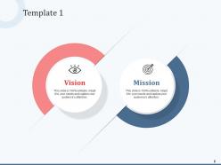
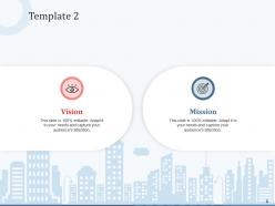
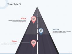
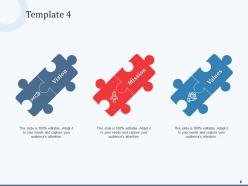
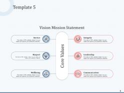
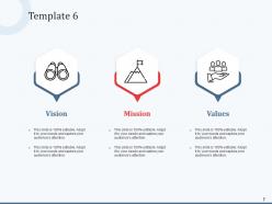
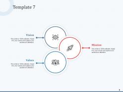
Achieve your organization’s mission by employing Organizational Objectives Vision Mission Values And Policy PowerPoint presentation. Highlight the goals and objectives associated with the strategy by using this strategic objective PowerPoint layout. Showcase the four phases of strategic management which are formulation, implementation, evaluation, and modification using this PPT layout. Menton the key elements of competitive strategy with the assistance of our organization’s vision and mission powerpoint presentation theme. Describe the company’s vision, mission, and values statement by using this operational objective PPT slide. Also, there are various high-grade icons present in the slide to make your presentation eye-catching and meaningful. You can easily explain the steps in the strategic model using these visually attention-grabbing SWOT analysis PowerPoint templates. Describe how vision and mission statements communicate purpose and direction to employees, customers, vendors, and other stakeholders. Increase efficiency and productivity in the organization by downloading the organizational objectives PPT presentation.
People who downloaded this PowerPoint presentation also viewed the following :
Vision mission and values powerpoint presentation slides with all 20 slides:
Use our Vision Mission And Values Powerpoint Presentation Slides to effectively help you save your valuable time. They are readymade to fit into any presentation structure.


FAQs for Vision mission and values
Look, your vision statement boils down to three things: future-focused, inspiring, and actually specific to what YOU do. Not some cookie-cutter nonsense every startup uses. Picture where you'll be in 10-15 years - what impact will you have made? Make it punchy enough that your team remembers it without googling your about page. Honestly, the best ones I've come across are just a sentence or two max. Here's what works: start with "what change do we want to create?" Then work backwards from there. Skip the corporate speak - you want something people genuinely get excited about, not eye-roll material.
You've gotta put that mission everywhere - onboarding, meetings, reviews, your website. But here's the thing: slapping it on conference room walls is pretty useless. Connect it to real decisions and projects instead. When your team nails something that screams "mission accomplished," tell that story! Share those wins with stakeholders too - they love concrete examples. Honestly, I've seen companies fail at this because they think posting motivational posters counts as strategy. It's all about repetition with actual context. People need to see how it affects their daily grind, not just read fancy words.
So your core values are basically like an internal GPS for decision-making. When someone hits a tricky situation and you're not around, they use those values to figure out what to do. Pretty smart system, honestly. They create this consistency in how people treat customers, handle problems, prioritize stuff - you know, the day-to-day things that actually matter. But here's the thing: they only work if you actually live by them, not just slap them on the break room wall. Otherwise employees will see right through that BS. Values help people navigate those gray areas without constantly asking "what should I do here?"
Honestly, just keep the core DNA but freshen up the language every year or so. Like when you renovate - foundation stays, but you update the paint and furniture. Your team should weigh in on what still feels right vs. what sounds dated now. Maybe "leading local provider" becomes something about "transforming community access" as you scale up. Small tweaks work better than blowing everything up. I always check changes against the original vibe before going live with them. Makes sense?
Make sure everyone gets what your mission actually means day-to-day, not just the polished version from your about page. During project planning, I always ask "how does this get us closer to [mission]?" - sounds simple but it works. Regular check-ins help too. You'll want some basic criteria to filter decisions through that mission lens. Here's the thing though - you've gotta be willing to pass on decent opportunities that don't fit. It's tough but necessary. The whole point is making this stuff automatic instead of something you only think about once a year.
Stories stick way better than boring bullet points, trust me. Like instead of "we care about customers" - tell them about your team pulling an all-nighter to fix someone's emergency. That's what people remember. Our brains are literally wired for narratives, it's weird but true. Start your next presentation with one real story that shows your mission in action. Then keep circling back to it when you make your main points. People need to actually picture what your values look like in real life, you know?
Honestly, most vision statements are way too vague - you know, all that "world-class excellence" fluff that means nothing. Keep it short or nobody will remember it. Don't confuse it with your mission statement either (they're totally different things). Here's what bugs me though - companies write these in boardrooms without asking anyone who actually works there. Test it with real people first! Make it specific to what you do, not some generic template you found online. Future-focused, yes. Inspiring but not completely unrealistic. Oh, and don't roll it out until you know it actually connects with people.
Honestly, your visual choices can do a lot of the heavy lifting here. Stick with brand colors that actually mean something, and fonts that match your vibe - like, don't slap Comic Sans on a law firm presentation, right? For images, ditch the generic stock photos if community is your thing. Real customer shots hit different. Clean layouts scream "we pay attention to details" while behind-the-scenes content works great for innovation-focused companies. I'd probably audit your next deck against each value you care about. See where the visuals aren't quite connecting - you'll be surprised how much stronger it feels afterward.
So basically when people can connect their daily tasks to the company's bigger purpose, work stops feeling pointless. You'll see way better performance because everyone's actually working toward the same thing instead of just spinning their wheels. People stick around longer too - honestly, who doesn't want to feel like their job matters? Plus your team starts making smarter decisions naturally because they get how their work fits the mission. Try having your people map their current projects to specific parts of your mission statement. Short exercise but it really clicks for them.
Honestly, I'd say every 2-3 years minimum for a real review. But don't be rigid about it - if something huge hits your industry (AI, pandemic, whatever), check sooner. Survey your team to see if they still buy into the vision. Ask customers too. Sometimes what felt inspiring five years ago just sounds like corporate fluff now. Your competitors might be shifting in ways that make your mission look stale. The real test? Does reading your vision statement still get people fired up, or do they just roll their eyes? If it's not guiding actual decisions anymore, time for a refresh.
For building strategy around values, I'd go with the Balanced Scorecard first - it makes you connect financial goals, customer stuff, processes, and learning back to what you actually believe in. SWOT works too, but filter everything through your values or it's pointless. OKRs are solid if you tie each objective to a specific value. I've watched so many teams skip this step and then act confused when their strategy feels fake. Actually had a client last year do exactly that - learned the hard way. Start simple: list your values, pick one framework, then just check if your strategic pieces actually support them.
Your customers are basically telling you what they actually care about, not what you think they should care about. Look for patterns in their feedback - if everyone keeps mentioning the same stuff, that's your cue to update your mission statement. Maybe they're obsessed with fast delivery and you're over here talking about "innovation excellence" or whatever. I'd say go through feedback every few months and see what themes keep popping up. Their actual words matter too - use language that sounds like them, not corporate speak. Does your current mission even mention what customers say they value most? If not, time for a rewrite.
Your vision and mission statements? They're like your brand's personality - what makes you actually YOU. Look at Patagonia or Tesla - you can feel their mission in everything they do. It's your North Star for staying consistent across all decisions. Here's the thing though - most companies just slap together generic corporate nonsense that means nothing. Don't do that. Yours need to reflect what you genuinely believe in and where you're going. When they're authentic, they'll naturally shape how you talk to customers, what you focus on, even your logo design. Makes everything way easier honestly.
Honestly, employee engagement and retention rates are your best bet - they show if people actually buy into your values or just nod along in meetings. Customer satisfaction usually follows the same pattern. I'd throw in hiring success rates too, plus how often you promote from within. Glassdoor reviews can be brutal but they're real feedback. Oh, and revenue per employee matters because aligned teams just perform better (sounds cheesy but it's true). Don't track everything though - pick maybe 3 metrics that match your specific values and check quarterly. You'll start seeing actual patterns instead of just hoping things are working.
Honestly, templates are a lifesaver for this stuff. You won't waste hours staring at blank slides trying to figure out where to start. Most good ones already have sections for current state, future vision, values - basically everything leadership expects to see anyway. Just drop in your content and tweak the colors to match your brand. Way better than getting caught up in fancy animations or whatever. The structure keeps you focused on what actually matters instead of overthinking it. I mean, why reinvent the wheel when someone's already figured out what works?
-
Great designs, really helpful.
-
Nice and innovative design.
-
Innovative and Colorful designs.
-
Use of different colors is good. It's simple and attractive.
-
Enough space for editing and adding your own content.
-
Content of slide is easy to understand and edit.
-
Unique research projects to present in meeting.
-
Use of different colors is good. It's simple and attractive.
-
Designs have enough space to add content.