


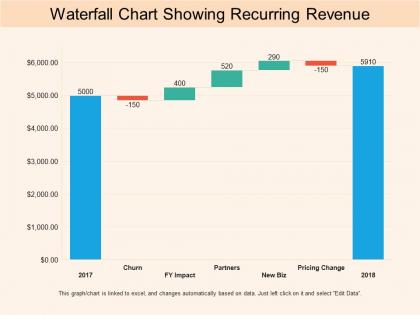
Waterfall chart showing recurring revenue




Try Before you Buy Download Free Sample Product
 Impress Your
 Audience
 100%
100% Editable
 Save Hours
 of Time


Your popularity is dear to our Waterfall Chart Showing Recurring Revenue. They strive to keep you on top of the charts.
People who downloaded this PowerPoint presentation also viewed the following :
Waterfall chart showing recurring revenue with all 6 slides:
Encourage cheerful bonhomie with our Waterfall Chart Showing Recurring Revenue. Get folks to indulge in exciting activities.
FAQs for Waterfall chart
A waterfall chart is a data visualization that displays cumulative effects of sequential positive and negative values, showing how an initial value increases or decreases through intermediate steps. It presents data through floating columns and connecting bridges, enabling viewers to track progression step-by-step, identify key drivers of change, and understand variance analysis, with financial teams finding it invaluable for budget-to-actual comparisons and performance tracking.
Waterfall charts are most effectively utilized when analyzing sequential changes in financial data, budget variances, profit and loss breakdowns, and cumulative effects over time periods. They excel in scenarios like revenue analysis, cost reduction tracking, and performance attribution, with many financial services firms, manufacturing companies, and consulting organizations finding that these visualizations streamline complex data storytelling and enhance stakeholder understanding.
Waterfall charts include starting values, positive increments, negative decrements, connecting bridges, and cumulative endpoints that visualize step-by-step changes in data. These components enable organizations to track financial performance, budget variances, and operational metrics by clearly showing contributing factors, intermediate totals, and final outcomes, with many businesses finding that this approach streamlines reporting and enhances decision-making transparency.
Waterfall charts enhance financial analysis by visually breaking down cumulative changes, tracking variance analysis, identifying key performance drivers, and illustrating sequential impacts on metrics like revenue or profit. These visualizations streamline financial reporting by enabling stakeholders to quickly understand contributing factors, assess period-over-period changes, and communicate complex financial movements, ultimately delivering clearer insights and more effective decision-making processes.
Waterfall charts excel at showing cumulative changes through sequential steps, unlike bar charts which display static comparisons or line charts which track trends over time. While pie charts show proportional relationships and scatter plots reveal correlations, waterfall charts uniquely demonstrate how individual components contribute to overall increases or decreases, making them invaluable for financial analysis, budget tracking, and performance breakdowns where understanding step-by-step impact drives strategic decisions.
Effective waterfall chart design requires contrasting colors for positive increases (green/blue) and negative decreases (red/orange), neutral tones for totals, and consistent styling throughout. Strategic color choices enhance data comprehension by creating visual hierarchy, enabling stakeholders to quickly identify performance drivers and variance patterns, with many financial teams finding that thoughtful design significantly improves executive reporting clarity.
Common mistakes include using inappropriate scales that distort data relationships, poor color choices that confuse positive and negative changes, overcrowding with excessive data points, and unclear labeling of categories. These errors undermine the chart's primary purpose of showing sequential impact, with many business analysts finding that simplified designs with consistent formatting and strategic data selection deliver clearer insights for stakeholder presentations.
Waterfall charts can effectively visualize project management metrics by tracking budget variances, milestone progress, resource allocation changes, and timeline impacts throughout project lifecycles. These charts enable project managers to communicate financial deviations, scope changes, and performance outcomes to stakeholders clearly, while identifying bottlenecks and cost overruns that require immediate attention, ultimately delivering enhanced project transparency and accountability.
**INPUT**: What software tools or platforms offer excellent templates for creating waterfall charts? **OUTPUT**: Excellent waterfall chart templates are available through Microsoft Excel, PowerPoint, Tableau, Power BI, and specialized presentation platforms like SlideTeam. These tools streamline financial reporting by offering pre-built formats, customizable design elements, and automated calculations, with many finance teams finding that professional templates significantly reduce preparation time while enhancing stakeholder presentations. [Word count: 54 words]
Enhance waterfall chart storytelling by using progressive reveal animations, color-coding positive and negative changes, adding narrative callouts for key data points, and incorporating complementary visuals like icons or trend arrows. These techniques help audiences follow the sequential flow more intuitively, with many presenters finding that combining verbal narration with visual highlights creates compelling financial narratives that drive decision-making.
Waterfall charts commonly represent financial metrics like revenue growth, profit margins, cost breakdowns, cash flow changes, and variance analysis between budgeted versus actual performance. These visualizations excel at showing sequential impacts across departments, with many organizations finding that tracking customer acquisition costs, operational expenses, and quarterly earnings progression delivers clearer stakeholder communication and enhanced financial transparency.
Labels significantly enhance waterfall chart readability by providing precise values, clear category identification, and immediate context for each data point, eliminating guesswork for viewers. Through strategic label placement, organizations streamline data interpretation, reduce analysis time, and improve decision-making accuracy, with many financial teams finding that well-labeled charts accelerate reporting processes and stakeholder comprehension.
Interactive waterfall charts enhance user engagement by enabling real-time data exploration, allowing presenters to drill down into specific segments, highlight key transitions dynamically, and respond to audience questions instantly. These interactive features transform static presentations into collaborative experiences, with many organizations finding that audiences retain information better when they can manipulate data visualizations themselves, ultimately delivering more impactful and memorable presentations.
You can customize waterfall chart templates by modifying colors to match brand palettes, adjusting fonts and typography, incorporating company logos, and adapting layouts to align with corporate design standards. These customization options enable organizations to maintain visual consistency across presentations, enhance brand recognition, and create professional materials that seamlessly integrate with existing marketing collateral, ultimately delivering cohesive communication.
When presenting waterfall charts, follow practices like clearly labeling each data segment, using consistent color coding for increases and decreases, starting with context about the baseline, and walking through each component sequentially. These approaches enhance audience comprehension by providing logical flow, visual clarity, and narrative structure, with many presenters finding that explaining the cumulative effect first helps stakeholders grasp complex financial transitions more effectively.
No Reviews