


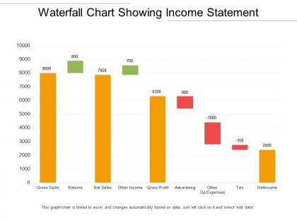
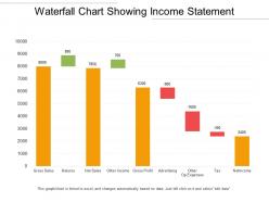
Waterfall chart showing income statement




Try Before you Buy Download Free Sample Product
 Impress Your
 Audience
 100%
100% Editable
 Save Hours
 of Time


Our Waterfall Chart Showing Income Statement have all the correct cards. They allow you to control the game.
People who downloaded this PowerPoint presentation also viewed the following :
Waterfall chart showing income statement with all 6 slides:
Be a donor with our Waterfall Chart Showing Income Statement. Give them a gift of brilliance.

FAQs for Waterfall chart
Waterfall charts primarily show cumulative effects of sequential positive and negative changes, track variance analysis between actual and budgeted figures, visualize profit and loss breakdowns, and demonstrate step-by-step progressions in financial performance. These visualizations streamline complex data interpretation by clearly illustrating how individual components contribute to final totals, with many financial analysts finding that waterfall charts significantly enhance stakeholder understanding of revenue flows and cost impacts.
Waterfall charts differ from bar and line charts by visualizing cumulative effects and sequential changes between starting and ending values, while bar charts compare static categories and line charts show trends over time. Through step-by-step breakdowns, organizations in financial services, retail, and manufacturing can track revenue build-ups, cost breakdowns, and variance analysis, ultimately delivering clearer insights into contributing factors than traditional comparison charts.
Financial services, consulting, manufacturing, and retail benefit most from waterfall charts because they frequently analyze sequential changes in metrics like revenue, costs, inventory, and project budgets. These industries require clear visualization of cumulative effects and variances, with consulting firms and financial analysts finding that waterfall charts effectively communicate complex data transformations to stakeholders, ultimately enabling better strategic decision-making.
Yes, waterfall charts excel at representing both incremental gains and losses by using positive bars for increases and negative bars for decreases, creating a visual bridge between starting and ending values. These charts enable finance teams, operations managers, and executives to track revenue changes, cost variations, and profit fluctuations simultaneously, ultimately delivering clear insights into business performance drivers.
Waterfall charts include starting values, positive increments, negative decrements, connecting bridges, and final totals, with color coding distinguishing increases from decreases. These components enable financial analysts, project managers, and executives to visualize cumulative effects across departments, quarterly performance, or budget variances, ultimately delivering clear insights into how individual factors contribute to overall business outcomes.
Waterfall charts enhance financial analysis by clearly visualizing sequential changes in values, such as revenue breakdowns, budget variances, and cash flow movements from opening to closing balances. These charts streamline complex financial reporting by highlighting specific drivers of change, enabling analysts to identify performance gaps, track quarterly progressions, and communicate variance explanations to stakeholders with greater clarity and impact.
Creating an effective waterfall chart requires starting with clean baseline data, choosing appropriate scale intervals, and using consistent color coding to distinguish positive increases from negative decreases. These charts streamline financial storytelling by clearly labeling each data point, maintaining logical flow from start to end values, and eliminating unnecessary gridlines, with many organizations finding that well-designed waterfall charts significantly enhance stakeholder understanding of variance analysis.
Excel, Tableau, Power BI, Google Sheets, and specialized presentation software like SlideTeam offer robust waterfall chart capabilities. These tools streamline financial storytelling by providing pre-built templates, automated calculations, and customizable formatting options, with many finance teams finding that dedicated business intelligence platforms deliver enhanced interactivity and seamless integration with existing data systems.
Color-coding enhances waterfall chart readability by distinguishing positive contributions, negative impacts, and cumulative totals through distinct visual elements, creating immediate pattern recognition for viewers. Through strategic color schemes, financial analysts, project managers, and business executives can quickly identify performance drivers, problem areas, and net outcomes, ultimately streamlining decision-making processes and improving stakeholder comprehension during presentations.
Common mistakes include using inconsistent data intervals, omitting connecting bridges between values, poor color coding that confuses positive and negative changes, overcrowding with excessive categories, and failing to clearly label starting and ending points. These errors undermine data comprehension and decision-making accuracy, with many organizations finding that simplified designs, logical category sequencing, and strategic color choices ultimately deliver clearer financial storytelling and enhanced stakeholder understanding.
Annotations play a crucial role in waterfall charts by providing context for data changes, explaining underlying causes, and highlighting key insights that numbers alone cannot convey. These explanatory elements enable viewers to understand the "why" behind each variance, with financial analysts and business managers finding that well-placed annotations transform complex data into actionable intelligence, ultimately delivering clearer communication and faster decision-making.
Waterfall charts enable project managers to visualize cumulative progress by showing individual task contributions, milestone achievements, budget allocations, and timeline deviations in sequential format. Through these visual breakdowns, organizations can identify bottlenecks, track resource utilization, and communicate project status effectively to stakeholders, ultimately delivering enhanced transparency and accountability across complex initiatives.
Interactive waterfall charts enhance user engagement by enabling real-time data exploration, clickable segments for detailed breakdowns, and dynamic filtering options that allow audiences to focus on specific categories or time periods. These interactive features transform passive presentations into collaborative experiences, with many presenters finding that audiences retain information better and ask more insightful questions, ultimately delivering stronger stakeholder buy-in.
Waterfall charts excel at displaying metrics involving sequential changes, cumulative effects, and variance analysis, including revenue breakdowns, profit and loss transitions, budget versus actual performance, cash flow movements, and inventory changes. These visualizations enable organizations across sectors like retail, manufacturing, and financial services to track step-by-step progressions, identify specific impact drivers, and communicate complex financial narratives with clarity, ultimately delivering enhanced transparency and strategic decision-making capabilities.
Waterfall charts assist in storytelling by visually demonstrating how individual components contribute to cumulative change, making complex financial narratives easily digestible for audiences. These charts enable presenters to guide stakeholders through revenue growth, cost analysis, and profit drivers step-by-step, with many organizations finding that this sequential visualization enhances decision-making and strategic alignment.
No Reviews