One look at a financial chart, and you know where your company or the country's economy is headed. You get pointers that help you take action to better your future. With its help, investors will predict the future of their capital and traders can rest assured about reaping profits.
Such is the utility of financial charts that provides transparency into net profits and indicates growth for market players to act accordingly.
A financial chart can be made public or used as a reference in day-to-day operations. Either way, these need to be accurate, up-to-date, and informative. If this data is to be presented to top management or stakeholders, its execution and delivery needs to be top-notch. Generally, financial charts released after hitting major milestones have an earnest audience waiting to analyze and deduce from these. Any discrepancy in data or difficulty in interpretation and you could lose prospective audience, including potential investors. Nobody likes that.
Besides, financial data that is mostly in the form of numbers makes more sense when visualized via charts (pie charts), graphs (bar graphs), sheets (balance sheet, cash flow) and geometric structures (inverted pyramids).
It is clear that creating these charts from scratch is time-intensive and costly. SlideTeam offers you a way out with its one-stop, content-ready template gallery for all your presentation needs. Explore our weekly updated library of 2 Million+ Templates, Graphs, and Themes to match your requirements. For your specific financial presentation needs, financial charts are also there.
The 100% customizable nature of the templates provides you with the desired flexibility to edit your presentations. Get ahead of the competition today by choosing our expert-designed, content-ready PowerPoint Designs.
Templates for You
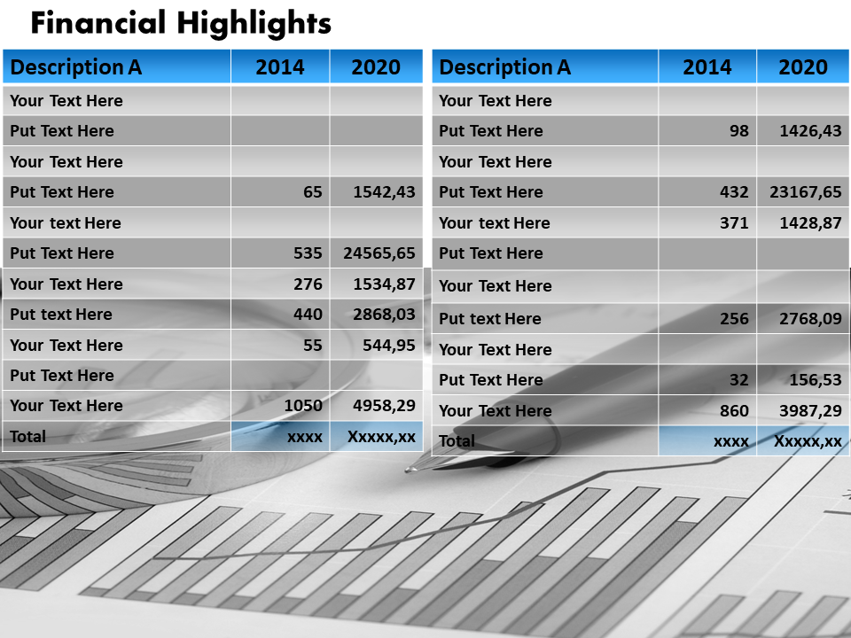
Template 1: Business Financial Chart Diagram Template
Compare and contrast the current financial highlights of your organization with data from some years back. This financial chart template is excellent for tracking your progress over the years to compare profits, liabilities, and overall revenue generated. Identify the need for budgeting via this PPT Diagram and create ease in money management. Download it now!
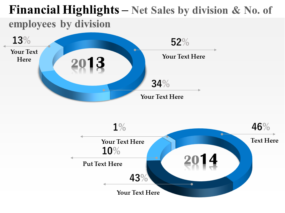
Template 2: Sales Division Financial Chart Diagram
Analyze and compare your sales performance for two consecutive years to evaluate the impact of growth strategies. Use this tier-chart diagram to showcase the proportions of profits, investments, CTRs, and customers onboarded in these two years. Ensure the success of your strategies and look for ways to magnify sales outputs using this sales division financial chart template. Download it now!
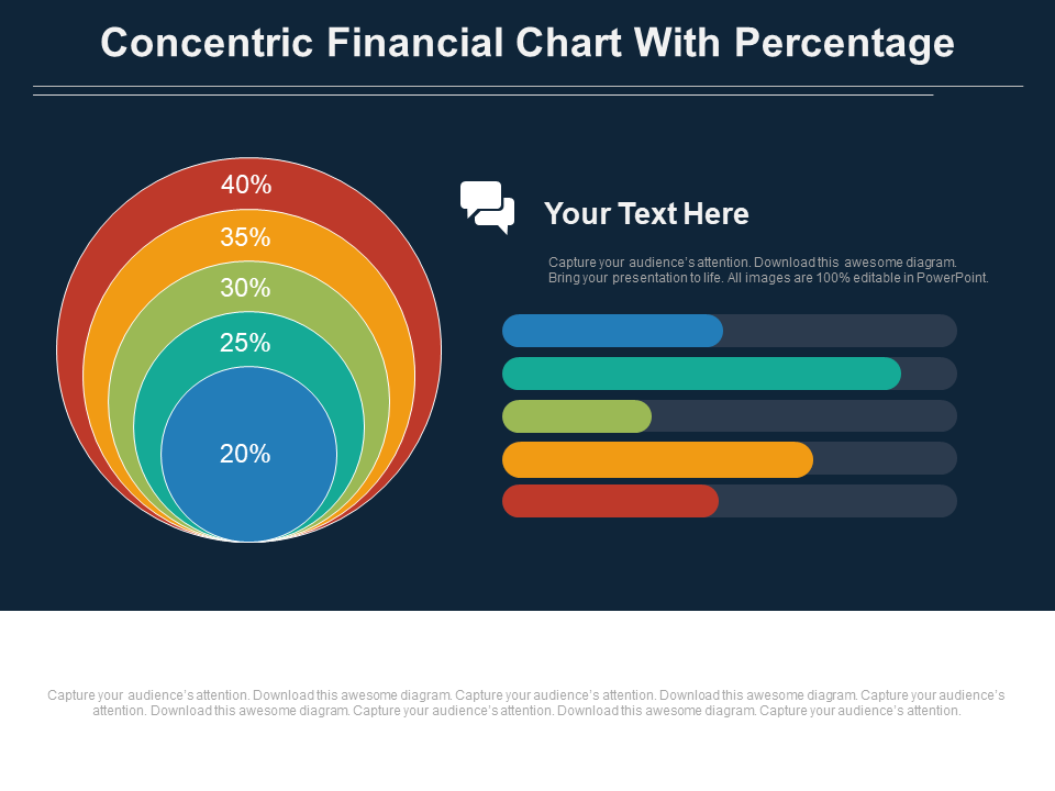
Template 3: Five-Staged Concentric Financial Chart with Percentage Template
Create a financial analysis of parameters that matter to your organization with this intense-color-coded concentric diagram. Collect and present accurately processed financial data and align it in this concentric circle diagram. If your audience loves simple bar indicators, you can replicate this information in bar graph form within this PPT Slide. Without much ado, download it now!
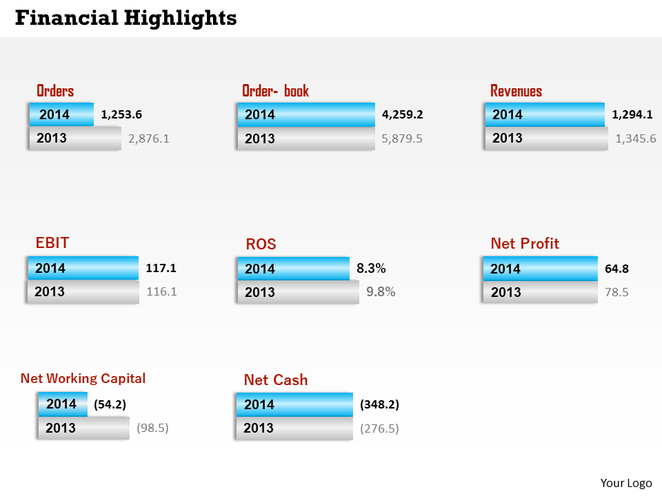
Template 4: Order and Revenue Financial Chart Diagram
Contrast the data of order books over the years with the comparison of revenue, EBIT, ROS, net profit, net working capital, and net cash. Use this block diagram template to mention these details and compare progress over two years. You can customize these parameters as per your financial pursuits and then showcase this classic assortment of data to your team. Don’t wait, download it now!
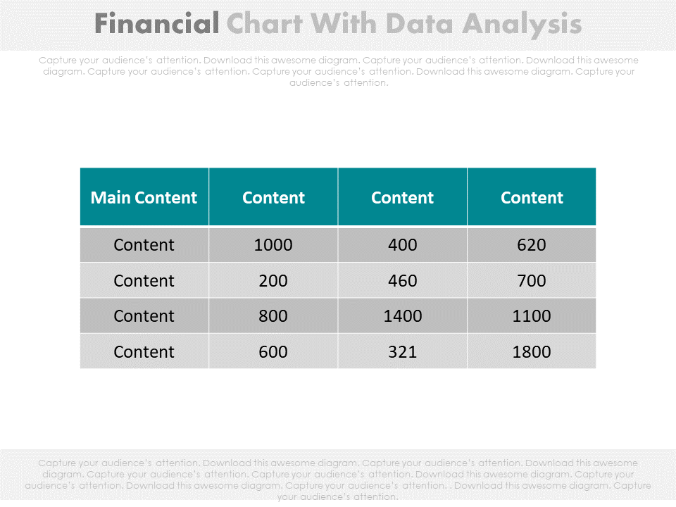
Template 5: Financial Chart with Data Analysis Template
Here is a color-coded template to gather and present the net summary of your financial data. List and compare important financial statistics like net revenue, profit, loss, etc, of three years of your organization's timeline. This PPT Slide like others is completely editable and ready to use so download it now!
Template 6: Four-Staged Financial Chart and Icons Template
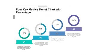
This is an infographic PPT Layout to tally your organization’s financial activities in four stages. Talk about the distribution in terms of percentage to recognize the importance of each activity. Budgeting of research, planning, statistics, and brainstorming sessions, etc can be tallied and highlighted with respective icons. Go ahead and click on the download link to use this creative financial chart template to its fullest.
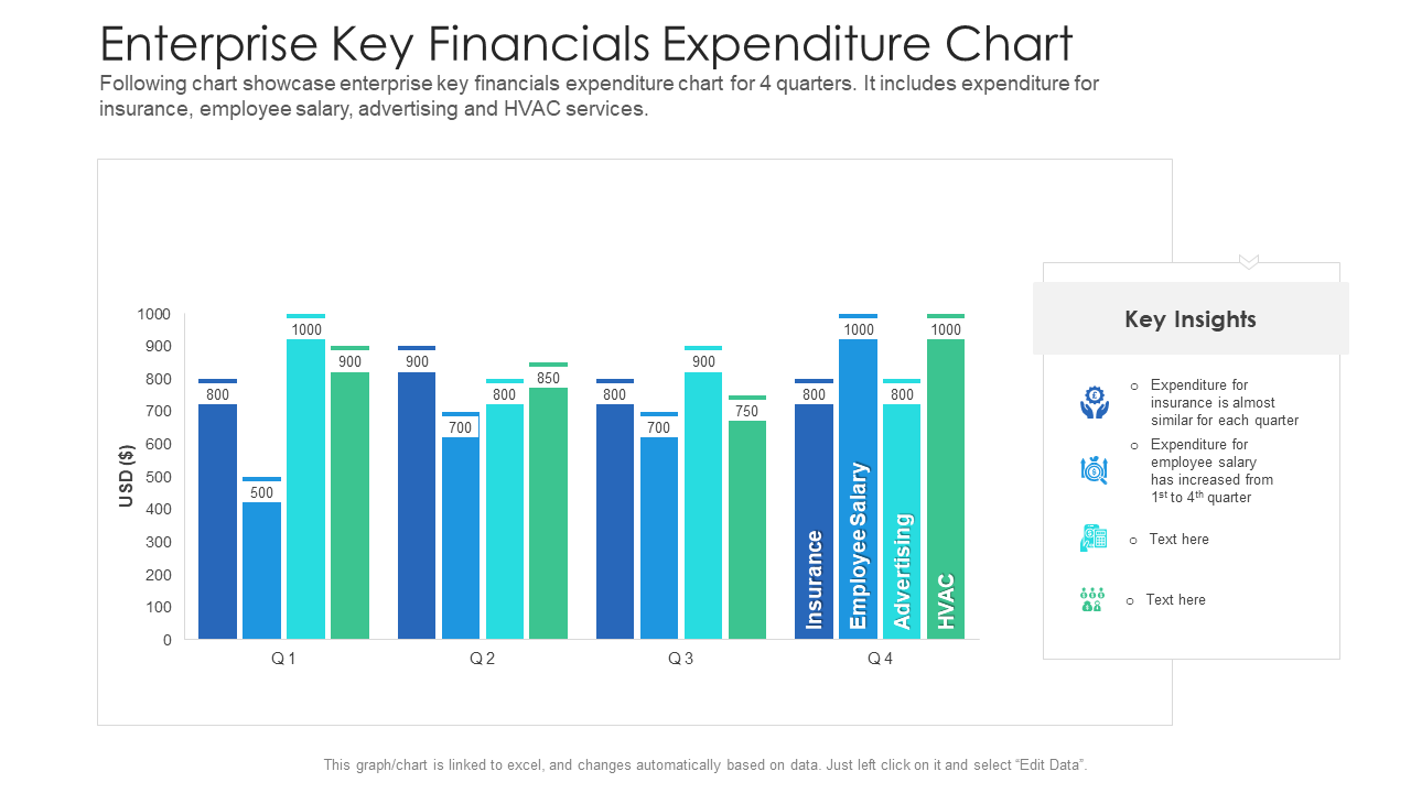
Template 7: Enterprise Key Financials Expenditure Chart Template
Maintain a visual representation of your organizational expenditures with this graphical PPT Template. Tally and record your financial expenditures with respect to insurance, employee salaries, advertising, and HVAC and compare it over the 12 months. Perform monthly and quarterly analyses with this editable and graphical financial expenditure chart template. Download now!
SIMPLIFY COMPLEXITY
Give an easy comprehension of your complex data with these financial chart templates. Download now.
PS: Financial decisions are a daily happening in business life. In today’s tech-driven world, another decision businesses deal with routinely is whether to build their own software or buy a product outright. Go through this guide replete with templates to make the right choice between the two.
FAQs on Financial Chat Templates
What are types of financial charts?
There are many financial charts that help you visualize financial data. Here are some of the most popular types:
- Line charts: This type of chart is created by plotting a series of data points on a line. Businesses use line charts to track changes in a stock's price over time.
- Bar charts: A bar chart is created by plotting data points as bars that are positioned horizontally or vertically. This type of chart compares categories of data.
- Candlestick charts: This type of chart is used in technical analysis to track the price movement of an asset over time. Candlestick charts display the opening and closing prices, as well as the high and low prices, for a particular time period.
- Area charts: An area chart is similar to a line chart, but the area below the line is filled in with color. This type of chart shows changes in a stock price over time.
- Scatter plots: A scatter plot is created by plotting two variables against each other. This type of chart is often used to identify patterns or correlations in financial data.
- Heatmaps: A heatmap is a graphical representation of data where values are represented by colors. Heatmaps are often used to show changes in stock prices across time periods or market sectors.
Each of these chart types has its own strengths and weaknesses, and the choice of chart type will depend on the specific needs of the user and the type of data being analyzed.
Which chart is best for financial data?
The best chart for financial data depends on the type of data being presented and the specific purpose of the chart. Each chart type has its own strengths and weaknesses, and the choice of the chart should be based on the type of information you want to convey.
For e.g. line charts are useful for showing trends over time, such as changes in stock prices or interest rates. Similarly, bar charts are useful for comparing data between different categories or time periods. Another type called heat maps are useful for showing changes in financial data across different time periods or market sectors.
Ultimately, the choice of chart type will depend on the specific needs of the user and the type of data being analyzed. It's important to choose a chart that effectively communicates the information you want to convey and is easy for your audience to understand.
How do you analyze a financial chart?
Analyzing a financial chart involves interpreting the data represented in the chart to identify trends, patterns, and other meaningful insights. Here are some steps you can follow to analyze a financial chart:
- Understand the chart type: Before analyzing a chart, it is important to know what type it is, such as a line chart, bar chart, candlestick chart, or others. Each chart type represents data differently.
- Identify the time period: Determine the time period covered by the chart, such as daily, weekly, monthly, or yearly data. This will give you an idea of how frequently the chart updates and how far back the data goes.
- Look for trends: Examine the chart for any trends in the data, such as increasing or decreasing values over time. Identify sudden spikes or dips.
- Use technical analysis: If the chart is a candlestick chart, you can use technical analysis to identify support and resistance levels, trend lines, and other indicators that can help you predict price movements.
- Check for volume: Look for any spikes or drops in trading volume, which can indicate significant market activity or lack thereof.
- Consider external factors: Keep in mind any external factors that may have influenced the data, such as news events, changes in government policies, or industry trends.
- Compare with other charts: Compare the data in the chart with other financial charts of the same asset, such as other stocks or indices, to get e the complete picture of market performance.
Using these steps, you can gain a better understanding of the data represented in a financial chart and make more informed investment decisions.



 Customer Reviews

