


Achieving Sales Target Sales Kpi Editable Dashboard Snapshot Ppt Diagrams






Try Before you Buy Download Free Sample Product
 Impress Your
 Audience
 100%
100% Editable
 Save Hours
 of Time


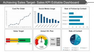
Monitor and compare current sales revenues with past year performance with our achieving sales target sales kpi editable dashboard PPT diagrams. This PPT slide of achieving sales target sales kpi will help you establish visibility of team activities and measure both team and product performance through key performance indicators. This sales target achievement PowerPoint layout will facilitate in analyzing your sales performance against targets on year on year and quarter over quarter basis. This action plan to achieve sales target PPT slide will allow you to examine sales target either as monetary value, number of units sold, or increasing social media followers. This sales performance management slide will help you classify your organization’s performance as monthly sales growth, average profit margin, sales opportunities, average purchasing value, customer lifetime value and average conversion time. This sales key performance indicators PPT templates will let you keep track of activities which will bring positive effects on your business such as knowing the relationship between your activities and your results. This PowerPoint diagram can also be used as a tool to create more efficient dialogue between sales managers and sales representatives. Our Achieving Sales Target Sales Kpi Editable Dashboard Ppt Diagrams are an excellent aid for growth. You will acquire expertise and experience.
People who downloaded this PowerPoint presentation also viewed the following :
Achieving Sales Target Sales Kpi Editable Dashboard Snapshot Ppt Diagrams with all 5 slides:
Be the jewel in the crown with our Achieving Sales Target Sales Kpi Editable Dashboard Ppt Diagrams. You will draw an immense amount of attention.

FAQs for Achieving Sales Target Sales Kpi Editable Dashboard
Honestly, just track what actually moves the needle revenue-wise. Your bread and butter metrics are total revenue, pipeline value, conversion rates, and average deal size. Activity stuff matters too - calls, meetings, follow-ups. I always tell people that without activity, you're basically hoping for magic to happen. Team performance is huge: individual numbers, quota hits, how long deals take to close. Customer acquisition cost is pretty crucial these days. Oh, and forecasting accuracy if your boss cares about that. But seriously, don't go crazy with like 30 dashboards. Pick maybe 10 that your team actually uses to make real decisions.
Honestly, those dashboards are game-changers because nobody can pretend their numbers don't exist anymore. Your team sees exactly how they're doing against targets in real-time – no surprises at month-end. It gets competitive in a good way when people can see who's killing it. Plus you'll catch problems way earlier instead of scrambling at quarter-end (been there, not fun). The accountability thing happens naturally without you breathing down anyone's neck. Just make sure everyone checks it daily – that alone will push performance up. Really wish I'd set one up sooner at my last job.
Honestly depends on your budget and how fancy you wanna get. Power BI and Tableau are amazing but there's definitely a learning curve there. Google Data Studio is free though and works pretty well for most stuff. Don't laugh, but I've seen some killer dashboards made in Excel - seriously! If you're already using HubSpot or Salesforce, their built-in dashboards are solid too. My advice? Start with whatever your team already knows how to use. You can always upgrade later when things get more complicated. No point overwhelming everyone right off the bat.
Daily updates are your best bet, but real-time is even better if you can swing it. Weekly? Too slow - you'll be chasing problems instead of preventing them. Fresh data helps you catch trends early and make faster decisions. Honestly, most sales environments move way too fast for anything less frequent. Set up automated refreshes so you're not manually updating all the time (trust me, that gets old quick). Then do a proper review with your team weekly to actually dig into what the numbers mean and plan your next moves.
Honestly, visualization is a game-changer because your brain just eats up visual info way faster than scanning through endless spreadsheet rows. Like, you can spot trends in seconds instead of squinting at numbers for ages. Charts and graphs give you those instant "oh crap, Q3 was actually amazing" moments that raw data never will. When you're showing stuff to people who aren't data nerds, a good dashboard basically does the talking for you. Just pick the right chart types for what you're measuring. Oh and stick with consistent colors - it looks way more professional than rainbow chaos everywhere.
Honestly, your historical KPI data is super useful for spotting trends. I'd pull at least 18 months of pipeline data and match it up with your actual closes. Look at conversion rates, deal velocity, seasonal stuff - the usual suspects. Year-over-year comparisons and rolling averages will show you patterns you probably didn't notice before. Focus on 12+ months for decent accuracy though. Oh, and figure out what activities led to your best performing months so you can do more of that. Dashboard should make this pretty straightforward if it's set up right.
Honestly, most people cram way too much stuff onto one screen - it's like information overload. Focus on what your sales team actually looks at every morning, not vanity metrics that just look pretty. I mean, who cares about total calls made when you could track revenue pipeline instead? Keep it simple with maybe 5-7 metrics tops. Real-time updates are clutch too, nobody wants stale data. Oh and definitely test it with actual reps first - learned that one the hard way. If they can't glance at it during their coffee and immediately know what's up, you've overcomplicated it.
Yeah so each sales channel needs totally different KPIs - like your online stuff should track conversion rates and cart abandonment, but retail locations care way more about foot traffic and transaction size. Phone sales teams are obsessed with call-to-close ratios (honestly those guys are intense about their numbers). I'd definitely segment your dashboard by channel first - otherwise you're comparing random metrics that don't even make sense together. Build out those channel-specific views, then maybe add a master overview on top. Trust me, you don't want to be swimming in a sea of irrelevant data points.
Honestly, just figure out what your audience actually cares about first. Executives want the big picture - revenue growth, conversion rates, maybe 3-4 key things max. Sales managers? They'll dig into team breakdowns and trends all day. Color coding saves your life here - green/yellow/red is stupid simple but works every time. Always throw in some context too, like how they're doing vs targets or last quarter. Oh, and make sure it works on phones since everyone's constantly checking these things on mobile. I usually just ask people what decisions they're trying to make, then build around that.
So here's the thing - segmentation completely changes your dashboard game. You go from "oh crap, revenue dropped 10%" to actually knowing WHY. Which products are tanking? What regions are killing it? Basic stuff, but most people skip it. Think of it like this: you wouldn't just treat "feeling sick," you'd figure out what's wrong first. I've seen companies celebrate growth while their best customers were already halfway out the door. Honestly, just pick your top 3 KPIs and break them down by whatever actually drives your business decisions.
Honestly, you need benchmarks or your KPI dashboard is pretty useless. Like, if you closed 50 deals this month - is that awesome or terrible? You can't tell without something to compare it to. I'd start with your historical data or just Google some industry averages. Benchmarks help you catch problems early and actually know when to celebrate wins. Otherwise you're basically staring at random numbers hoping they mean something. They're what separate a real decision-making tool from just another boring spreadsheet with fancy colors.
Honestly, sales KPI dashboards are game-changers for figuring out what's actually wrong. Like, you'll see one rep crushing prospecting calls but bombing at demos - boom, you know they need closing help, not lead gen training. Way smarter than just throwing random coaching at everyone and hoping something sticks. I pull these reports monthly and check conversion rates, deal velocity, win/loss ratios by person. The patterns jump out pretty quick. If three reps all suck at the same stage, that's your team training right there. Makes creating development plans so much easier than guessing.
So leading KPIs are like your early warning system - calls made, demos booked, pipeline speed. Lagging ones? That's your actual results after the fact: deals closed, revenue, conversion rates. Most people obsess over the lagging stuff, which honestly makes no sense to me. You can't change what already happened, right? Leading indicators let you pivot when there's still time to fix things. Short sentences keep dashboards clean. I'd go with maybe 2-3 leading metrics for every lagging one you track - gives you way better control over outcomes.
Dude, CRM integration is a total game-changer for your sales dashboard. Real-time pipeline updates flow straight in instead of you pulling data from like five different places. Your conversion rates and deal velocity stay current automatically. Honestly, I wish I'd done this sooner – you can drill down from big picture stuff to specific deals instantly. Track your reps without the manual work. Best part? Set alerts when metrics hit certain levels so you're not scrambling to fix problems after they blow up. Way more accurate than static reports that are basically useless after a week.
Think of your dashboard like telling a story - big picture stuff at the top, then dig into the details that explain what's happening. Group related KPIs together and use the same colors consistently so people can actually follow along. Seriously, most dashboards are just random charts thrown everywhere with no rhyme or reason. Show how things connect - lead volume affects conversion rates which affects revenue, that kind of thing. Oh, and always end with clear action items or alerts so your team knows what actually needs fixing.
-
Innovative and Colorful designs.
-
Awesome use of colors and designs in product templates.