


File structure diagram covering folders arrows




Try Before you Buy Download Free Sample Product
 Impress Your
 Audience
 100%
100% Editable
 Save Hours
 of Time


Even if you have the jitters our great File Structure Diagram Covering Folders Arrows will help you break the ice and get you going. That means you are one step closer to a great presentation.
People who downloaded this PowerPoint presentation also viewed the following :
Content of this Powerpoint Presentation
A tree chart can be used for important tasks. Whether it is to showcase the members of a family and their relationship with one another or to showcase the hierarchy of personnel and their reporting managers in an organization, tree charts help in representing varied and complex data feasibly.
But did you know that you can also use a tree chart to explain the locations and constituents of files and folders? Such a chart can easily showcase the folders and files that each folder contains. You can create the required tree chart using a professional tool but drafting such an infographic is quite complicated.
Instead, you can take the help of SlideTeam’s 100% customizable, pre-designed, and ready-to-use template for a file structure diagram covering folders and arrows to showcase the required data. Check out the content and offerings of the vertical folder chart offered in the template right below.
If you are looking for a file structure template showing data subfolders horizontally, then you can take the help of this document instead.
Template 1: File Structure Diagram Covering Folders Arrows
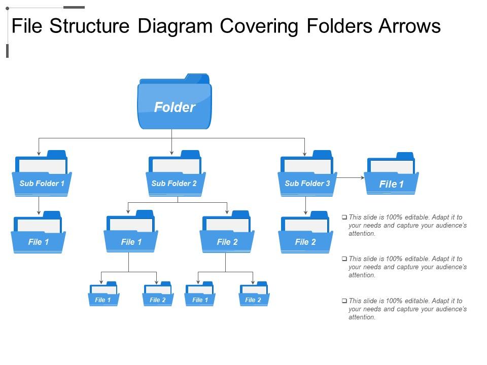
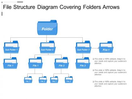
This extensive and infographic PPT Template is a comprehensive take on the subject. There are three levels or stages of the folder structure and its content. These three stages are File Structure, Records Structure, and Folder Structure. The main folder sits at the top of the chart with arrows showcasing the sub-folders available within. You can name the folders and subfolders as required for a better representation. Also, if any folder or subfolder contains any file, you can showcase the same in the chart.
Use the simplistic file structure folders with four subfolders template provided for you to showcase non-complex data with ease.
Enhance the Level of Presentability with Folder Chart
The above folder chart is multi-purpose and allows you to define the structure of files and folders, vertically, available within the organization, an online system, or otherwise. You can modify the content and names of the files and folders as required to represent adequate data with ease.
Here’s a template on a five-file structure showing laptop documents that will allow you to showcase the content of laptop files.
File structure diagram covering folders arrows with all 5 slides:
Just leave the design aspect of your next presentation to us. We have a range of File Structure Diagram Covering Folders Arrows for your every presentation need.

FAQs for File structure diagram
So you basically need three things: your folder structure, file names (with extensions), and how everything connects. Start with your main directory at the top, then branch down to subfolders and individual files. Tree diagrams work great, but honestly a simple indented list gets the job done too - whatever makes sense to you. Show file types if they actually matter for your project. Oh, and don't forget symbolic links if you've got any floating around. The whole point is making it visual enough that anyone can glance at it and immediately get where stuff lives.
So basically, file structure diagrams are like showing someone your folder setup - where everything lives in your project. Flowcharts are totally different - they map out processes and decision-making with those diamond and rectangle shapes. You'd use file structure stuff when onboarding new people or documenting your codebase layout. Flowcharts work better for showing how your app logic flows or business workflows. I always do file structure diagrams during handoffs because honestly, nobody wants to dig through mystery folders trying to figure out where you put everything. Saves so much back-and-forth later.
So basically start at the top with your main folder and branch down from there. Use tabs or lines to show what goes where - makes it way clearer. Honestly, I used to try cramming every tiny subfolder in there but it just gets messy. Focus on the stuff people actually use. Keep your folder names short but obvious, and stick to the same naming style throughout (seriously, mixed conventions drive me nuts). Toss in some example file types if it helps explain what goes where. The whole point is helping your team find things fast without getting lost.
Honestly, file structure diagrams are lifesavers for keeping everyone on the same page about where stuff lives in your codebase. New people joining the team can actually understand what's going on instead of wandering around lost for days. When you're building new features, you'll spot weird dependencies before they become headaches. Also super helpful for refactoring - which, let's be real, happens way more than we plan for. I'd make one early and just update it when you do major changes. Trust me, you don't want to be that person asking "wait, where should this go?" six months later.
For file structure diagrams, I'd probably go with **Draw.io** first since it's free and does everything you need. **Lucidchart** is another solid web option. If your work has Microsoft licenses, **Visio** is the old reliable choice. I've actually seen people throw together decent diagrams in **Figma** or **Miro** too, even though that's not really what they're for. Mac users swear by **OmniGraffle**. There's also **yEd** which is free but honestly kind of a pain to learn - super powerful though. Start with Draw.io, you can't go wrong there.
Honestly, file structure diagrams are lifesavers when new people join your team or you're dealing with messy legacy code. Great for compliance stuff too - auditors love visual docs. I probably should've started using them way earlier in my career, but whatever. They're clutch during code reviews since everyone can actually see what's going on. Super helpful for big apps with tons of nested folders or when you've got multiple repos talking to each other. My rule? If someone couldn't figure out your project structure in like 5 minutes, make a diagram.
Honestly, these diagrams are game-changers for keeping your files organized. You'll spot duplicate stuff way faster and actually understand how everything connects. New people on your team won't be totally lost either - they can see the whole setup at once. When I had to reorganize our project folders last month, having a visual saved me hours of clicking around randomly. Short sentences work great. The hierarchy becomes super obvious, which helps when you're trying to standardize things. Trust me, sketch one out for your current project. You'll probably find weird organizational choices you forgot you even made.
Ugh, the balance is brutal - too simple and people are confused, too detailed and it's just chaos on a page. I've literally seen diagrams that look like explosion sites lol. Technical accuracy vs what normal humans can understand? That's the daily struggle. File structures never stay put either, so your beautiful diagram becomes outdated garbage fast. Start small though. Test with real people first - they'll tell you what actually makes sense. Oh, and build some way to update regularly or you'll have pretty docs that everyone ignores because they don't trust them anymore.
Dude, color coding is a total game changer for file diagrams. I use blue for folders, green for docs, red for anything executable - you get the idea. Your brain just processes it so much faster when everything's visually grouped. No more squinting at tiny labels trying to figure out what's what. Oh and don't go crazy with colors or it'll look like a kindergarten art project. Three or four max works best. You can even use lighter/darker shades to show different folder levels. Seriously wish I'd started doing this years ago.
Think of file structure diagrams as your project's GPS - nobody wants to dig through random folders trying to find that one component. New devs can jump in way faster when they see how everything connects. I always make one early on because honestly, even I forget where I put things after a few weeks lol. Your whole team stays on the same page about where stuff should go. Just remember to update it when you add big new folders or restructure things - there's nothing worse than outdated documentation that leads people astray.
Start with flexible components instead of hardcoding everything - trust me, you'll thank yourself later. Name things consistently and create templates for stuff that repeats. I always think of it like building with Legos instead of concrete blocks, you know? Document your logic too, because future you will have no clue what past you was thinking. The sections most likely to grow? Design those first with expansion in mind. Short answer: modular beats rigid every time. Oh, and actually review it as your project changes - sounds obvious but half the diagrams I see are basically archaeological artifacts at this point.
Don't go overboard with details - nobody wants to see every cache file and temp folder cluttering things up. But also don't make it so vague that it's useless. I always start with the main structure and build from there. Show what actually exists right now, not some perfect setup you're planning to build someday. Honestly, inconsistent naming will drive you nuts later when you're trying to remember what you meant. Focus on the relationships that actually matter between directories. Short version: useful beats pretty every time.
Honestly, these diagrams are game-changers for team projects. Nobody has to ask "where's that file again?" in every meeting anymore. Your whole team sees the same layout, so new people actually understand how you organize stuff right away. I learned this the hard way on my last project – we wasted so much time just hunting for files. Architecture discussions become way smoother when everyone's looking at the same map. Short version: make one early and you'll thank yourself later. Trust me on this one.
So basically, hierarchical diagrams show parent-child relationships - think family tree style with branches going down from root folders to individual files. Flat ones just list everything at the same level without showing how things nest inside each other. Honestly, hierarchical is way better when you've got complex folder structures. You can actually see the path from top to bottom. Flat diagrams are more like spreadsheet layouts - cleaner but you lose that nesting info. Go hierarchical if your system's got deep folders. Flat works fine for simpler stuff where you just need a basic overview.
Honestly, stakeholder feedback will totally flip your file structure on its head. They know the actual workflows way better than you do - like, they'll catch missing pieces you never thought of or suggest way better folder names. Get their input early because they love dropping bombs like "oh yeah, we also store client videos somewhere" that changes everything. Short sentences work. Your diagram needs to match how people actually work, not your assumptions about it. I always run major changes by the team first though - learned that one the hard way.
-
Great quality slides in rapid time.
-
Great designs, really helpful.